Tooltip
A tooltip shows helpful text when users hover their cursor over an element.
Anatomy
Section titled “Anatomy”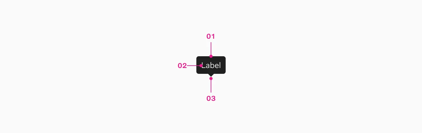
- Container
- Label
- Pointer arrow
Use tooltips to display brief descriptive text when users hover over UI elements, explaining their purpose and making the interface more user-friendly.
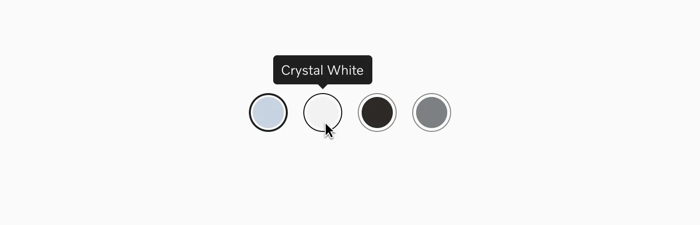
Displaying tooltip together with color picker.
When to use
Section titled “When to use”- Use tooltips for unlabelled UI elements such as icon buttons.
- Use tooltip sparingly and only when necessary.
When not to use
Section titled “When not to use”- Don’t use tooltips when the UI element already has label text.
- Don’t use tooltips if the explanation can’t be kept short — use overlays instead.
- Don’t use tooltip for critical information. Instead show that directly on the page.
- Tooltips must be triggered by user action. Popups that automatically appear to showcase new features or explain functionality are not considered tooltips.
- Avoid using tooltips on touch devices – they’re not reliably accessible without hover interactions.
Color mode
Section titled “Color mode”For maximum contrast, we use dark colors in light mode and light colors in dark mode.
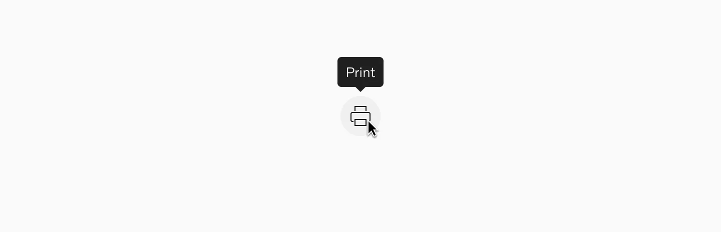
Displaying tooltip on light mode.
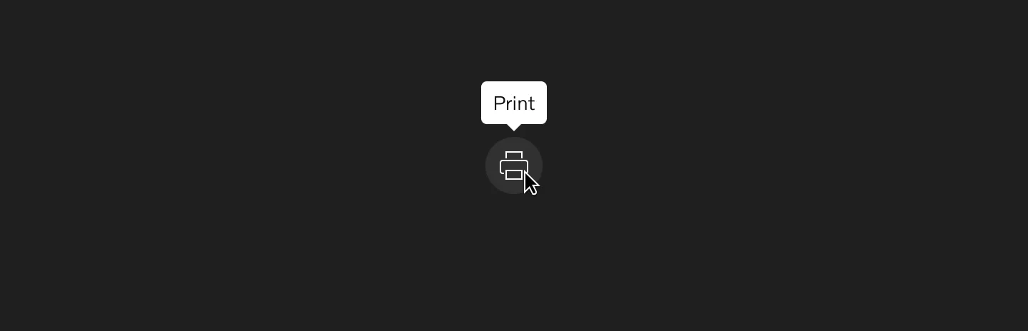
Displaying tooltip on dark mode.
Spacing
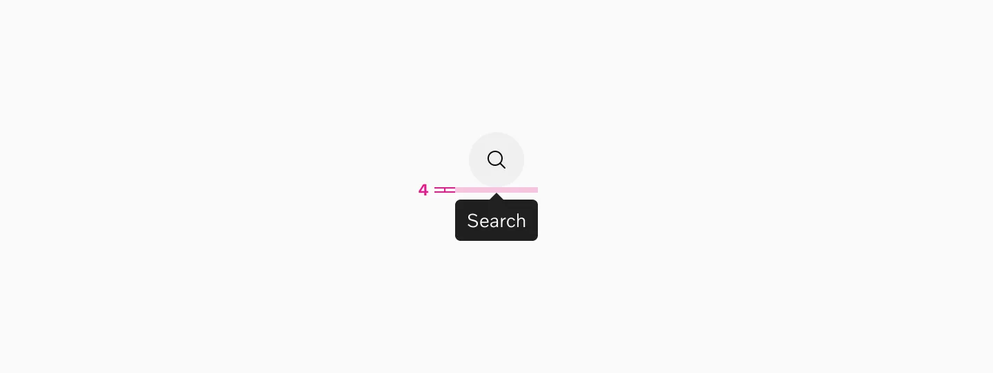
Section titled “Spacing”The spacing between the end of the pointer and the UI element is 4px.
Max width
Section titled “Max width”Tooltips have a maximum width of 24 characters. Text that exceeds this width wraps onto a second line.
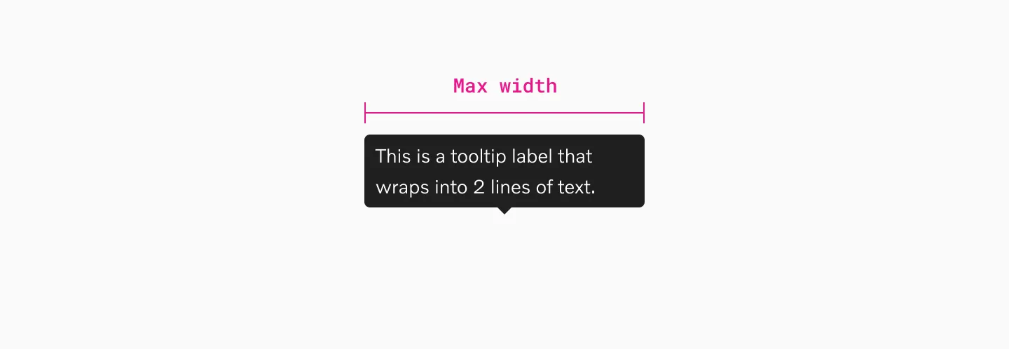
Showing a tooltip at its maximum width that spans two lines of text.
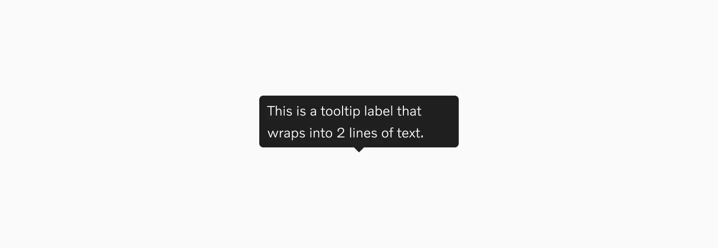
Overflow
Section titled “Overflow”When the label is too long for the available horizontal space, it wraps to form another line.
Content
Section titled “Content”Be concise
Section titled “Be concise”Write clear, concise tooltip text that explains the UI element’s purpose. Limit the text to 1–2 short sentences. For longer explanations, use a modal dialog instead.
When to use period
Section titled “When to use period”End a tooltip with a period if it’s a complete sentence or multiple sentences. Skip the period for short phrases, tool names, actions, or icon labels.
Actions or other interactive elements
Section titled “Actions or other interactive elements”Tooltips should not contain interactive elements like buttons or links — these elements are inaccessible since tooltips do not receive focus.
Behaviour
Section titled “Behaviour”Tooltips appear when the user hovers over a clickable element or when the element receives keyboard focus. They disappear when the cursor moves outside of the clickable area or the element loses focus.
Examples
Section titled “Examples”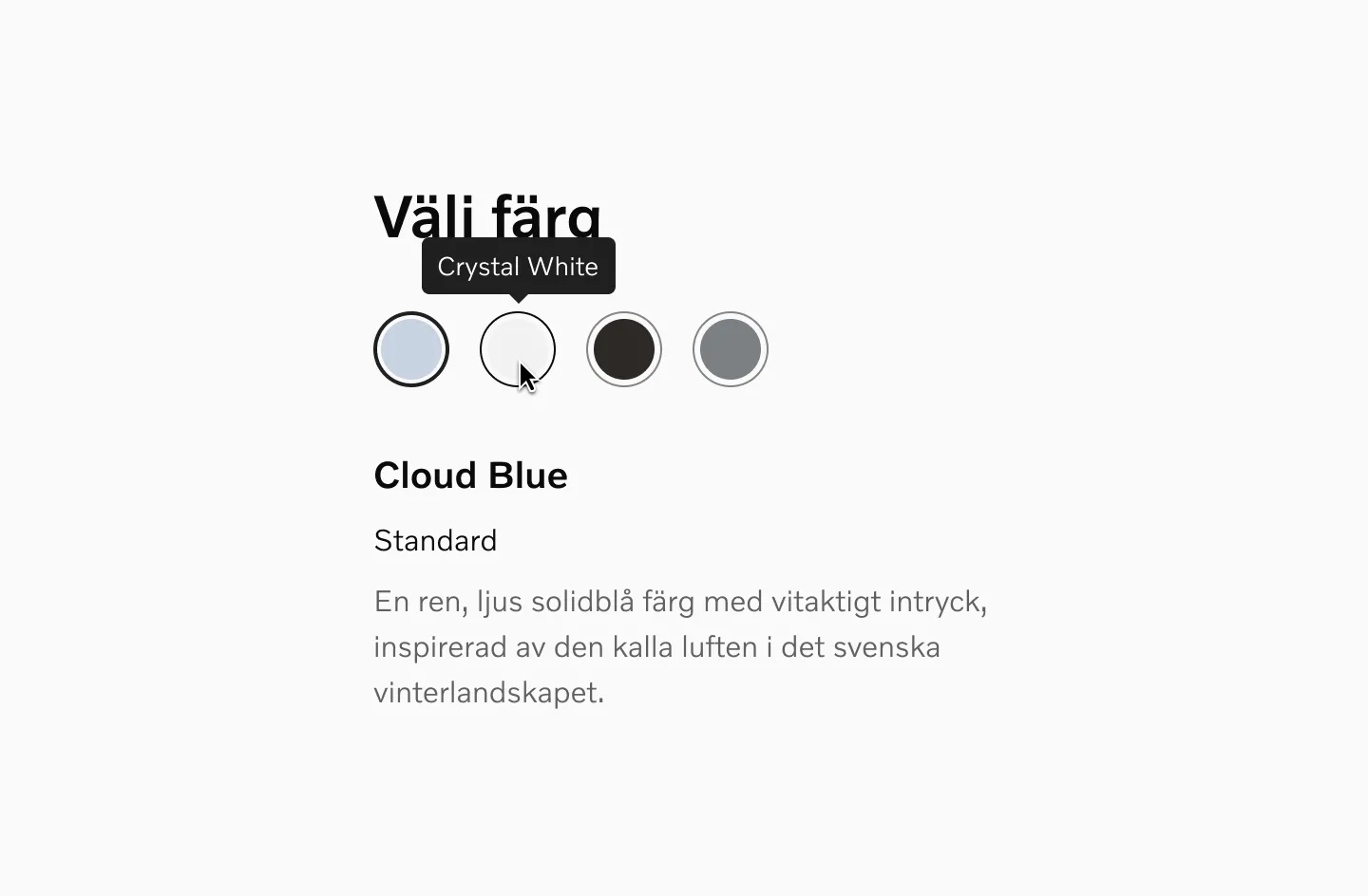
Example of a tooltip being used with a color picker.
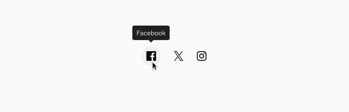
Example of a tooltip used with icon buttons.
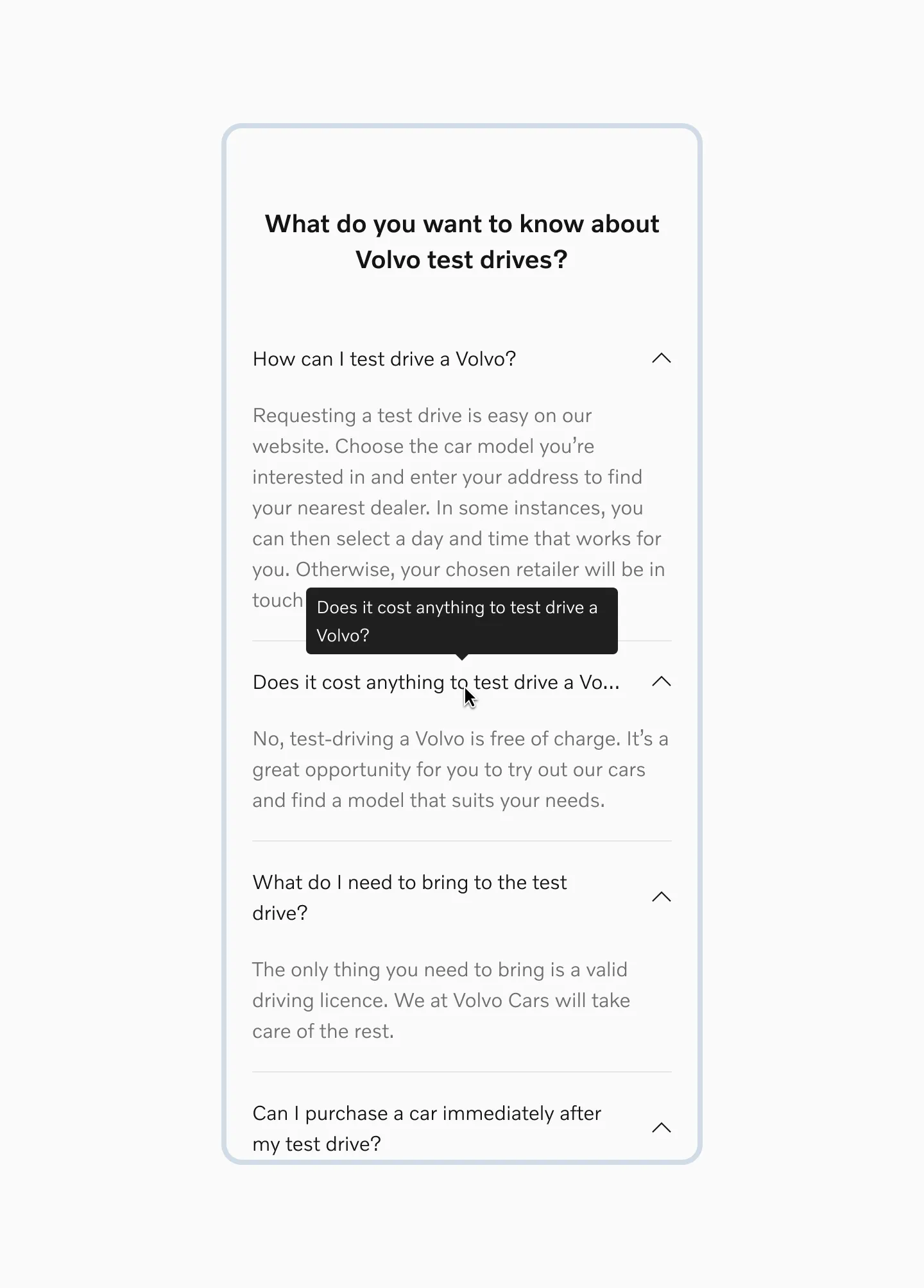
Example of a tooltip used with accordions.
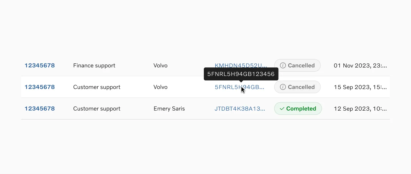
Example of a tooltip shown on table row hover.
Storybook
Section titled “Storybook”Migrating from EDLS Tooltip
Section titled “Migrating from EDLS Tooltip”Breaking changes
- 🔴
invertedprop has been removed, and the Tooltip will now render with adata-color-modeaware theme that renders the component dark on light mode (the opposite of current behaviour) - 🟢 A positional arrow has been added by default. While the arrow is recommended, it can be disabled where necessary by setting
withArrow={false}