Private lease EX60 with included insurance
Private Lease
From 8 495kr/month
Shop
Cards are content containers for displaying related information such as offers, products, or articles. Use text-card for text-only layouts or media-card when pairing content with an image.
For interactive selection patterns (checkbox/radio), see Selectable Cards. For clickable navigation elements, see Tiles.
The text card displays text content with a secondary background. The action slot anchors to the bottom, keeping layouts consistent even when cards have varying amounts of content.
Use <article> for standalone cards or <li> when rendering a list.
Private Lease
From 8 495kr/month
Shop<!-- Set your own height or min-height — the card sizes to its content by default --><article class="text-card" style="height: 400px; max-width: 375px"> <h3 slot="title">Private lease EX60 with included insurance</h3> <p slot="subtitle">Private Lease</p> <p slot="body">From 8 495kr/month</p> <a class="link-underlined" slot="action" href="#">Shop</a></article>This component uses slots to give content built-in styling.
slot="title" – Primary headingslot="subtitle" – Secondary textslot="body" – Supporting textslot="action" – Link or buttontitle
subtitle
body
action
<article class="text-card" style="height: 300px"> <code slot="title">title</code> <code slot="subtitle">subtitle</code> <code slot="body">body</code> <code slot="action">action</code></article>Text cards don’t have a built-in height — they size to their content by default. Set an explicit height or min-height on the card (or its container) to add whitespace and separate the action slot from the body content.
height or min-height directly on the card elementheight or min-height on the grid container — all cards in the row stretch equally, aligning the action slots at the bottomThe height: 400px in the examples above is just for demonstration. Choose a value that suits your content and layout.
Use CSS grid utilities to arrange multiple cards. Give the grid container a fixed height so the action slots align at the bottom across cards. Use <li> elements with the text-card class inside a <ul>.
<!-- Set the height on the grid container so all cards in the row stretch equally --><ul class="grid-cols-2 gap-gridded-element" style="height: 400px">  <li class="text-card">    <h3 slot="title">Private lease EX60 with included insurance</h3>    <p slot="subtitle">Private Lease</p>    <p slot="body">From 8 495kr/month</p>    <a class="link-underlined" slot="action" href="#">Shop</a>  </li>
<li class="text-card"> <h3 slot="title"> Care. By Volvo Business lease with included wall charger </h3> <p slot="subtitle">Business Lease</p> <p slot="body">From 8 995 kr/month</p> <a class="link-underlined" slot="action" href="#">Explore</a> </li></ul>The media card adds an image above the text content. The media slot defaults to a 1 / 1 aspect ratio with object-fit: cover, making it suitable for product imagery.
Electric
From 5990 kr / month or 670 000 kr
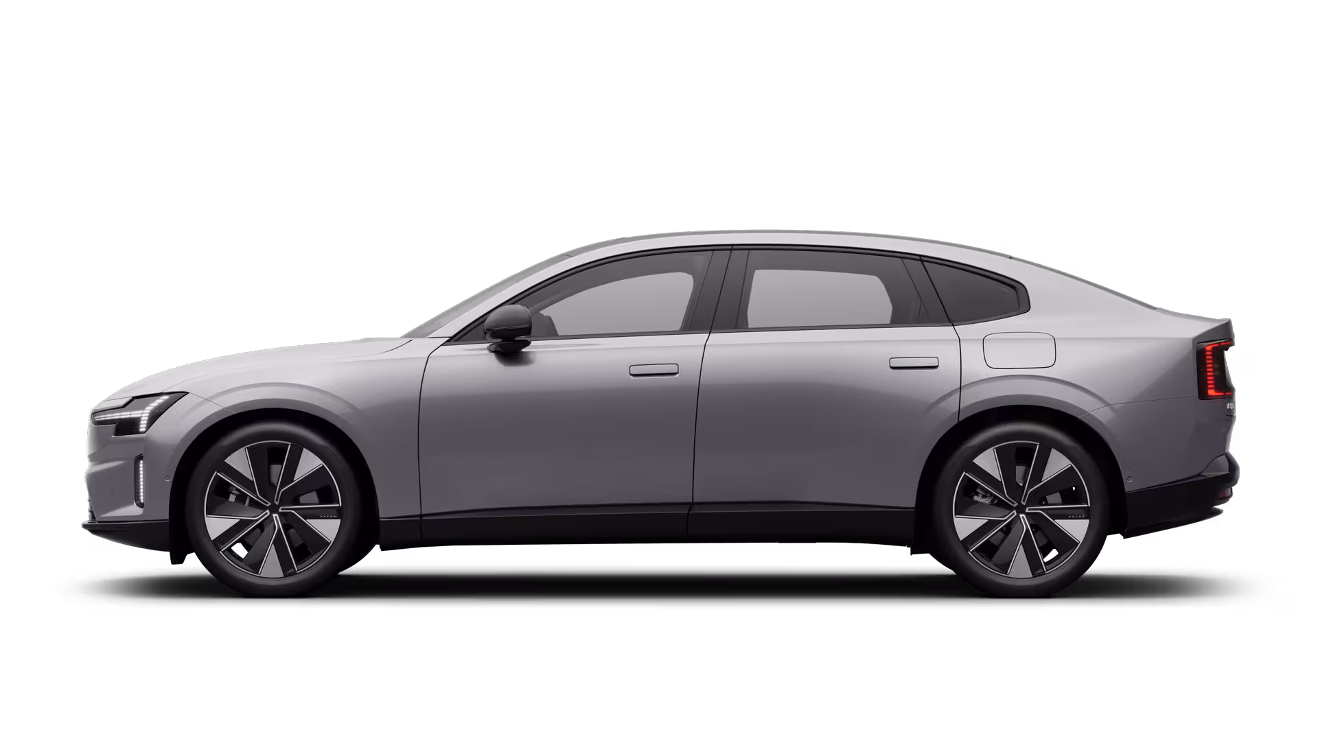
<article class="media-card" style="max-width: 425px"> <img slot="media" class="img object-contain" src="/images/cars/thumbnails/es90.avif" alt="" /> <h3 slot="title">ES90</h3> <p slot="subtitle">Electric</p> <p slot="body">From 5990 kr / month or 670 000 kr</p> <button class="link-underlined" slot="action" type="button">Explore</button></article>This component uses slots to give content built-in styling.
slot="media" – Image or videoslot="title" – Primary headingslot="subtitle" – Secondary textslot="body" – Supporting textslot="action" – Link or buttonmedia
title
subtitle
body
action
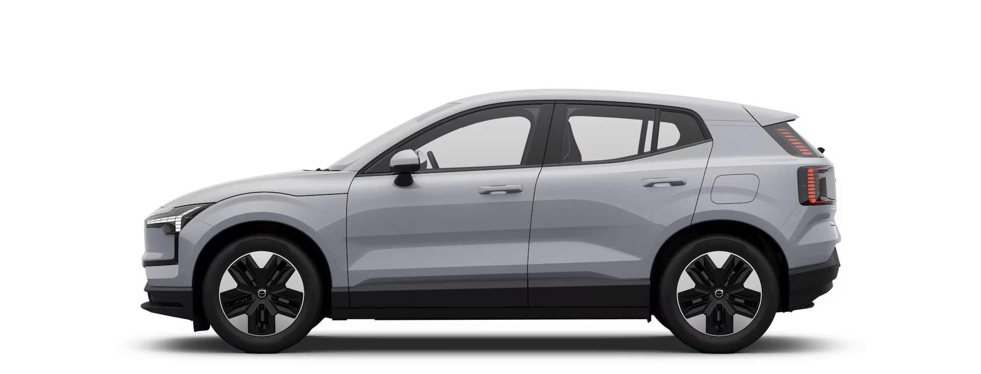
<article class="media-card" style="max-width: 360px"> <div slot="media" class="bg-feedback-gray flex items-center justify-center h-full" > <code>media</code> </div> <code slot="title">title</code> <code slot="subtitle">subtitle</code> <code slot="body">body</code> <code slot="action">action</code></article><ul class="grid-cols-3 gap-gridded-element"> <li class="media-card"> <img slot="media" class="img aspect-1/1 object-contain" src="/images/cars/thumbnails/ex30.avif" alt="" /> <h3 slot="title">EX30</h3> <p slot="subtitle">Electric</p> <p slot="body">From 3900 kr / month or 350 000 kr</p> <a class="link-underlined" slot="action" href="#">Explore</a> </li>
<li class="media-card"> <img slot="media" class="img aspect-1/1 object-contain" src="/images/cars/thumbnails/es90.avif" alt="" /> <h3 slot="title">ES90</h3> <p slot="subtitle">Electric</p> <p slot="body">From 5990 kr / month or 670 000 kr</p> <a class="link-underlined" slot="action" href="#">Explore</a> </li>
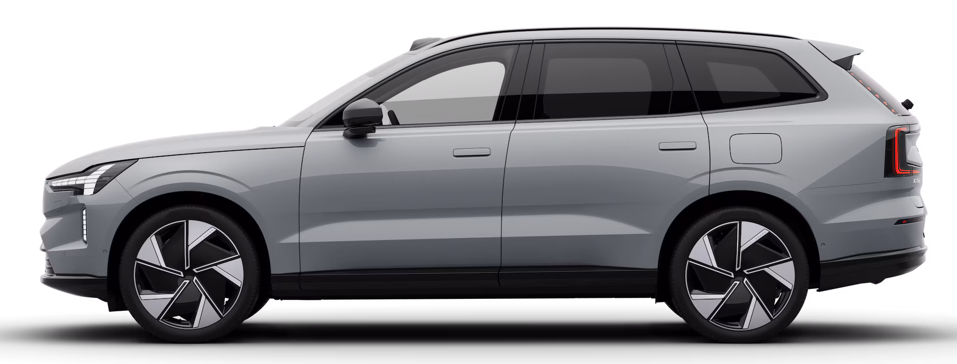
<li class="media-card"> <img slot="media" class="img aspect-1/1 object-contain" src="/images/cars/thumbnails/ex90.avif" alt="" /> <h3 slot="title">EX90</h3> <p slot="subtitle">Electric</p> <p slot="body">From 6990 kr / month or 770 000 kr</p> <a class="link-underlined" slot="action" href="#">Explore</a> </li></ul><article> for standalone cards that make sense on their own, or <li> inside a <ul> for card groupsalt text for product images, or use alt="" with aria-hidden="true" for decorative images<h2>, <h3>, etc.) based on the page hierarchy| Class | Description |
|---|---|
text-card | Text-only card with secondary background and bottom-anchored action. |
media-card | Card with image (1:1 cover) and text content. Suitable for product listings. |