
Links

Link navigates to another page, another section of a page, or an external site, with lighter visual weight than a button.
The underlined link is the default standalone link treatment.

Show code
<a href="#" class="link-underlined">Learn more</a>Variants
Section titled “Variants”Inline links
Section titled “Inline links”Links within body text are automatically styled with an underline. No class needed: any <a href> without a class gets inline link styling.
Underlined links
Section titled “Underlined links”Use link-underlined for standalone links that need clear visual indication. These have a 40px minimum tap target.
Plain links
Section titled “Plain links”Use link-plain for links in navigation or contexts where interactivity is already clear. Only shows underline on hover/press. Text color doesn’t change on hover or press; only the underline appears or thickens.
| Class | Available sizes |
|---|---|
link-underlined | 16, 14, 12pt |
link-plain | 24, 20, 16, 14, 12pt |
Disabled state isn’t available for inline links.
Target size
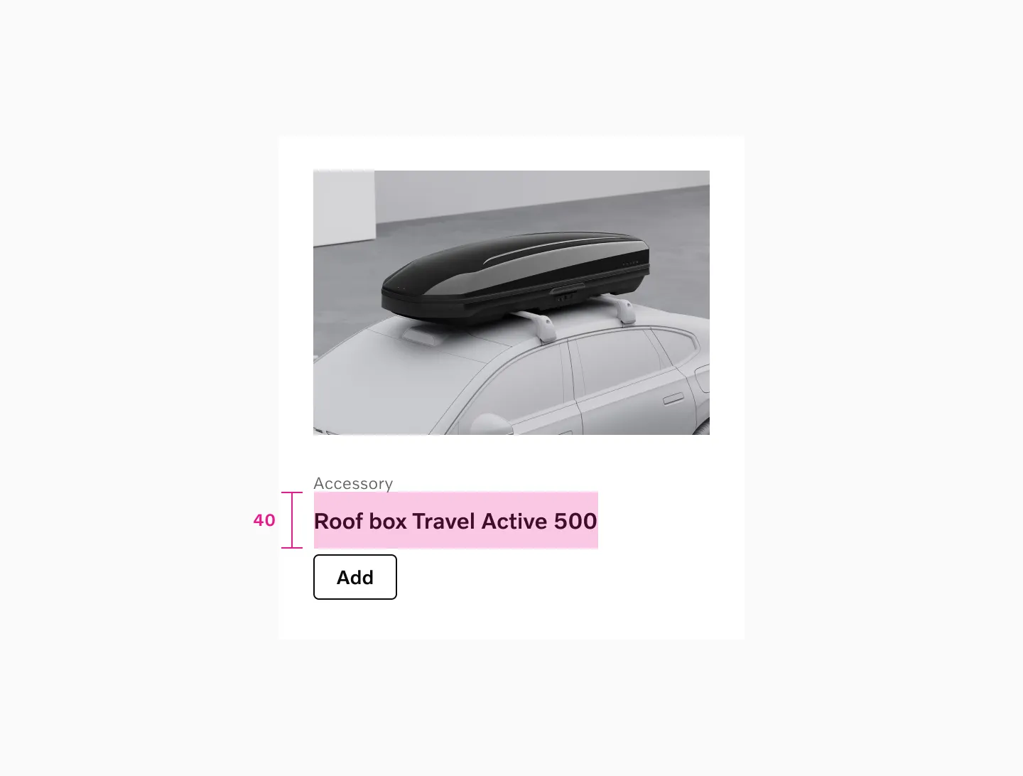
Section titled “Target size”Plain links and underlined links get a 40px minimum target size.
Accessibility
Section titled “Accessibility”Links are keyboard accessible by default. Key considerations:
- Use descriptive link text that makes sense out of context
- Avoid generic text like “click here” or “read more”
- Don’t use icons in inline links