Layout
The layout system is fluid by nature. Pages take advantage of the full viewport width, allowing content to breathe and scale naturally across breakpoints — a shift from earlier, more fixed principles where wider page margins left less room for content.
It is also gridless by principle. Instead of hard-coded columns, layouts are built around fluid content widths, responsive spacing, and component-level constraints. This keeps the foundation flexible while still producing consistent, well-aligned interfaces.
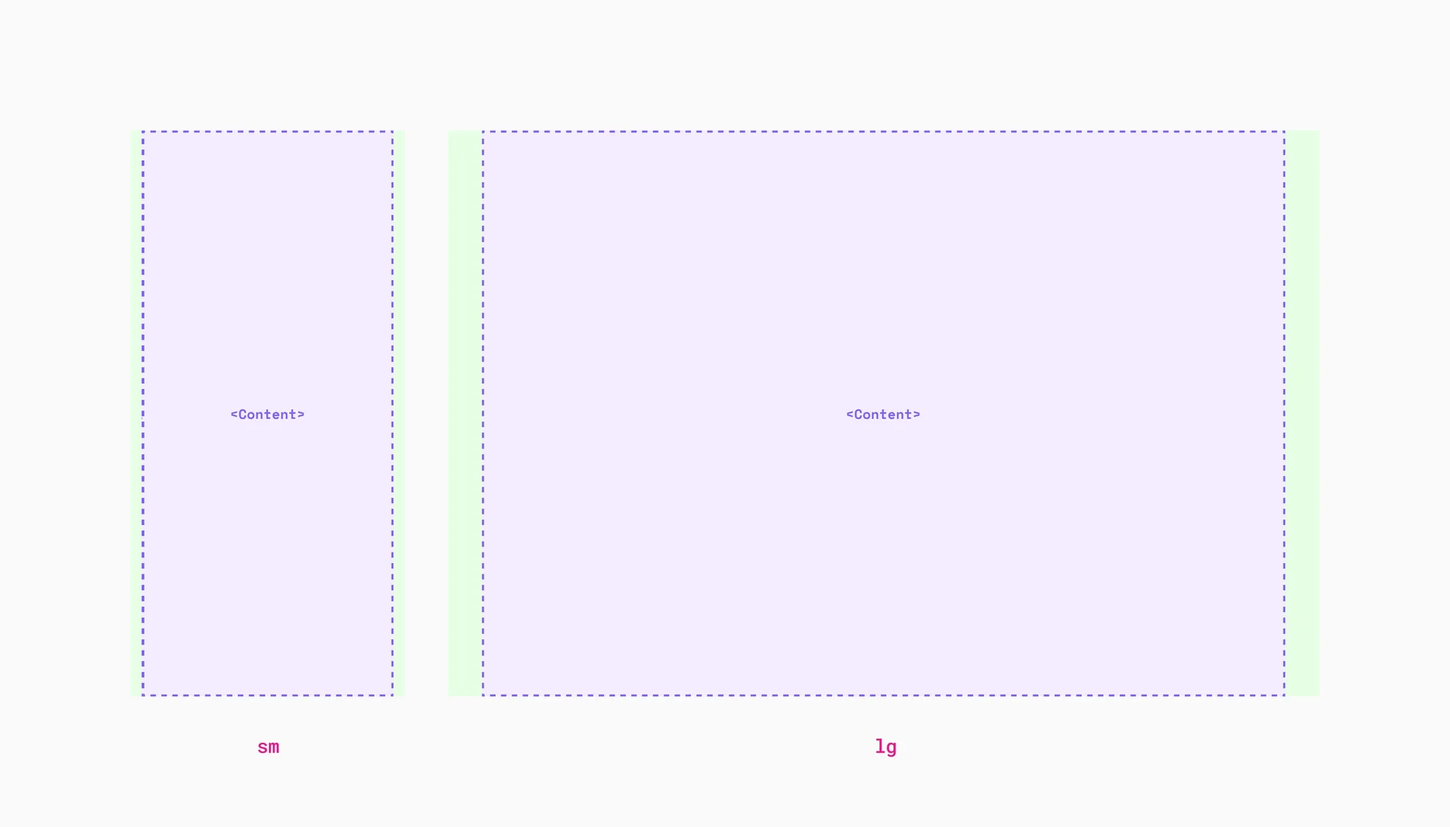
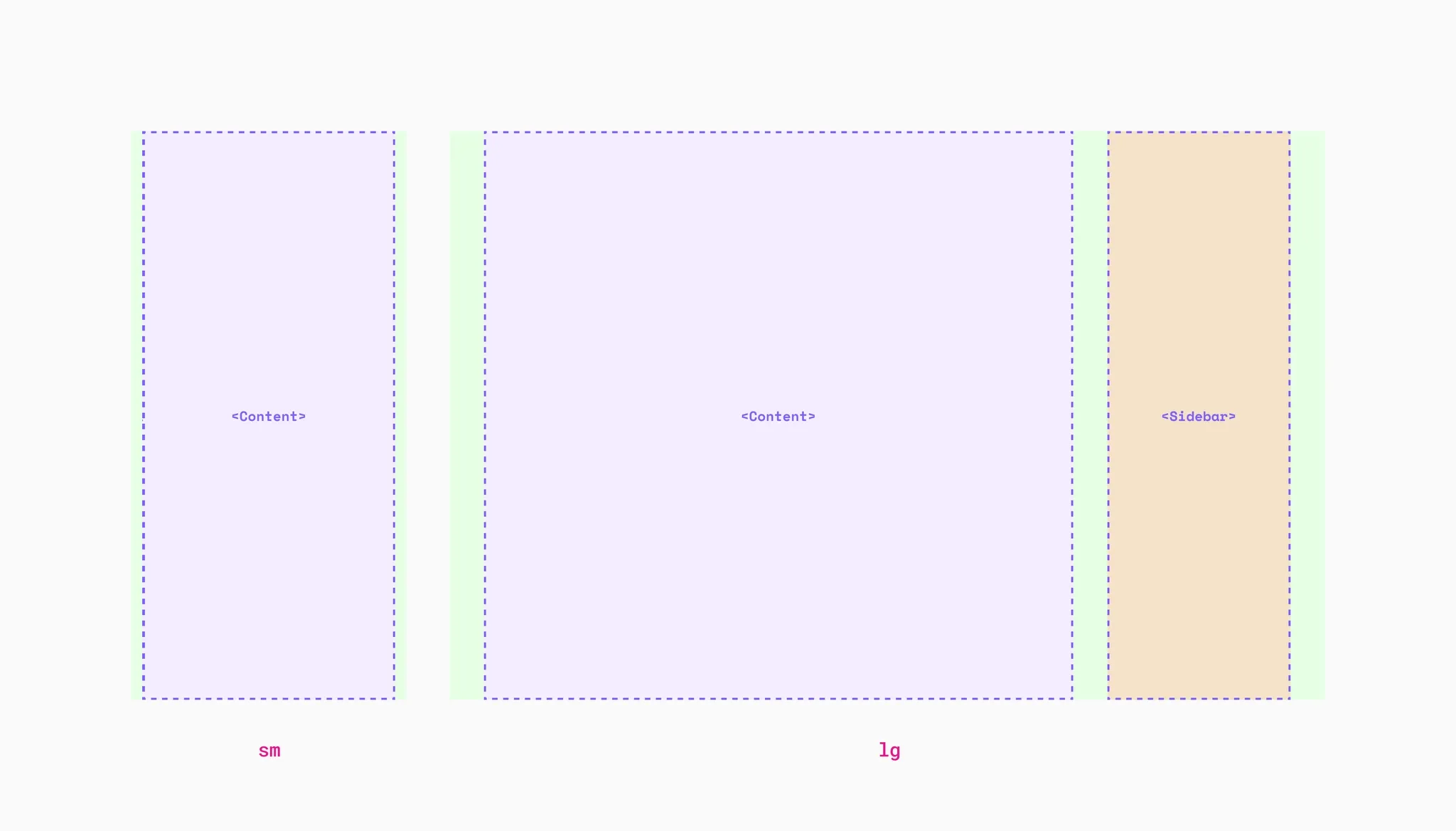
Layout anatomy
Section titled “Layout anatomy”Every page is made up of a few structural parts:
- Content area — the main region where primary page content lives.
- Sidebar area — an optional secondary region alongside the content, typically used for navigation, filters, or supporting content.
- Page margins — fluid space between the content and the viewport edges. Controlled by
--v-space-pagemargin(16 px on small screens, scaling up to 64 px on large screens).
Page layout
Section titled “Page layout”The pagelayout class goes on the <main> element. It sets up a CSS Grid that handles page margins, sidebar placement, and bleed automatically. Every page should include it.
<main class="pagelayout"> <!-- page content goes here --></main>Default layout
Section titled “Default layout”The page layout uses slots to assign structural roles to direct children of the pagelayout element.
Use slot="page" for sections that take all available space inside the page margins.
<main class="pagelayout"> <div slot="page">Content area</div></main>Bleed removes the page margins, letting content expand to the full viewport width. Add a data-bleed attribute to any slotted child:
| Attribute | Effect |
|---|---|
data-bleed | Bleeds both sides |
data-bleed-start | Bleeds only the start side (left in LTR) |
data-bleed-end | Bleeds only the end side (right in LTR) |
Each attribute also accepts responsive values to limit the bleed to specific viewport ranges:
| Value | Meaning |
|---|---|
"true" (default) | Always bleeds |
"until-md" | Bleeds below medium breakpoint only |
"until-lg" | Bleeds below large breakpoint only |
"md" | Bleeds from medium breakpoint and up |
"lg" | Bleeds from large breakpoint and up |
<main class="pagelayout"> <div slot="page" data-bleed>Full bleed — extends to viewport edges</div></main>Sidebar layout
Section titled “Sidebar layout”Add slot="main" and slot="sidebar" (or slot="sidebar-narrow") to create a two-column layout. The sidebar position is determined by DOM order — place it before main for a start-side sidebar, or after for end-side.
| Slot | Width | Description |
|---|---|---|
slot="main" | Fluid (fills remaining space) | Primary content area |
slot="sidebar" | 368–464 px (fluid) | Wide sidebar (--v-size-sidebar-wide) |
slot="sidebar-narrow" | 240–304 px (fluid) | Narrow sidebar (--v-size-sidebar-narrow) |
On screens below the large breakpoint, the sidebar stacks with the main content. If you want to hide it on small screens instead (for example, relocating its content to a sheet), use conditional rendering in your application code.
Both slot="main" and slot="sidebar" support the same data-bleed attributes described above.
<main class="pagelayout"> <div slot="main">Main content</div> <div slot="sidebar">Sidebar</div></main>Sidebar on the start side
Section titled “Sidebar on the start side”Swap the DOM order to place the sidebar before the main content:
<main class="pagelayout"> <div slot="sidebar">Sidebar</div> <div slot="main">Main content</div></main>Containers
Section titled “Containers”Containers are centered, max-width constrained content areas. Use them inside pagelayout to limit content width while keeping page margins consistent.
| Class | Max width token |
|---|---|
container-xs | --v-size-grid-xs |
container-sm | --v-size-grid-sm |
container-md | --v-size-grid-md |
container-lg | --v-size-grid-lg |
container / container-xl | --v-size-grid-xl |
container-max | 160 rem |
Containers also support data-bleed to go full-width at smaller viewports — useful for content that should be constrained on desktop but edge-to-edge on mobile:
<main class="pagelayout"> <div class="container-lg" data-bleed="until-lg"> Constrained on large screens, full width on smaller ones </div></main>Use max-w-prose to constrain text content to a comfortable reading width (--v-size-contentmax).
<main class="pagelayout"> <div class="container-xl">Full-width container</div> <div class="container-md">Medium container</div> <div class="container-sm">Small container</div></main>Simple column grid utilities for equal-width layouts. Use gap-x-gutter for consistent column spacing.
| Class | Columns |
|---|---|
grid-cols-2 | 2 equal columns |
grid-cols-3 | 3 equal columns |
grid-cols-4 | 4 equal columns |
Supports responsive prefixes: md:grid-cols-2, lg:grid-cols-3, xl:grid-cols-4.
<div class="grid-cols-2 gap-x-gutter gap-y-24">  <div>Column</div>  <div>Column</div></div>
<div class="grid-cols-3 gap-x-gutter gap-y-24">  <div>Column</div>  <div>Column</div>  <div>Column</div></div>
Responsive design
Section titled “Responsive design”Web experiences should be built mobile first, with layouts fluidly adjusting using flexbox, grid, container queries, and viewport units. Use breakpoints only when you need to significantly shift the layout at specific viewport sizes.
Breakpoints
Section titled “Breakpoints”Our breakpoints cover the most common points where you might need to significantly change the layout. Design handovers (delivery) will be in the middle of these breakpoints and are intended to cover the entire range up until the next breakpoint.
| Breakpoint | Token | Min | Delivery | Max |
|---|---|---|---|---|
Small (sm) | — | 0 | 402px | 479px |
Medium (md) | 30rem | 480px | 768px | 1023px |
Large (lg) | 64rem | 1024px | 1280px | 1599px |
Extra large (xl) | 100rem | 1600px | 1920px | ∞ |
sm
md
lg
xl
Utility class modifiers
Section titled “Utility class modifiers”Some layout classes have responsive modifier prefixes. Fluid utilities that already adapt to the viewport typically don’t need them.
Common modifiers — apply from the breakpoint and up:
| Prefix | Media query |
|---|---|
md: | @media (--v-from-md) |
lg: | @media (--v-from-lg) |
xl: | @media (--v-from-xl) |
Range modifiers — available for some classes:
| Prefix | Media query |
|---|---|
until-md: | @media (--v-until-md) |
until-lg: | @media (--v-until-lg) |
until-xl: | @media (--v-until-xl) |
md:until-lg: | @media (--v-from-md) and (--v-until-lg) |
md:until-xl: | @media (--v-from-md) and (--v-until-xl) |
lg:until-xl: | @media (--v-from-lg) and (--v-until-xl) |
<!-- Centered on small screens, left aligned on medium, right aligned on large --><p class="text-center md:text-start lg:text-end"> We want to provide you with the freedom to move in a personal, sustainable and safe way.</p>Media queries
Section titled “Media queries”Media query breakpoints are exported as Custom Media Queries, a draft CSS specification. They require a CSS postprocessor such as PostCSS. Import the breakpoints in each file that uses them:
@import url('@volvo-cars/css/breakpoints.css');
.component {  --size: 2rem;  width: var(--size);  height: var(--size);}
@media (--v-from-lg) {  .component {    --size: 3rem;  }}
To avoid fragmenting styles across a stylesheet, keep component styles in a single place and only change custom properties at different breakpoints.
Custom media queries reference
Section titled “Custom media queries reference”| Query | Range |
|---|---|
--v-from-md | ≥ 30 rem (480 px) |
--v-from-lg | ≥ 64 rem (1024 px) |
--v-from-xl | ≥ 100 rem (1600 px) |
--v-until-md | < 30 rem |
--v-until-lg | < 64 rem |
--v-until-xl | < 100 rem |
--v-only-md | 30 rem – 63.99 rem |
--v-only-lg | 64 rem – 99.99 rem |
--v-only-xl | ≥ 100 rem |
Utilities
Section titled “Utilities”Spacing tokens
Section titled “Spacing tokens”The design system provides two spacing scales — fixed values for precise control and fluid values that scale with the viewport.
Fixed spacing — pixel-based (expressed in rem), used for component-level spacing:
| Token | Value |
|---|---|
--v-space-2 | 2 px |
--v-space-4 | 4 px |
--v-space-8 | 8 px |
--v-space-12 | 12 px |
--v-space-16 | 16 px |
--v-space-24 | 24 px |
--v-space-32 | 32 px |
--v-space-48 | 48 px |
--v-space-64 | 64 px |
Fluid spacing — scales between a min and max based on viewport width, used for vertical section spacing:
| Token | Range |
|---|---|
--v-space-xs | 8 – 20 px |
--v-space-sm | 16 – 32 px |
--v-space-md | 24 – 48 px |
--v-space-lg | 32 – 56 px |
--v-space-xl | 48 – 72 px |
--v-space-2xl | 64 – 128 px |
Other tokens:
| Token | Description |
|---|---|
--v-space-pagemargin | Fluid page margins (16 – 64 px) |
--v-space-gutter | Column gutter spacing |
--v-space-gridded-element-gap | Micro gap between gridded UI elements |
Use .stack-* classes to create vertical rhythm between sibling elements. Stack applies margin-top to all children except the first.
Fixed stacks:
| Class | Gap |
|---|---|
stack-4 | 4 px |
stack-8 | 8 px |
stack-16 | 16 px |
stack-24 | 24 px |
stack-32 | 32 px |
stack-48 | 48 px |
stack-64 | 64 px |
Fluid stacks:
| Class | Gap |
|---|---|
stack-s | --v-space-s |
stack-m | --v-space-m |
stack-l | --v-space-l |
stack-text starts as stack-16 but includes additional rules for heading compositions, ensuring consistent typographic spacing with little effort.
<div class="stack-text"> <h1 class="statement-3">For a better future.</h1> <p class="heading-2">We want to provide you with the freedom to move.</p></div>Override individual gaps with mt-* classes or the --stack-gap custom property.
Use .gap-* classes to create separation between children in flex or grid layouts.
| Class | Value |
|---|---|
gap-0 | 0 |
gap-2 | 2 px |
gap-4 | 4 px |
gap-8 | 8 px |
gap-12 | 12 px |
gap-16 | 16 px |
gap-24 | 24 px |
gap-32 | 32 px |
gap-48 | 48 px |
gap-64 | 64 px |
Each size is also available as gap-x-* (column only) and gap-y-* (row only). Fluid row gaps are available: gap-y-xs, gap-y-sm, gap-y-md, gap-y-lg, gap-y-xl, gap-y-2xl.
Use gap-x-gutter to match the column gutter and gap-gridded-element for micro spacing between gridded UI elements.
<div class="flex-row gap-16"> <div>A</div> <div>B</div> <div>C</div></div>Margin
Section titled “Margin”Use m{direction}-{size} classes for precise spacing control. Direction is one of t (top), b (bottom), y (vertical), l (inline-start), r (inline-end), x (horizontal), or omitted for all sides.
Fixed: m-0 through m-64 (and all direction variants like mt-8, mx-16). Negative margins available with -m-*.
Fluid (vertical only): mt-s, mb-m, my-l, as well as mt-sm, mb-md, my-lg, my-xl, my-2xl.
Page margin: mx-pagemargin, ml-pagemargin, mr-pagemargin — match the fluid page margin spacing.
Auto: m-auto, mx-auto, my-auto, mt-auto, mb-auto, ml-auto, mr-auto.
Prefer stack for vertical rhythm and flexbox distribution (justify-between, justify-evenly) for horizontal spacing. Use margin utilities when you need precise control over individual elements.
Padding
Section titled “Padding”Use p{direction}-{size} classes. Same direction pattern as margin: t, b, y, l, r, x, or omitted.
Fixed: p-0 through p-64 (and all direction variants like pt-8, px-16).
Fluid (vertical only): pt-s, pb-m, py-l, as well as pt-sm, pb-md, py-lg, py-xl, py-2xl.
Page margin: px-pagemargin, pl-pagemargin, pr-pagemargin.
<section class="py-xl px-16"> Fluid vertical padding, fixed horizontal padding</section>Display
Section titled “Display”| Class | Effect |
|---|---|
block | Block outer layout |
inline | Inline outer layout |
flow-root | Establishes a new block formatting context (inline-block equivalent with inline flow-root) |
contents | Element’s children participate in the parent layout directly |
hidden | display: none |
invisible | visibility: hidden (preserves layout space) |
sr-only | Visually hidden, accessible to screen readers |
inline can be combined with flex and grid: inline flex-row, inline grid-cols-2.
To hide elements responsively, use breakpoint prefixes: md:hidden, until-lg:hidden, md:until-lg:hidden.
Use the HTML hidden attribute for always-hidden content. Use hidden="until-found" if the content should be searchable with find-in-page. Use empty:hidden to hide only when the element is empty.
| Class | Effect |
|---|---|
flex-row | Horizontal direction (default) |
flex-col | Vertical direction |
flex-row-reverse | Reversed horizontal |
flex-col-reverse | Reversed vertical |
flex-wrap | Allow wrapping |
flex-nowrap | Prevent wrapping |
flex-grow | Allow item to grow |
flex-grow-0 | Prevent growing |
flex-shrink | Allow item to shrink |
flex-shrink-0 | Prevent shrinking |
Alignment:
| Class | Effect |
|---|---|
items-start | Align items to start |
items-center | Center items |
items-end | Align items to end |
items-stretch | Stretch items (default) |
self-start | Override alignment for one item |
self-center | Center one item |
self-end | Align one item to end |
self-stretch | Stretch one item |
Justify:
| Class | Effect |
|---|---|
justify-start | Pack items to start |
justify-center | Center items |
justify-end | Pack items to end |
justify-between | Even spacing, no edges |
justify-around | Even spacing, half edges |
justify-evenly | Even spacing, equal edges |
<nav class="flex-row items-center justify-between gap-16"> <a href="/">Logo</a> <div class="flex-row gap-8"> <a href="/about">About</a> <a href="/contact">Contact</a> </div></nav>Slices
Section titled “Slices”Slices are macro layout utilities for horizontal split layouts. They sit at the same level as containers and are always based on container-xl width.
| Class | Split |
|---|---|
layout-4-5 | 4 / 5 proportions |
layout-5-4 | 5 / 4 proportions |
layout-4-6 | 4 / 6 proportions |
layout-6-4 | 6 / 4 proportions |
Add data-reversed to flip the column order. On viewports below lg, columns stack vertically.
<div class="layout-6-4"> <div>Larger content area</div> <div>Smaller content area</div></div>Do not nest slices inside containers smaller than container-xl — use flex or grid utilities for split layouts within smaller blocks.
Fixed: w-{number} sets a rem-based width (e.g. w-24, w-32, w-48, w-64).
Relative: w-full (100%), w-1/2 (50%).
Content-based: w-fit (width: fit-content), w-min (width: min-content).
Grid-aligned: w-xs, w-sm, w-md, w-lg — fluid widths matching the container grid tokens. Unlike containers, these are not centered.
Supports responsive prefixes: md:w-full, lg:w-1/2.
Height
Section titled “Height”Fixed: h-{number} sets a rem-based height (e.g. h-24, h-32, h-48, h-64).
Relative: h-full (100% of parent).
Min / max: min-h-{number}, max-h-{number}, min-h-full, max-h-full.
Position
Section titled “Position”| Class | Effect |
|---|---|
static | Default positioning |
relative | Relative to normal position |
absolute | Removed from flow, relative to positioned ancestor |
fixed | Relative to viewport |
sticky | Sticks when scrolling past threshold |
Offsets: top-{n}, bottom-{n}, start-{n}, end-{n} (e.g. top-0, top-8, start-16). Uses logical properties — start and end respect RTL direction.
Use contain-content on a parent to scope absolutely positioned children.
<div class="contain-content"> <div class="absolute top-0 end-0">Positioned element</div></div>Overflow
Section titled “Overflow”| Class | Effect |
|---|---|
overflow-auto | Scroll when needed |
overflow-hidden | Clip overflow |
overflow-visible | Show overflow |
overflow-clip | Clip with no scrolling |
Also available per-axis: overflow-x-auto, overflow-y-hidden, etc.
Use scrollbar-none to hide the native scrollbar while keeping scroll functionality — only when you provide a visual scroll indicator and clickable controls.
Supports responsive prefixes: overflow-hidden lg:overflow-auto.
Translate
Section titled “Translate”Reposition elements using the CSS translate property. Horizontal translations automatically flip in RTL.
| Class | Effect |
|---|---|
translate-x-1/2 | Move right 50% |
-translate-x-1/2 | Move left 50% |
translate-y-1/2 | Move down 50% |
-translate-y-1/2 | Move up 50% |
translate-x-full | Move right 100% |
-translate-x-full | Move left 100% |
translate-y-full | Move down 100% |
-translate-y-full | Move up 100% |