Toast message
A toast message is a brief, temporary notification that confirms an action or process that the user just performed.
Anatomy
Section titled “Anatomy”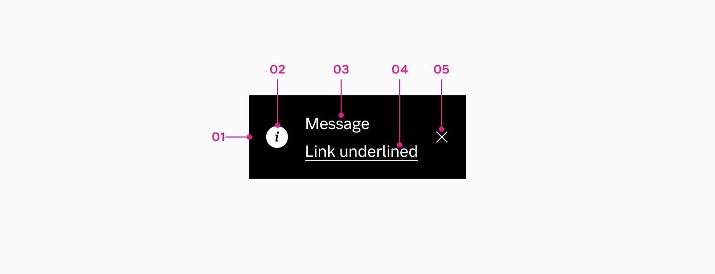
- Container
- Icon
- Message
- Link
- Close button
How to use
Section titled “How to use”Use toast message to provide users with immediate, non-critical feedback about actions or processes without disrupting their workflow.

Example showing a toast message that indicates an item has been removed.
Considerations
Section titled “Considerations”- Don’t use toast message for critical information or actions that require user input. Instead, use a modal dialog that requires immediate user action.
- Do replace existing toast message with newer ones.
- Display only one toast message on screen at a time. Toast messages do not stack.
- If there is an action it should be somewhere else on the page as well.
Action
Section titled “Action”- Do not use auto-hide duration when an action button is present. For this case always display the ‘X’ button to give users control over dismissing or acting on the message.
- The ‘X’ button is optional for toast messages without actions. It can be used alongside auto-hide duration to improve component usability.
Variants
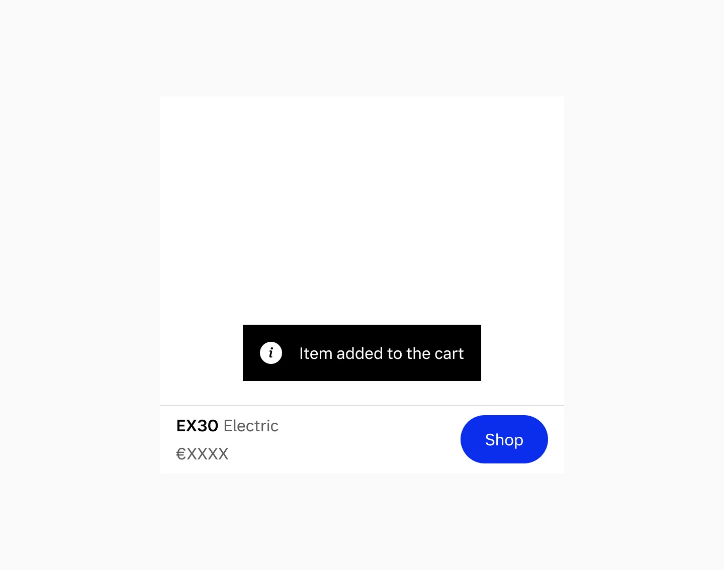
Section titled “Variants”Neutral
Section titled “Neutral”Neutral toast messages display general status updates and informational messages.

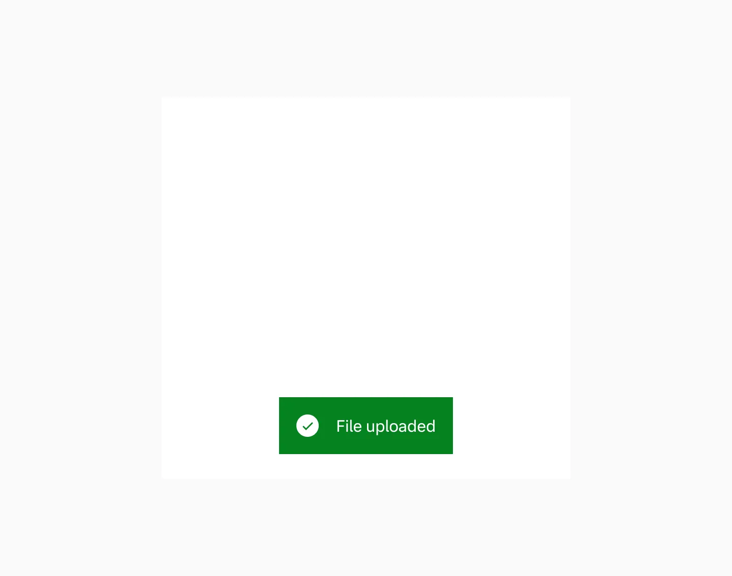
Positive
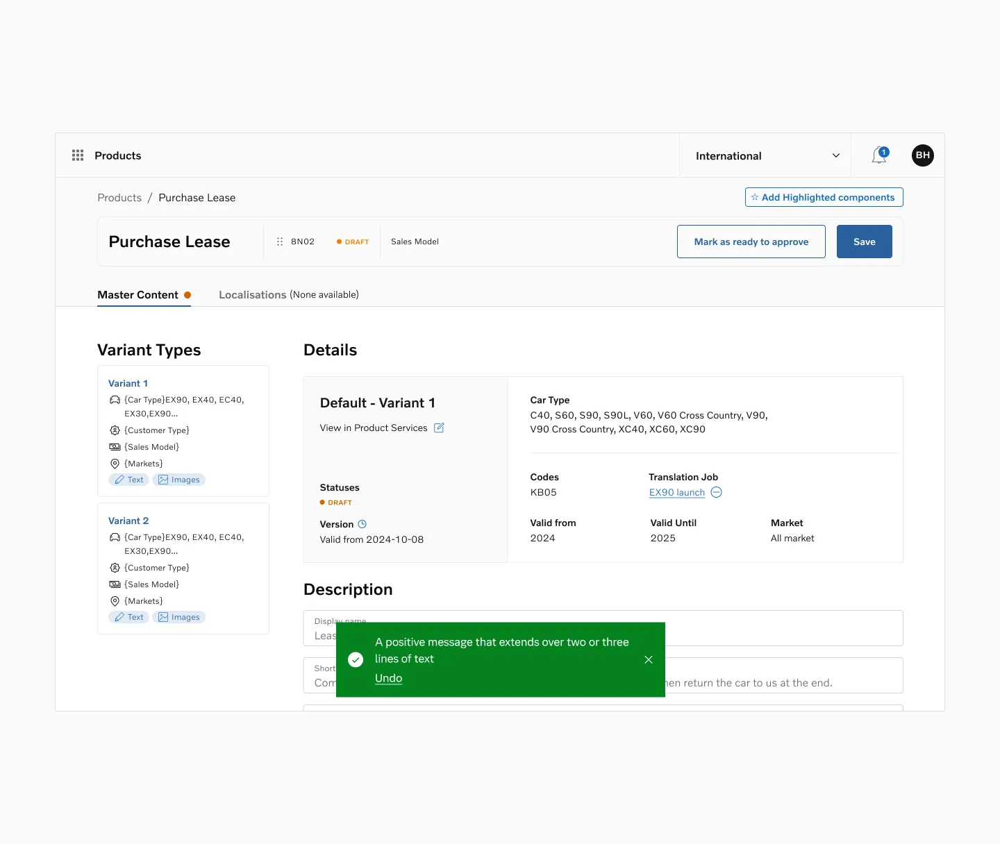
Section titled “Positive”Positive toast messages display successful actions, such as when a file has uploaded or a transaction has completed.

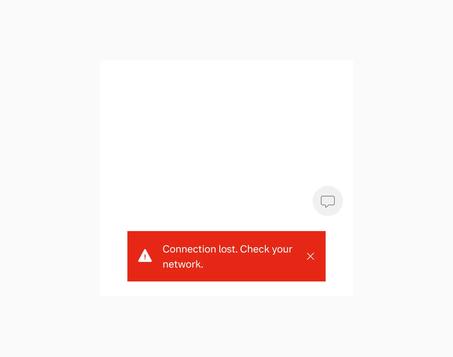
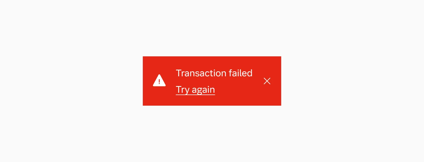
Negative
Section titled “Negative”Negative toast messages display alerts or indicate when errors occur.

Placement
Section titled “Placement”Default placement
Section titled “Default placement”Toast messages appear top or bottom center on all screen sizes. Bottom placement is the default.
Bottom placement.
When using bottom navigation
Section titled “When using bottom navigation”When bottom navigation is present, the toast message displays above the navigation.
When using floating button
Section titled “When using floating button”When a floating button is present, the preferred placement of a toast message is below.
Considerations
Section titled “Considerations”- Don’t customize the placement of the toast message.
- Avoid placing toast message over navigation elements or floating buttons.
Color mode
Section titled “Color mode”Toast message is set to use light mode in both dark and light mode.
Displaying toast message in light mode.

Displaying toast message in dark mode.
Toast width is determined by its content — longer messages result in a wider component. When an action is included, it always appears on a separate line below the message. Keep the body text to a maximum of two lines.
Max width
Section titled “Max width”Toast messages have a maximum width of 45ch. On smaller devices, the toast message uses the full width minus the page margins.
Spacing
Section titled “Spacing”We maintain a 24px spacing between the toast message and any persistent element. If there’s no element below, the toast message is positioned 24px from the bottom of the screen.
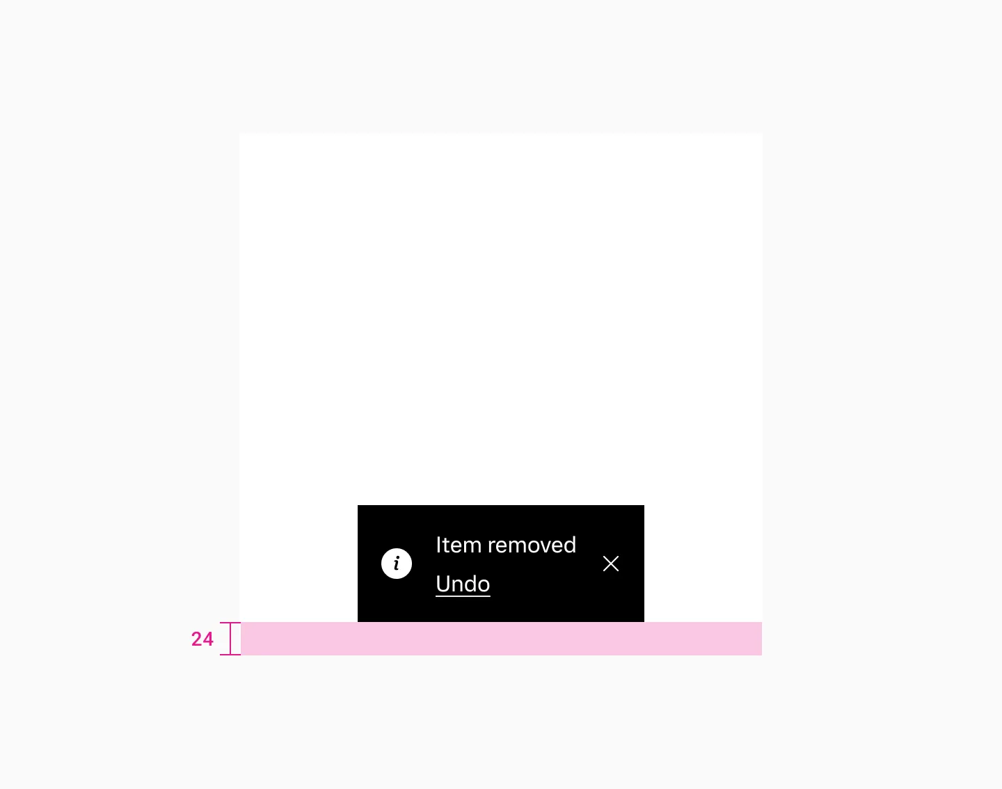
Shows spacing when there are no elements below the toast message.
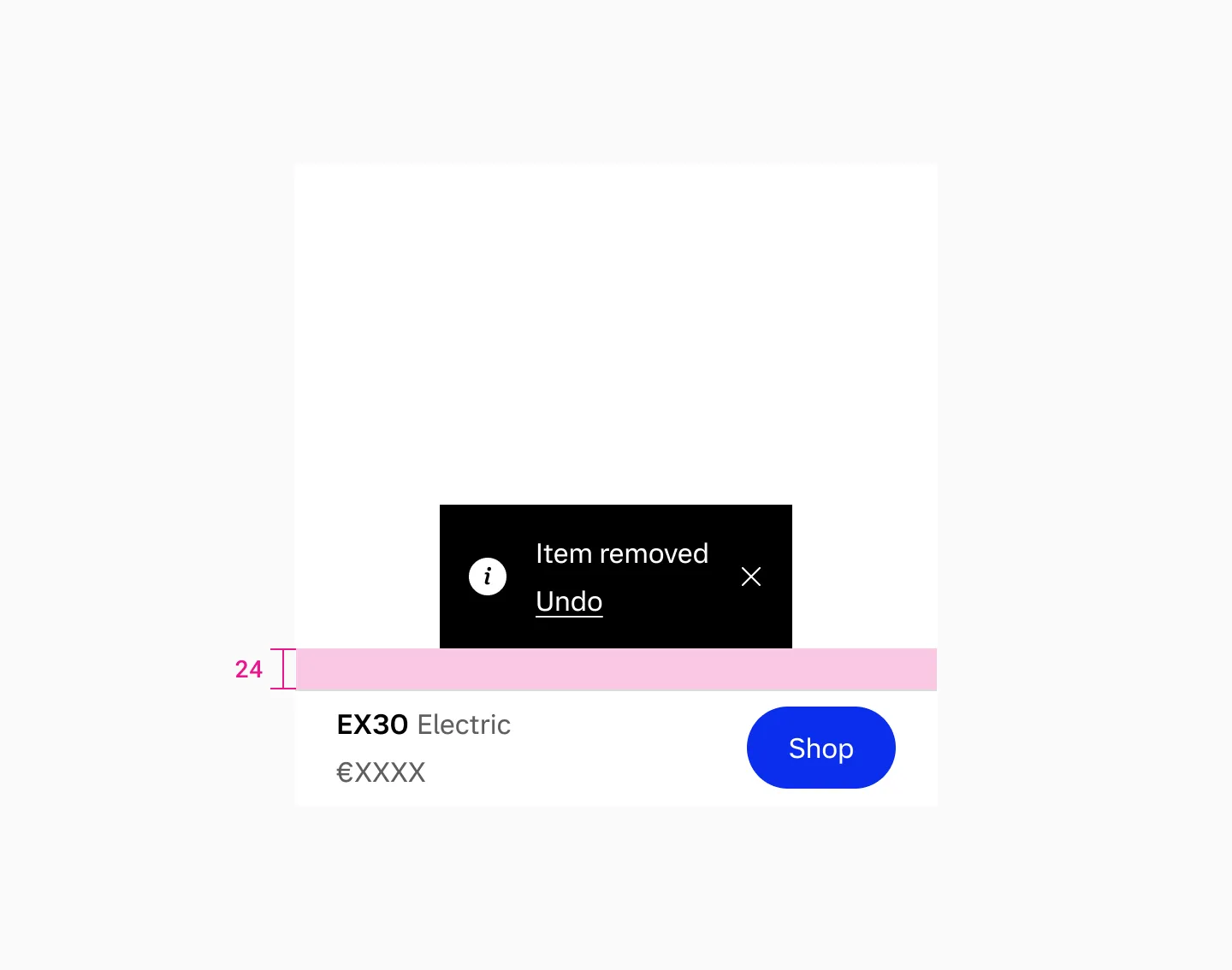
Shows spacing with a navigation bar below the toast message.
Keep toast message text as short as possible, with no more than two lines in English, and use generic language for items.
Behaviour (WIP)
Section titled “Behaviour (WIP)”Toast messages slide up from the bottom when users trigger an action and automatically hide after a brief period.
Auto-hide
Section titled “Auto-hide”When automatic hide is enabled, the toast message slides out.

Hide by interaction
Section titled “Hide by interaction”When a user triggers an action or close, the toast fades out.
Custom duration
Section titled “Custom duration”Toast messages with important actions can be customized to disable auto-hide, adjust display duration, or dismiss when users interact with them.
Accessibility
Section titled “Accessibility”- Avoid triggering toast messages too frequently. Repeated interruptions can be disruptive for users with cognitive and visual impairments.
- Toast messages can be disruptive for users with cognitive and visual impairments. Intentional keyboard interaction and correct reading order are preferred.
- Give users enough time to read when an action button is present. If the action button must be used, the message must be clear and precise.
- Toasts should not automatically dismiss when an action is present; instead, ensure users can dismiss them manually (e.g., via the close button).
Examples
Section titled “Examples”Examples
Section titled “Examples”
Displaying a neutral toast message when an item has been added.
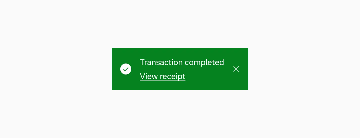
Displaying a positive toast message when a transaction has been completed.
Displaying a positive toast message when an item has been removed.
Enterprise examples
Section titled “Enterprise examples”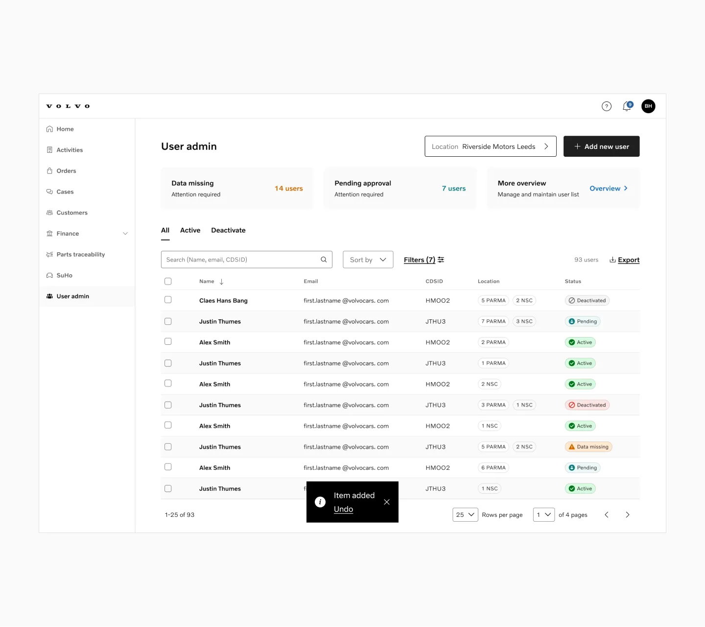
Displaying a neutral message.
Displaying a positive message with overflow.
Displaying a negative message without link.