Tiles
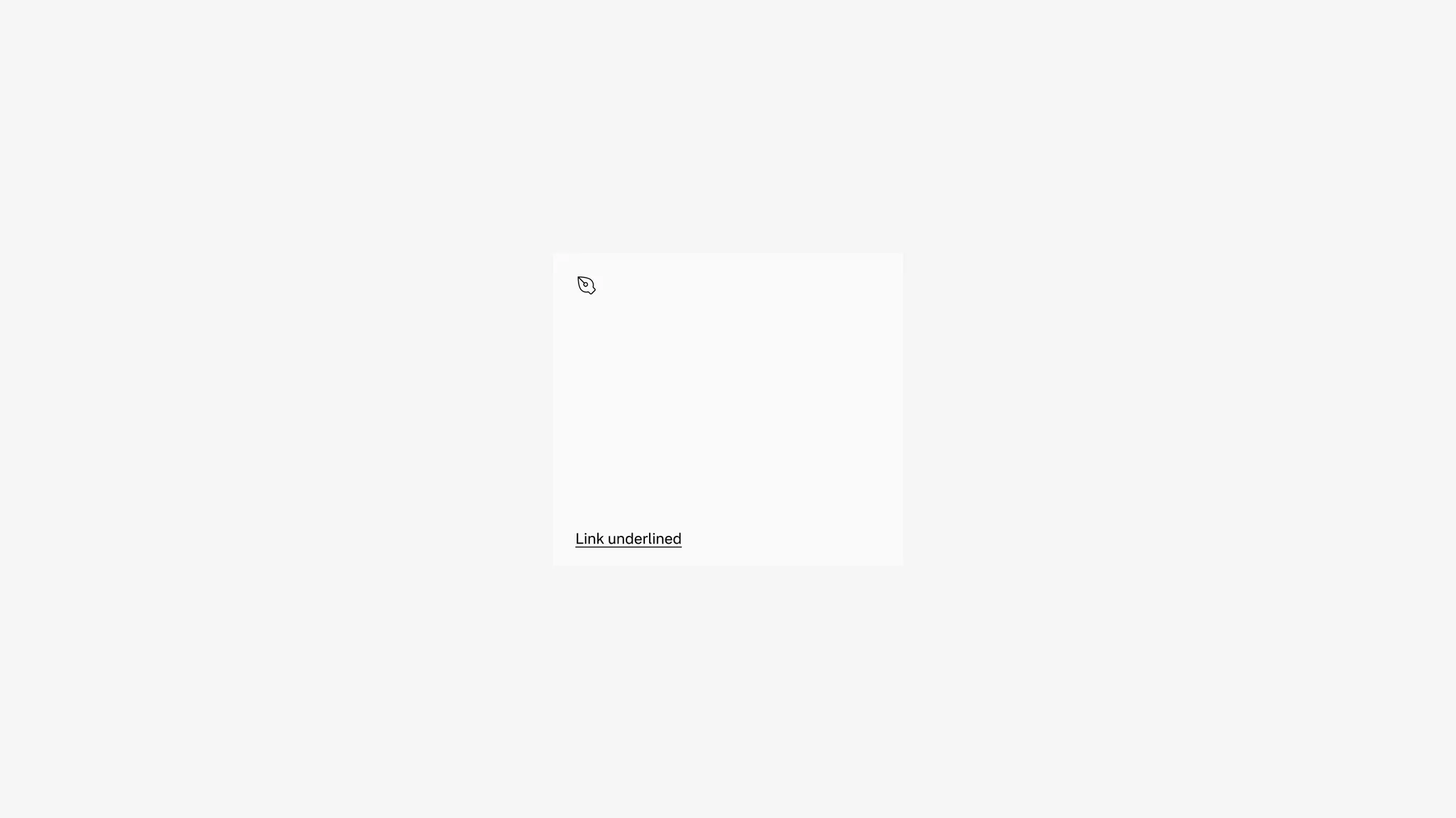
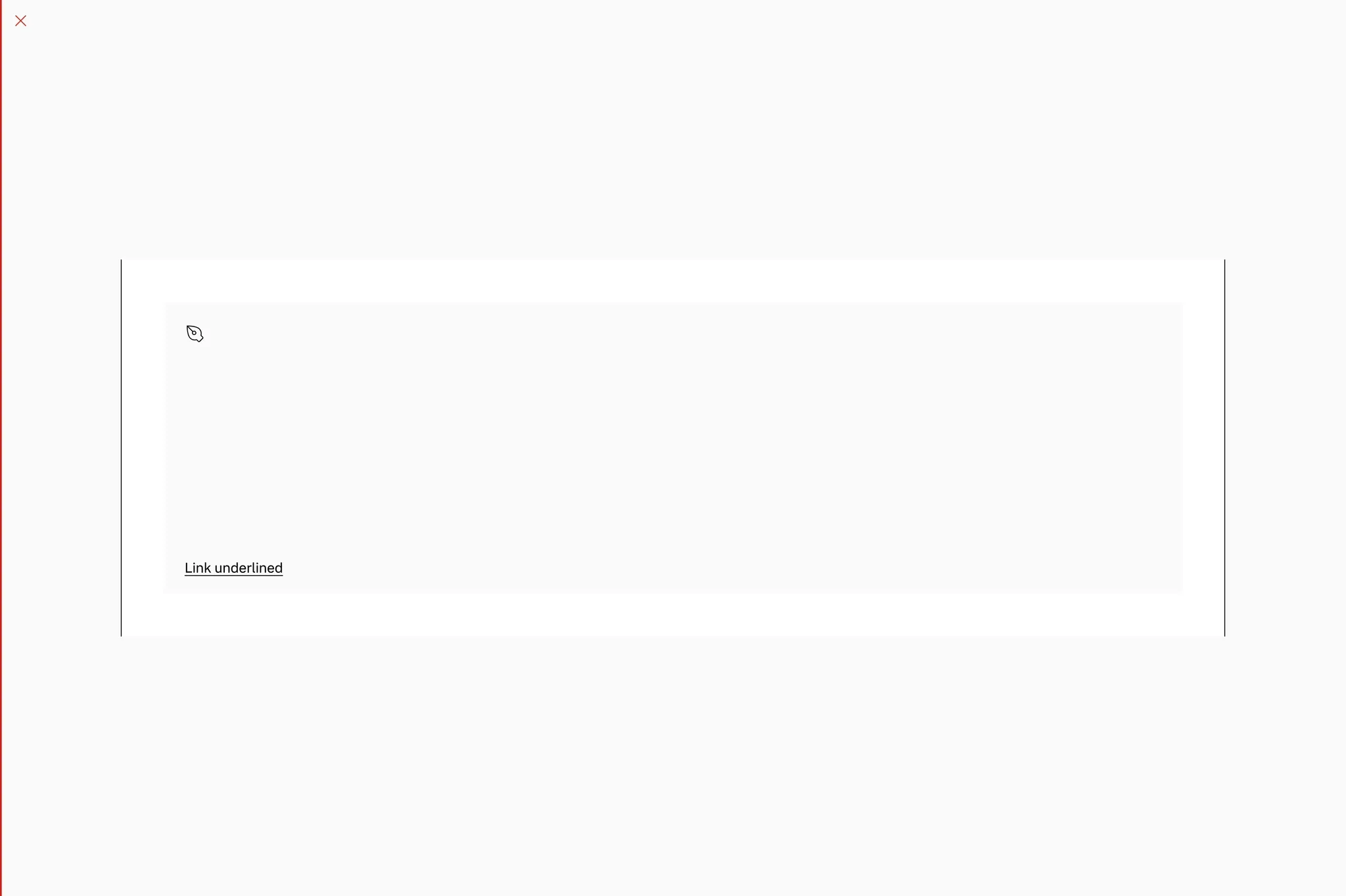
Text tile
Section titled “Text tile”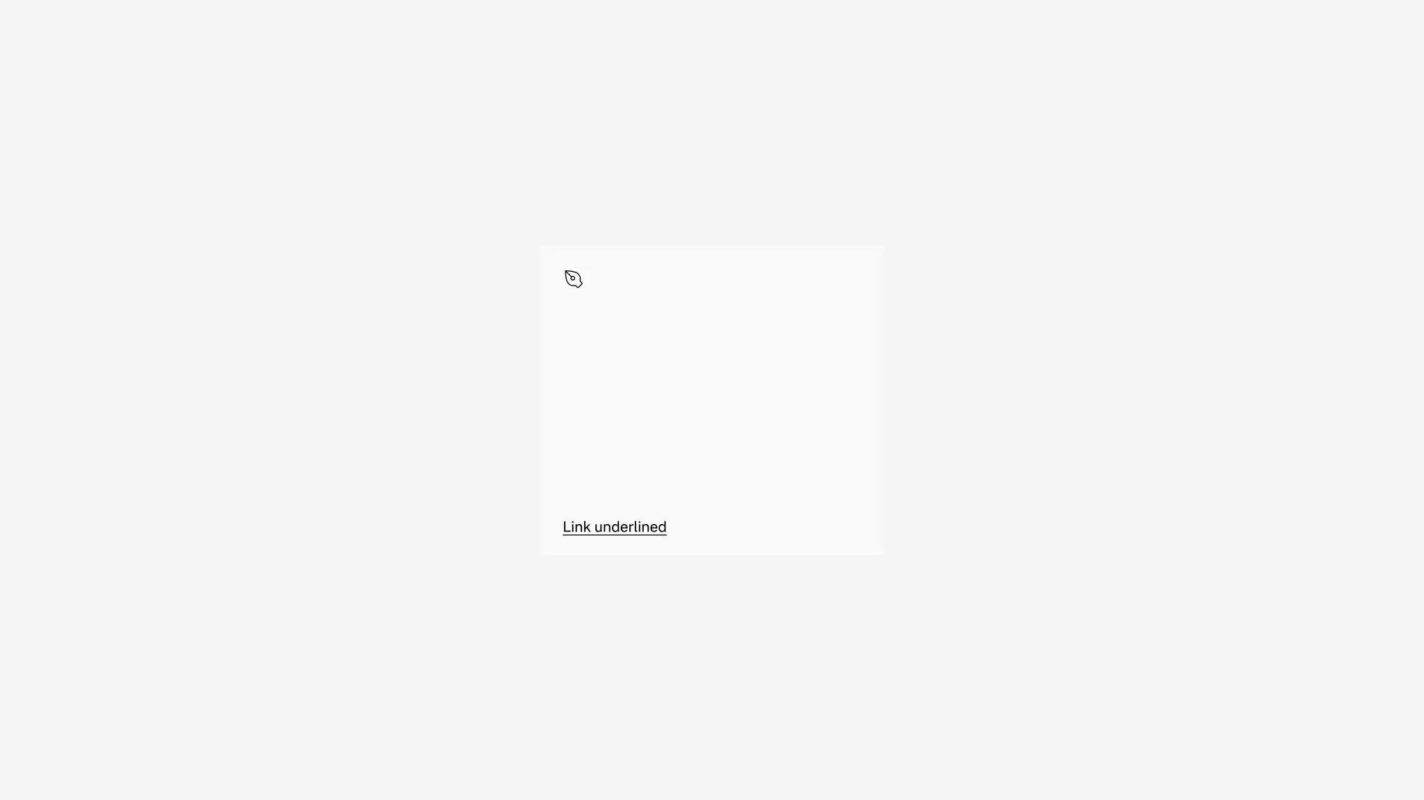
Showing: Text tile in default state
Variants
Section titled “Variants”Sizing
Section titled “Sizing”The text tile is free-forming and can be set to any width or height you need. For consistency, use the allowed ratios coming from the media placeholder as far as possible.
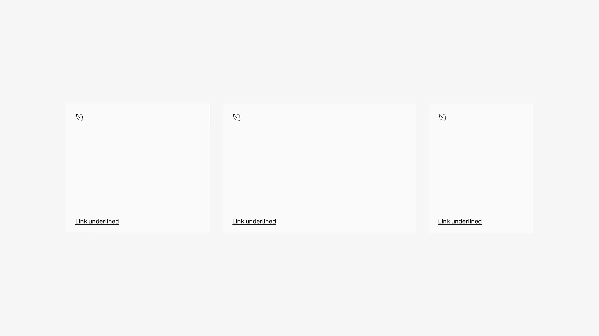
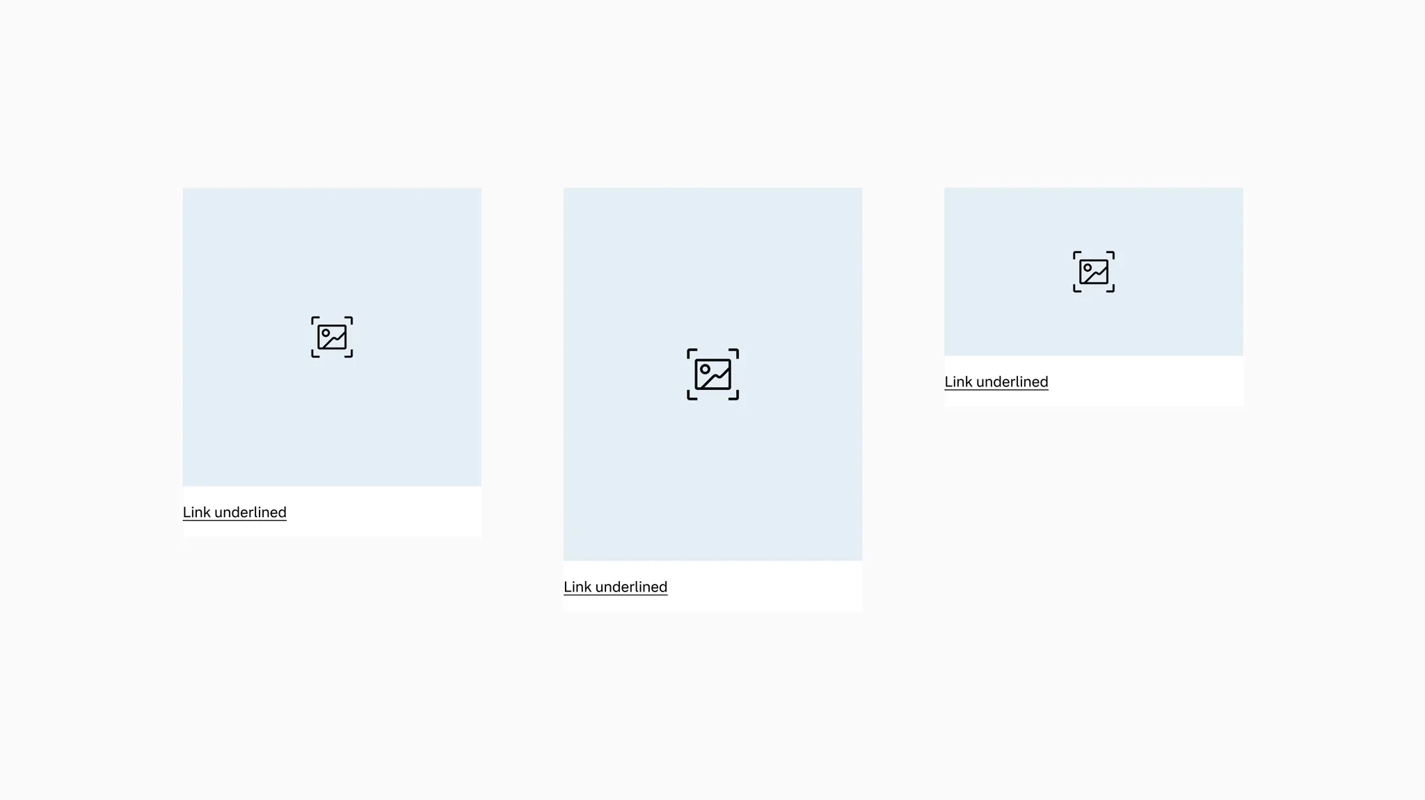
Showing: Text tile in various sizes.
The text tile comes with an optional icon that can be turned on and off.
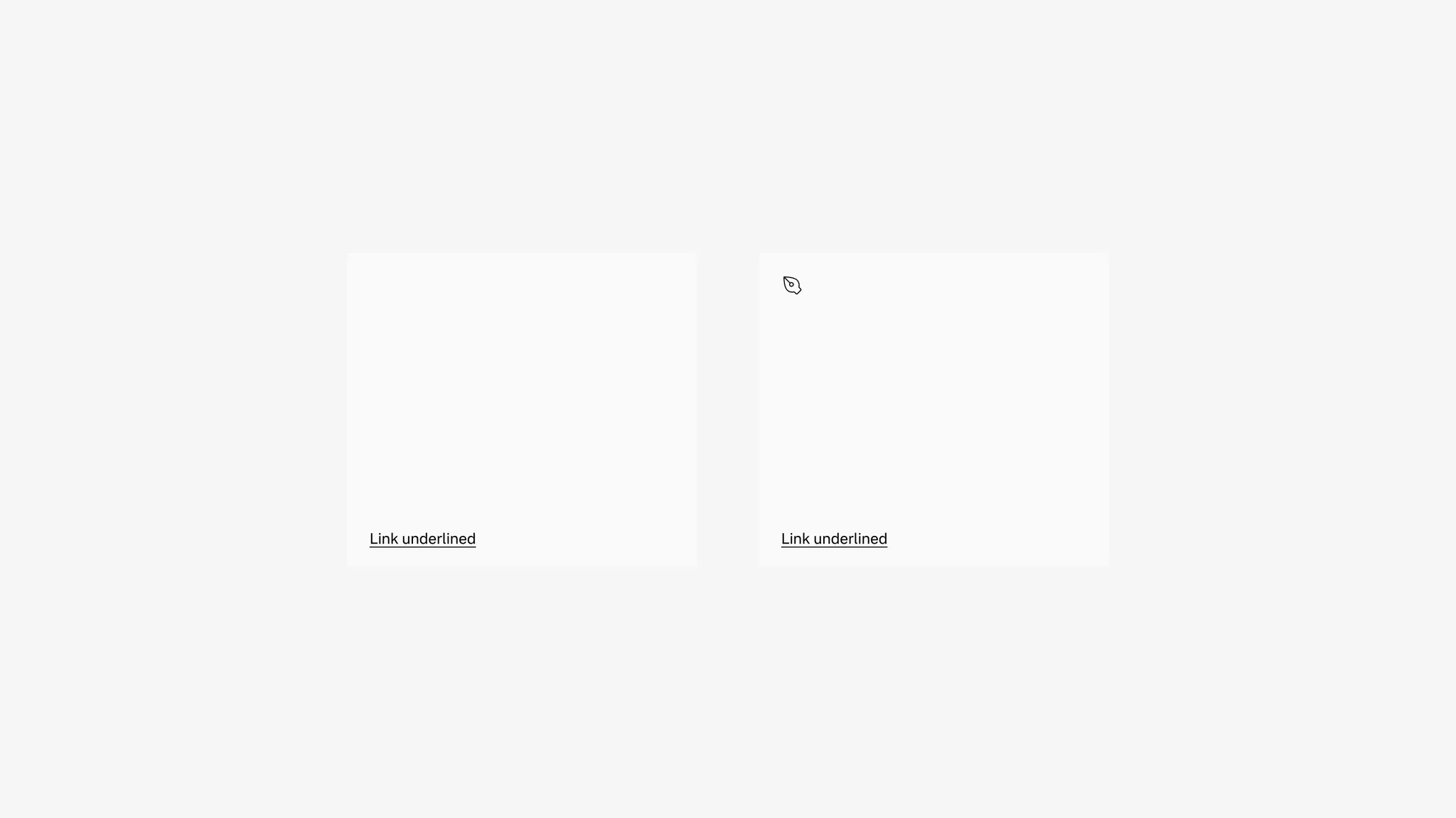
Showing: Text tile without icon (left) and with icon (right)
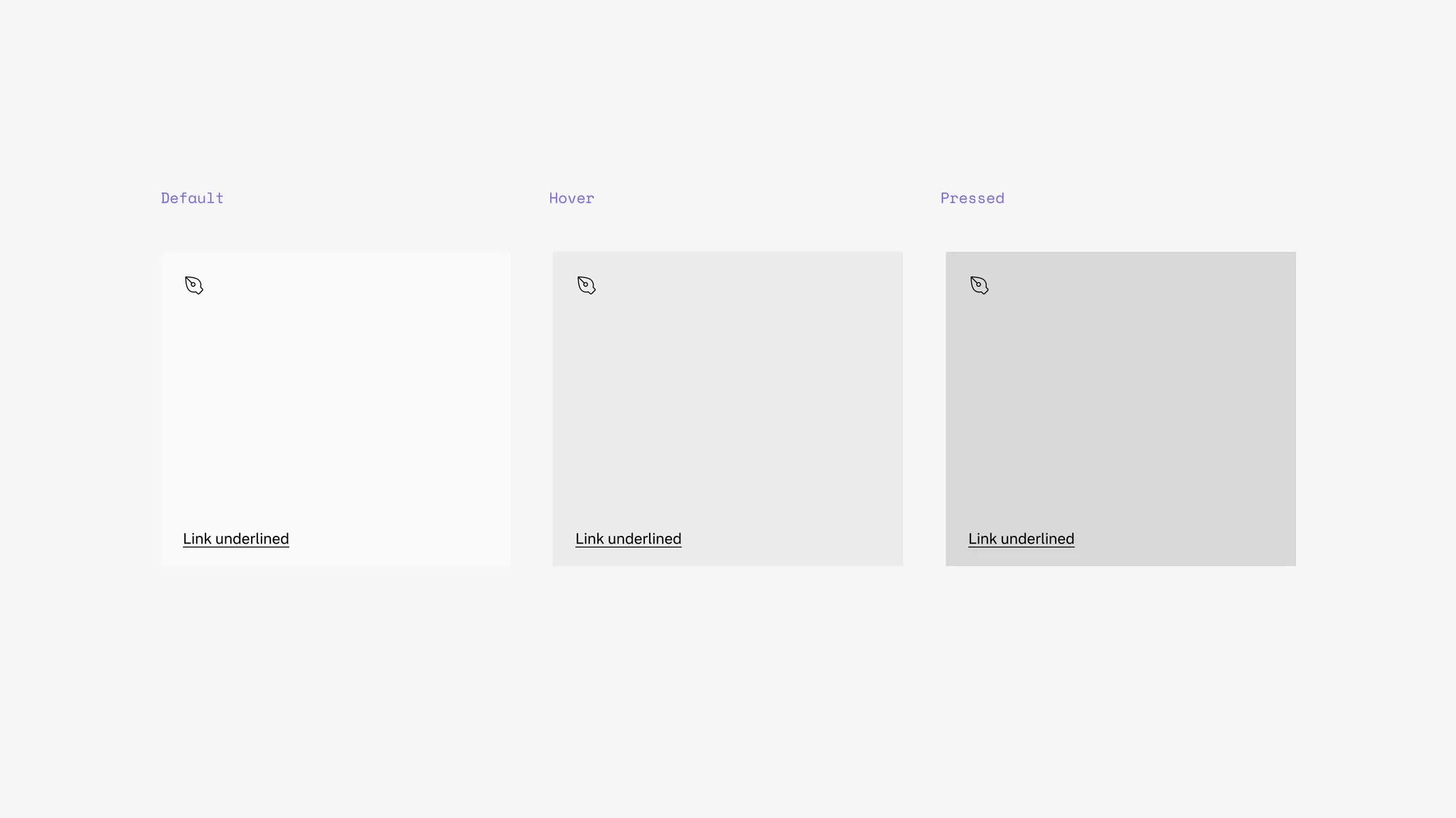
States
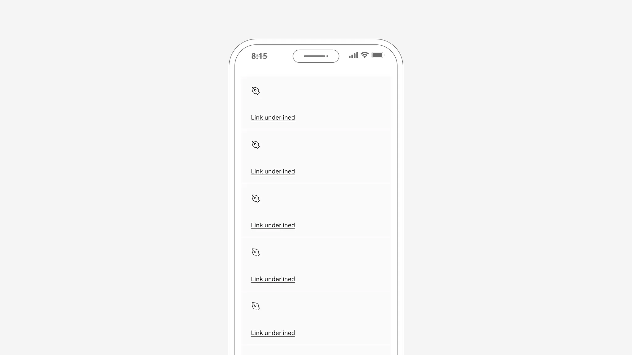
Section titled “States”The text tile is clickable with states. The link underline included in the tile has states as well.
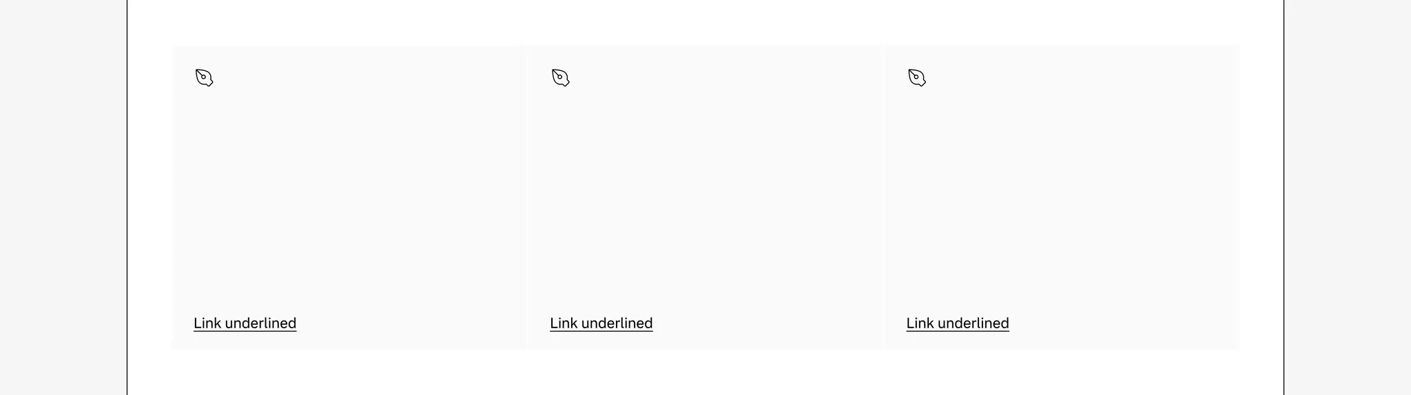
Background color
Section titled “Background color”The text tile supports secondary background.
Showing: Text tile in secondary background
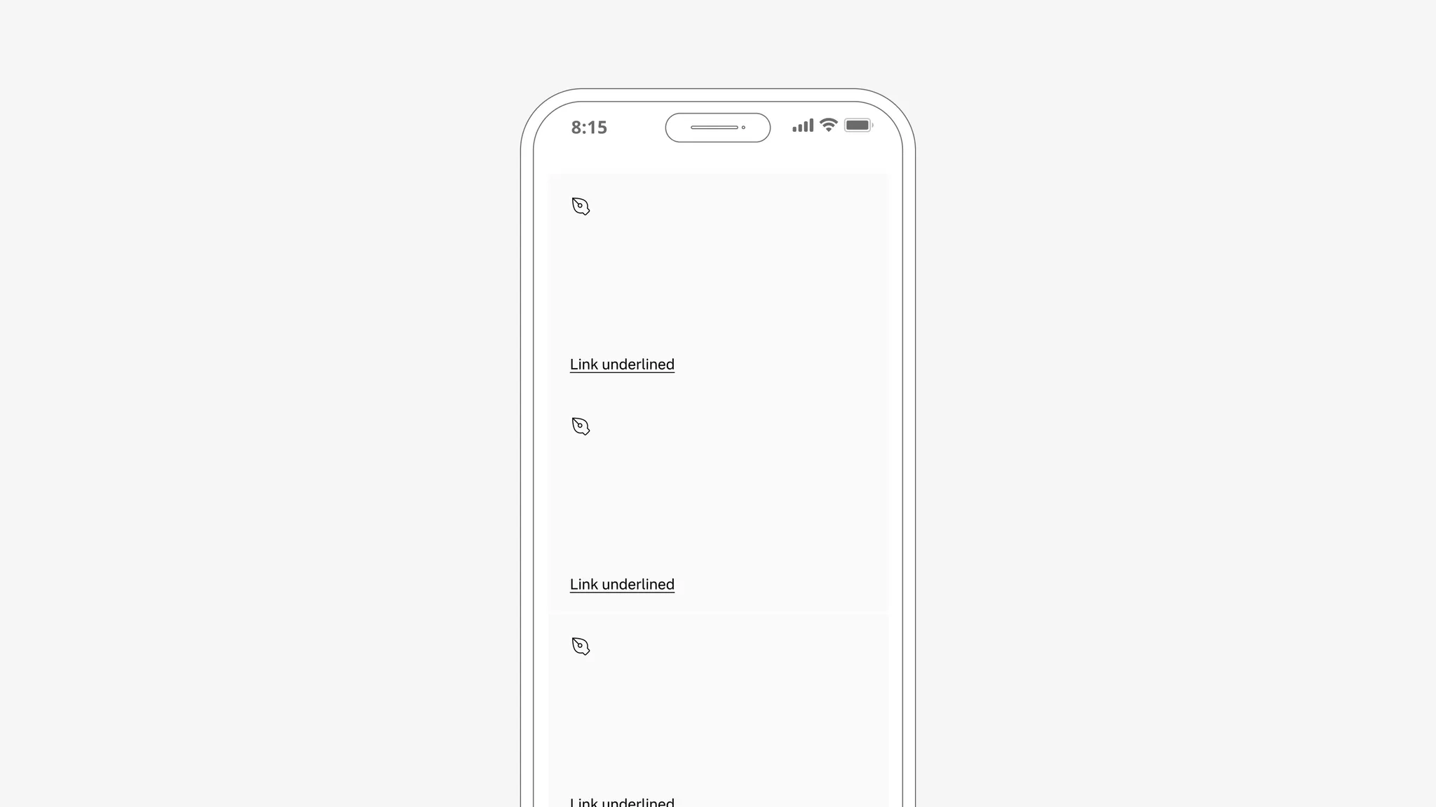
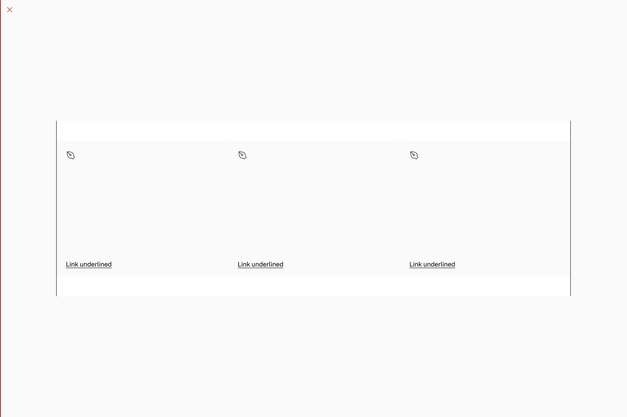
Spacing
Section titled “Spacing”In vertical columns and grids the text tile can use gridded-element-gap or a more traditional gutter depending on context.
Showing: Text tile with gridded-element-gap

Showing: Text tile with gutter
Page margins
Section titled “Page margins”The text tile needs page margin — ensure it’s added to the page or container.
Showing: Text tile in page margin layout
Examples
Section titled “Examples”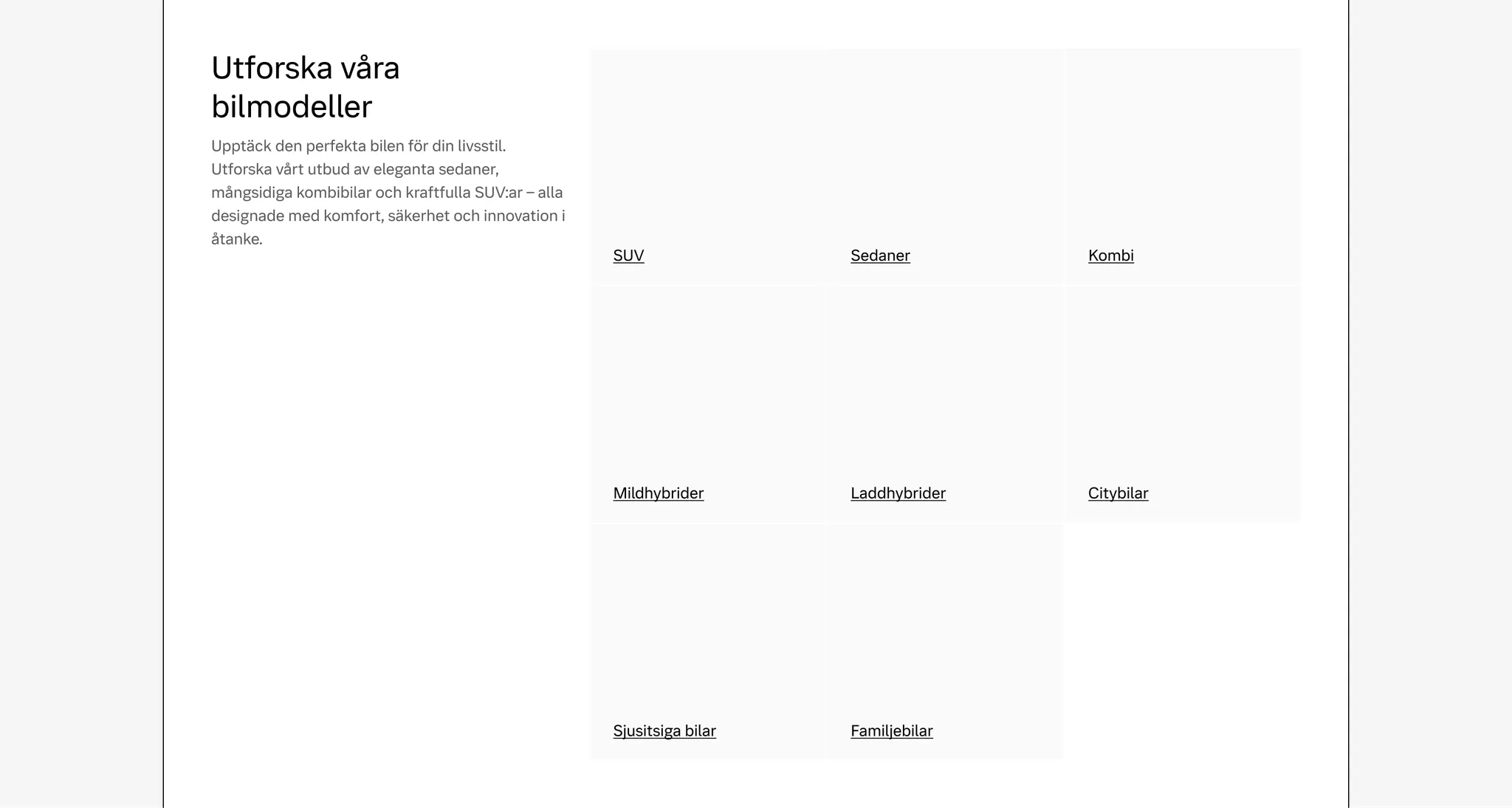
Example: Text tile used as on-page linking for car categories
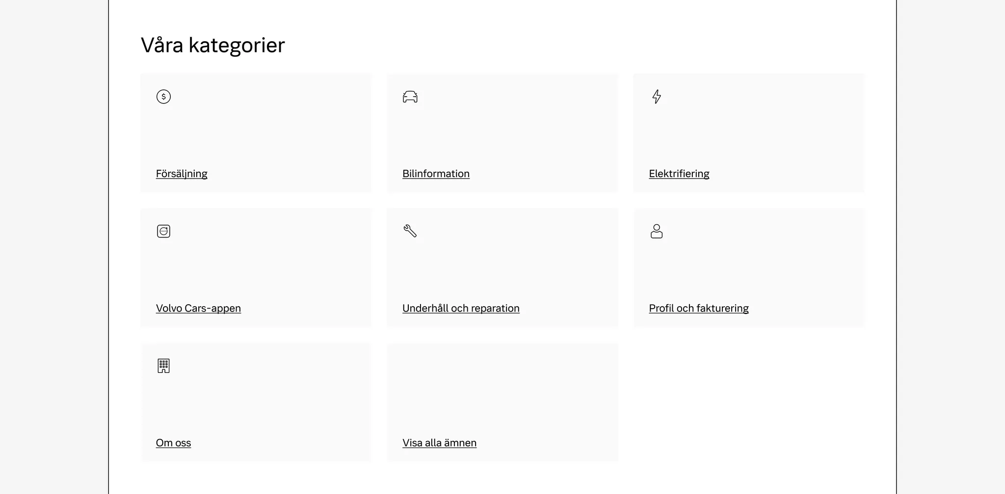
Example: Text tile used as on-page linking for support categories
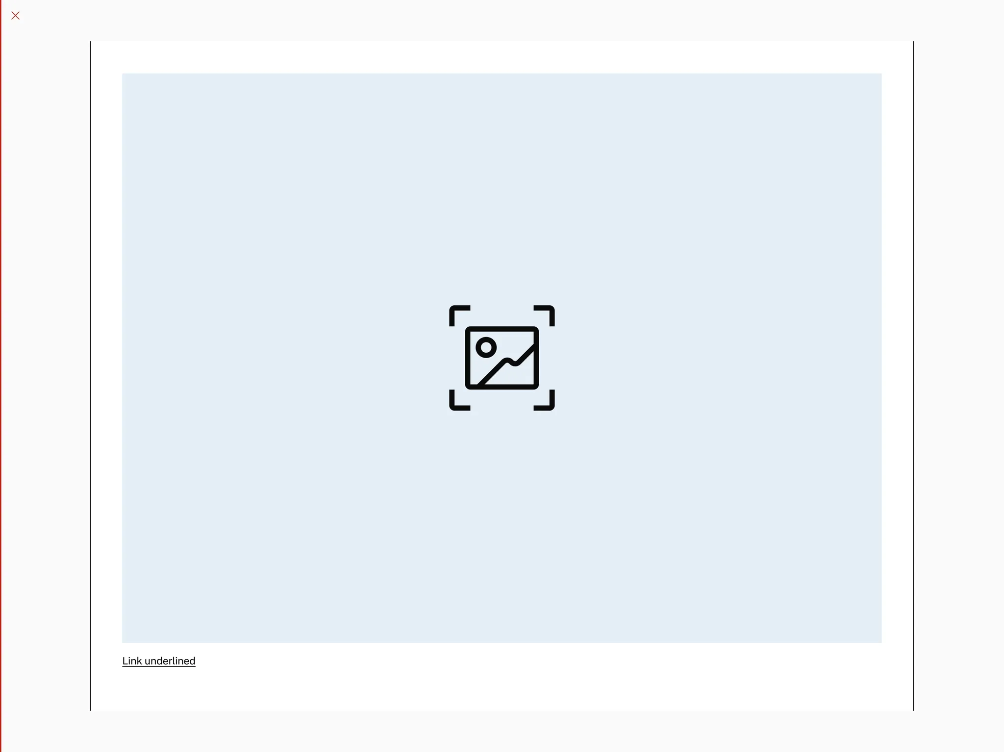
Media tile
Section titled “Media tile”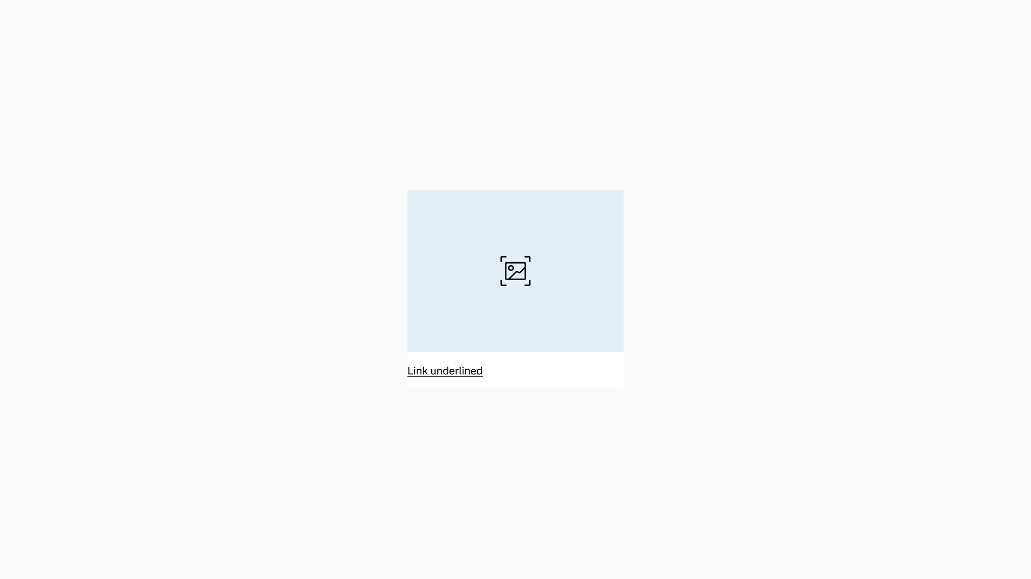
Showing: Media tile in default state
Variants
Section titled “Variants”Ratios
Section titled “Ratios”The media tile includes multiple media ratios to allow for compact and tall layouts.
Showing: 1:1, 4:5, and 16:9 ratio variants.
Media type
Section titled “Media type”The media tile includes two media types to allow for image and video.
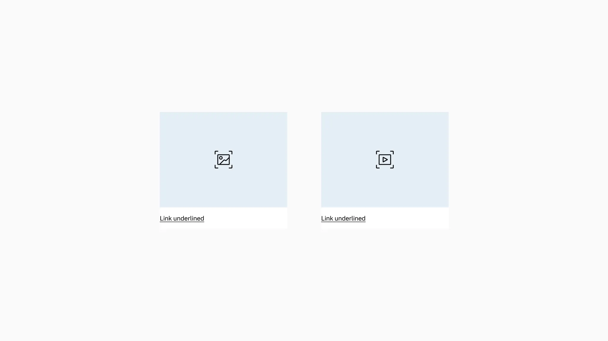
Showing: Image and video variants
Layout
Section titled “Layout”The media tile includes two layouts: vertical and horizontal.
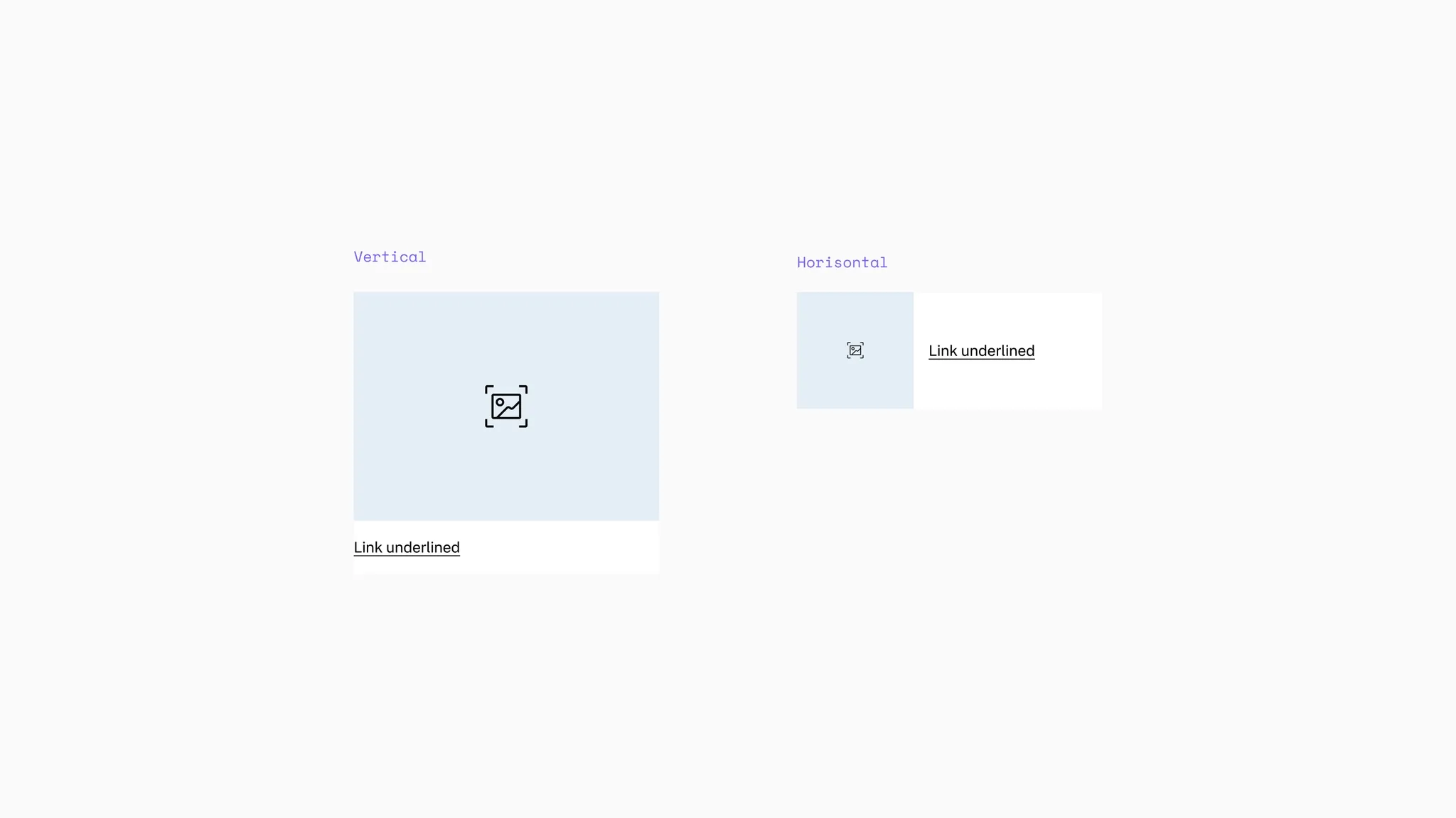
Showing: Media tile in vertical and horizontal layout
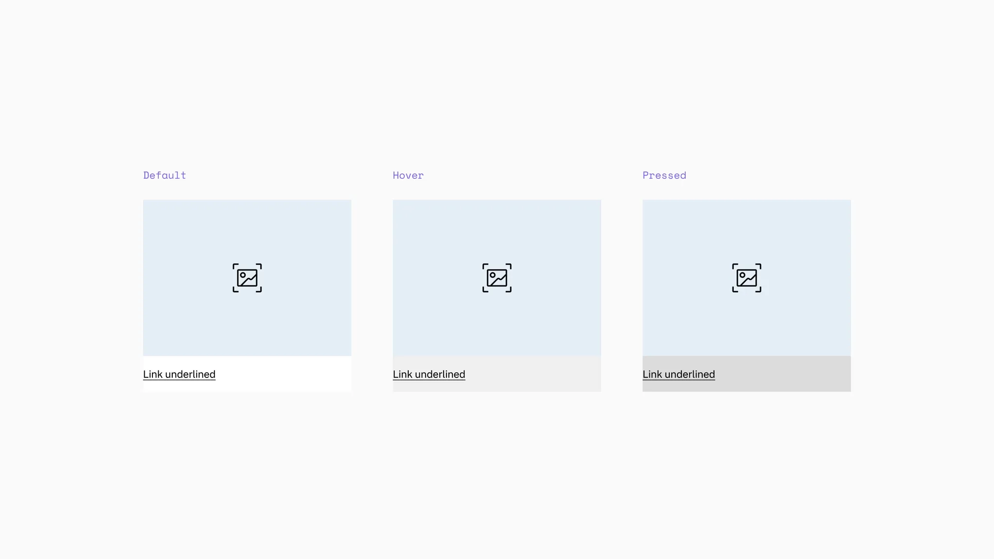
States
Section titled “States”The media tile is clickable with states. The image in the tile will scale on hover. The link underline included in the tile has states as well.
Background color
Section titled “Background color”The media tile supports primary background.
Showing: Media tile in primary background
The media section comes with a default secondary background color to support transparent PNGs.
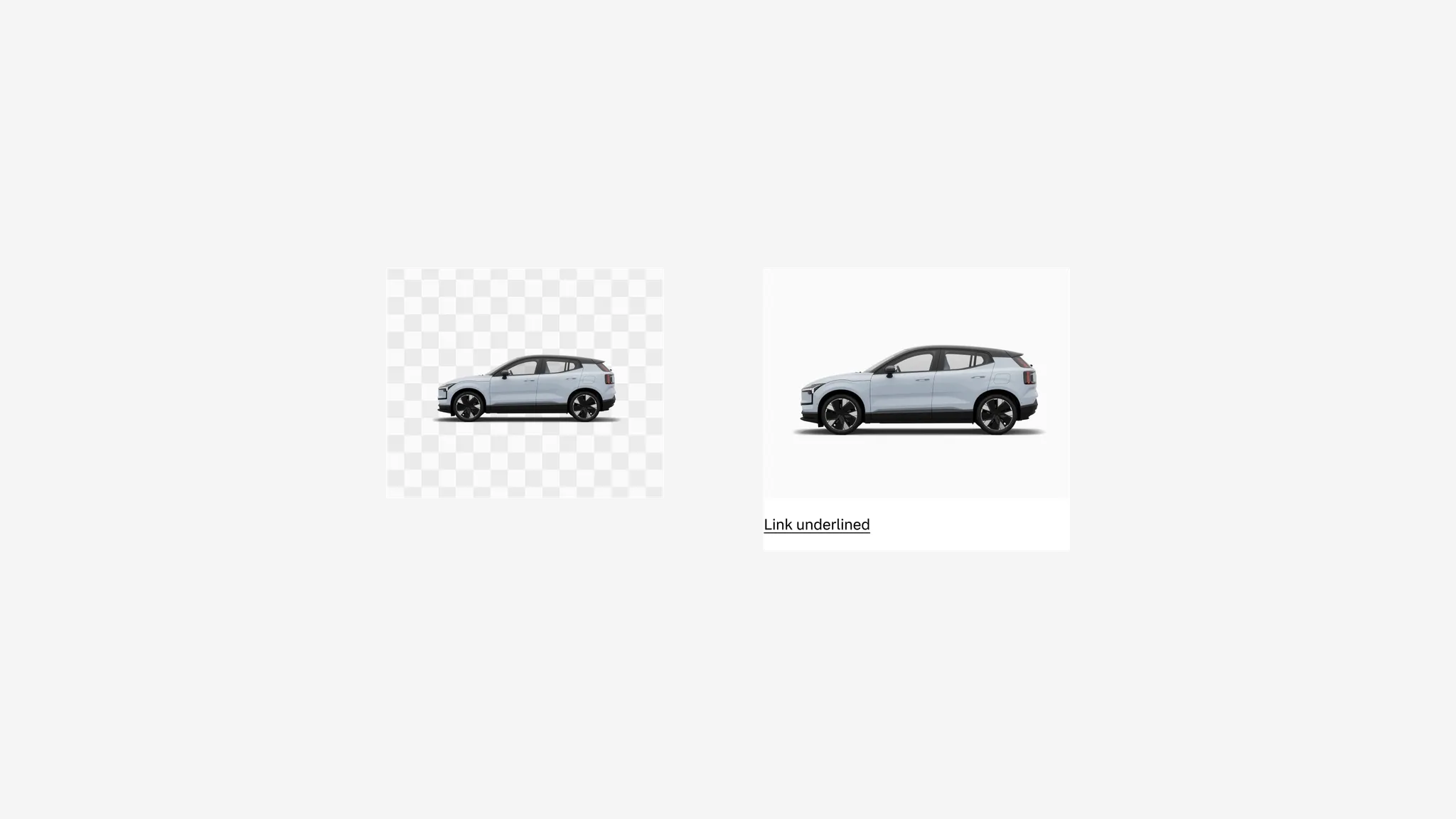
Showing: Media tile with secondary background in media container
Spacing
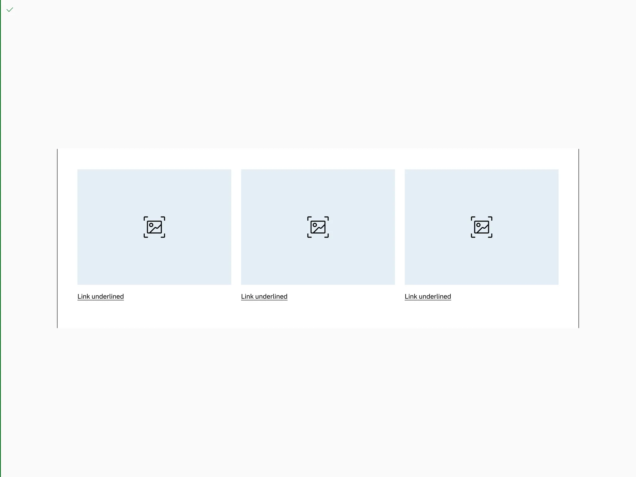
Section titled “Spacing”In vertical columns and grids the media tile can use gridded-element-gap or a more traditional gutter depending on context.
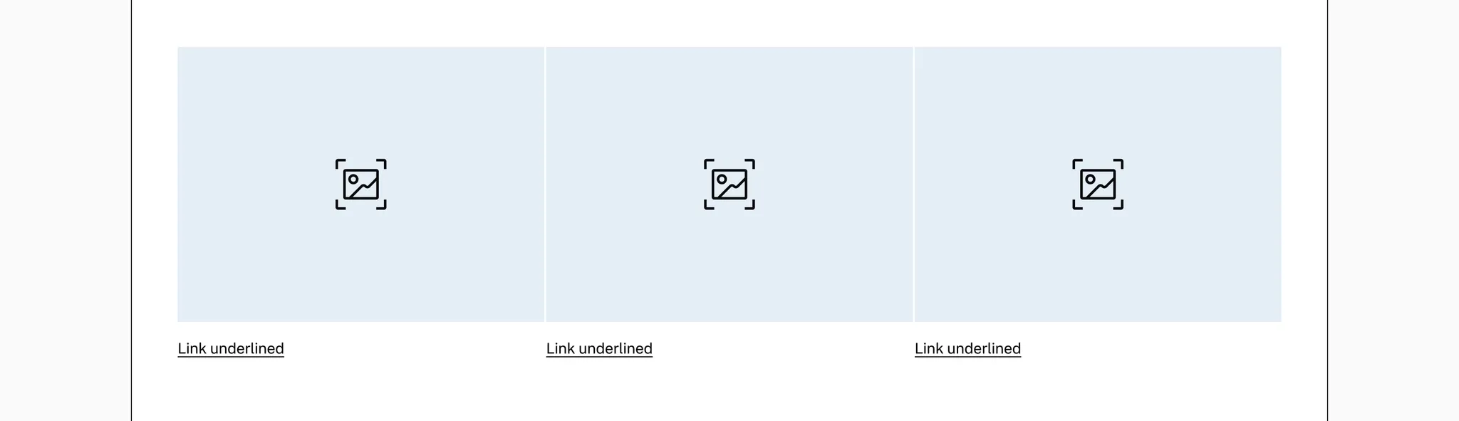
Showing: Media tile with gridded-element-gap
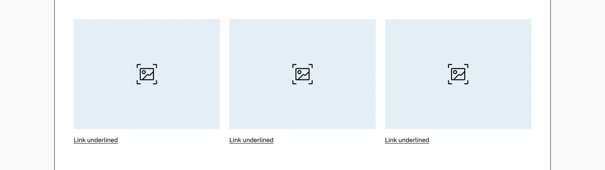
Showing: Media tile with gutter
Page margins
Section titled “Page margins”The media tile needs page margin — ensure it’s added to the page or container.
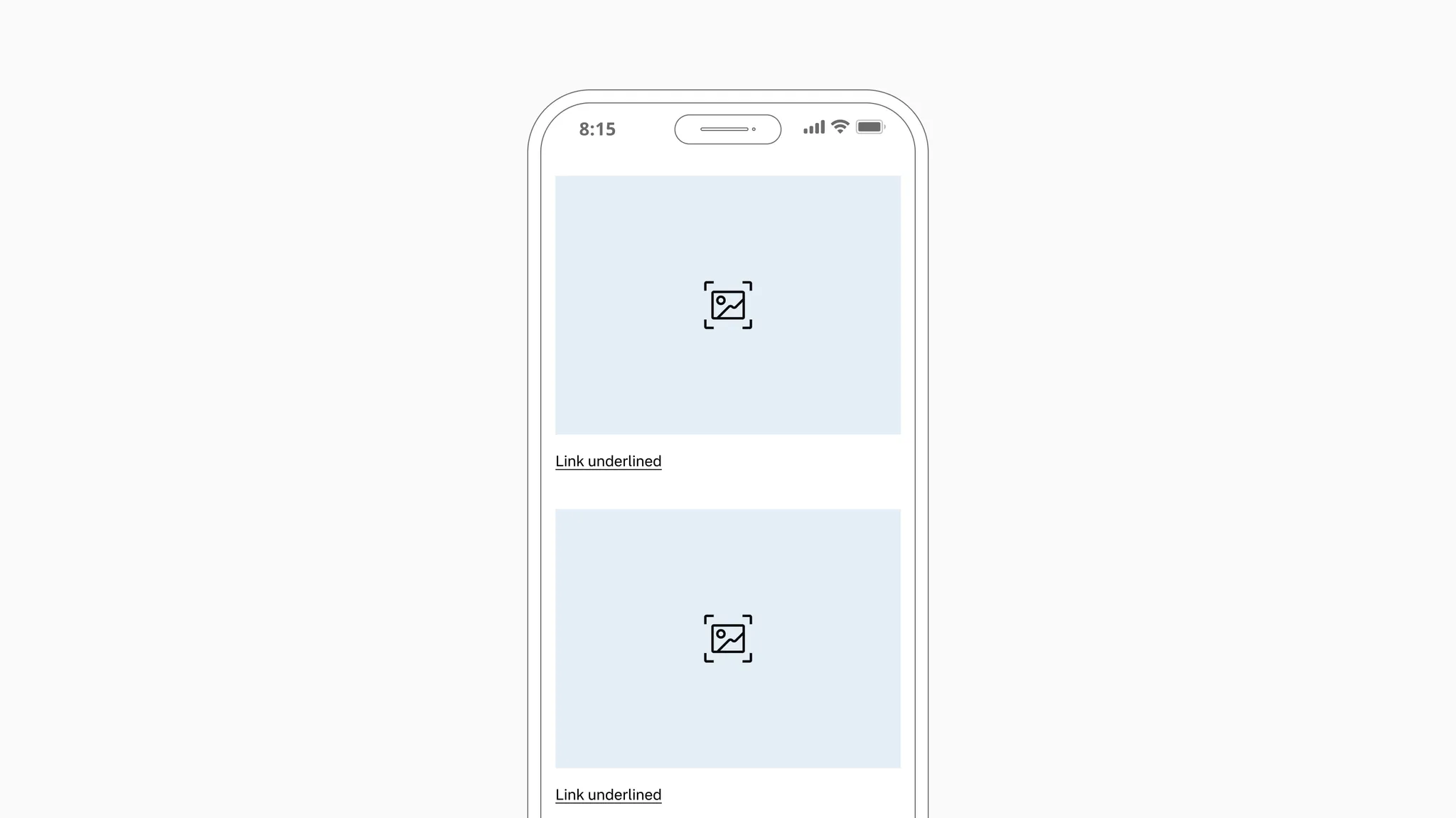
Showing: Media tile in page margin layout
Examples
Section titled “Examples”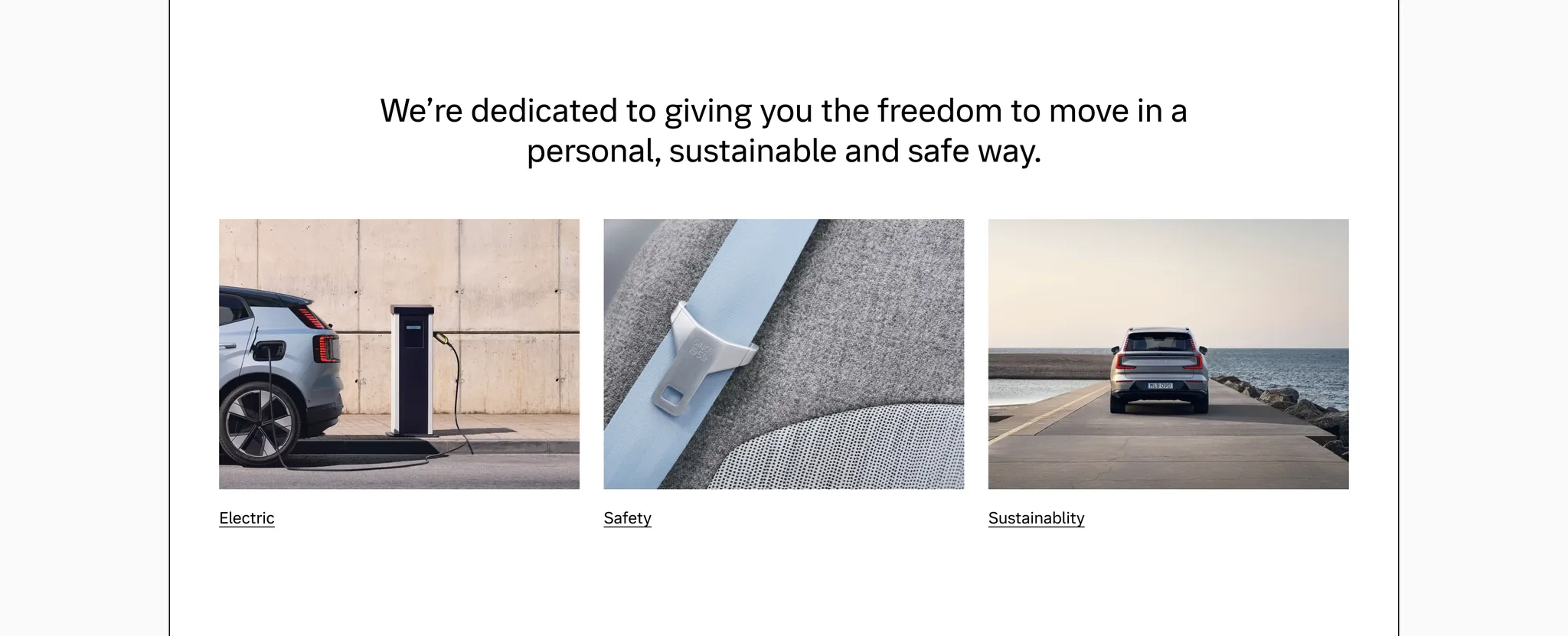
Example: Media tile used as on-page linking for company core principles
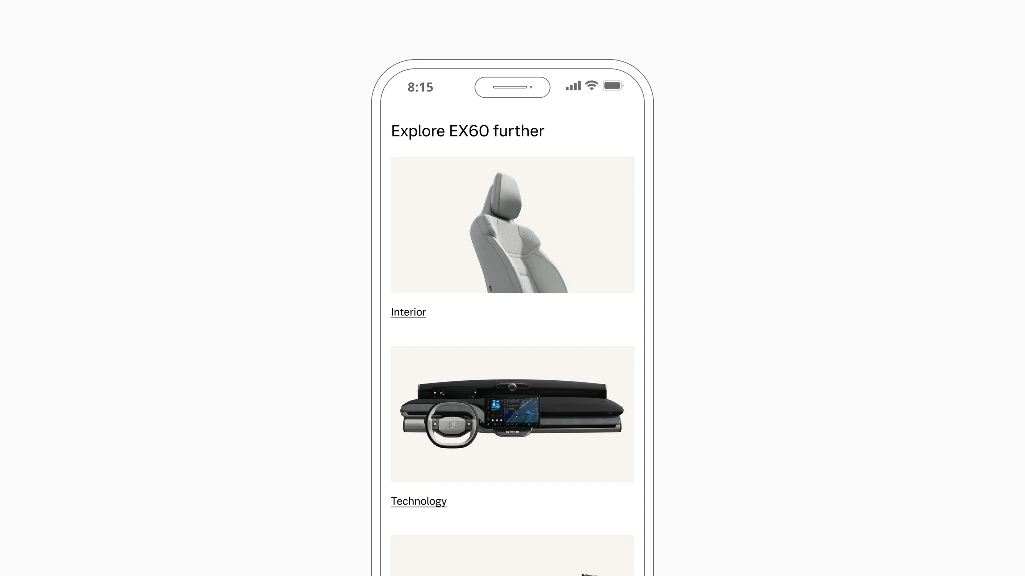
Example: Media tile used as on-page linking between PDP sub-pages
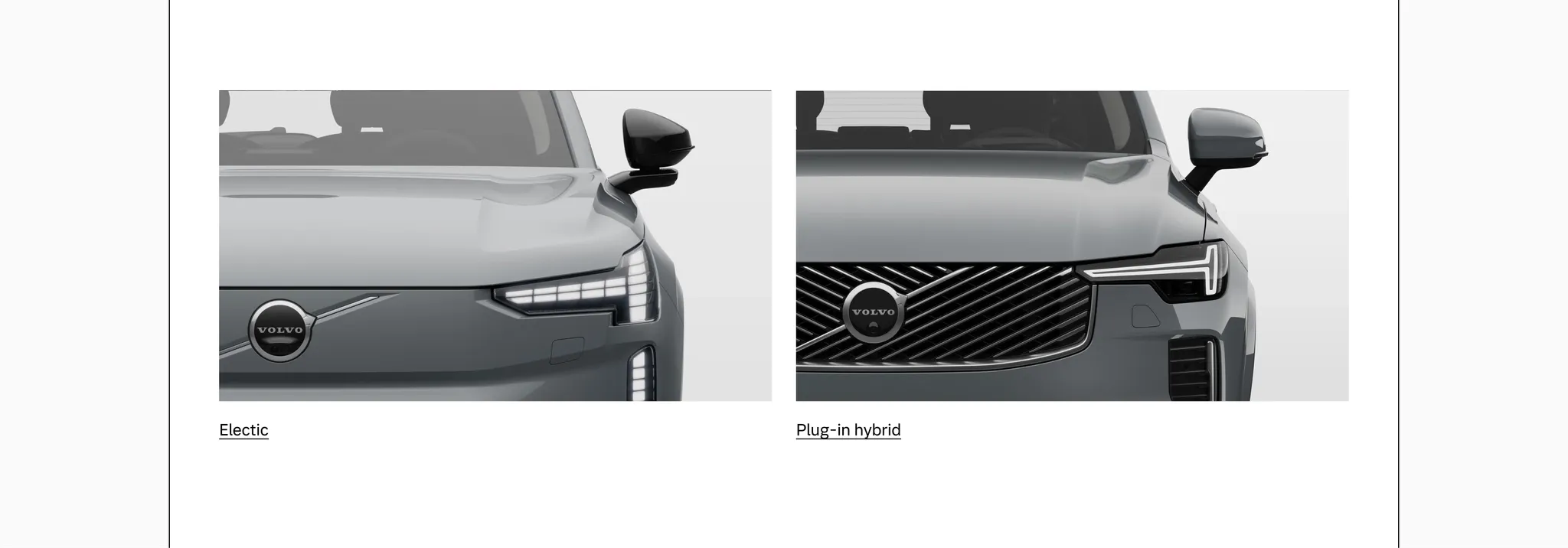
Example: Media tile used for on-page linking between body types
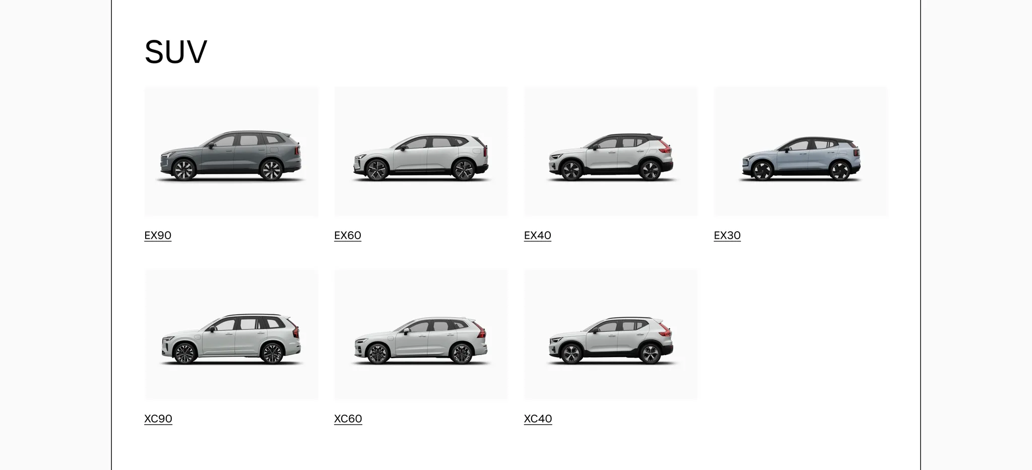
Example: Media tile used on a Model Selector page
Considerations
Section titled “Considerations”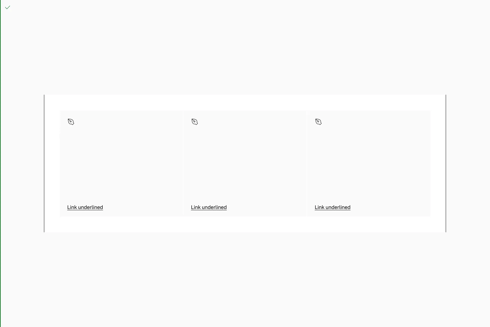
Do put tiles in a grid or space where the width is constrained.
Do put tiles in a grid or space where the width is constrained.
Don’t use one tile to take up the full width of a page on larger breakpoints.
Don’t use one tile to take up the full width of a page on larger breakpoints.
Page margin
Section titled “Page margin”Always put tiles in containers with pagemargin if the container spans the page.
Do use pagemargin on the grid container.
Don’t go full bleed on the grid container.