Tabs
The Tabs component lets users switch between different sections of content or functionality without leaving the current page or screen.
Tabs effectively organize complex information or controls within a single page, boosting usability, efficiency, and user experience without overwhelming users.
When to use
Section titled “When to use”-
Switch between views. Each tab is responsible for a unique view or content area, so when a user selects a tab, the main content area refreshes to display the relevant information or controls.
-
On-page navigation. Tabs can function as anchor links, facilitating easy navigation across different content sections on a single page. Unlike main tabs that change the content view, these tabs, particularly when vertical, act more like shortcuts. They scroll users to designated sections instead of switching to new views.
When not to use
Section titled “When not to use”-
Comparing information. Tabs should not be used if the user needs to compare information in different groups, as this would result in the user having to click back and forth to complete a task.
-
Filtering the same content. Tabs aren’t meant for filtering because they suggest separate content areas rather than different views of the same information. This confuses users about what’s happening when they click. Use Chips instead when users need to filter or show/hide content based on specific criteria.
-
Too few sections. Try to avoid tabs when you only have 1–2 content sections. The tab structure adds unnecessary complexity when simple headings and content blocks would work better.
Variants
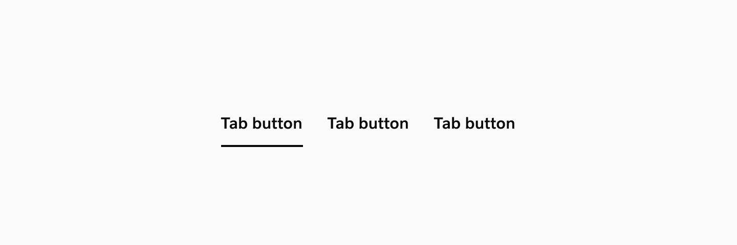
Section titled “Variants”Horizontal Tabs
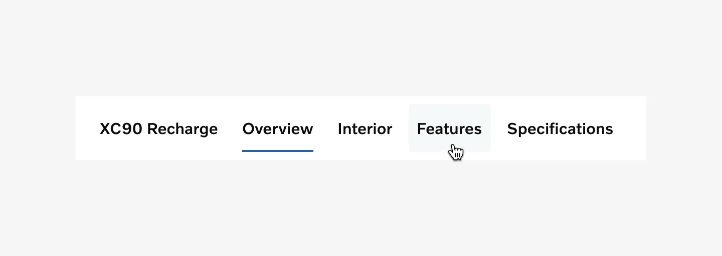
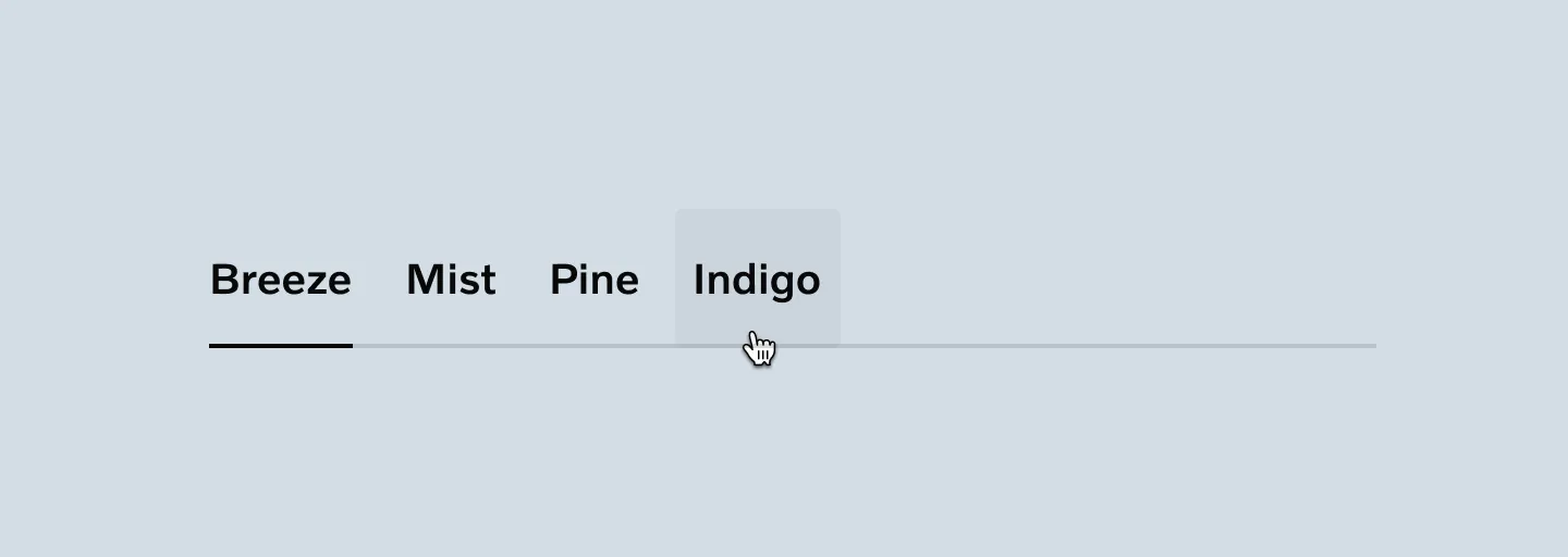
Section titled “Horizontal Tabs”Standard implementation for most use cases. Tabs align left-to-right and work well with 3–7 content sections. Suitable for general content organization and familiar to users across platforms.
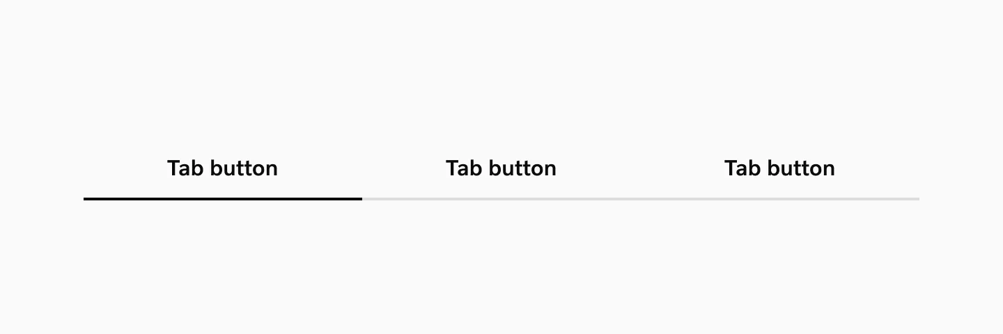
Stretched Horizontal Tabs
Section titled “Stretched Horizontal Tabs”Tabs stretch to fill the full width of their container. Best used with 2–4 tabs of similar label lengths to maintain visual balance. Effective for creating structured layouts with equal emphasis on each section.
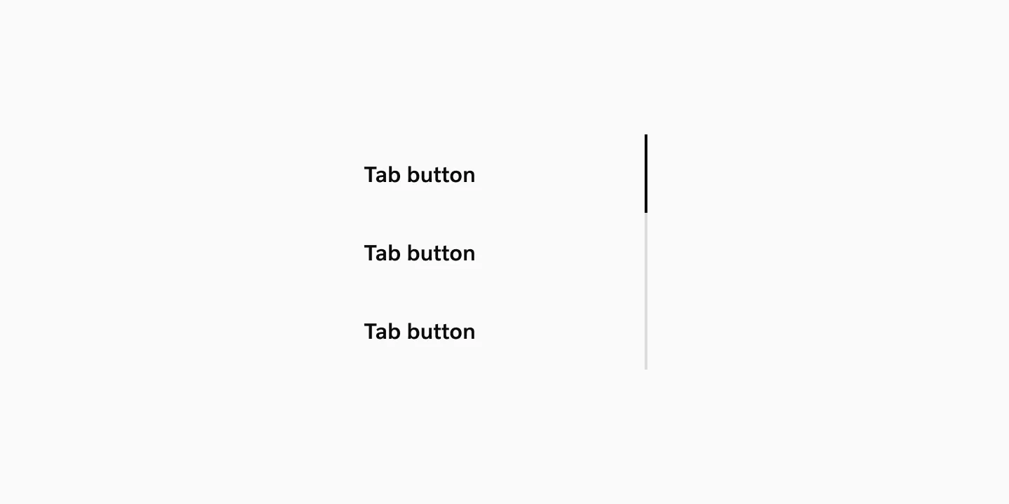
Vertical Tabs
Section titled “Vertical Tabs”Labels stack vertically along the left or right side of the content area. Optimal for interfaces with 4–8 sections where preserving horizontal content space is priority, such as dashboards or detailed product pages.
Modifiers
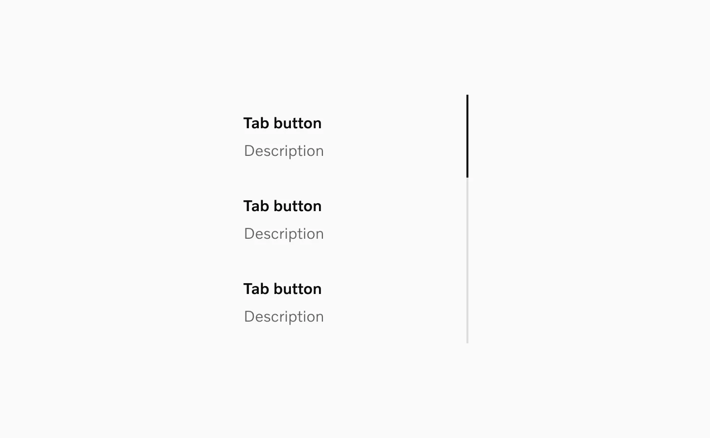
Section titled “Modifiers”Secondary labels
Section titled “Secondary labels”Vertical tabs support an optional secondary label that can be used for short descriptions or additional information about each tab.
The Tabs component uses 16px labels by default. The component supports label size overrides, with 20px as the recommended alternative for improved hierarchy or accessibility needs.
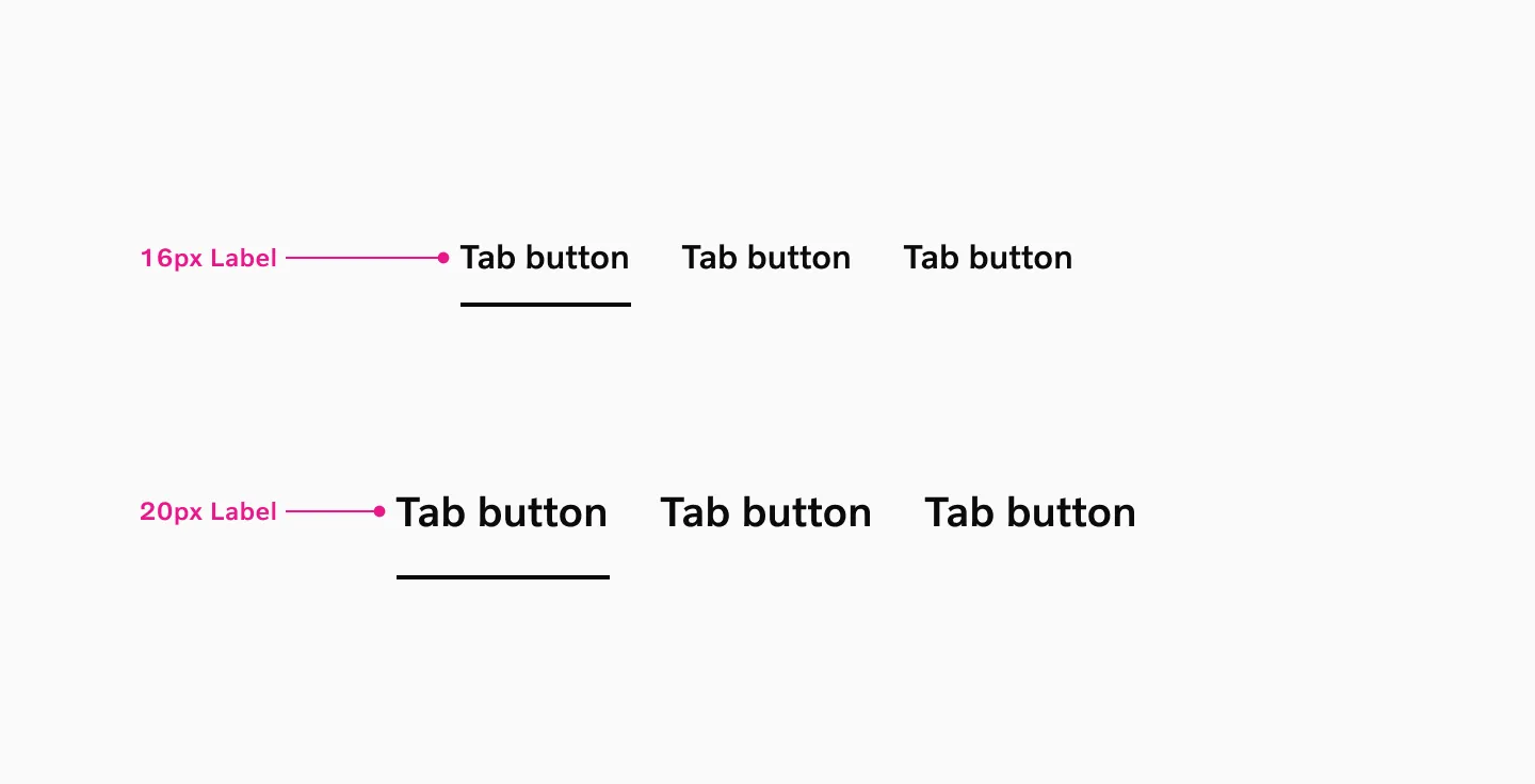
Supported sizes: 16px Label, 20px Label
States
Section titled “States”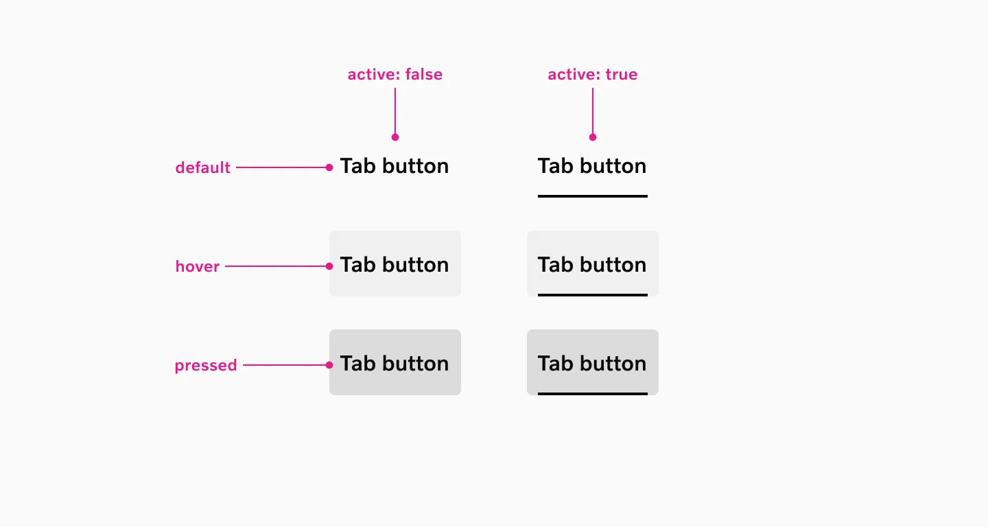
Supported states: Selected, Hover, Pressed, Disabled
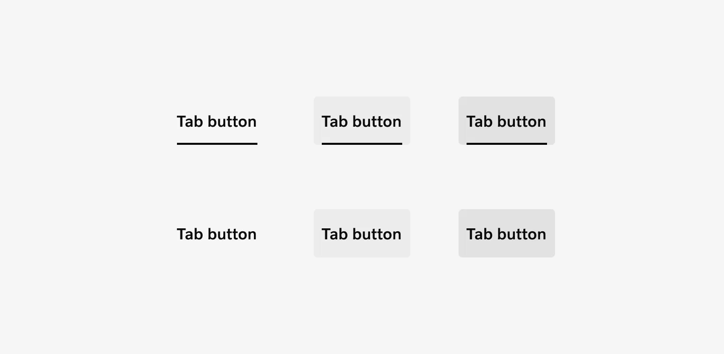
Neutral
Section titled “Neutral”The default color variant using the primary brand color for active states.
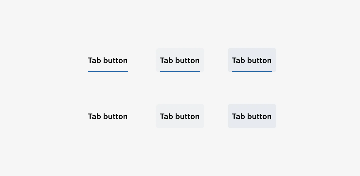
Accent blue
Section titled “Accent blue”An alternative color option that applies accent colors to active states, providing visual variety while maintaining component functionality.
Interaction
Section titled “Interaction”Only one tab can be active at a time. When a user selects a tab, the visual indicator smoothly transitions to the newly selected item while the content area updates immediately to show the corresponding view.
Scrolling
Section titled “Scrolling”When tabs extend beyond the available screen space, they become horizontally scrollable. The active tab automatically scrolls into view when selected programmatically or through keyboard navigation.
Accessibility
Section titled “Accessibility”Target size
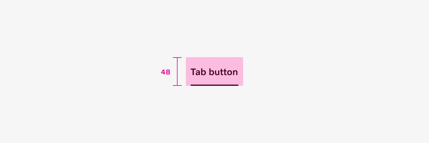
Section titled “Target size”Horizontal tabs with 16px labels have a minimum target area height of 48px.
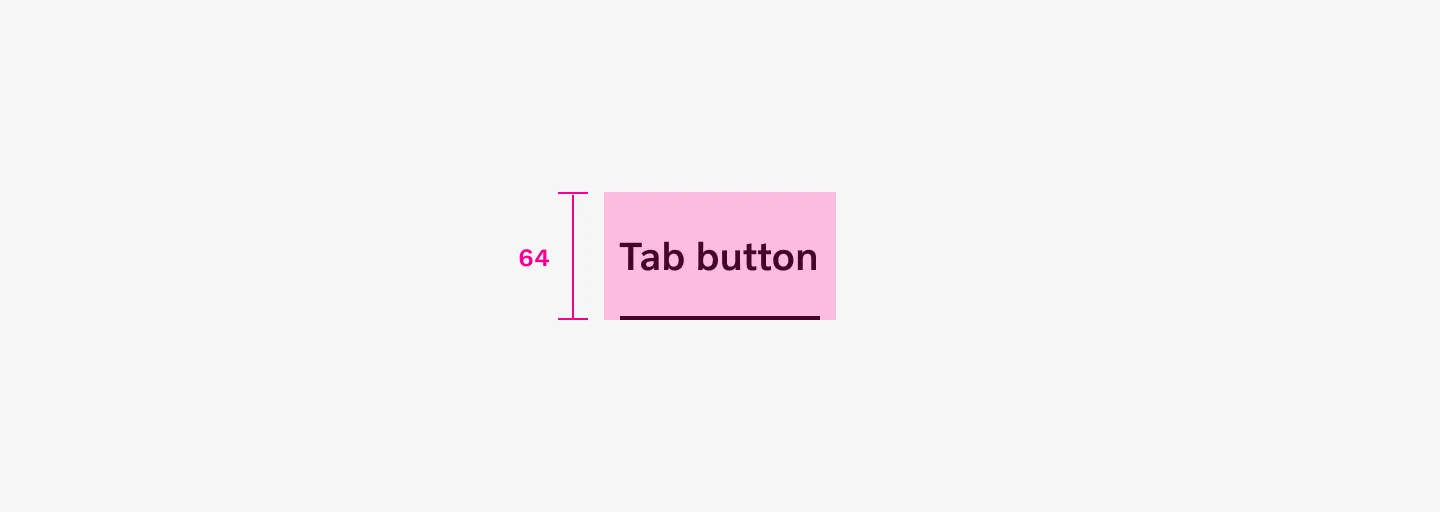
Horizontal tabs with 20px labels have a minimum target area height of 64px.
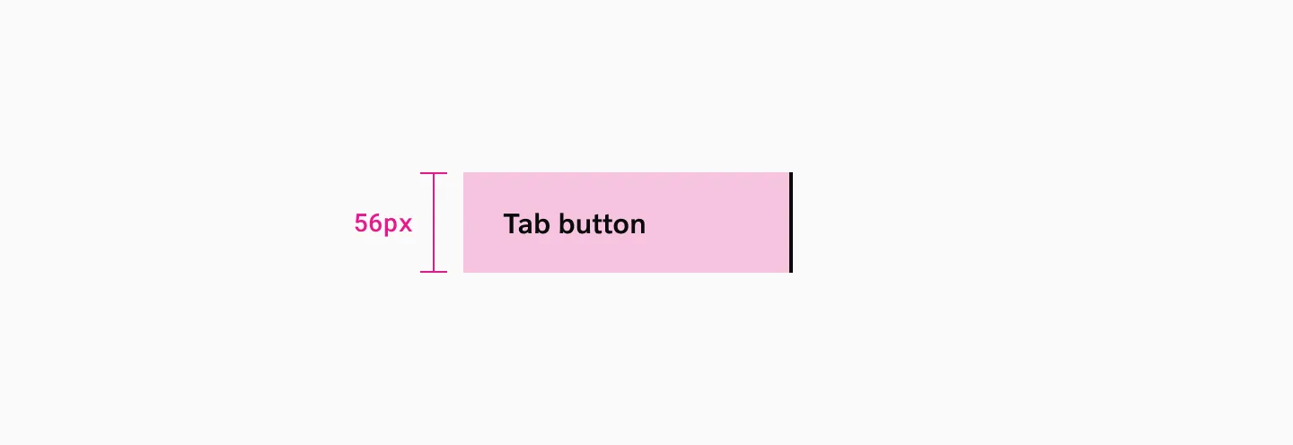
Vertical tabs have a minimum target area height of 56px.
Keyboard Support
Section titled “Keyboard Support”All interactive elements must be reachable and operable via keyboard. Complete keyboard navigation with logical tab order, arrow key support for tab switching, and proper focus management. Use the left and right keyboard arrows to shift focus from one tab to another and automatically display its associated tab panel. The tab key is used to navigate to the tab content, not to the next tab. This is so that people who use screen readers don’t have to tab through all of the tabs to read the content.
Screen Reader Compatibility
Section titled “Screen Reader Compatibility”Proper ARIA implementation with role definitions, state announcements, and meaningful labels. Tab relationships and current selection must be clearly communicated.
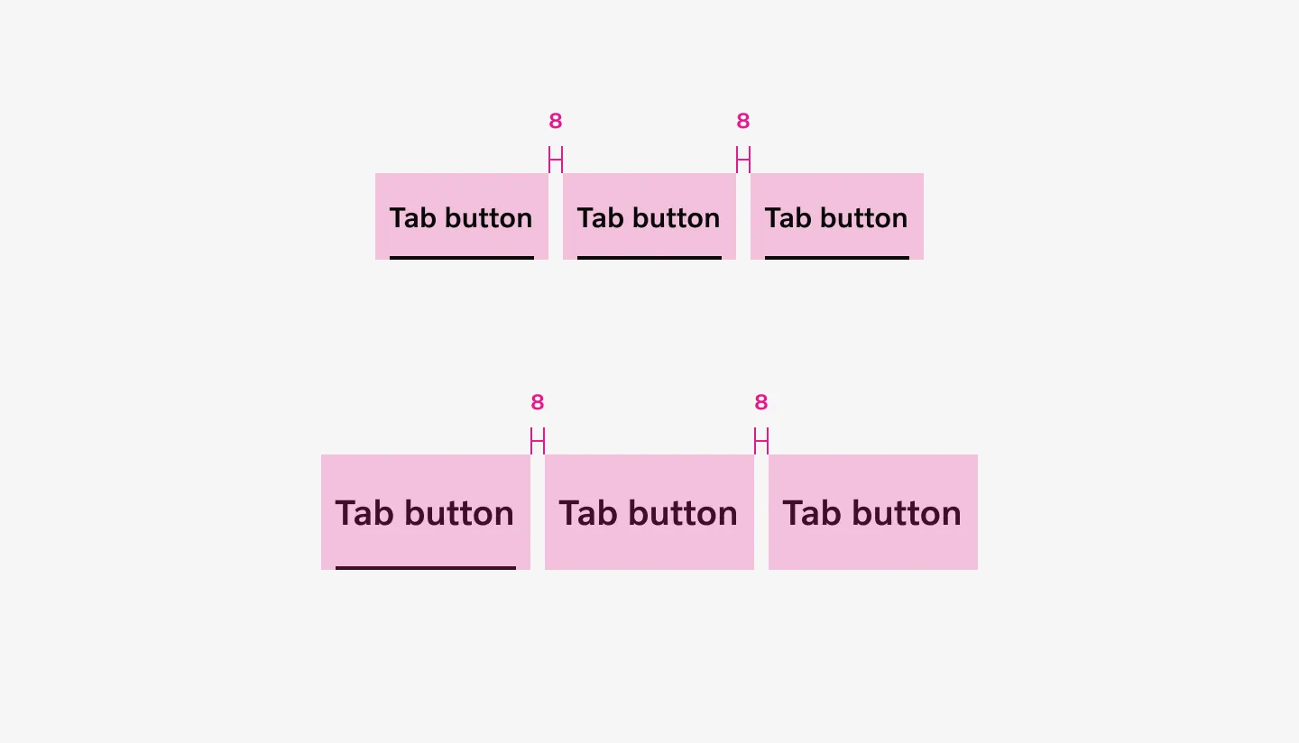
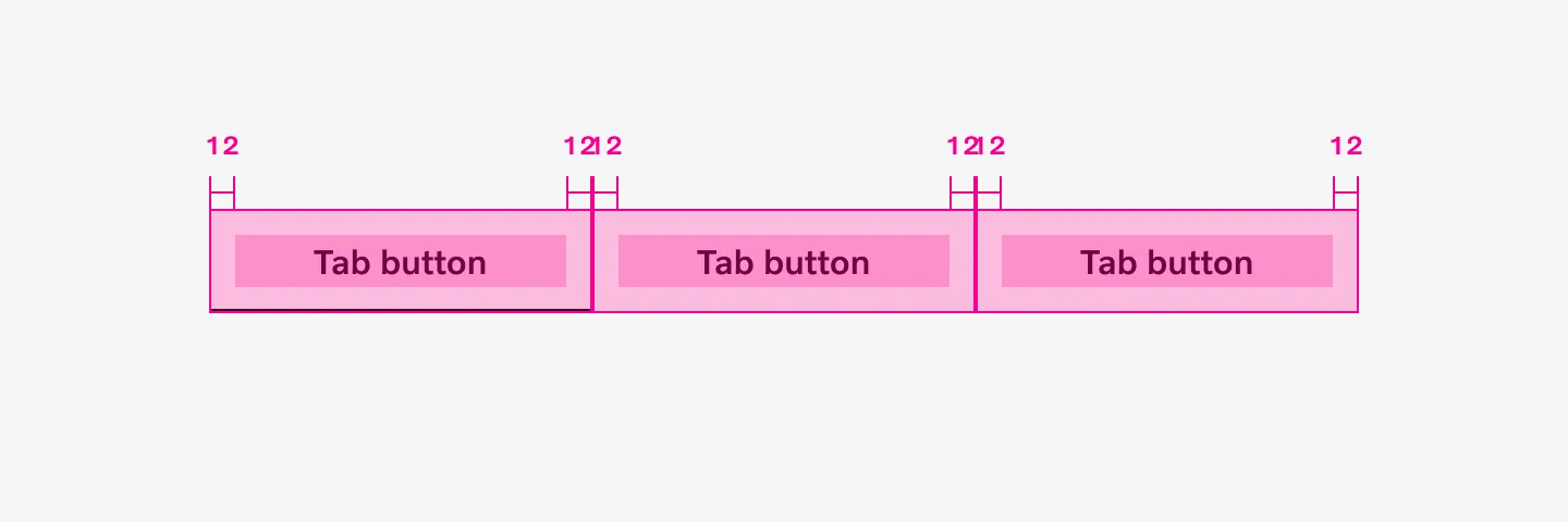
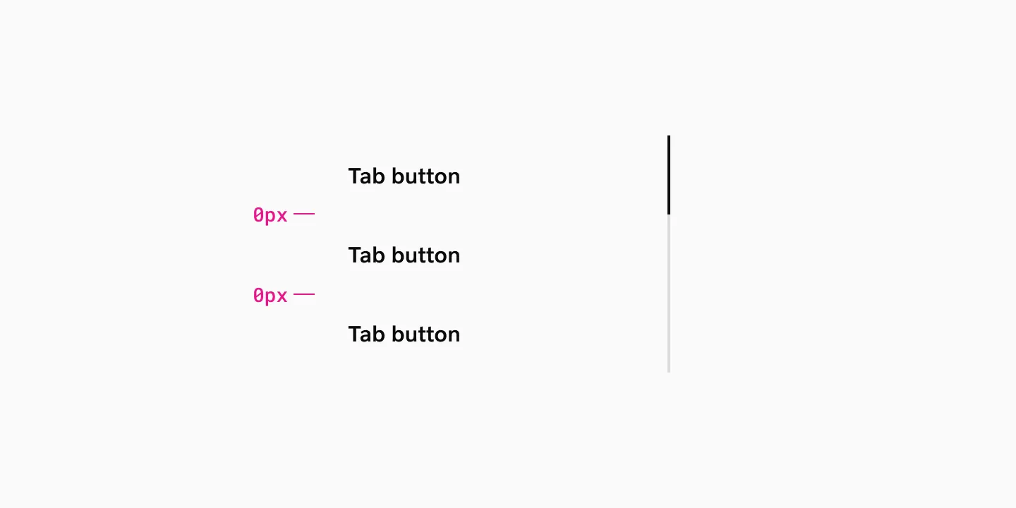
Spacing
Section titled “Spacing”Horizontal tabs have an 8px spacer between each tab.
Stretched horizontal tabs have no spacer between tabs, but horizontal padding inside each tab provides the necessary separation.
Vertical tabs don’t use spacer between tabs. Instead, vertical padding within each tab creates the needed separation.
Considerations
Section titled “Considerations”Text labels
Section titled “Text labels”Tab labels provide clear and concise explanations of the content within.
Hidden Content
Section titled “Hidden Content”Be conscious that when you’re using tabs, you’re hiding content. This not only makes it less discoverable for sighted users, but also for users of assistive technology like screen readers.
Responsive design
Section titled “Responsive design”When designing horizontal tabs, ensure they adapt properly to narrower screen widths. Consider whether they should transform into vertical tabs or be replaced with a more appropriate component for smaller screens to maintain optimal usability (e.g. Accordion or Stepped accordion).
Performance Optimization
Section titled “Performance Optimization”Consider lazy loading for content-heavy tabs. Implement smooth transitions while maintaining interface responsiveness across devices.
Tabs as navigation
Section titled “Tabs as navigation”While the typical expected behaviours for tabs is to switch between views within the same page, they can also be used as the basis for navigation components, like side bar. When implemented as a side bar, switching tabs takes users to a new page.
Examples
Section titled “Examples”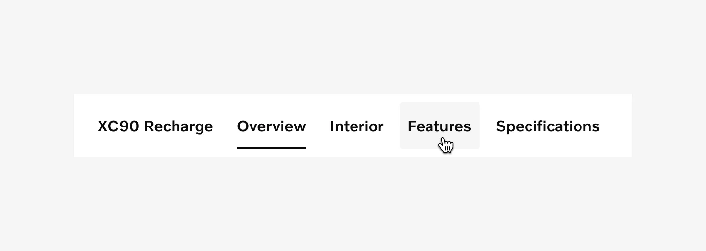
Horizontal tabs on neutral background with tabs in default, active and hover states.
Horizontal tabs with accent color on neutral background with tabs in default, active and hover states.
Left-aligned customized horizontal tabs in neutral color on color background with tabs in default, active and hover states (2px ornamental stroke added).
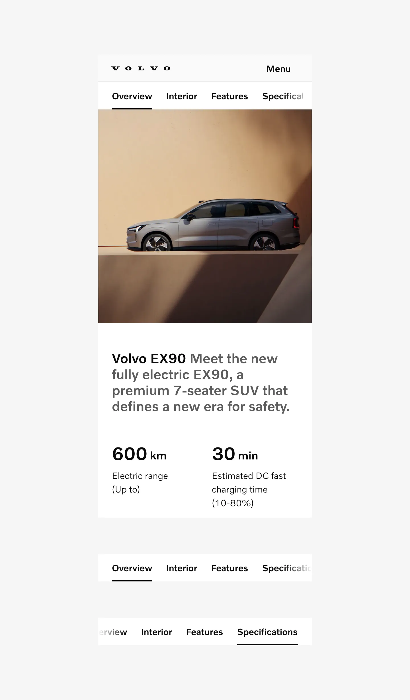
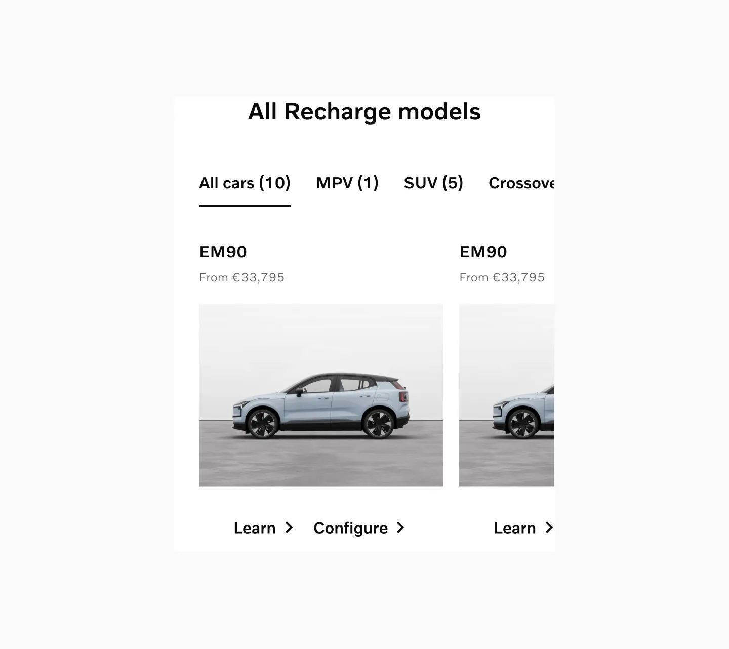
Scrollable tabs on a product page.