Switch
Switch allows the user to toggle between two different states that take immediate effect.
How to use
Section titled “How to use”Switches must feature a descriptive label. Use Switches only where instant change in the user-interface based on their assigned action is intended.
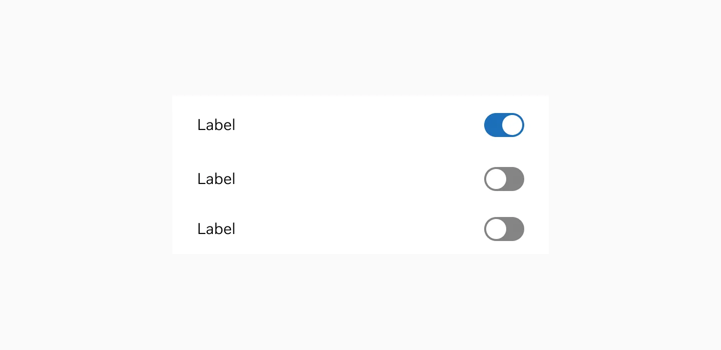
Showing Switch and On and Off with label.
Anatomy
Section titled “Anatomy”
Label placement
Section titled “Label placement”Place labels to the left from the switch to make it easier for users to comprehend the meaning. Left-aligned labels will work best as they fit the way users scan the layout (in the Western culture, people read from left to right). And vice versa for the Right to Left reading audience
Variant
Section titled “Variant”
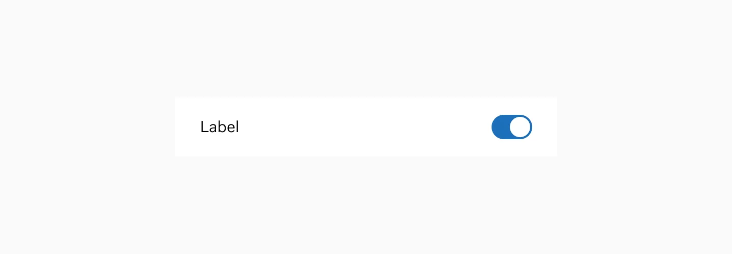
Showing switch in on state.

Showing switch in off state.
States
Section titled “States”Enabled
Section titled “Enabled”The enabled state is the default state of the Switch. It is not currently being interacted with, but is available to be interacted with.

Switch in enabled state.
The hover state is shown when the user places a cursor over the switch on non-touch devices.

Switch in hover state.
Disabled
Section titled “Disabled”A disabled state of a button is system initiated and indicates that the button cannot be interacted with.

Switch in disabled state.
The switch uses a neutral color scheme.
Switch in neutral color
Color modes
Section titled “Color modes”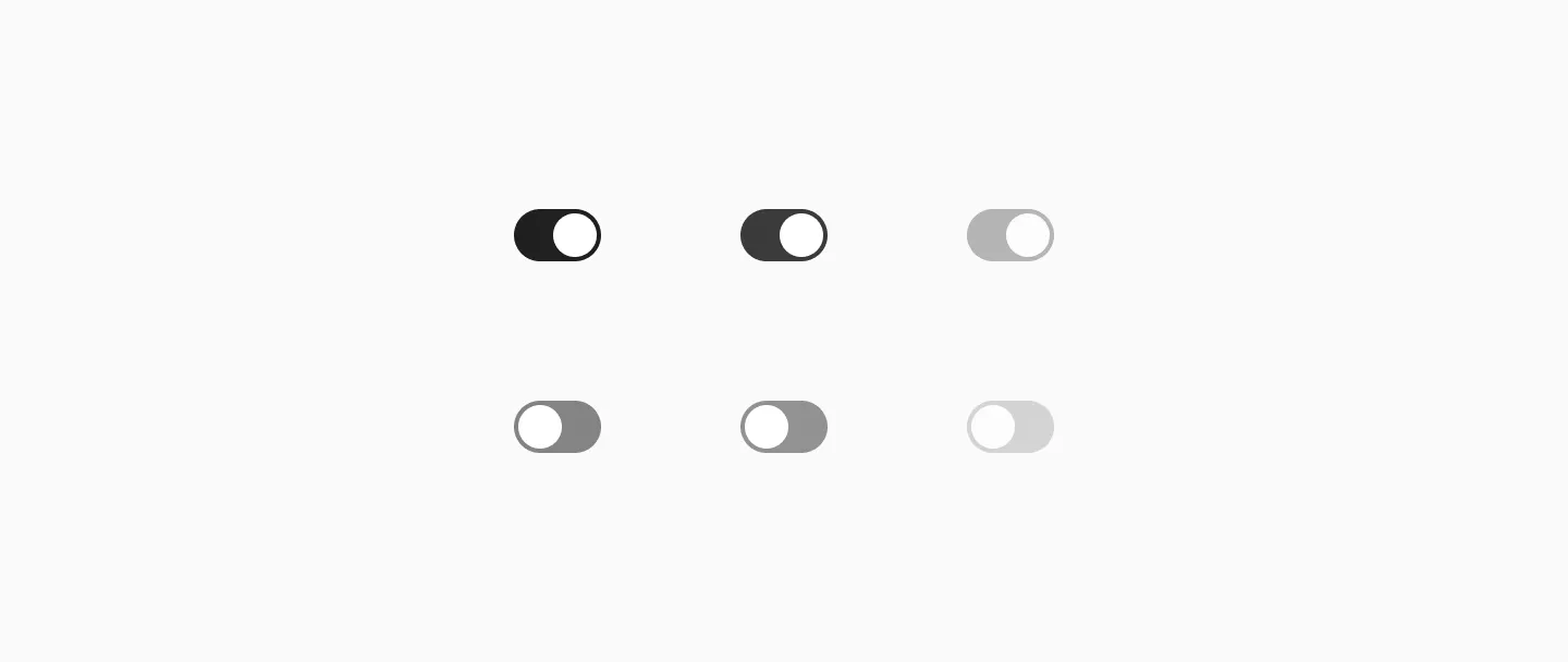
Switch in light mode.

Switch in dark mode.
Target size
Section titled “Target size”
Switch uses 40px target size.
Examples
Section titled “Examples”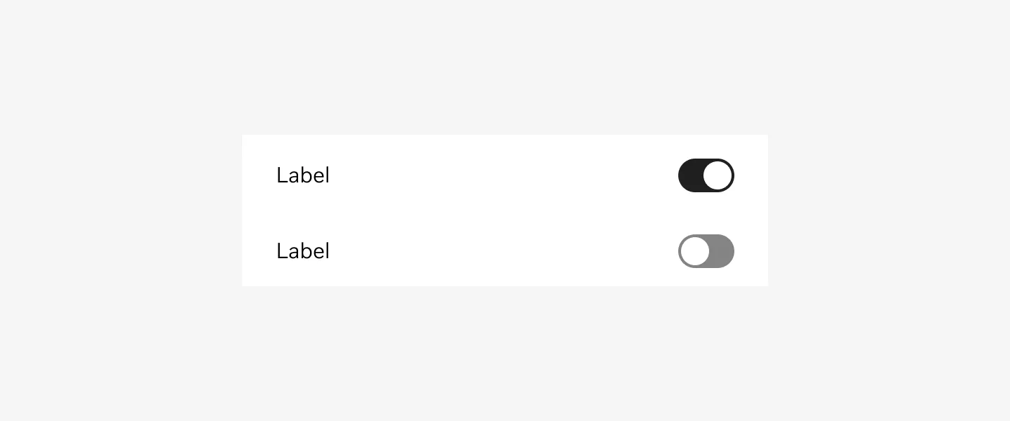
Switch in enabled state.
Considerations
Section titled “Considerations”Keep in mind that Switches should only be used when the user needs to decide between two opposing states.
Write clear labels. The toggle labels should describe what the control will do when the switch is ON.
Write short and direct labels. Limit the total number of words. Label should have one or two words, preferably nouns, that describe the functionality of the toggle controls.
Avoid adding labels to describe the values of a toggle. Toggles are either OFF or ON. Adding extra text labels that describe these states (‘On’ or ‘Off’) will introduce unnecessarily clutters to the interface.