Skeleton
Skeleton is a placeholder to show a loading state and the expected shape of a component.
Anatomy
Section titled “Anatomy”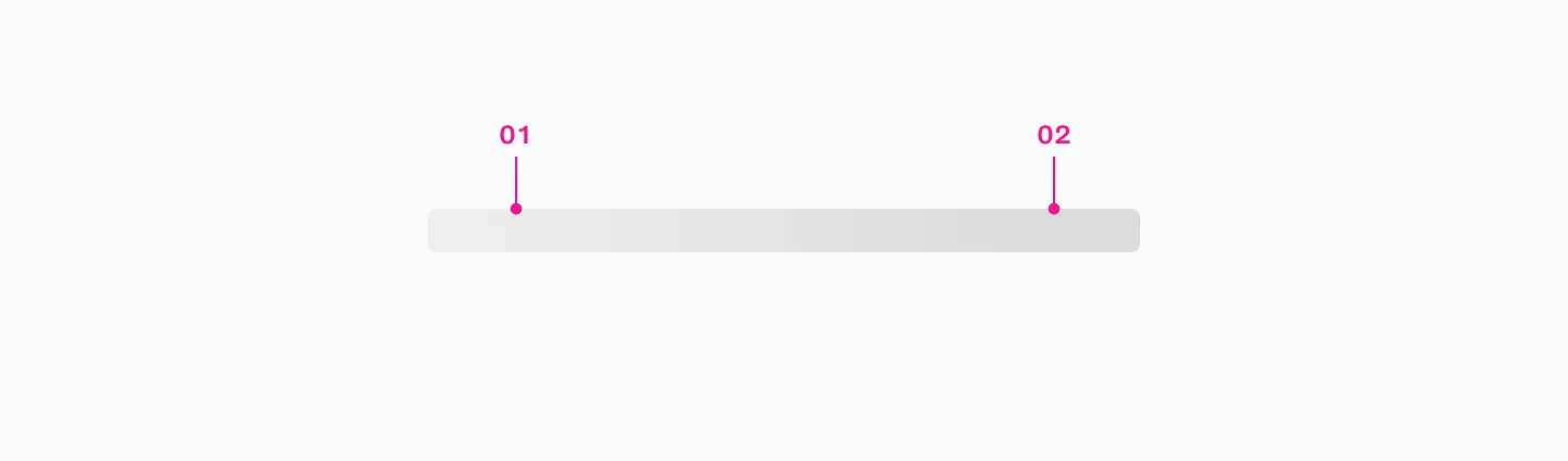
- Animated gradient layer
- Background
How to use
Section titled “How to use”When component data isn’t immediately available, you can use skeletons to improve the perceived responsiveness of the interface.
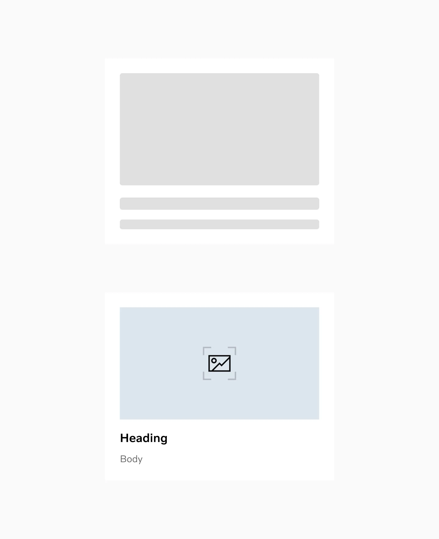
Displaying skeleton loading and loaded content.
Color mode
Section titled “Color mode”
Skeleton in light mode

Skeleton in dark mode
Considerations
Section titled “Considerations”When to use skeletons:
Section titled “When to use skeletons:”- If the page has a consistent layout pattern (e.g. tables, grids, lists,…)
- To indicate loading state on late-loaded content (e.g. images, text, …), for example when fetching data from an API
When to not use skeletons:
Section titled “When to not use skeletons:”- If loading time is minimal (e.g. less than 1 second)
- If the components will be conditionally rendered (e.g. a feature flagged component that may not be shown)
You can use the skeleton class to create your skeletons, make sure that the loading state recreates the expected shape of the component.
Replace text with skeleton in Figma
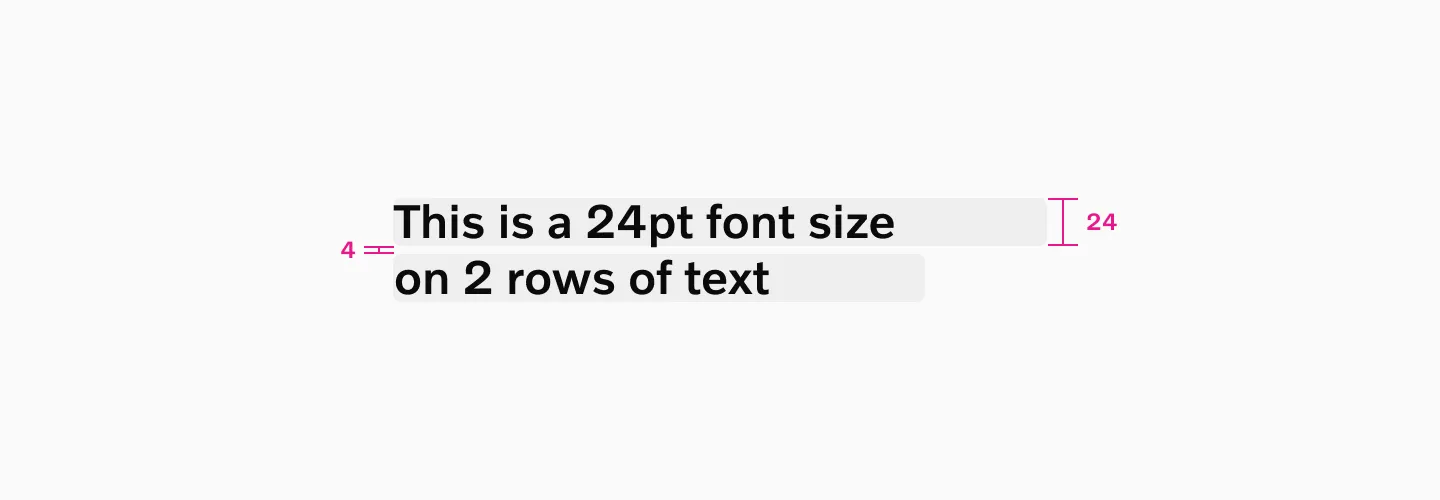
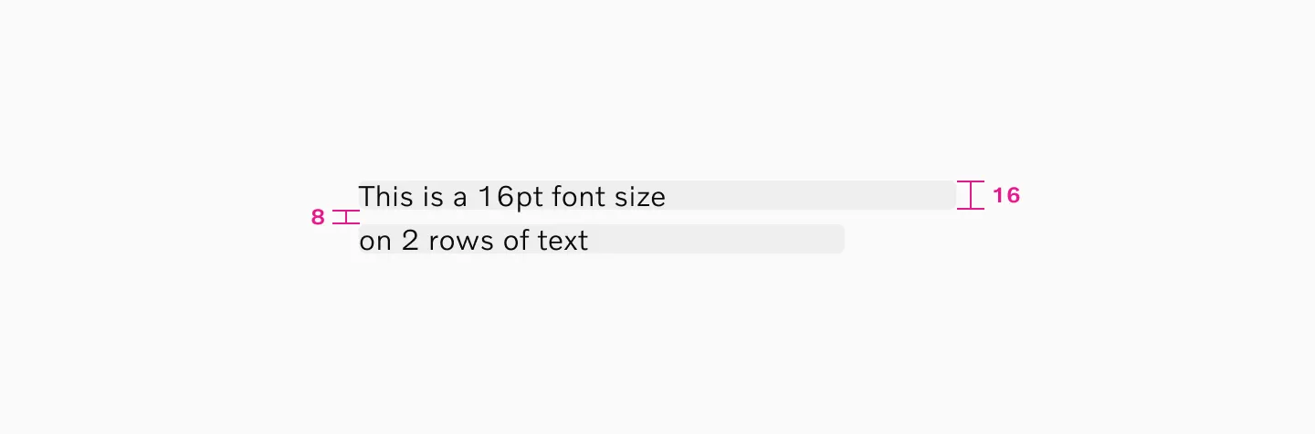
Section titled “Replace text with skeleton in Figma”When using skeleton to replace text, the skeleton height should match the text size.
For example, if you have a 16pt font, the skeleton graphic should be 16px in height.
Spacing
Section titled “Spacing”Body elements have an 8px vertical spacing between skeleton elements for multiple rows.
Heading elements have a 4px vertical spacing between skeleton elements for multiple rows.
Statement elements have a 4px vertical spacing between skeleton elements for multiple rows.
Example
Example with heading 2.
Example with font size 16.