Selectable Cards
Selectable cards display content and actions related to a single subject.
When to use
Section titled “When to use”Selectable cards display content and actions on a single topic. They’re designed for easy scanning of relevant, actionable information.
Rich Content
Section titled “Rich Content”Use when options require images, icons, or detailed descriptions that a simple label can’t convey.
High-Value Choices
Section titled “High-Value Choices”Use when the decision is significant and needs extra attention (e.g., selecting a subscription tier).
Improved Accessibility and Touch Targets
Section titled “Improved Accessibility and Touch Targets”Larger clickable areas benefit mobile users and those with motor difficulties.
Grouping Related Items
Section titled “Grouping Related Items”Use to visually cluster options, making them feel like distinct units.
Filtering and Tagging
Section titled “Filtering and Tagging”Use to clearly represent distinct categories or tags with visual appeal.
Components
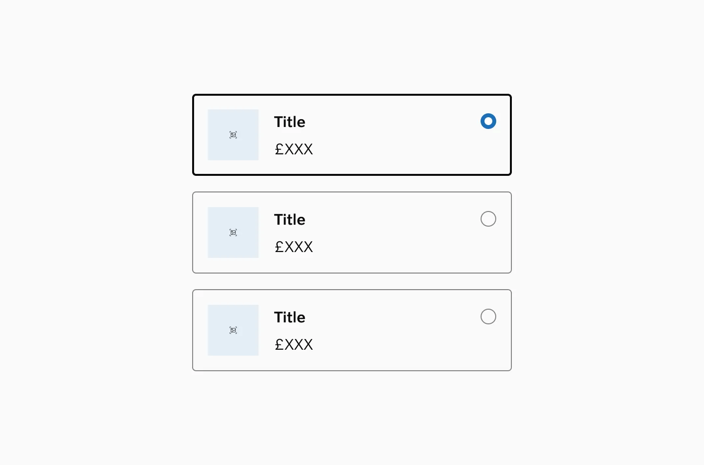
Section titled “Components”Radio card (single choice)
Section titled “Radio card (single choice)”Radio cards let users select one option from a group. They can include links for additional information and display a radio button on the right for better accessibility.
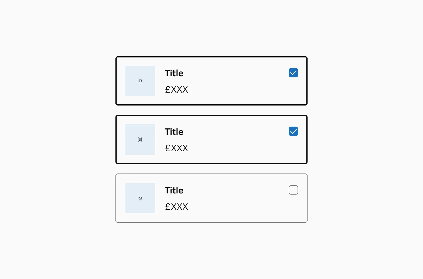
Checkbox Card (Multiple Choices)
Section titled “Checkbox Card (Multiple Choices)”Checkbox cards allow users to select multiple options from a group. They can include links for additional information and display a checkbox on the right side for improved accessibility.
Spacing
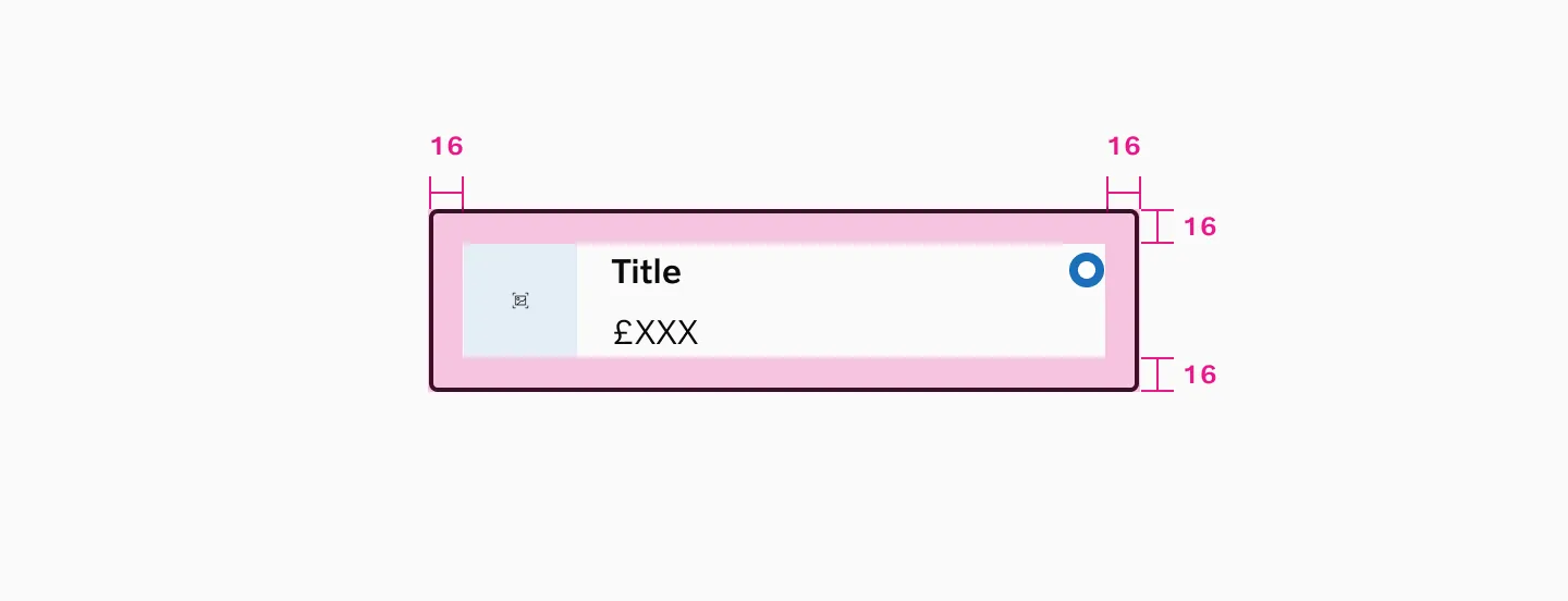
Section titled “Spacing”Inner spacing
Section titled “Inner spacing”Selectable cards use 16px inner spacing.
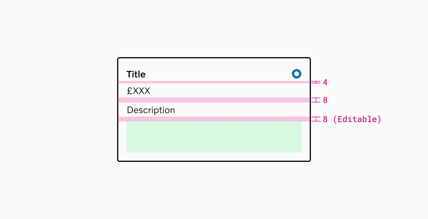
Vertical spacing
Section titled “Vertical spacing”Selectable cards use a default 8px spacer between content and slot, which can be adjusted based on content needs.
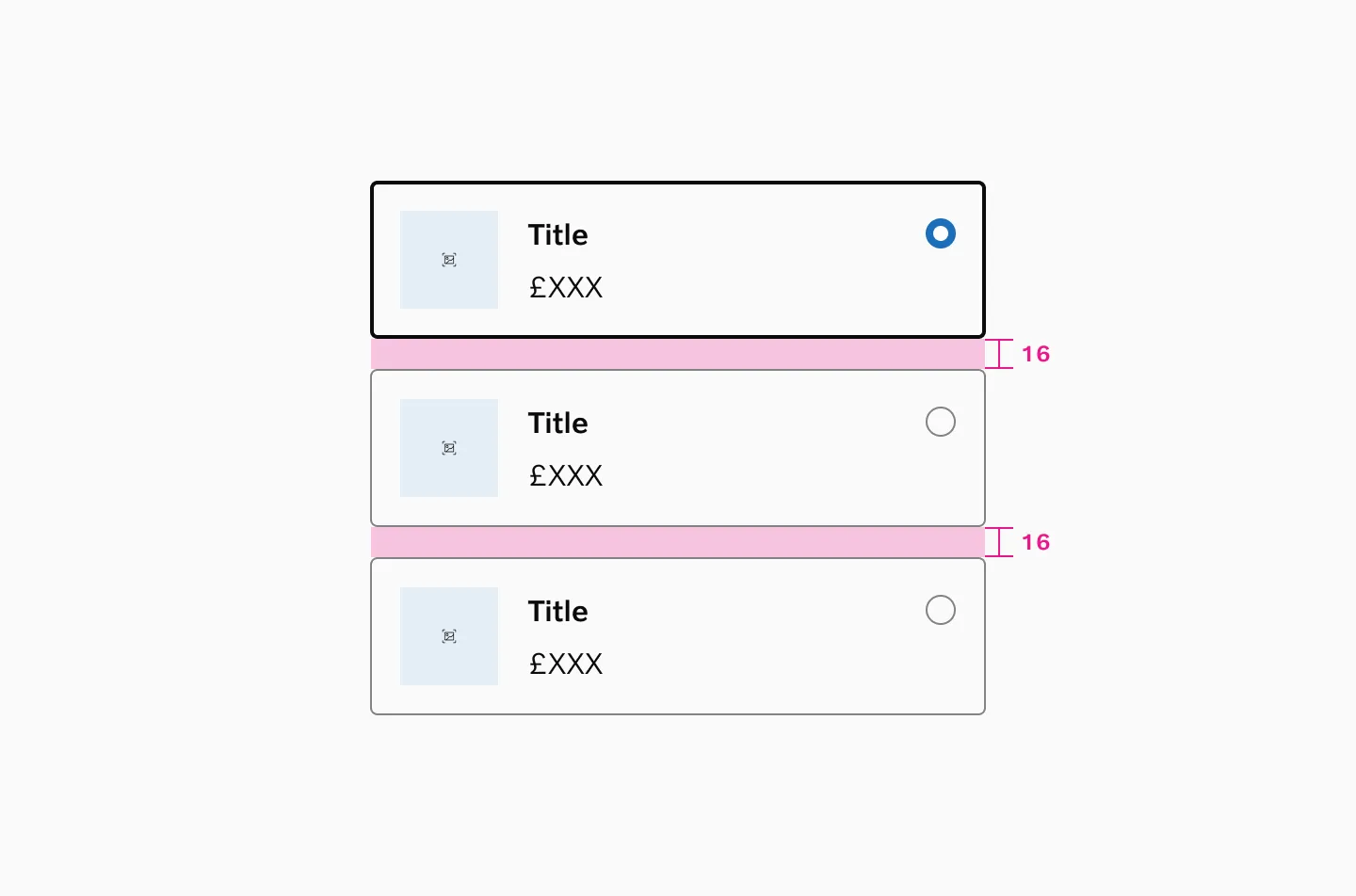
Stacked cards
Section titled “Stacked cards”Use a 16px spacer when stacking selectable cards vertically.
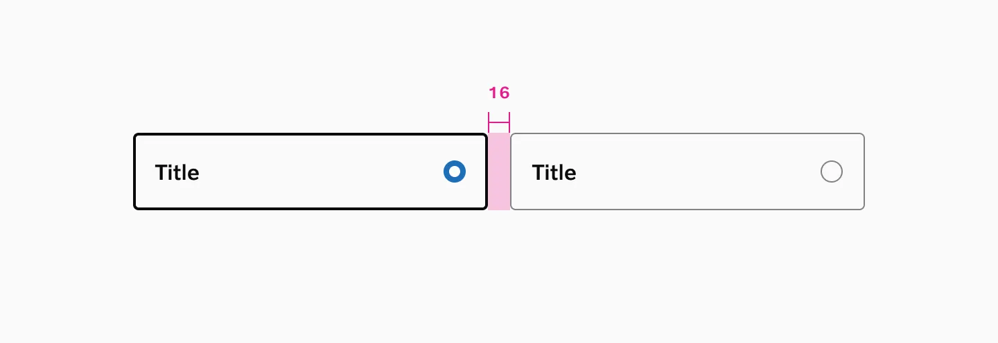
Side by side
Section titled “Side by side”Use 16px spacing between selectable cards placed side by side.
States
Section titled “States”Radio card
Section titled “Radio card”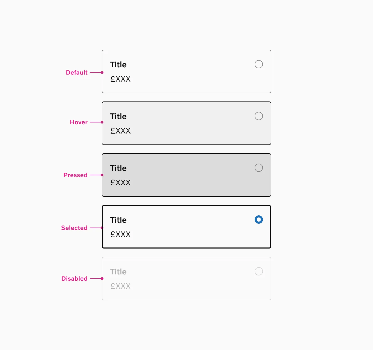
Supported states: default, hover, selected, disabled
Checkbox card
Section titled “Checkbox card”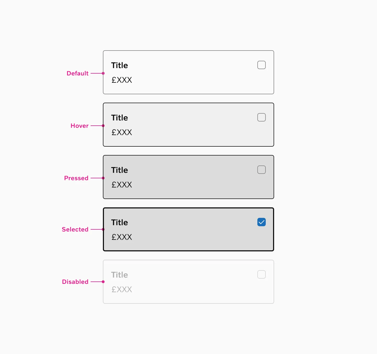
Supported states: default, hover, pressed, disabled
Examples
Section titled “Examples”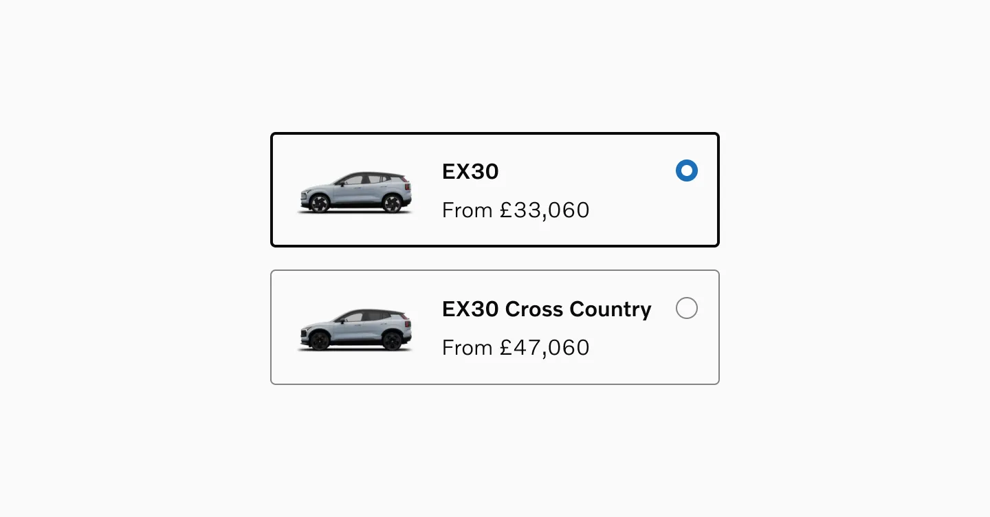
Radio cards with Image, title and price.
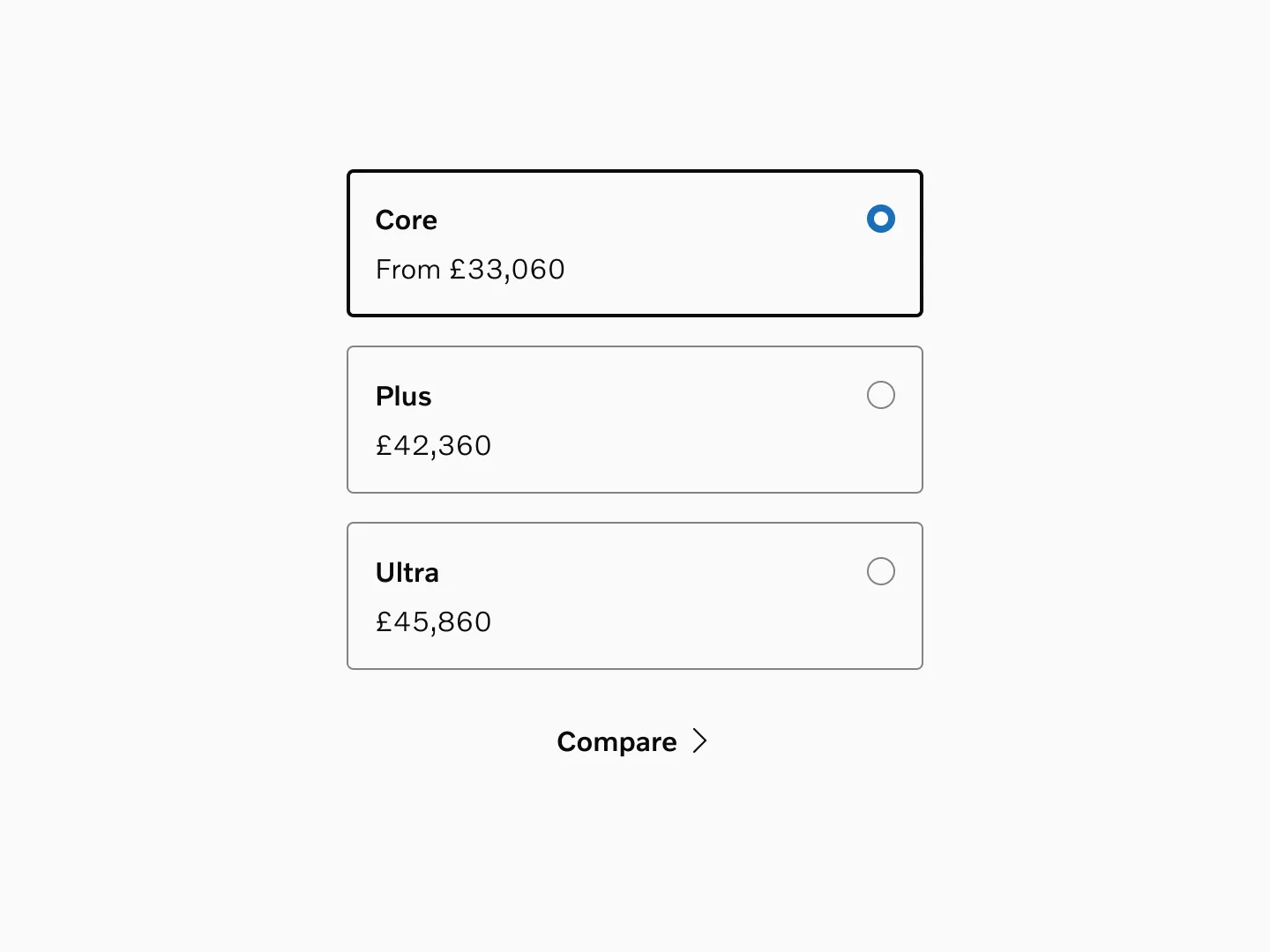
Radio cards with title, price, description and underlined link.
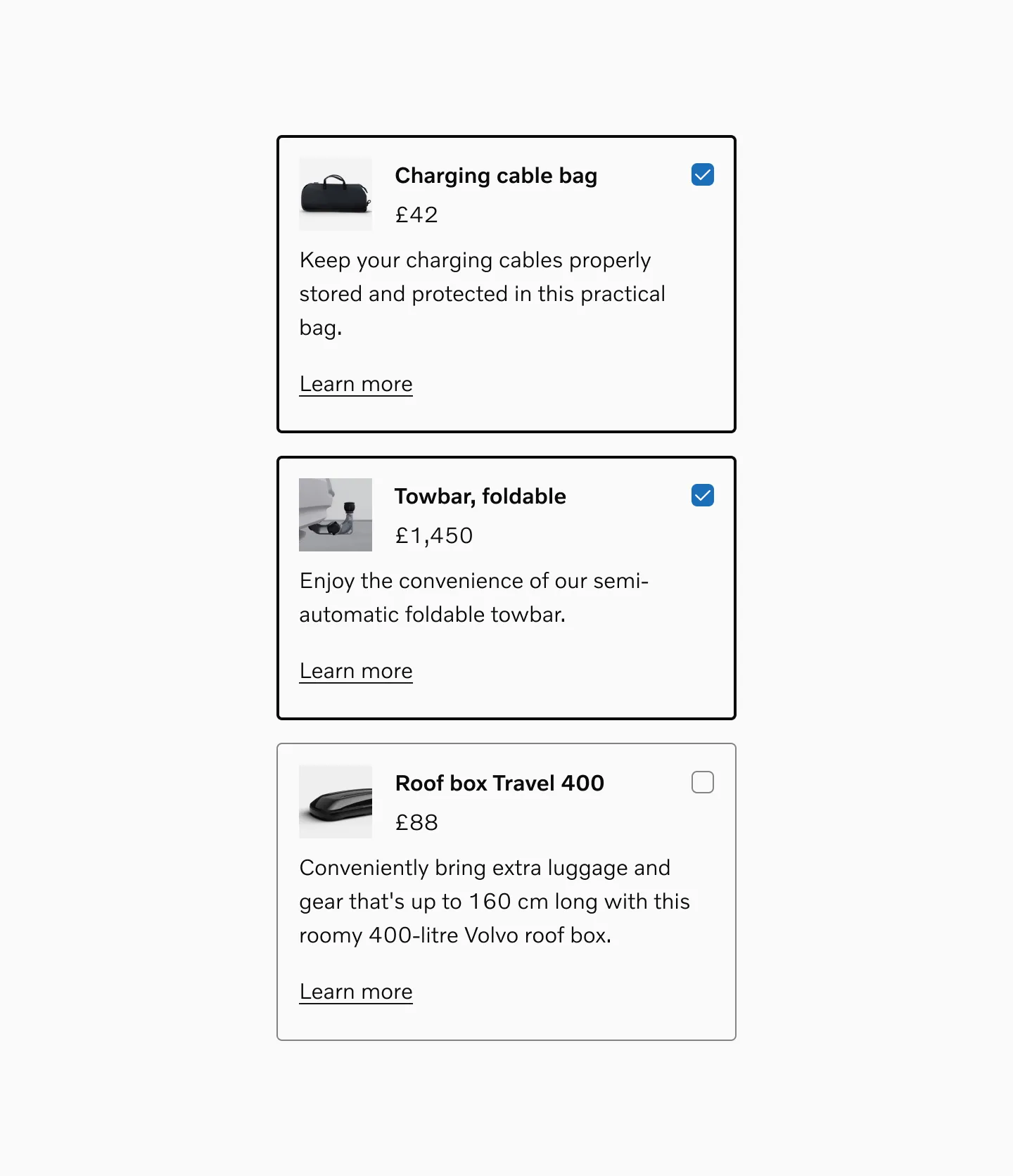
Checkbox cards with image, title, price, description, and underlined link.
Considerations
Section titled “Considerations”Appropriate content length
Section titled “Appropriate content length”Keep card text concise and focused. Long text in cards can disrupt visual consistency and layout.
When to use standard Checkboxes or Radio buttons
Section titled “When to use standard Checkboxes or Radio buttons”Consider using a standard Checkbox or Radio button instead of Selectable cards when you have a long list of selections and need to save space. Prefer the standard pattern that users are already familiar with.
Use clear, concise labels
Section titled “Use clear, concise labels”Make the primary choice obvious with short titles and supporting text.
Keep content scannable
Section titled “Keep content scannable”Use bullets, icons, or short descriptions. Avoid dense paragraphs.
Limit the number of cards
Section titled “Limit the number of cards”Ideally 2–6 options to prevent cognitive overload.
Don’t mix cards in a group
Section titled “Don’t mix cards in a group”Don’t mix single-select and multi-select cards in the same group.