Reel
The reel shows a collection of items that may be scrollable sideways using scrollbars and/or scroll buttons.
Anatomy
Section titled “Anatomy”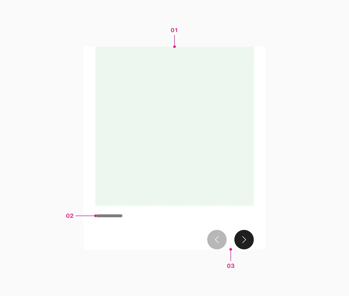
- Slot
- Native scrollbar
- Scroll buttons
The reel component is used for horizontal scrollable content with controls. It always shows partially visible content to indicate what’s coming next.

Scrollable vs non scrollable content
Section titled “Scrollable vs non scrollable content”When all content of the reel fits within the viewport, frames are displayed side by side. However, if the reel’s contents exceed the viewport’s width, it becomes scrollable.
Example side by side
Section titled “Example side by side”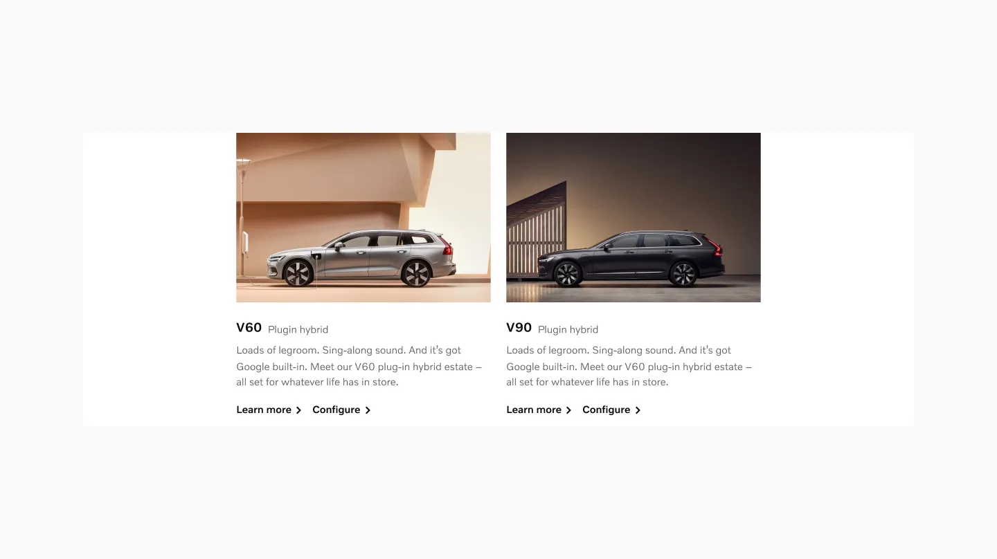
2 cards becomes non-scrollable on larger viewport.
Example scrollable
Section titled “Example scrollable”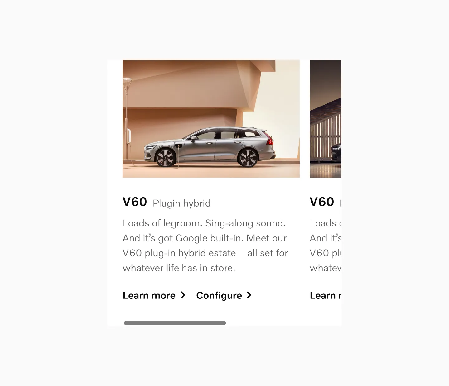
2 cards becomes scrollable on smaller viewports.
Controls
Section titled “Controls”The Reel may include scroll buttons and a native scrollbar to provide more visual affordance that the content is scrollable. The more critical the content, the more visual affordance should be provided.
Scroll buttons
Section titled “Scroll buttons”You may use scroll buttons to make it clearer to the user that additional content is available and to provide more ways to navigate.
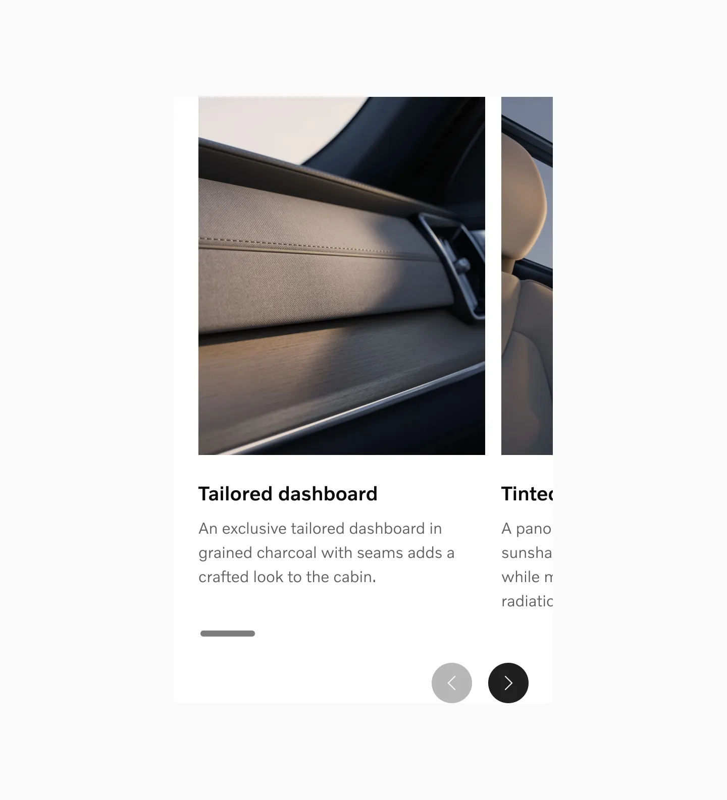
Placement
Section titled “Placement”Scroll buttons should be positioned beneath the reel cards.
Scroll button states
Section titled “Scroll button states”Start
In the start state, the left button is disabled and the right button is active, indicating that you can only scroll forward.

Mid
In the mid state, both buttons are in their default state, indicating that you can scroll both backward and forward.

End
In the end state, the left button is active and the right button is disabled, indicating that you can only scroll backward.

Native scrollbar
Section titled “Native scrollbar”The native scrollbar is positioned beneath the reel cards. On browsers that support overlay scrollbars, the scrollbar becomes visible when interacting with the Reel.

Examples
Section titled “Examples”Fewer than 3
Section titled “Fewer than 3”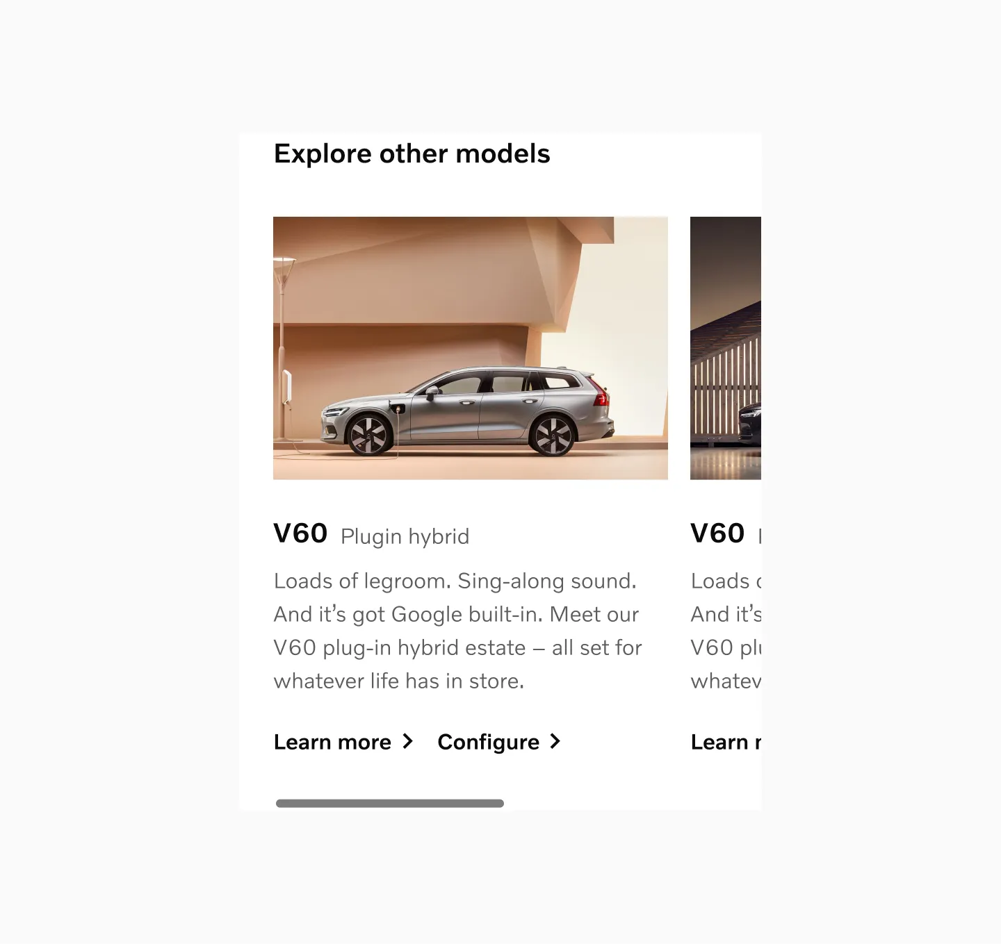
Model cards with fewer than three cards in sm breakpoint.
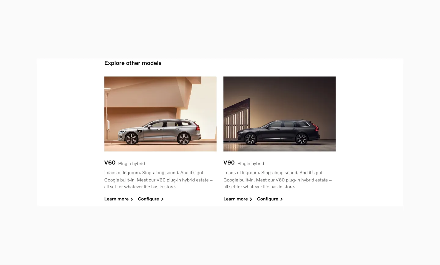
Model cards with fewer than three cards in lg breakpoint.
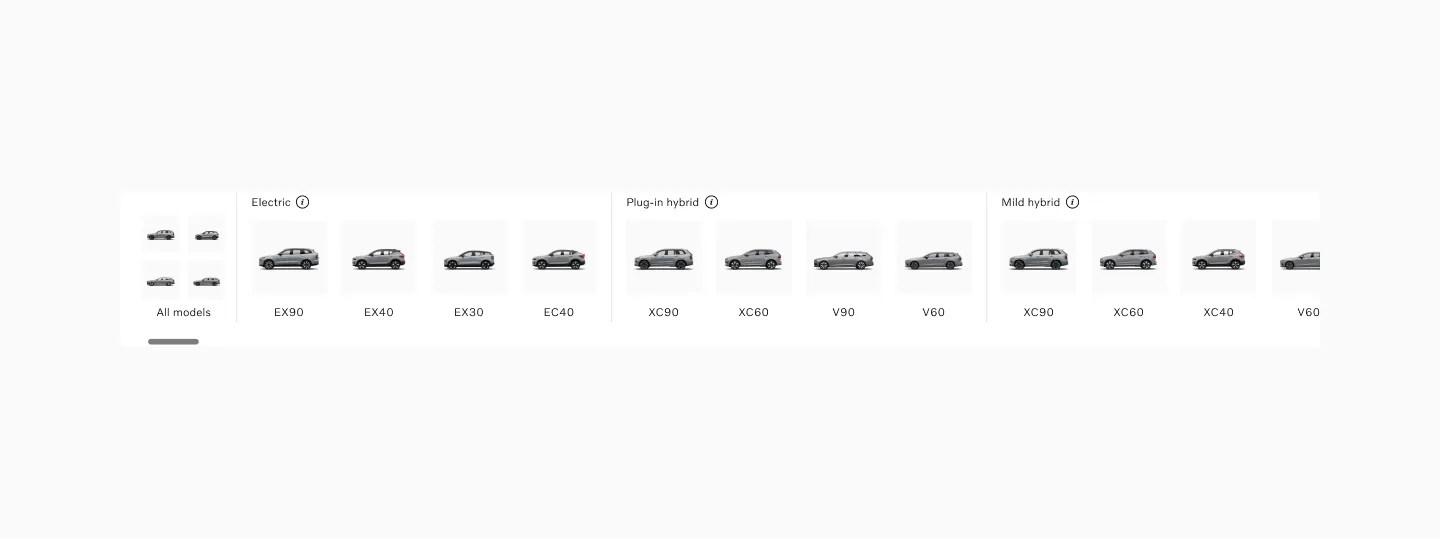
Small sized items
Section titled “Small sized items”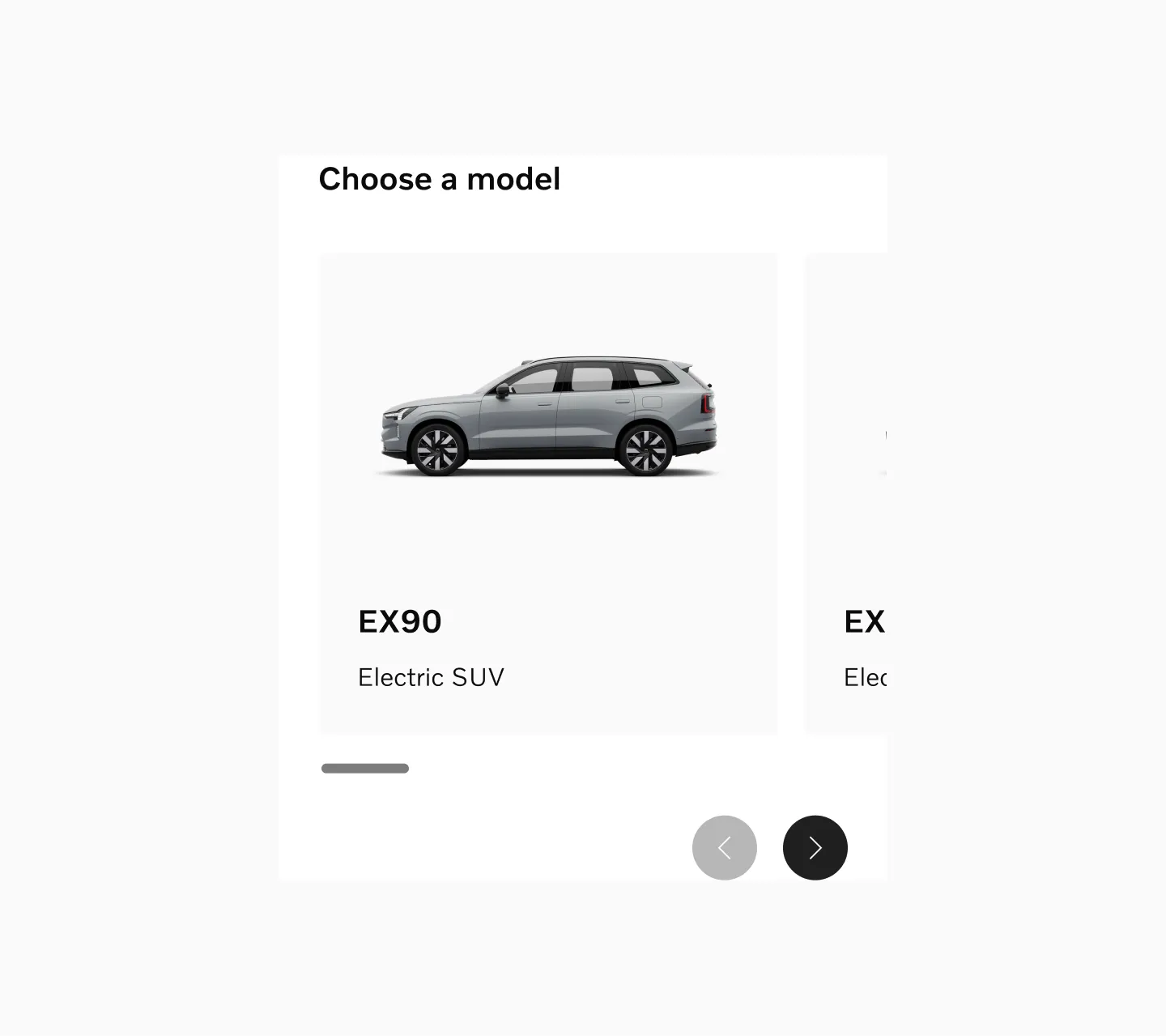
Model cards in sm breakpoint.
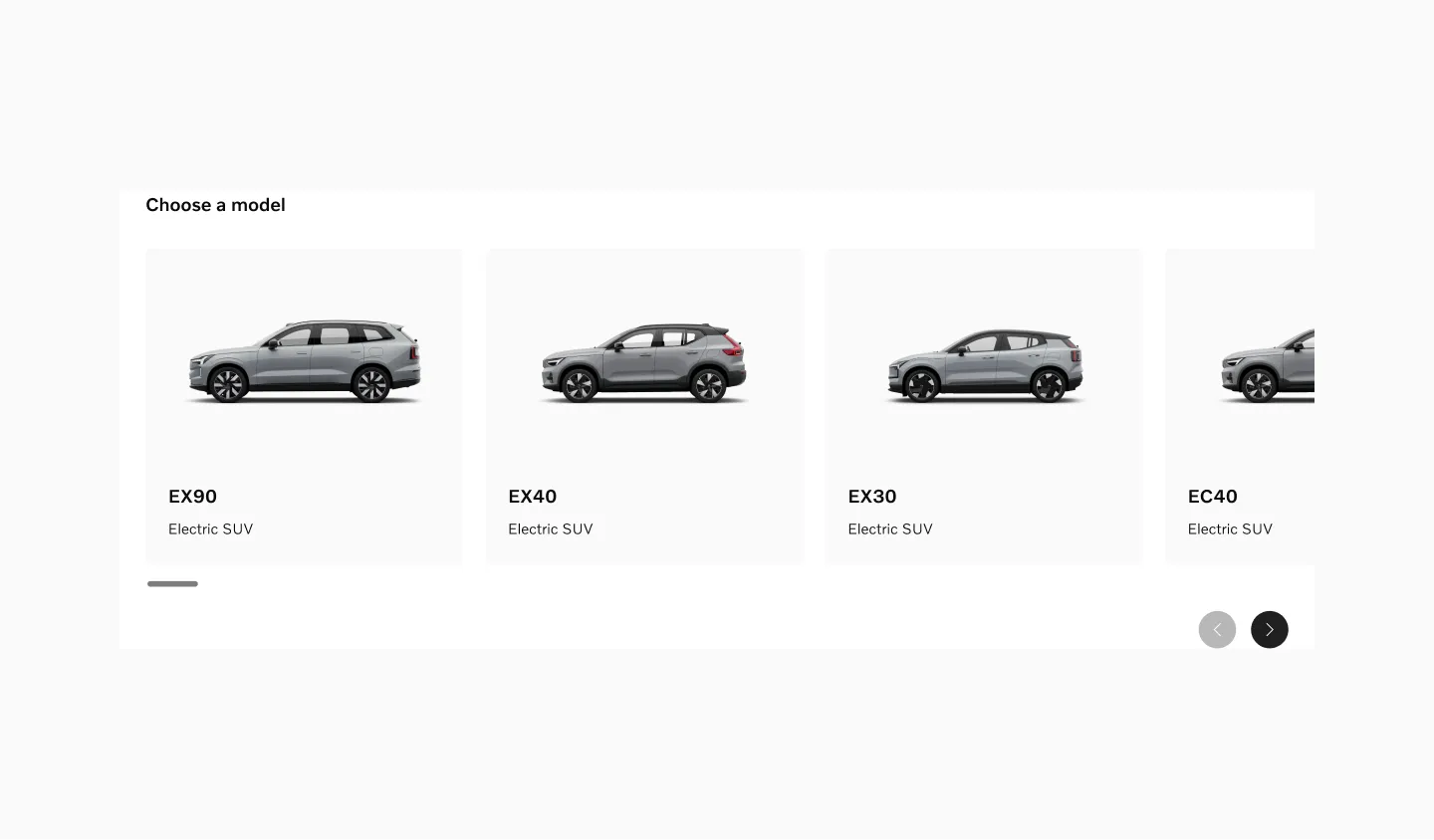
Model cards in lg breakpoint.
Medium sized items
Section titled “Medium sized items”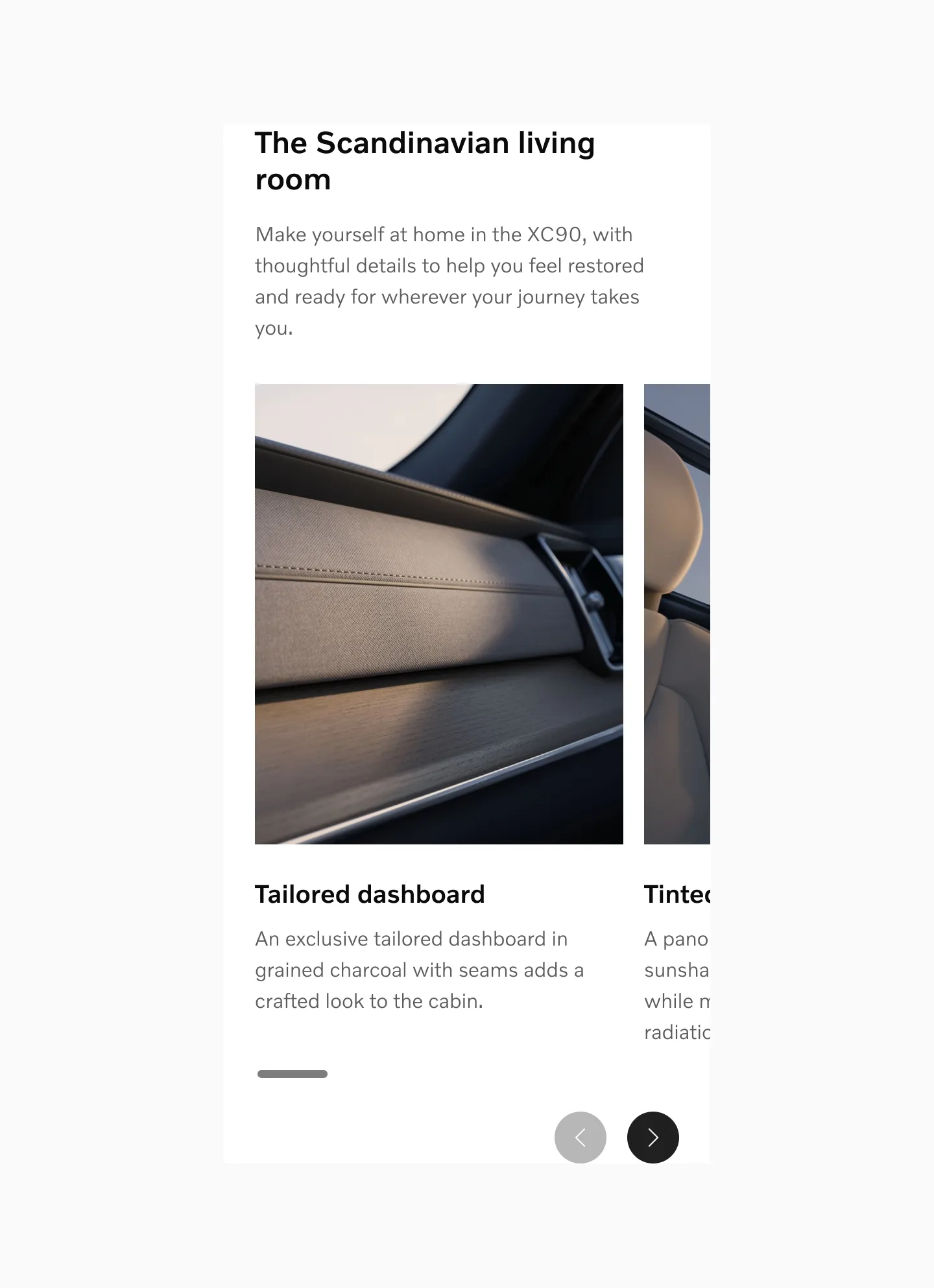
Interior cards in sm breakpoint.
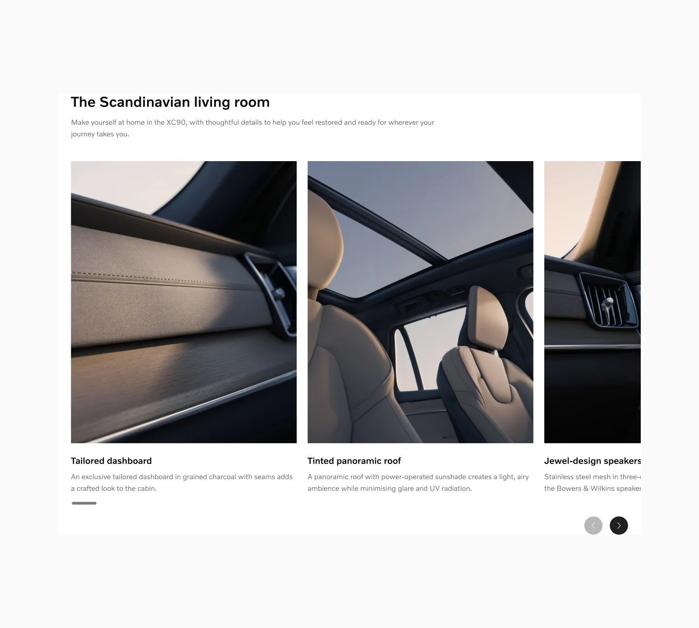
Interior cards in lg breakpoint.
Large sized items
Section titled “Large sized items”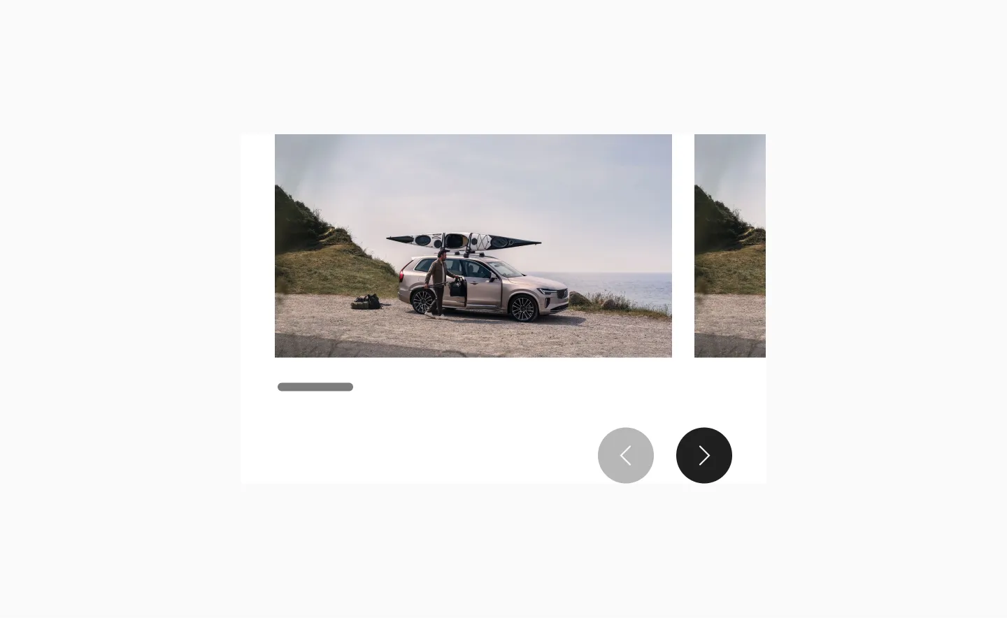
Gallery in sm breakpoint.
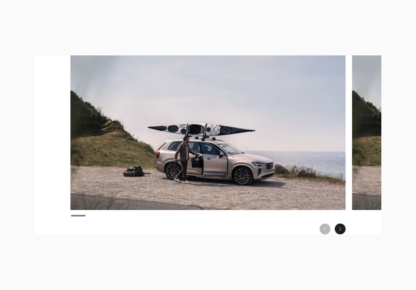
Gallery in lg breakpoint.
Random sizes
Section titled “Random sizes”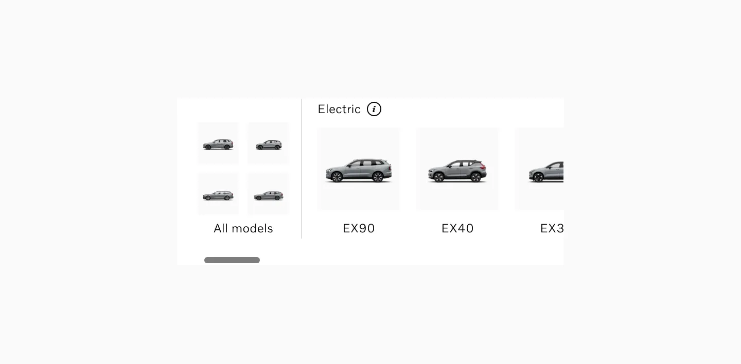
Model selector in sm breakpoint.
Model selector in lg breakpoint.
Recommended card sizes
Section titled “Recommended card sizes”These are recommended card sizes when designing Reel content. The last frame in the view should always be partially visible.
sm (mobile) | md (tablet) | lg (desktop) | |
|---|---|---|---|
| Small | 284px | 288px | 340px |
| Medium | 284px | 473px | 496px |
| Large | 284px | 596px | 1016px |
Considerations
Section titled “Considerations”Stacking cards
Section titled “Stacking cards”If the content is very important, consider stacking the content instead of using a reel. With a reel or other components that require user interaction to disclose additional content, there’s always a risk that some users will miss the content that’s not visible by default.
Relevant content
Section titled “Relevant content”Carousels work best when they contain interesting and relevant content presented in a clear context. If the content does not create engagement of a user outside of a carousel, inserting it in the reel will not improve its performance.
Fewer than 3
Section titled “Fewer than 3”When the reel has fewer than 3 cards it will only be scrollable on sm breakpoints. On larger breakpoints both cards are visible and controls are removed.
Items of varying sizes
Section titled “Items of varying sizes”When using items of varying sizes, ensure that the last item is partially visible across all major breakpoints.
Hidden scroll buttons
Section titled “Hidden scroll buttons”Scroll buttons should always be hidden if all the content already fits on the screen.