RangeSlider
The Range slider component lets users select values within a defined range, commonly used for adjusting settings or inputting numeric values.
How to use
Section titled “How to use”The Range slider component allows users to select values within a defined range. It is commonly used for adjusting settings or inputting numeric values.
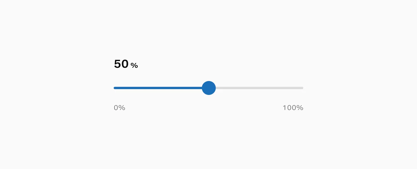
The selected value is typically presented as a dynamically updated value that is presented in close proximity to the slider itself.
Variants
Section titled “Variants”Min and max labels (Figma only)
Section titled “Min and max labels (Figma only)”The min and max labels help users understand the scale of the available range they can select from. (This appears only in Figma and is not implemented in code).

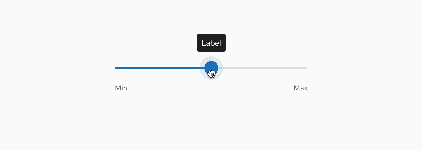
Tooltip
Section titled “Tooltip”The Tooltip can be toggled to be displayed on drag.
States
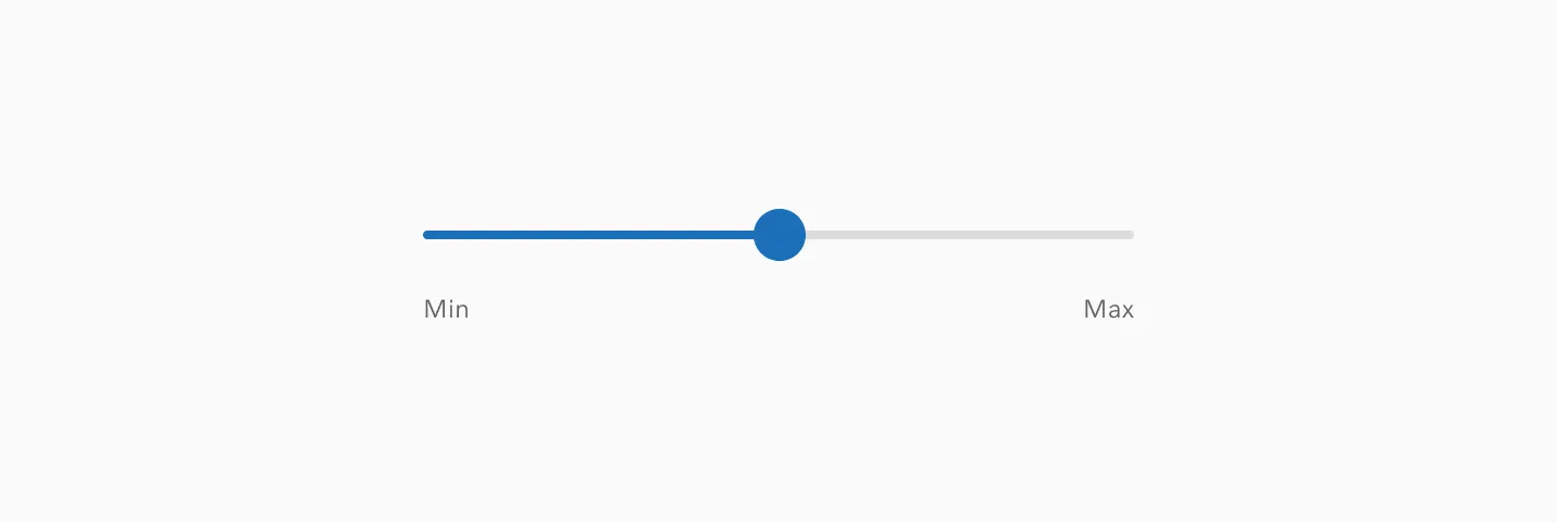
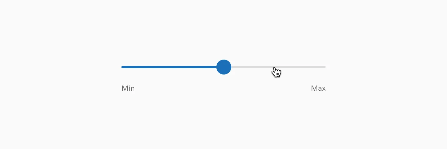
Section titled “States”Default
Section titled “Default”This is the default state for range slider.
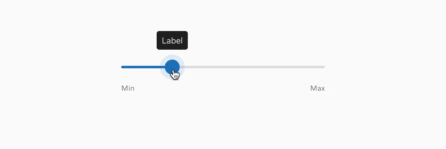
The hover state is only shown when hovering on the thumb.

Pressed / Drag
Section titled “Pressed / Drag”In the pressed state, you have the option to display a tooltip.

Interaction
Section titled “Interaction”Drag interactions
Section titled “Drag interactions”Users can change values by holding and dragging the thumb.
Clicking
Section titled “Clicking”Users can also click the track to instantly select a specific value.
Accessibility
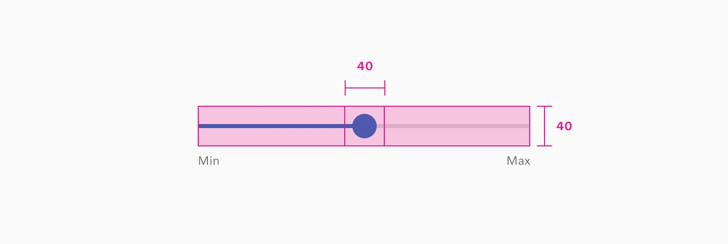
Section titled “Accessibility”Target size
Section titled “Target size”The Range slider track has a minimum target size of 40px. The thumb has a 40px by 40px minimum touch area.
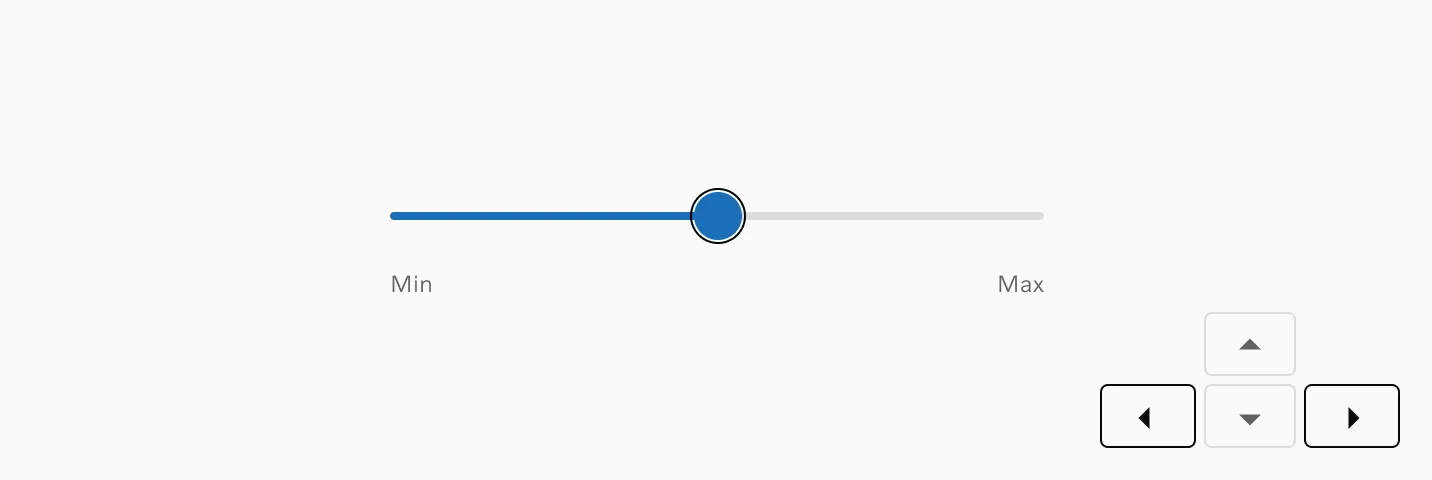
Keyboard input
Section titled “Keyboard input”Users can adjust the value by pressing the arrow keys when the RangeSlider is in focus.
Considerations
Section titled “Considerations”Numeric inputs
Section titled “Numeric inputs”For values requiring precision, consider pairing the RangeSlider with numeric inputs. This approach is particularly helpful on mobile devices, where precise slider interactions can be difficult.
Motion
Section titled “Motion”Slider interactions utilize simple linear animation with no easing or bounce effects. Tooltip fade-in when appearing and fade-out when disappearing.
Examples
Section titled “Examples”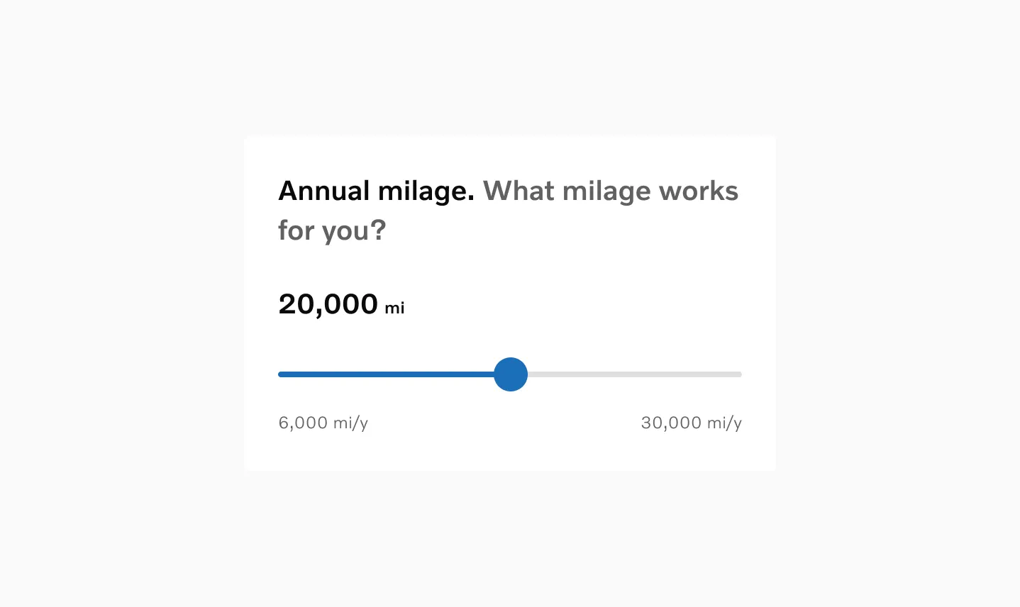
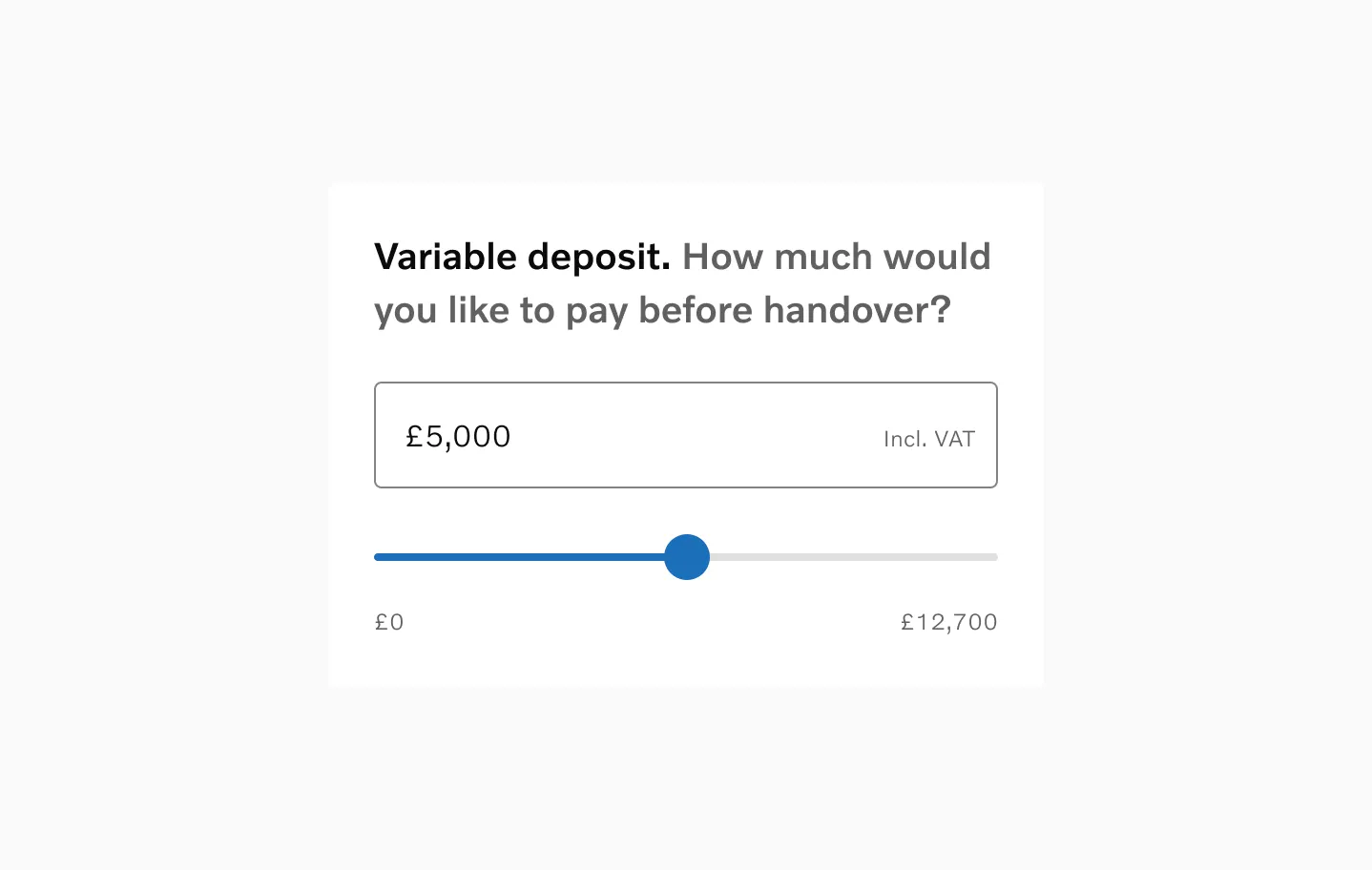
Range slider with value label and min and max labels.
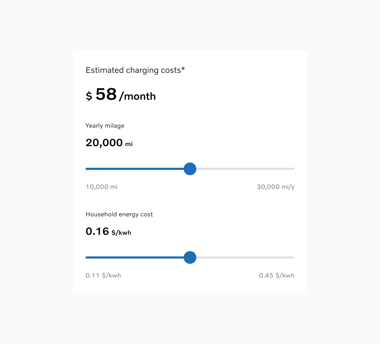
Multiple sliders connected to calculate the estimated cost.