Pill
The pill component is a small label used to display a variety of metadata or helper texts.
How to use
Section titled “How to use”The base pill component is meant to be a non-interactive element that can be used to help contextualize various states or options. It is often used as a sub component within other, more complex, components.
The pill component can be used in the following scenarios:
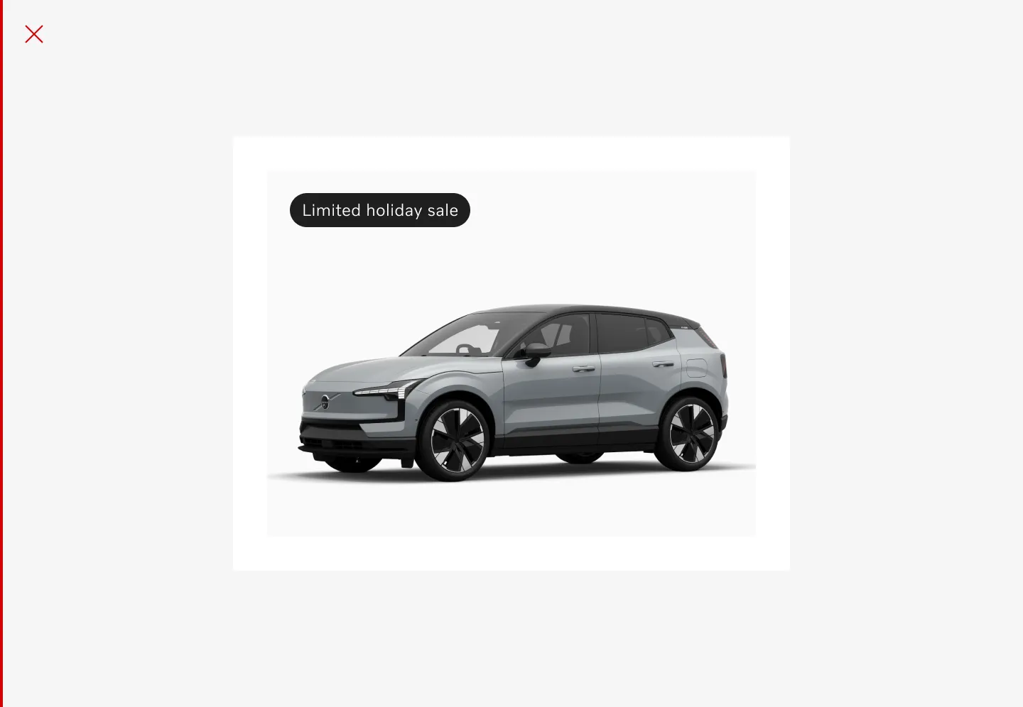
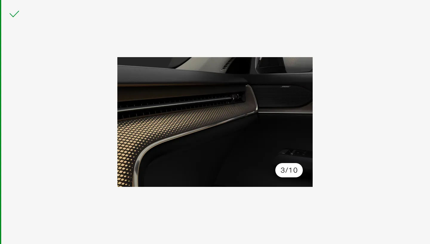
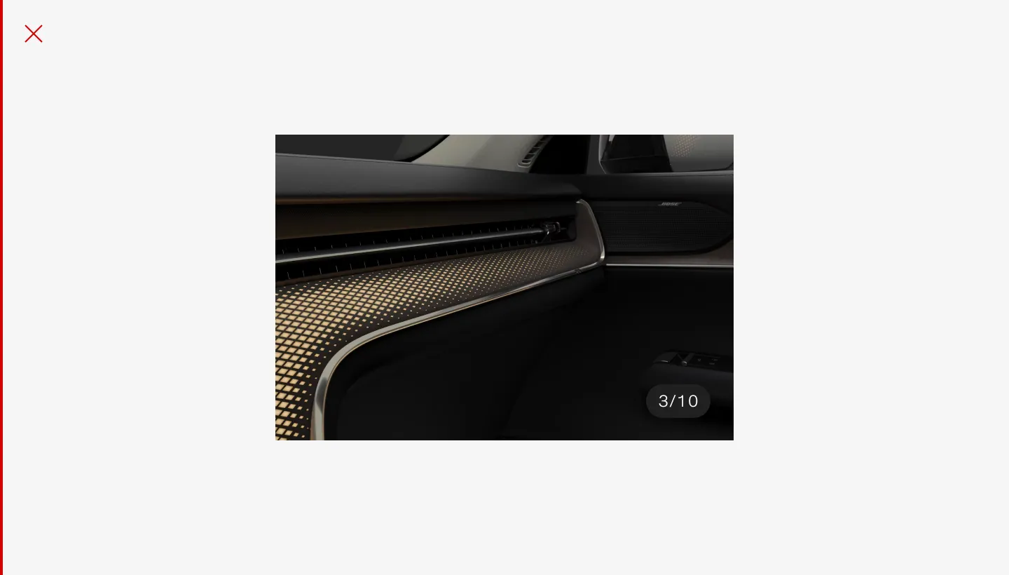
Contextual
Section titled “Contextual”Displays information such as the current selection, slide show position, or selected values.
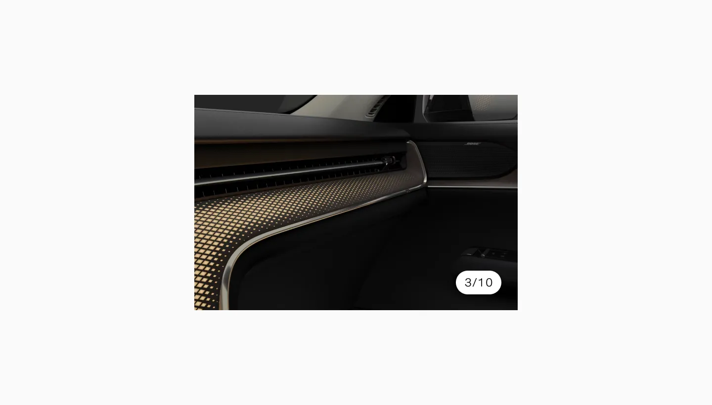
Showing a pill with the text 3/10.
Status messaging
Section titled “Status messaging”Represents the status of an item, such as “Pending”, “Approved”, or “Completed”.
Showing left aligned inline disclaimer on desktop.
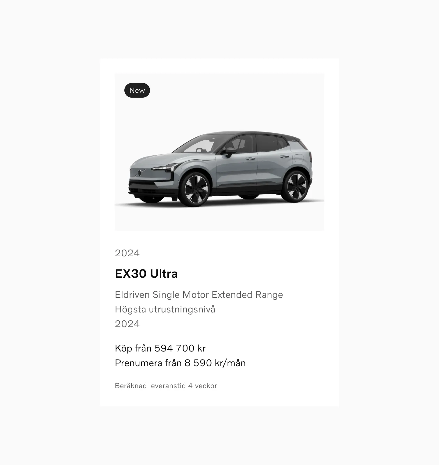
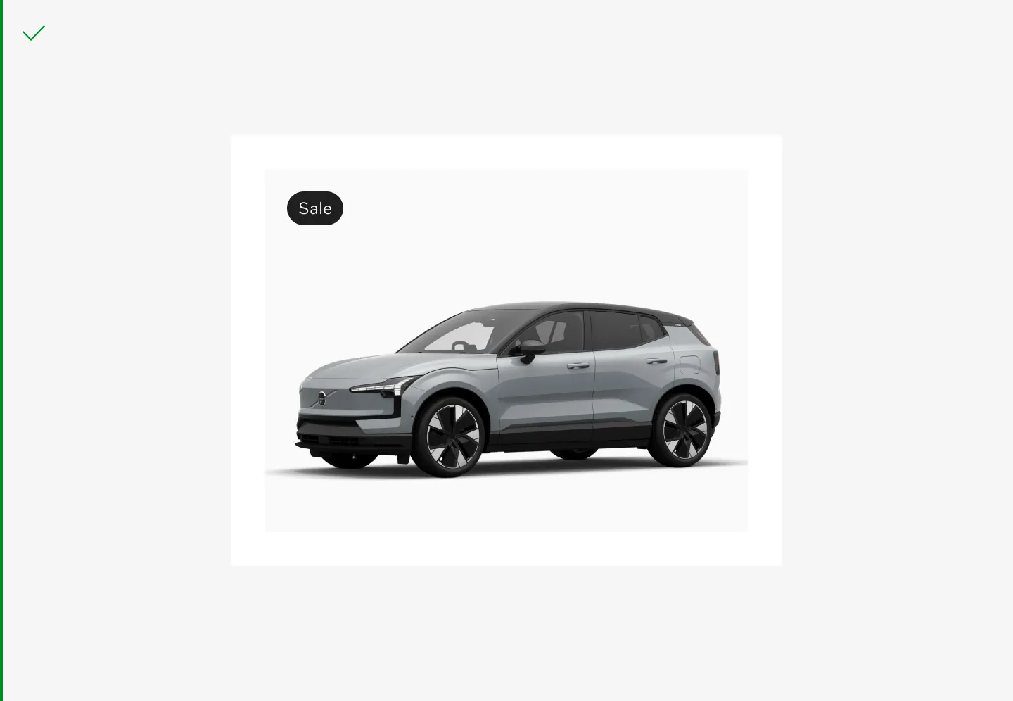
Classifies content with tags like “Featured”, “Trending”, or “Popular”.
Showing a pill that shows a relevant metadata tag.
Anatomy
Section titled “Anatomy”
- Plate – The plate is the base of the component. It can be displayed in different shades depending on the background or the importance of the information.
- Label – This is the actual value that is being displayed.
Variants
Section titled “Variants”Filled
Section titled “Filled”
This is the base version of the pill, used to clearly signify active states or other important signifiers.
Outlined
Section titled “Outlined”
The outlined version has less contrast when placed against the standard background color. It can therefore be used to show passive information.

The soft option can be used to display things such as metadata or tags that aren’t crucial to describing the current item or status.
The pill component is meant to adapt to the width of its content. The height should be consistent across all instances to maintain a uniform look.
Remember to keep the content short in order to prevent truncation or line wraps.

Displaying the standard dimensions of the pill.
Interaction
Section titled “Interaction”The base pill component is non-interactive. It is solely used for display purposes and does not respond to user actions.
Accessibility
Section titled “Accessibility”Users should be able to:
- Read the information displayed within the pill using assistive technology
- Navigate through content without relying on the pill for interaction
Color modes
Section titled “Color modes”
Showing pill in light color mode.

Showing pill in dark color mode.
Considerations
Section titled “Considerations”Short and sweet
Section titled “Short and sweet”Use the pill to display concise, relevant metadata or status information.
Try to convey the information needed with as few words as possible.
Don’t overload the pill with too much information, keep it short.
Legibility
Section titled “Legibility”Ensure the pill text is legible and contrasts well with its background.
Use the primary variant on top of varying backgrounds such as images. Make sure to switch color mode between the images so that the pill always has a strong contrast compared to the background color.
Make sure the pill has visible contours in most situations.
Non-interactive
Section titled “Non-interactive”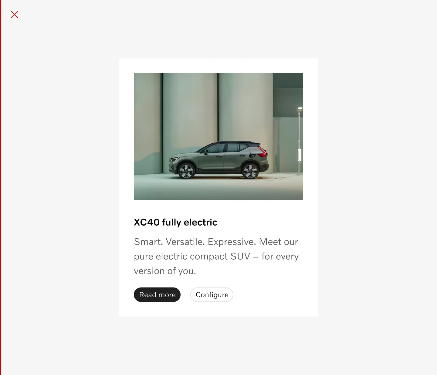
Don’t use the pill as a replacement for a button.