Pagination
Pagination Dots
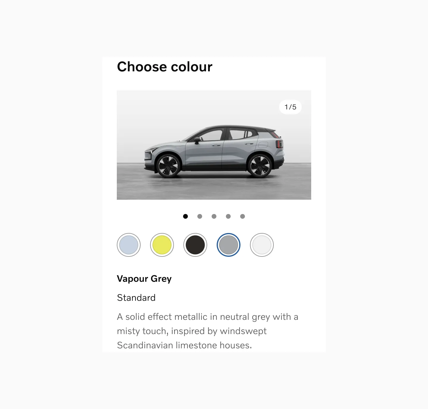
Section titled “Pagination Dots”Pagination Dots are a series of small indicator dots representing available pages, screens, or elements.
Anatomy
Section titled “Anatomy”
- Active page
- Inactive page
How to use
Section titled “How to use”Use Pagination Dots to represent movement between an ordered list of pages, screens, or elements. They indicate that multiple items are in a sequence, with the active item highlighted. Pagination Dots are only suitable if a single frame is visible or the obvious primary focus at a time, since each dot represents a single item.
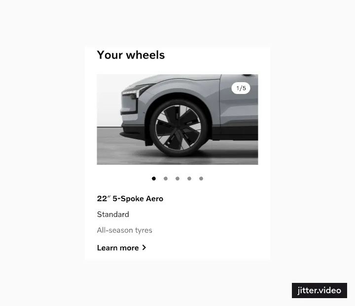
We recommend displaying a maximum of 5 dots, as this number is easy to count at a glance.
For elements with more than 7 pages, consider using a different navigation method that allows non-sequential movement. Prioritize the most important items to appear first.
Placement
Section titled “Placement”Position Pagination Dots at the bottom to ensure users always know where to find them.
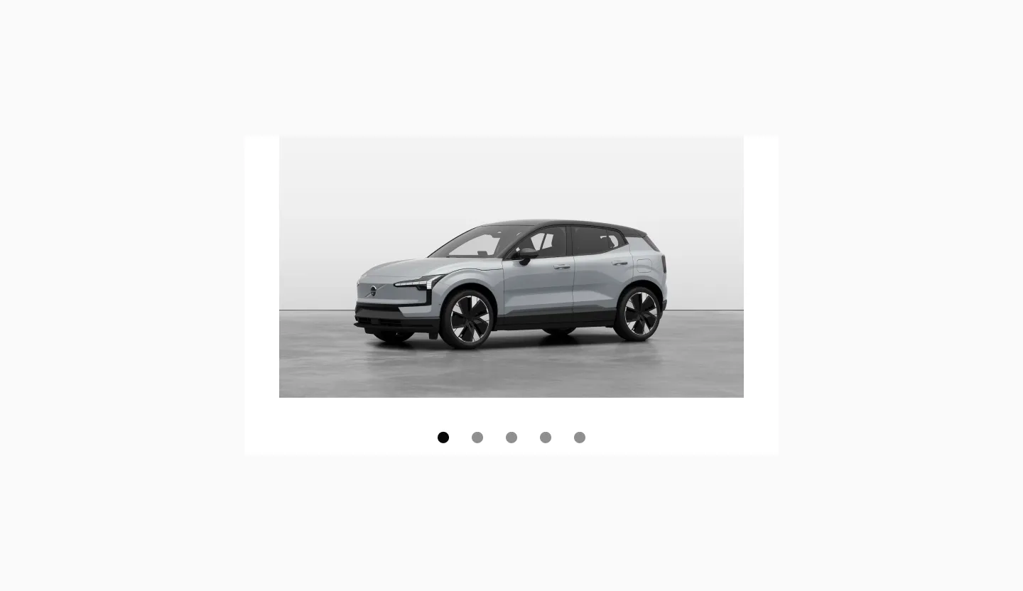
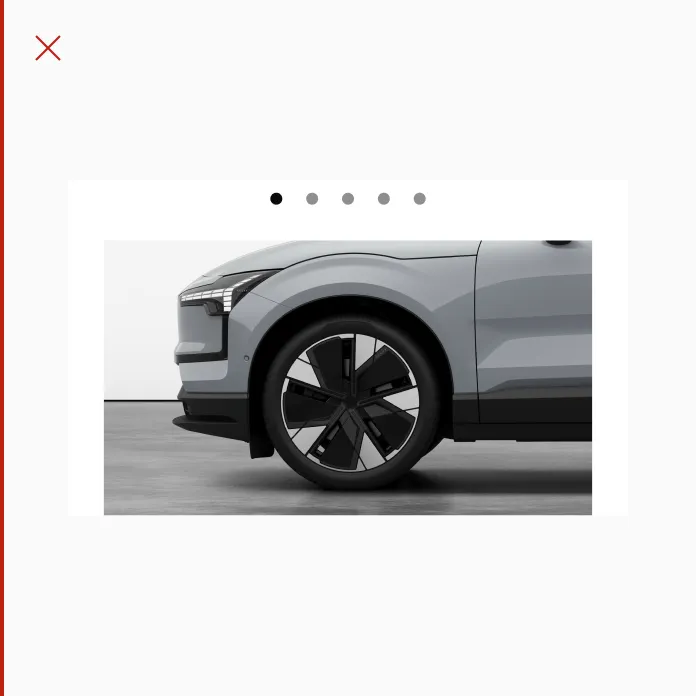
Displaying pagination dots below element in a slideshow.
Behaviour
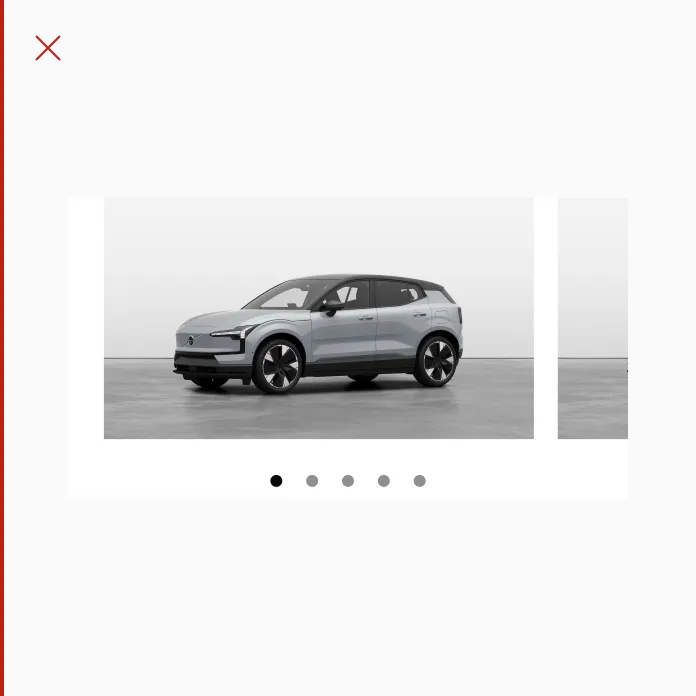
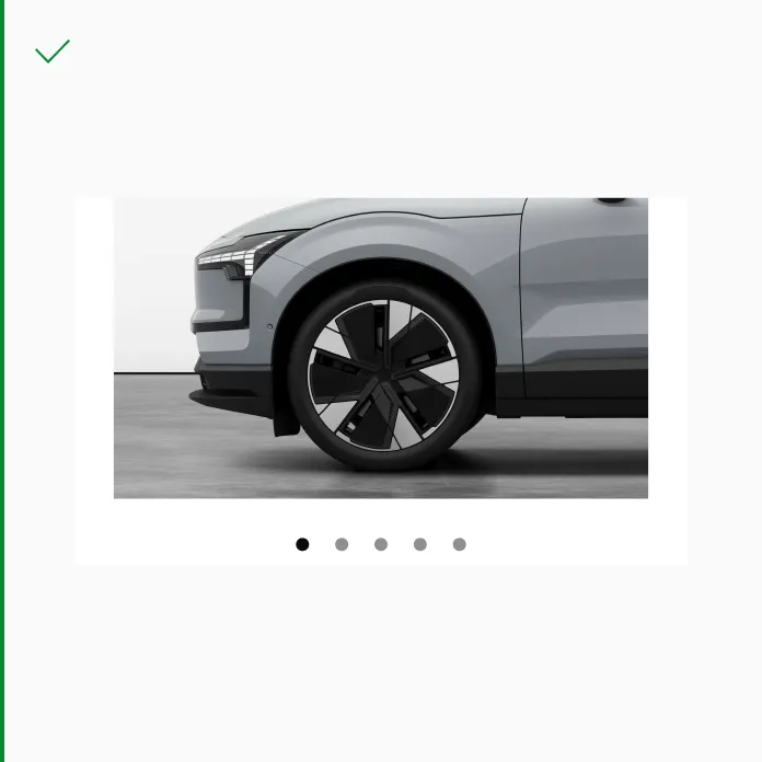
Section titled “Behaviour”Pagination dots can be clicked to navigate to the corresponding page in the set.
Pagination dots are also updated by swiping left or right on mobile devices or using scroll buttons on larger screens. The dots highlight the current page, allowing users to easily track their position within the content.
Displaying animated pagination dots in a slideshow on the sm breakpoint.
States
Section titled “States”Default
Section titled “Default”
Displaying selected and unselected dots in the default state.

Displaying selected and unselected dots in the hover state.
Pressed
Section titled “Pressed”
Displaying selected and unselected dots in the pressed state.
Spacing
Section titled “Spacing”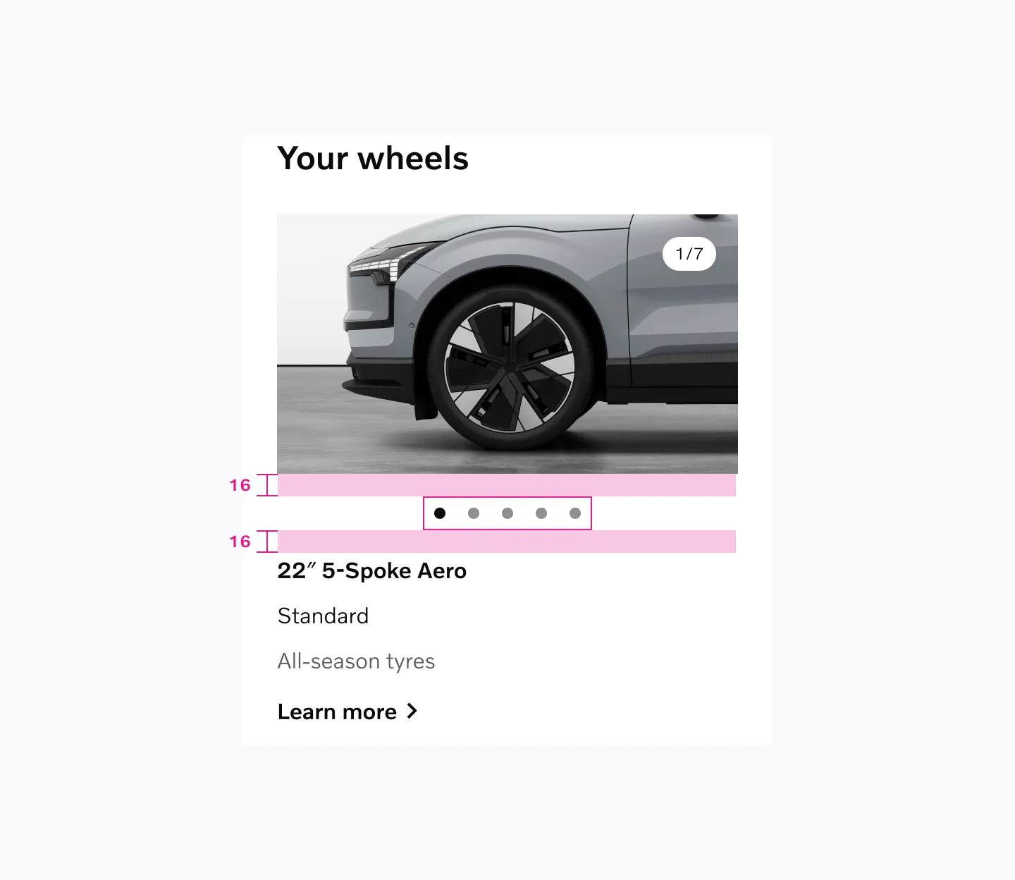
Top or bottom margins are adjusted depending on surrounding content. We recommend to use minimum 8px spacer.
Color mode
Section titled “Color mode”Light mode
Section titled “Light mode”
Displaying pagination dots in light mode.
Dark mode
Section titled “Dark mode”
Displaying pagination dots in dark mode.
Touch area
Section titled “Touch area”
Pagination dots is using 24px touch area.
Examples
Section titled “Examples”
Pagination dots combined with numbers, displaying 5 pages.
Pagination dots combined with numbers, displaying 5 pages.
Considerations
Section titled “Considerations”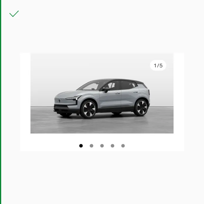
Use pagination dots when there are no peeking elements.
Don’t use pagination dots if there are peeking elements. The peeking element already signifies to the user that the list is scrollable.
Do position pagination dots at the bottom of an element to ensure users always know where to find them.
Avoid positioning pagination dots at the top of an element.