Links
Links are used to trigger actions. They communicate calls to action and allow users to interact with pages and functions in a variety of ways.
Anatomy
Section titled “Anatomy”Link inline
Section titled “Link inline”
-
Label
-
Underline
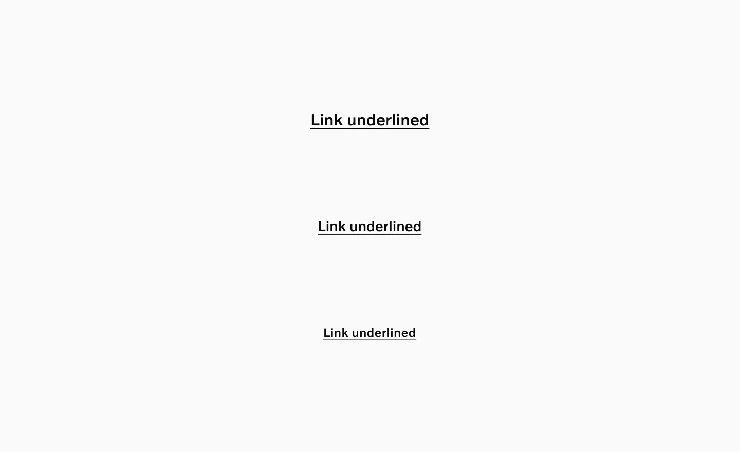
Link underlined
Section titled “Link underlined”
-
Label
-
Underline
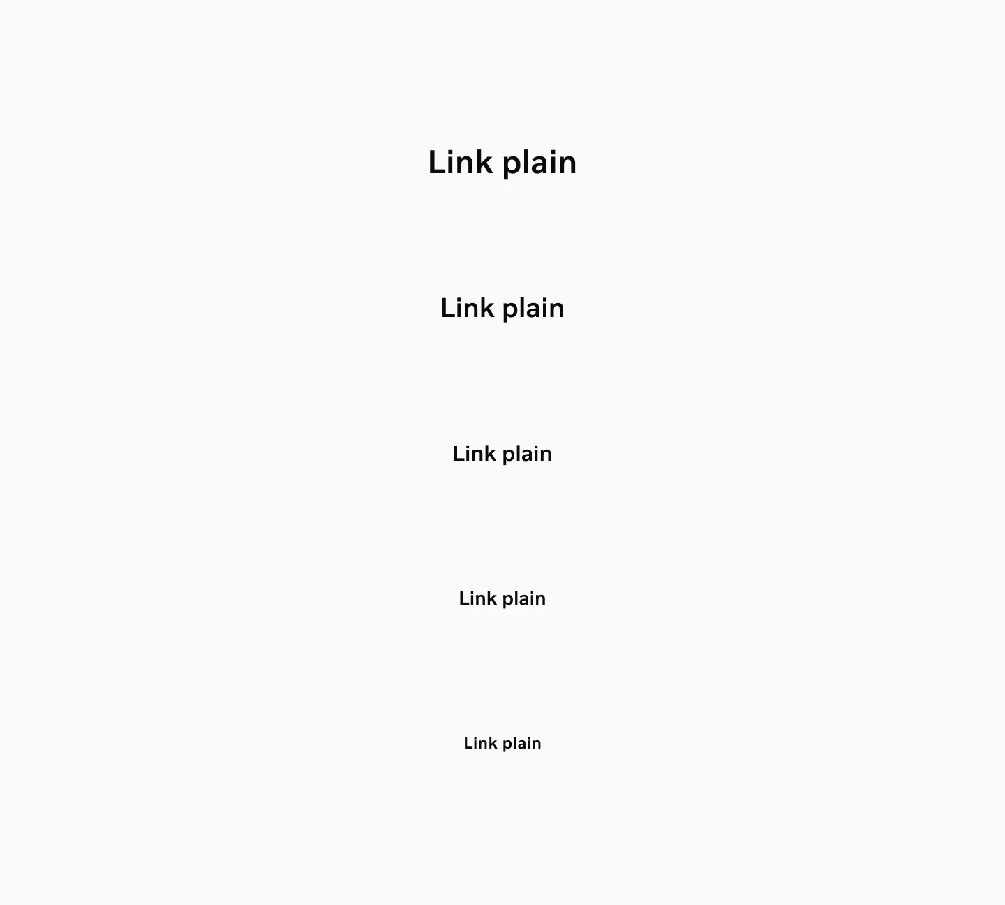
Link plain
Section titled “Link plain”
-
Label
-
Underline on hover
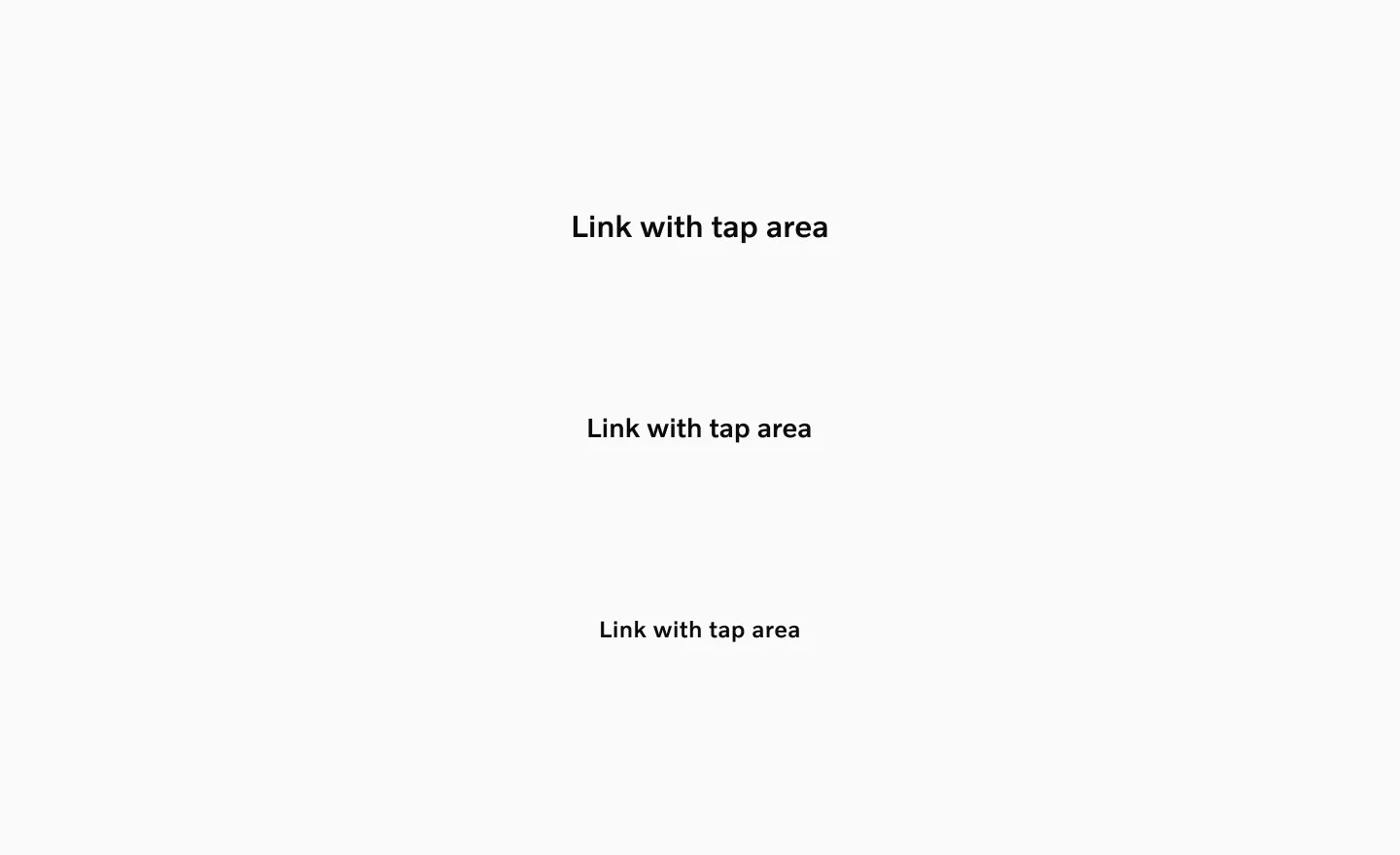
Link with tap area
Section titled “Link with tap area”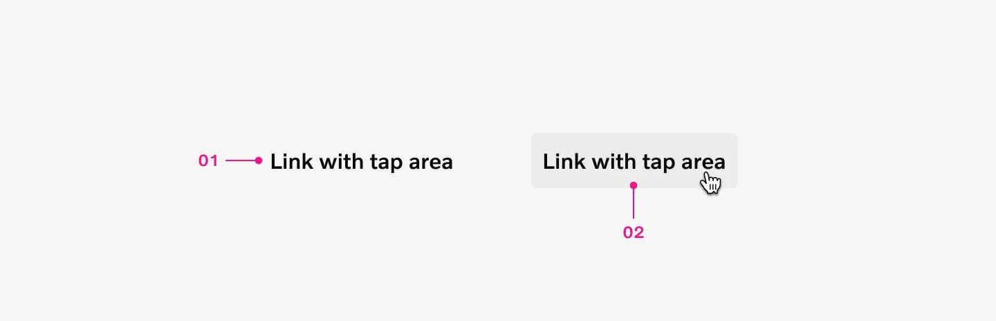
-
Label
-
Fill on hover
How to use
Section titled “How to use”Use links for navigation between different pages, different sections within a page, or external pages. They serve as a less emphasized alternative to buttons, particularly for page navigation actions. Underlined links clearly signal to users that an element is interactive and navigable.
Link inline
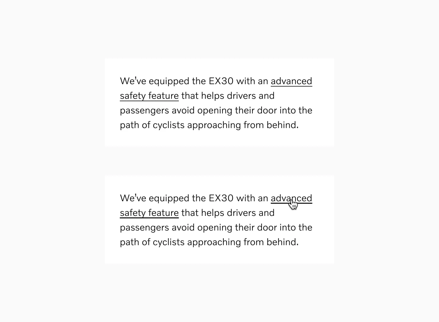
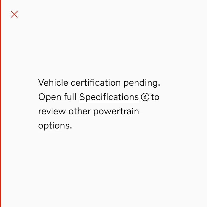
Section titled “Link inline”Link inline are used in sentences or paragraphs of text.
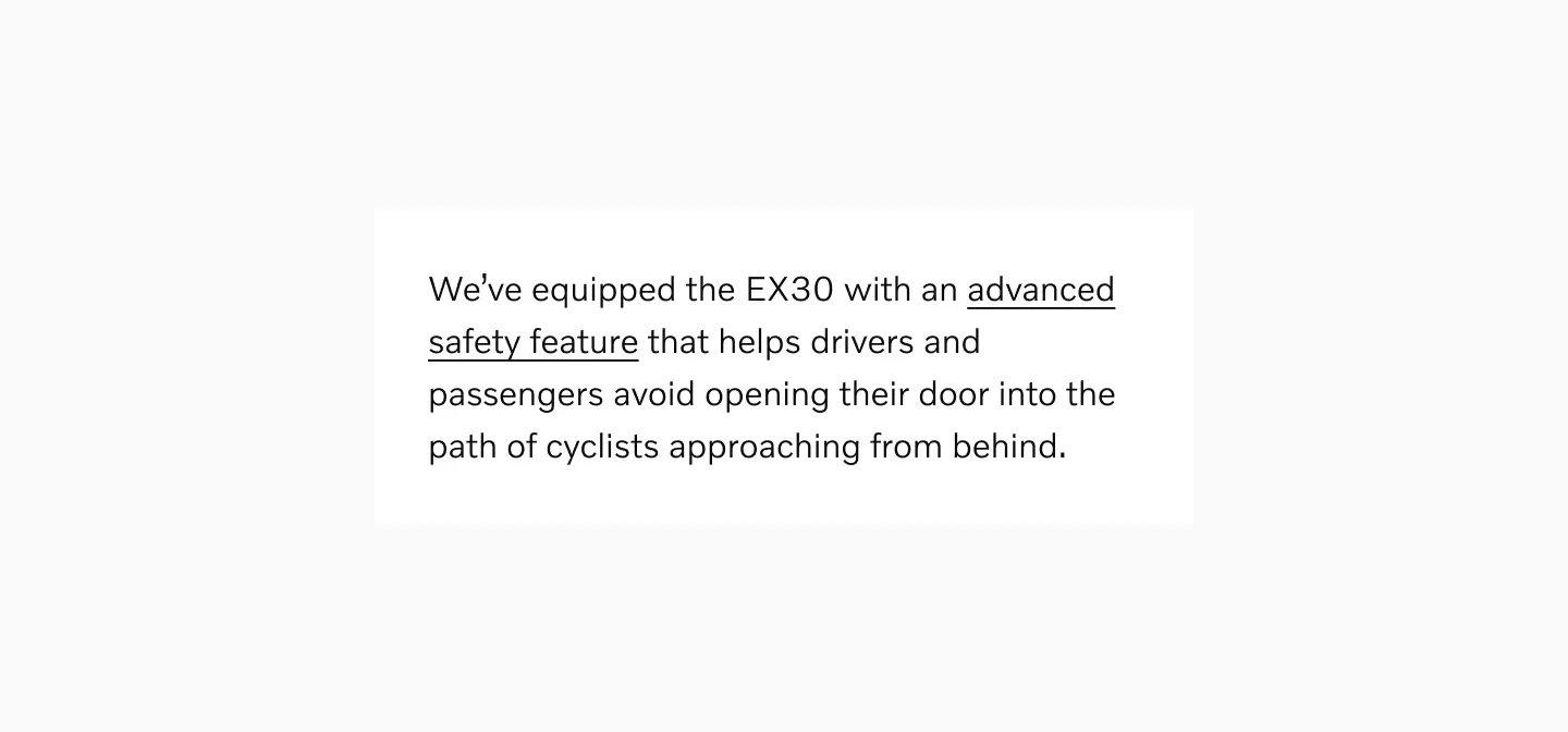
Displaying link inline in a paragraph text.
Considerations
Section titled “Considerations”Link inline are not available as separate component in Figma. These could instead be represented by applying text styles.
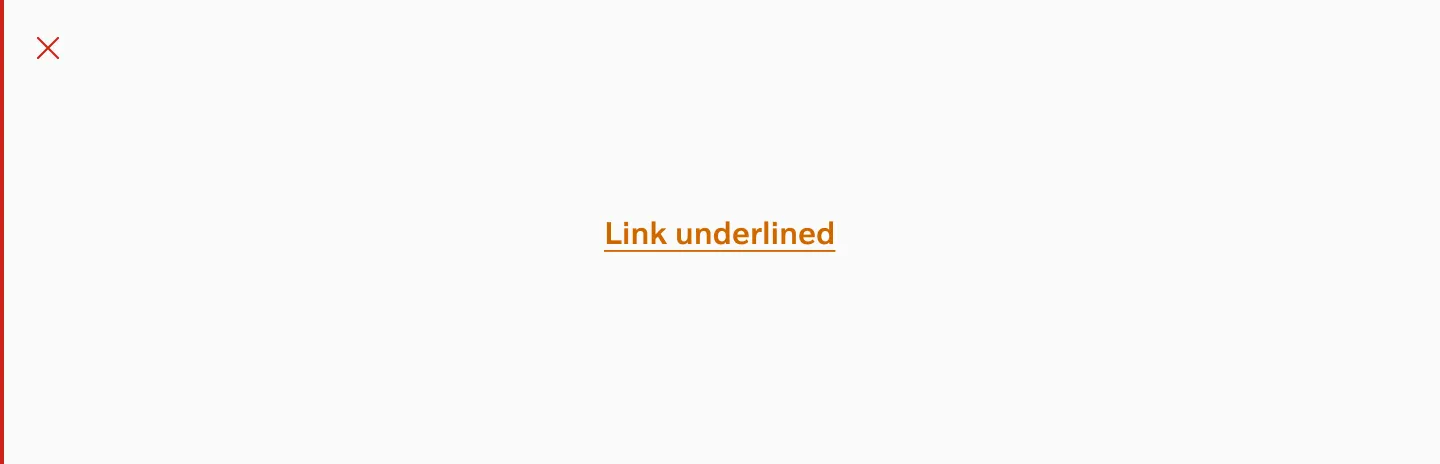
Link underlined
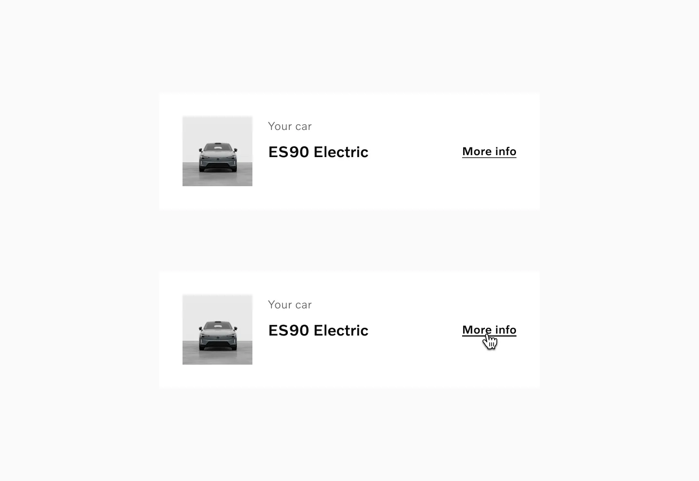
Section titled “Link underlined”Link underlined are used when buttons would otherwise be too prominent. It could also be used as a more lightweight alternative that takes up less space.
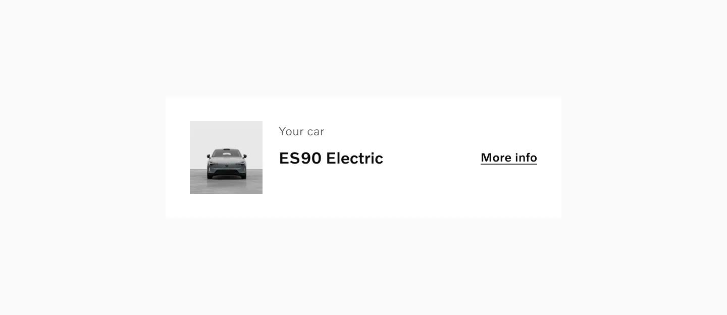
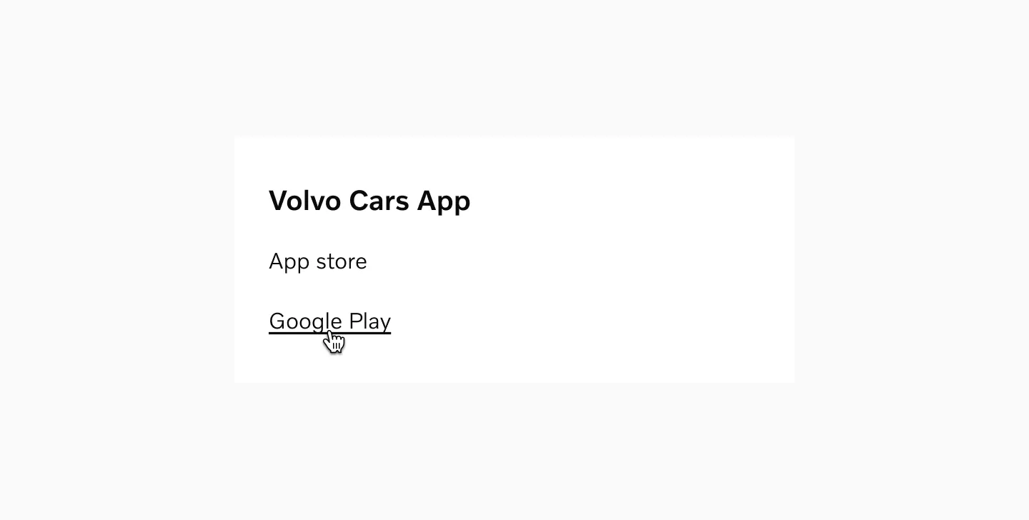
Displaying link underlined in a card.
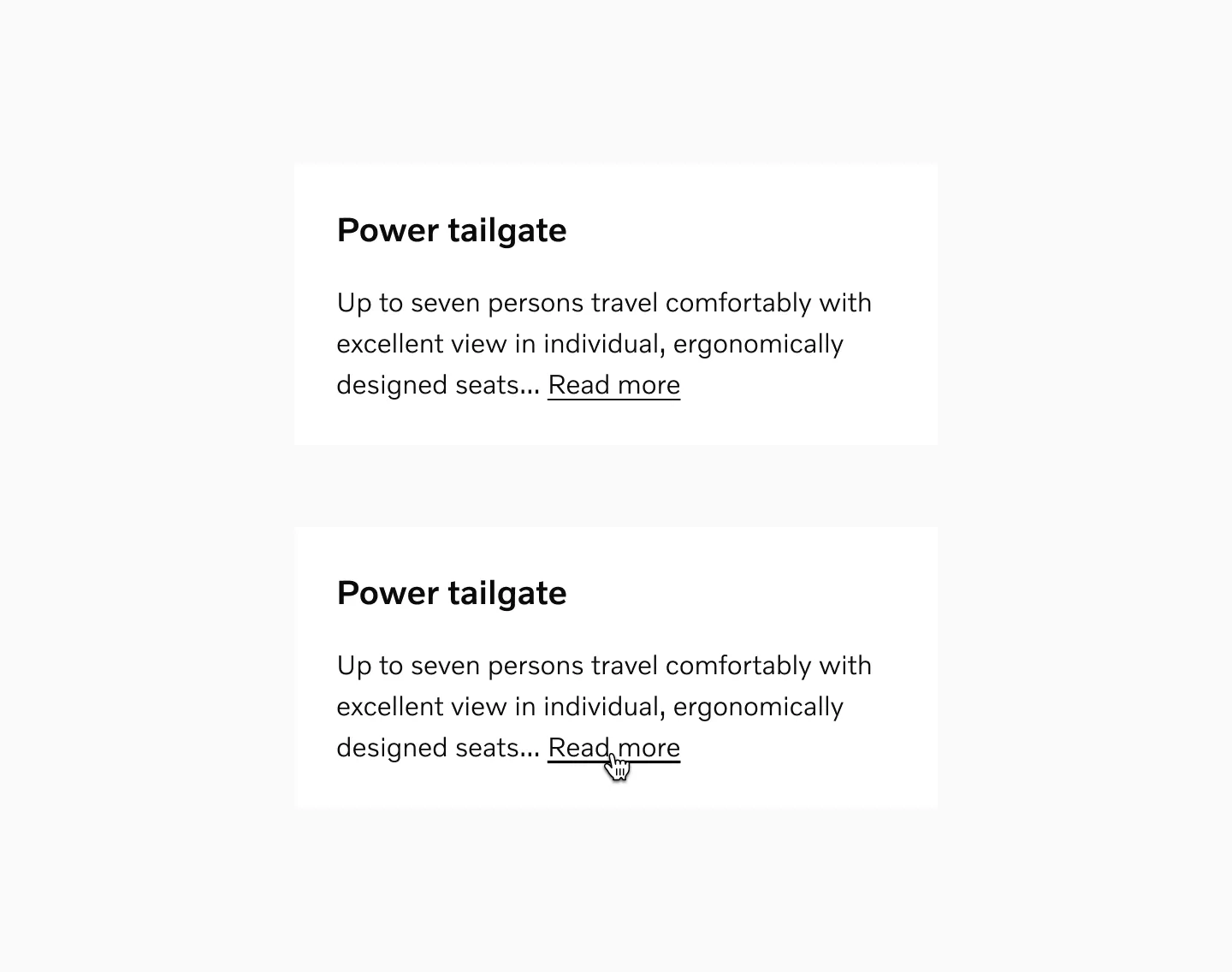
Link plain
Section titled “Link plain”Link plain are not underlined by default. They should only be used when the context makes it clear that it’s interactive, such as in a list of links in a navigation.
Link plain are similar to Button text but allow the text to wrap and doesn’t have icons by default.

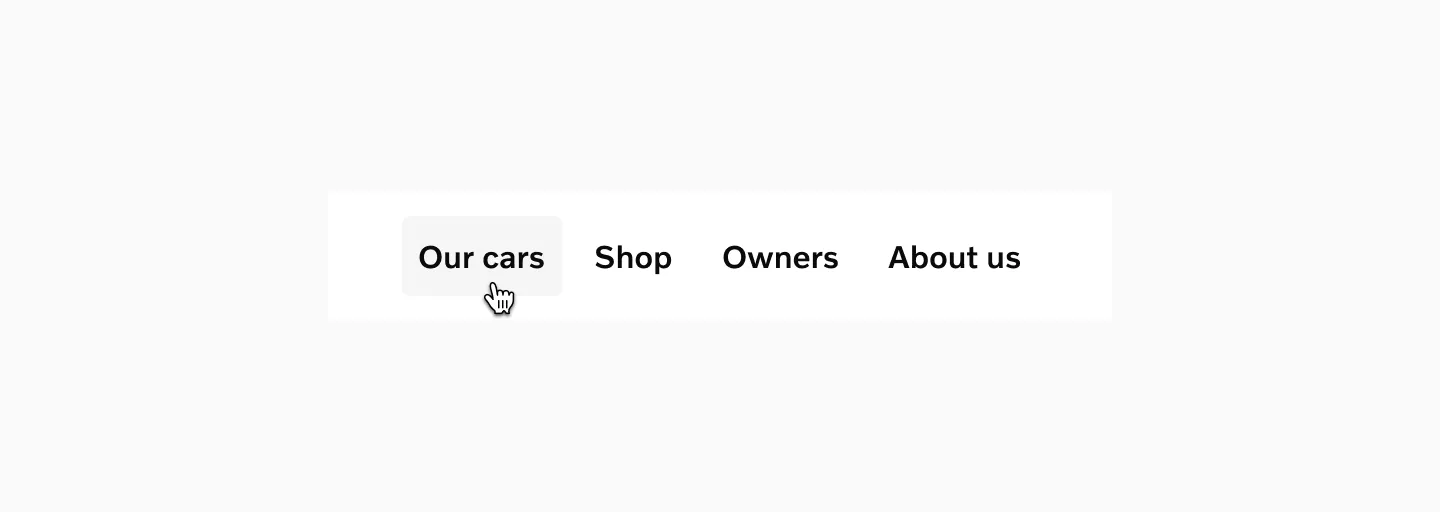
Displaying link plain in navigation with one link in its hover state.
Link with tap area
Section titled “Link with tap area”Link with tap area can be used for navigational elements.

Displaying link with tap area in navigation with one link shown in its hover state.
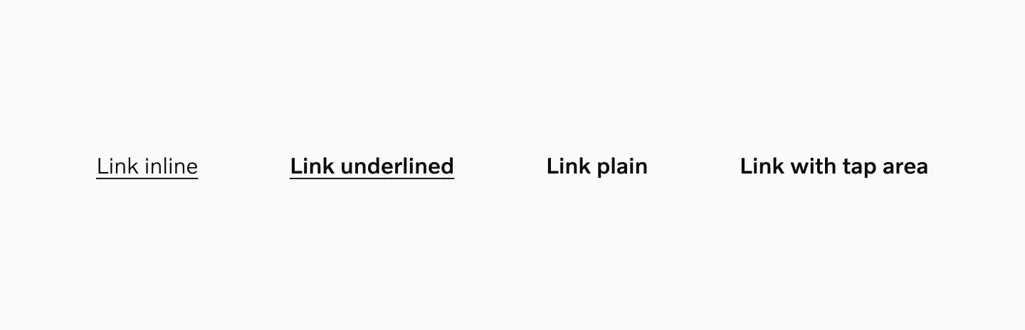
Variants
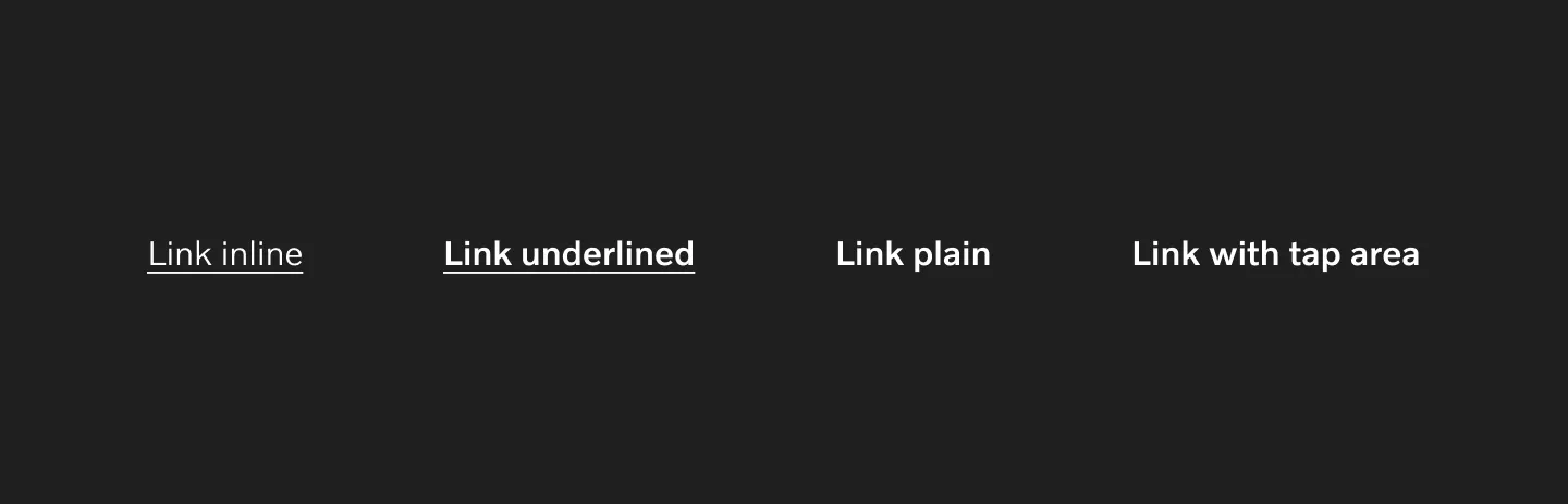
Section titled “Variants”Links comes in 4 variants.
-
Link inline (Represented as a style in Figma)
-
Link underlined
-
Link plain
-
Link with tap area
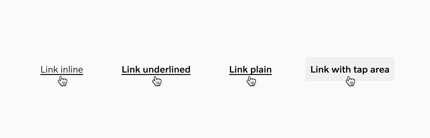
Link inline
Section titled “Link inline”Link Inline is the default link variant within paragraphs or sentences of text. It should not be used outside of a main body of text.
Example: Link inline in paragraph texts. Showing default and hover states.
Example: Link inline in paragraph texts. Showing default and hover states.
Link underlined
Section titled “Link underlined”Link Underlined is used when a button would otherwise be too prominent, heavy, or take up too much space. It may be grouped with other Link Underlined or stand on its own.
Example: Model card with Link underlined showing its default and hover states.
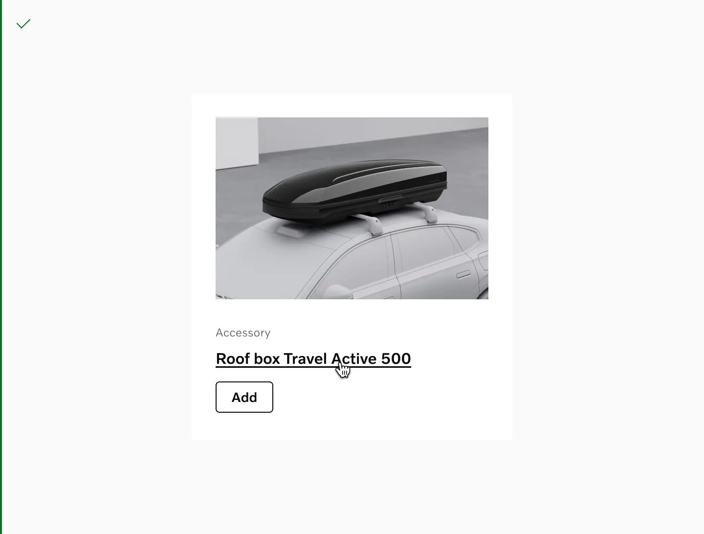
Link plain
Section titled “Link plain”Link Plain is the least prominent link variant as it is not underlined by default. It’s similar to Button Text but allows wrapping of longer link labels. Since there’s almost no indication that these are interactive, it is very important that these are only used in contexts where it is otherwise clear that these are interactive.
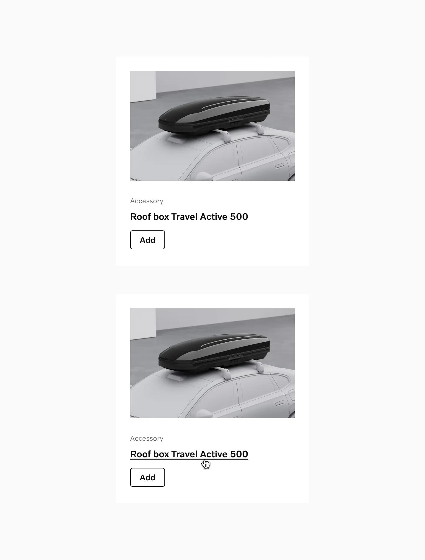
Example: Link plain used as a header in an accessory card.
Example: Link plain used in navigation as title showing hover state.
Example: Link plain used in navigation showing hover state.
Considerations
Section titled “Considerations”-
Link plain should only be used when the context makes it otherwise clear that it’s interactive, such as in a list of links in a navigation, or when a more prominent Link or Button variant in close proximity leads to the same action.
-
Link plain doesn’t include icons.
Link with tap area
Section titled “Link with tap area”Link with tap area are used for navigation links.
Example: Link with tap area used in a top navigation bar.
Link underlined
Section titled “Link underlined”Link underline comes in 3 sizes.
Sizes: 16pt, 14pt, 12pt
Link plain
Section titled “Link plain”Link plain comes in 5 sizes.
Sizes: 24pt, 20pt, 16pt, 14pt, 12pt
Link with tap area
Section titled “Link with tap area”Link underline comes in 3 sizes.
Sizes: 16pt, 14pt, 12pt
States
Section titled “States”Default
Section titled “Default”This is the default state of a link when no user interaction is occurring, though the link remains available for interaction.
The hover state appears when users move their cursor over a link on non-touch devices. Links with an underline on hover display a more prominent line beneath the text.
Considerations
Section titled “Considerations”- The text color never changes on hover, ensuring an appropriate text contrast regardless of the state of the link.
Pressed
Section titled “Pressed”The pressed state communicates a user click, tap, or press. On touch devices the pressed state is identical to the hover state described above.

Disabled
Section titled “Disabled”A link in a disabled state shows that an action exists, but is not available at the moment. This state can be used to maintain layout continuity and to communicate that an action might become available at a later time.
Disabled state is not available for inline links.
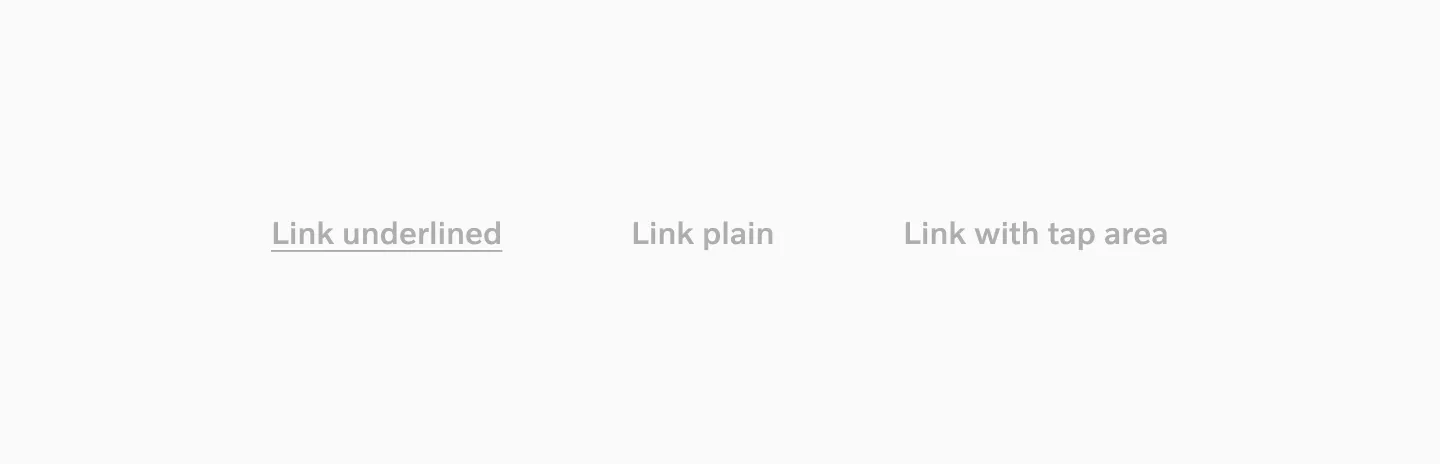
Target size
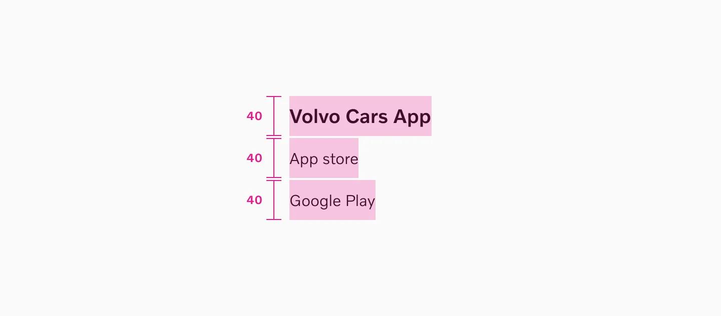
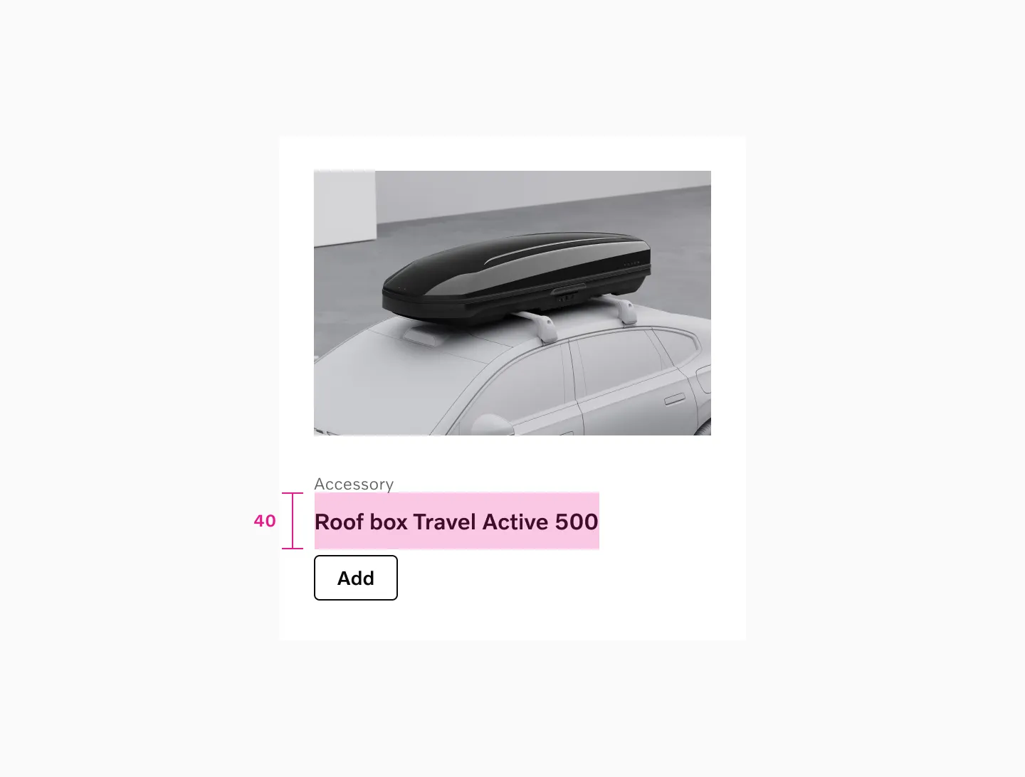
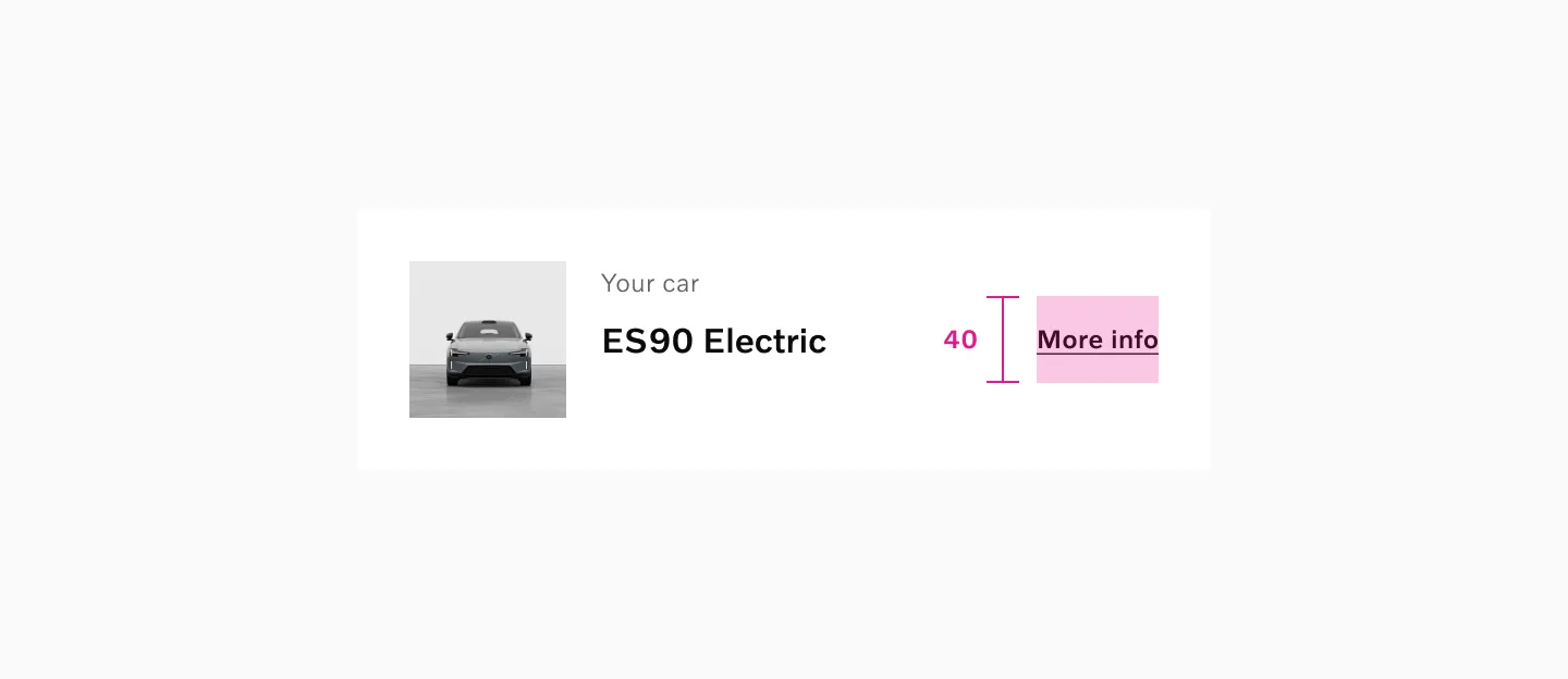
Section titled “Target size”Plain links and underlined links get a 40px target size. Make sure not to overlap the links’ target size areas.
Example: Link plain in navigation.
Example: Link plain in a model card.
Example: Link underlined inside a card.
Color mode
Section titled “Color mode”
Showing: Link inline, Link underlined, Link plain and Link with tap area in the light color mode.
Showing: Link inline, Link underlined, Link plain and Link with tap area in the dark color mode.
Considerations
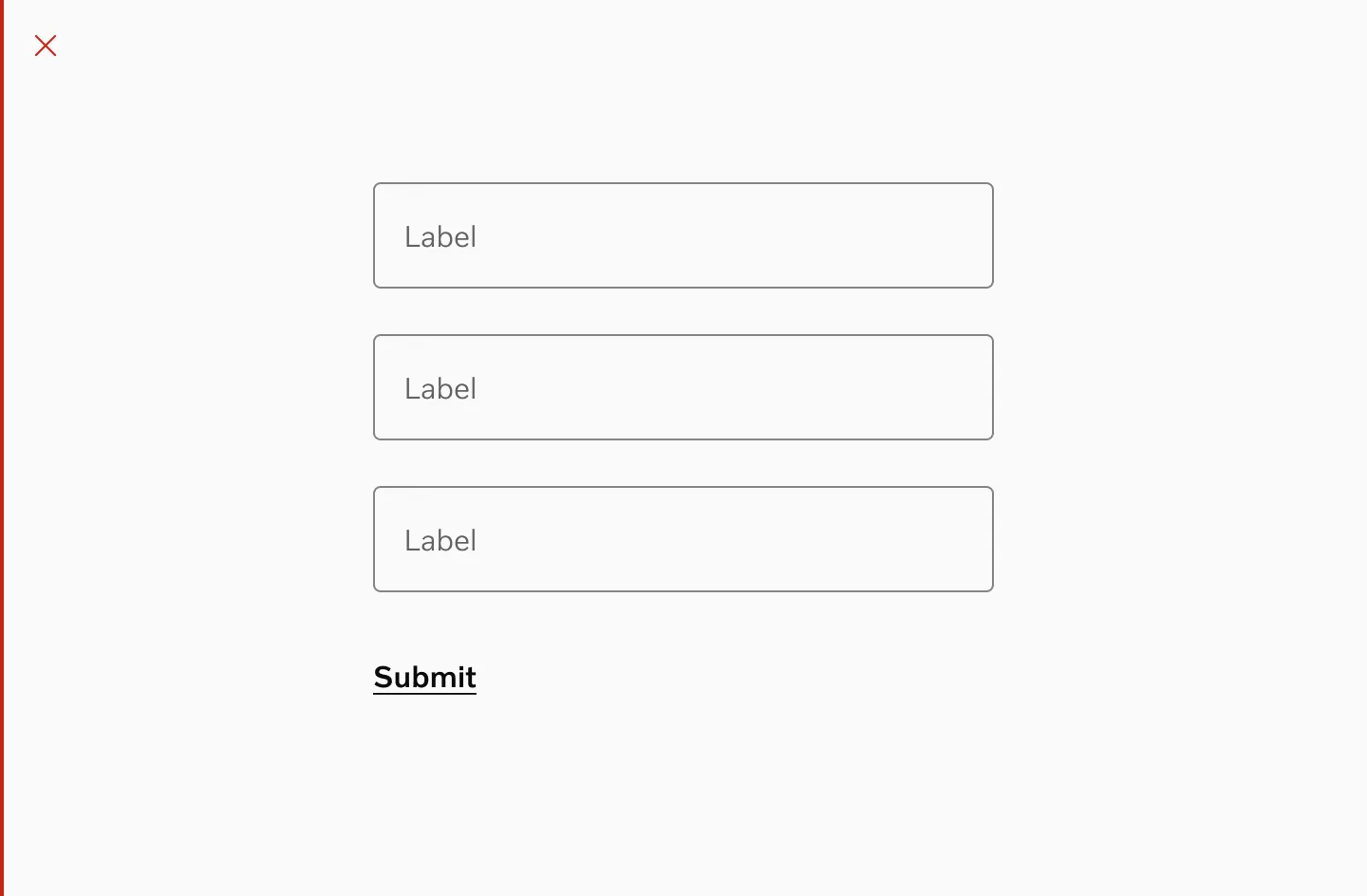
Section titled “Considerations”Submit button
Section titled “Submit button”Links should not be used to submit a form.
Underlined text
Section titled “Underlined text”Never underline texts that are not meant to be used as links.
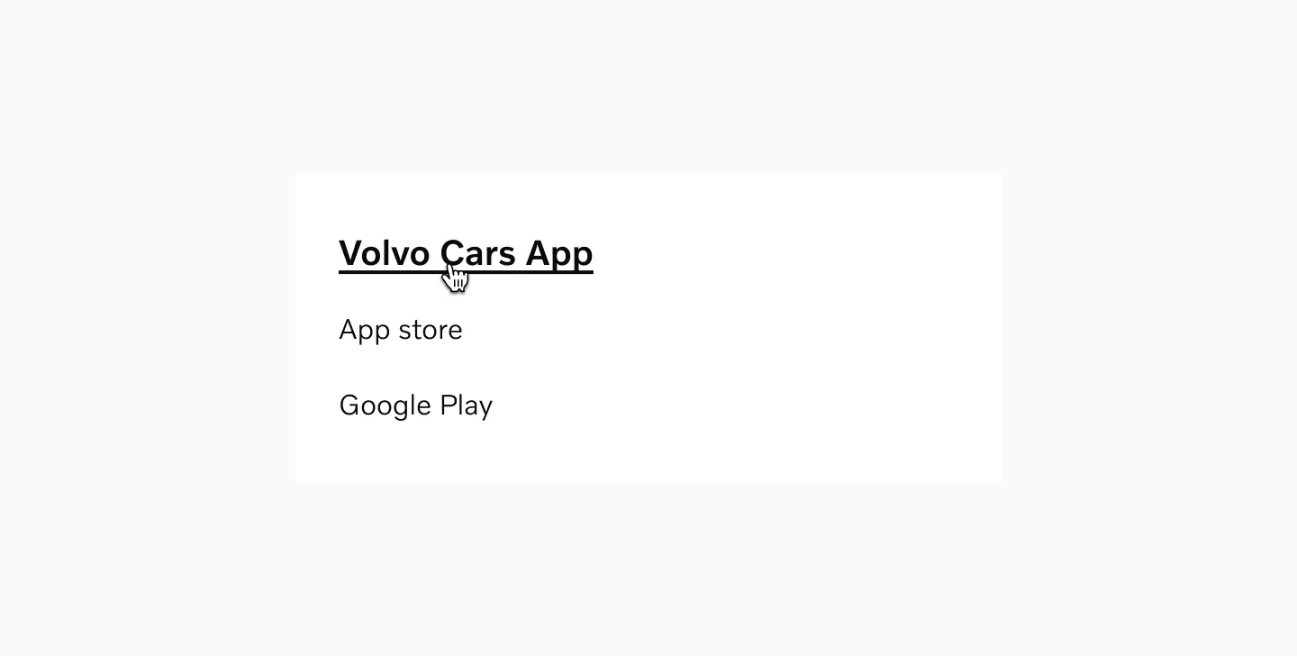
Headline link
Section titled “Headline link”Link plain can be used for headlines.
Do not override color
Section titled “Do not override color”Do not use custom colors for links. The colors of different link variations have been designed to be consistent and accessible.
Don’t combine icons with inline link
Section titled “Don’t combine icons with inline link”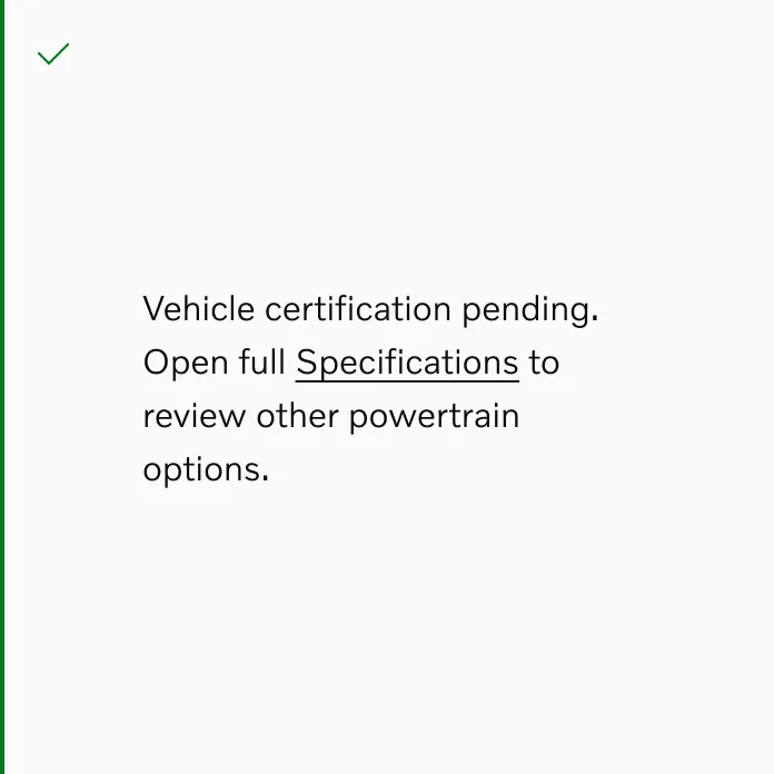
Do
Don’t
Storybook
Section titled “Storybook”https://developer.volvocars.com/design-system/web/?path=/docs/components-link—docs