Input Fields
Our input fields follow HTML browser defaults, with variants available for different use cases like currency input, password input, and more.
Anatomy
Section titled “Anatomy”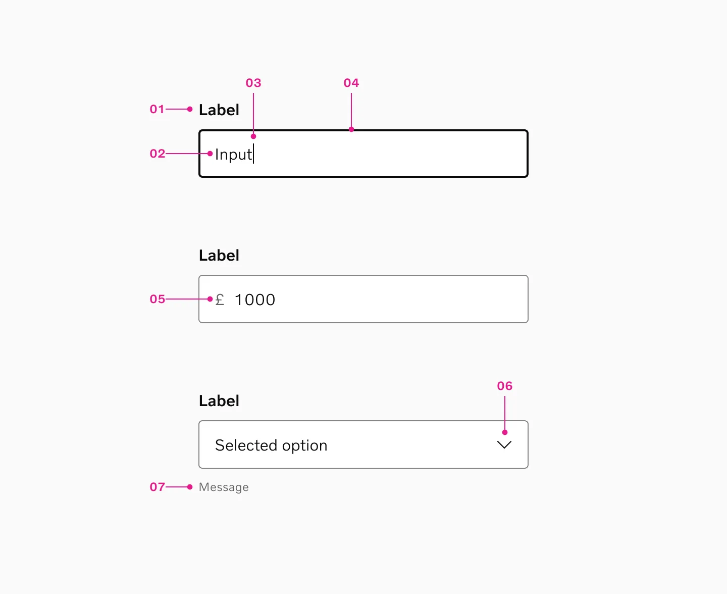
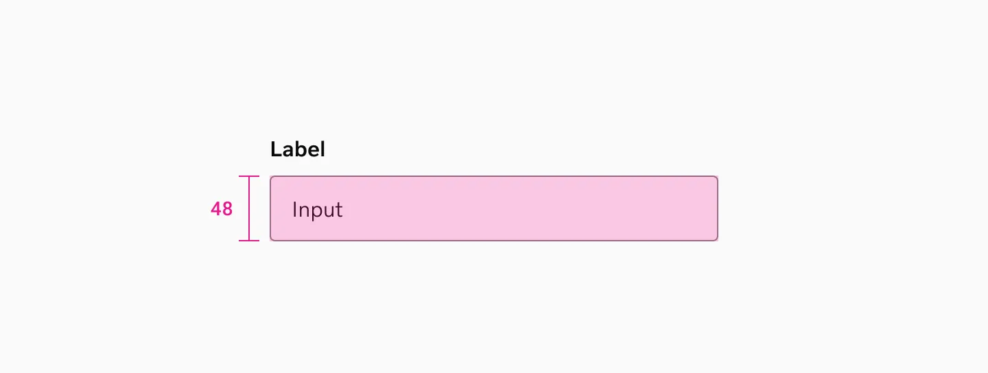
- Label - Indicates what the user should enter. Can be rendered directly by the component or supplied separately.
- Input / Placeholder Texts - The text-entry or selection area (for text input, select menus, etc.).
- Cursor - When the input field is in focus, the cursor blinks to indicate that the user can type.
- Container - The overall wrapper with a visible stroke or outline. Its appearance changes based on the current state.
- Slot before (optional) - Typically holds non-interactive icons or short prefixes (e.g., currency symbol).
- Slot after (optional) - Typically used for interactive icons (e.g., toggles, clear buttons) or short suffixes.
- Form Message (optional) - Displays an additional hint text (often very technical or contextual) below the input.
We offer 2 variants of input fields. Top label and floating label. Input fields with top labels are recommended in most cases.
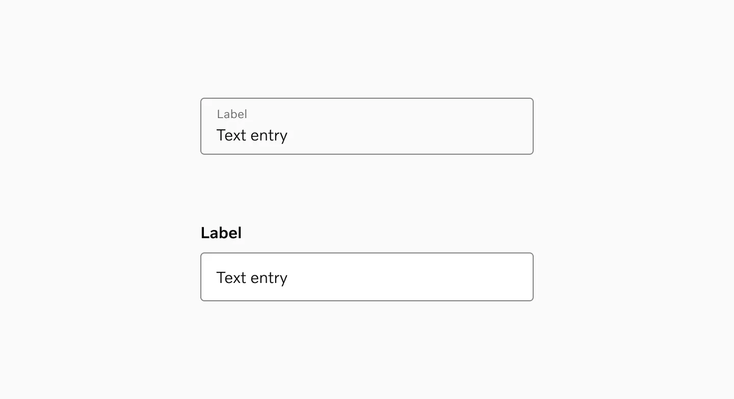
Showing examples of input fields with both floating labels and top labels.
Top label inputs
Section titled “Top label inputs”Prefer input fields with top labels, as they provide the following benefits:
- Improves scan-ability and readability of labels
- Allows for more input types with prefixes (e.g. Currency) as well as suffixes
- Enables designs with larger labels and descriptions in conversational forms or focused tasks
- Reduces confusion between what’s a label and what’s placeholder text
- Supports narrower input fields when appropriate (e.g., postal codes)
- Allows making inputs and buttons the same height for placement side-by-side
- Handles longer (translated) labels better, reducing bugs
- Reduces the risk of browser- and browser-extension specific issues and bugs
Floating label
Section titled “Floating label”Use floating label inputs sparingly, as they offer limited advantages compared to top labels. However, they can be helpful when:
- Helps conserve vertical space in compact layouts
- Fits better in narrow UI components such as sidebars or filter panels
Standard HTML behavior
Section titled “Standard HTML behavior”By default, these inputs leverage native HTML attributes and behaviors wherever possible (e.g., browser autofill, date pickers, validation).
If you need custom multi-select dropdown, advanced search filters, or special behaviors, you can create a custom input variant.
Labels
Section titled “Labels”There should always be an associated label that is programmatically tied to each input field. Screen readers rely on these labels to announce the field’s purpose.
Placeholders
Section titled “Placeholders”Avoid placeholders unless absolutely necessary. They often reduce accessibility (screen readers or visually impaired users may miss them), and they disappear once the user starts typing.
Components
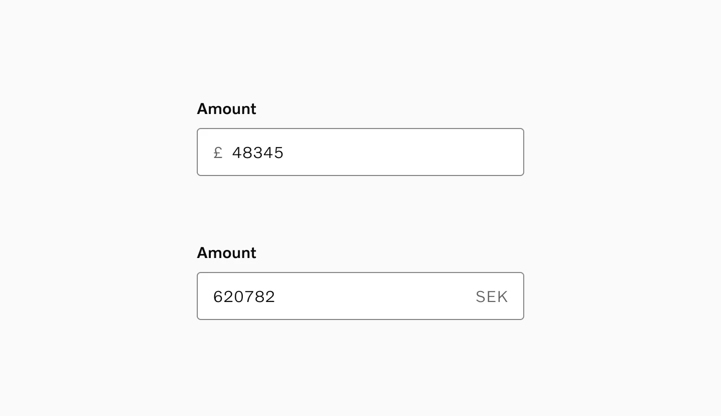
Section titled “Components”Currency Input
Section titled “Currency Input”Currency inputs handle monetary values by displaying the currency symbol or code as a prefix or suffix.
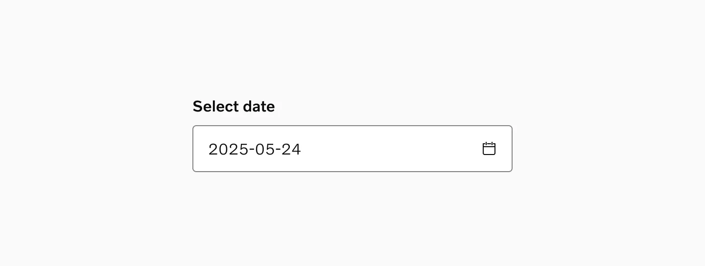
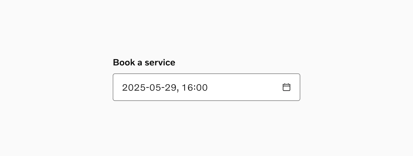
Date Input
Section titled “Date Input”Allows users to select a date from the native calendar dropdown. Use this when users need to see the calendar context.
Date Time Input
Section titled “Date Time Input”Allows users to select a date and time from the native calendar dropdown. Use this when it’s important to capture both date and time.
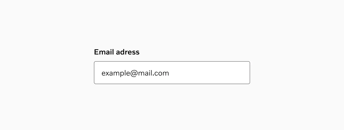
Email Input
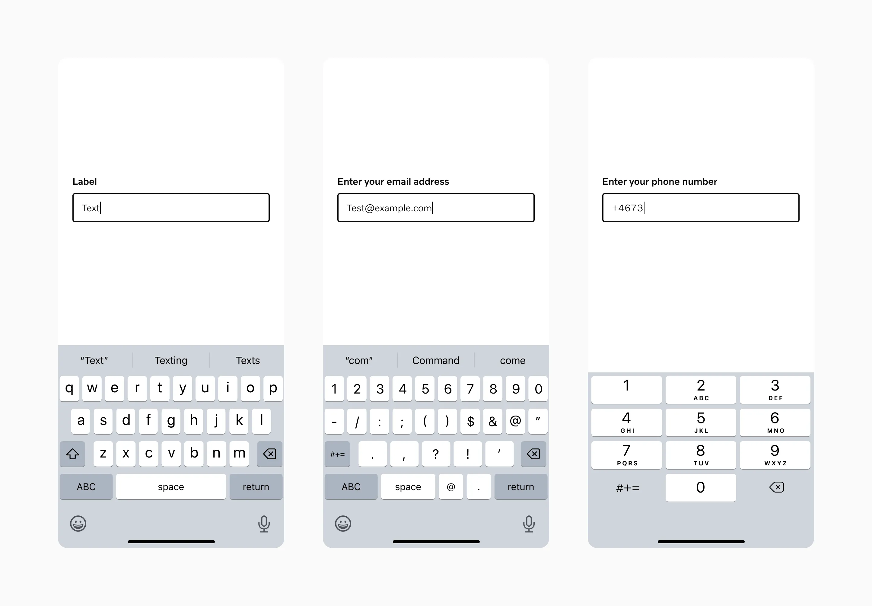
Section titled “Email Input”Email input should be used whenever the user needs to enter an email address. While it appears identical to a text input, it triggers email-specific keyboard layouts on mobile devices.
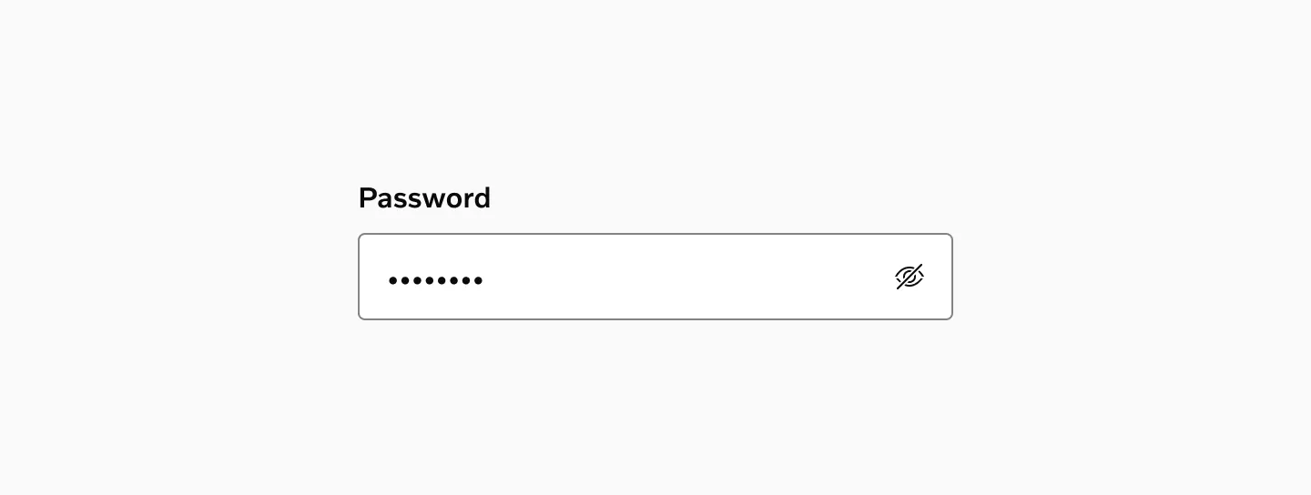
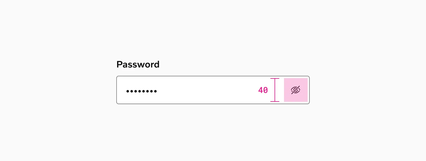
Password Input
Section titled “Password Input”Password input should be used when a user needs to enter a password. It provides functionality to show/hide the password.
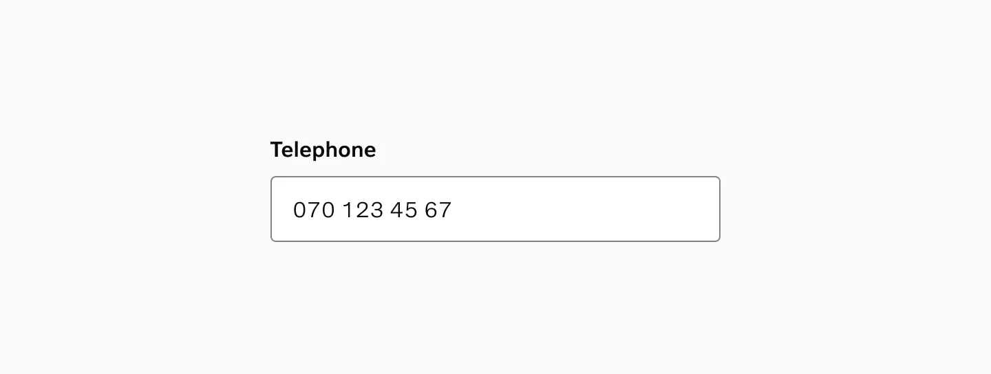
Tel Input
Section titled “Tel Input”Tel input should be used when users need to enter a phone number. While it appears identical to a Text input, it triggers numeric keyboard layouts on mobile devices.
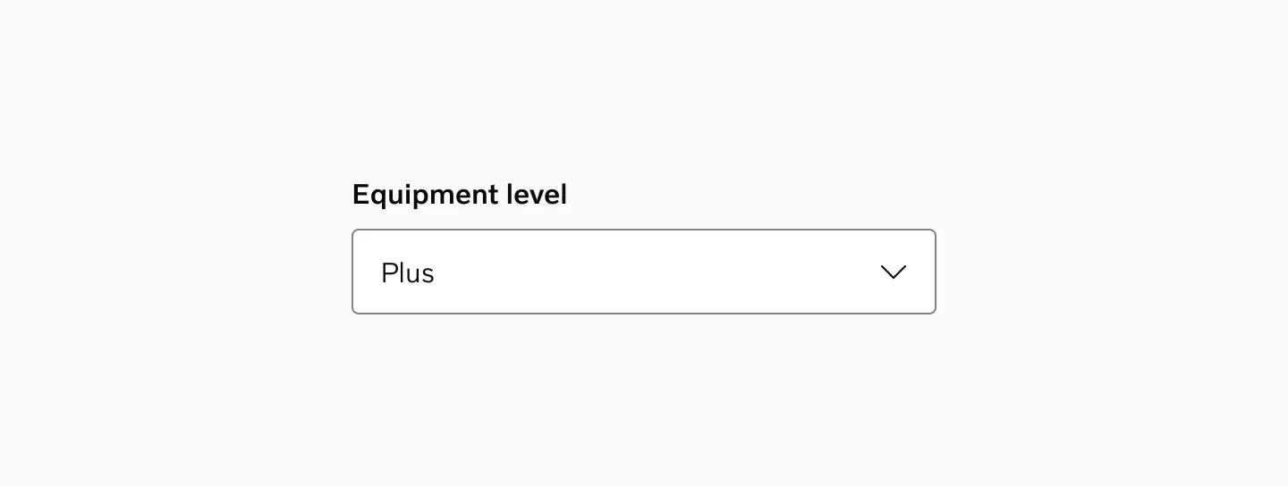
Select
Section titled “Select”Select allows users to choose one option from a predefined list containing three or more choices. For fewer options, consider using radio buttons instead.
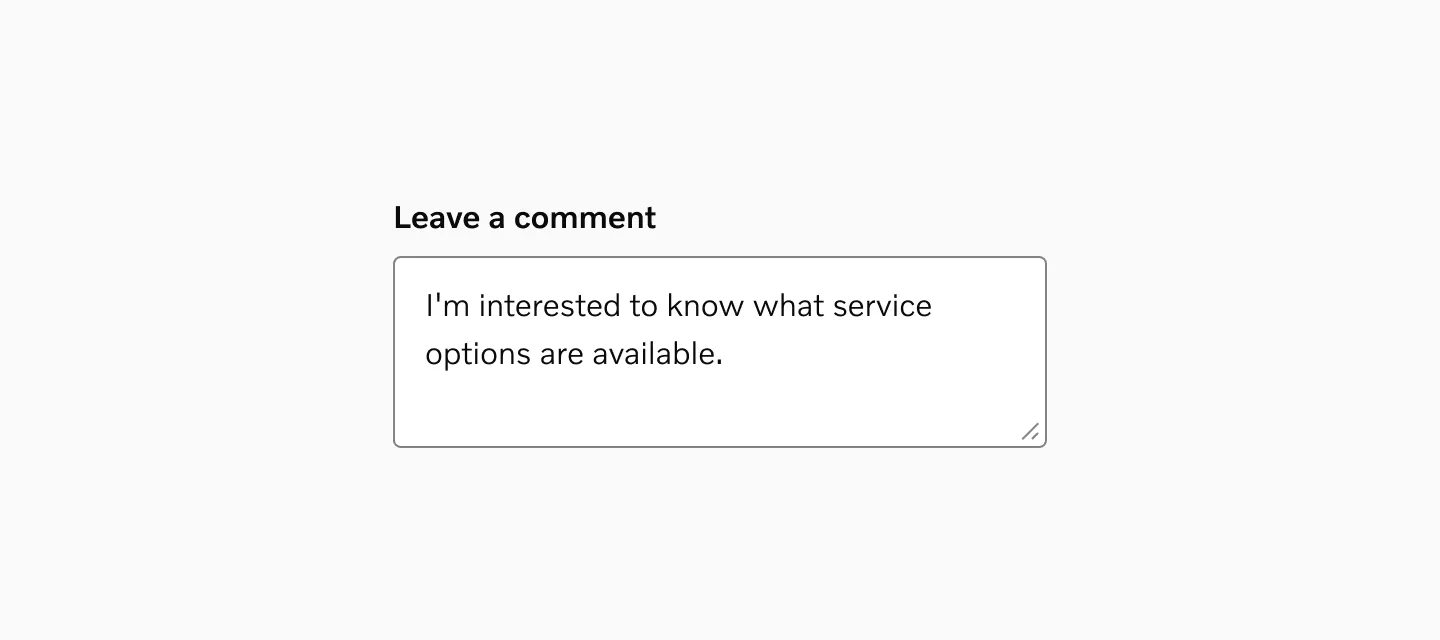
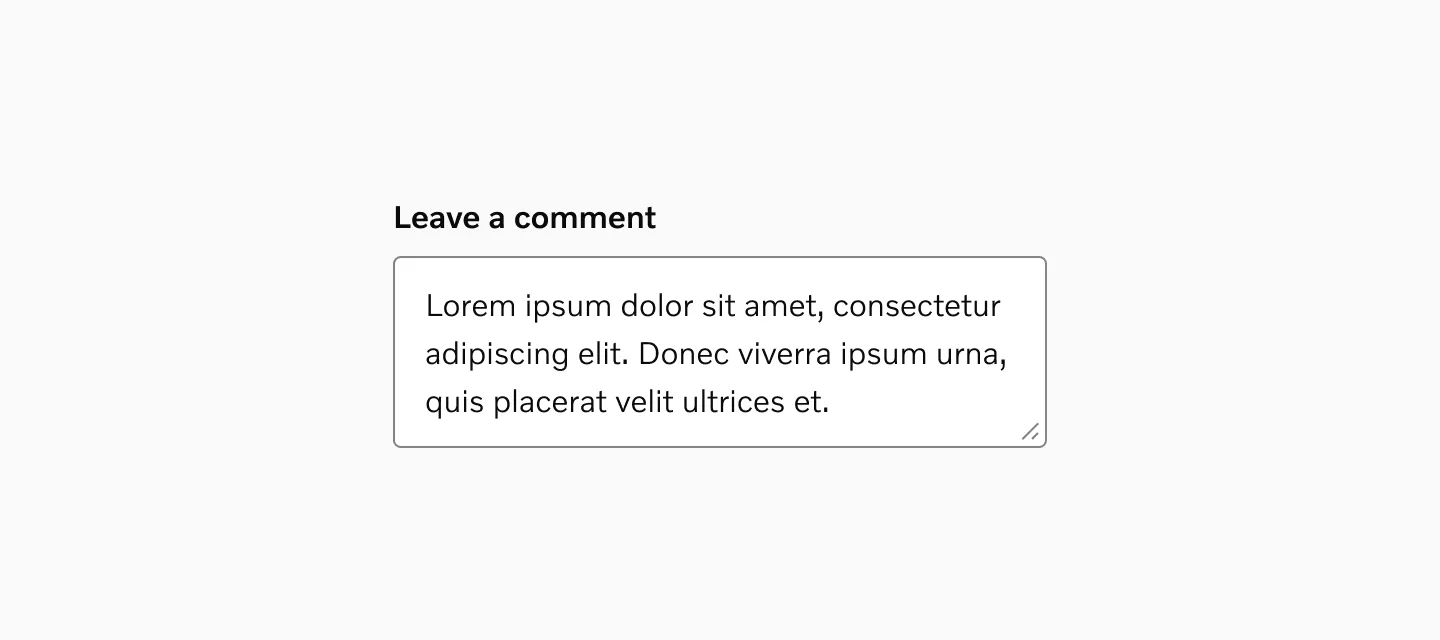
Text Area
Section titled “Text Area”Text area provides a multi-line text input field that expands vertically to accommodate longer content.
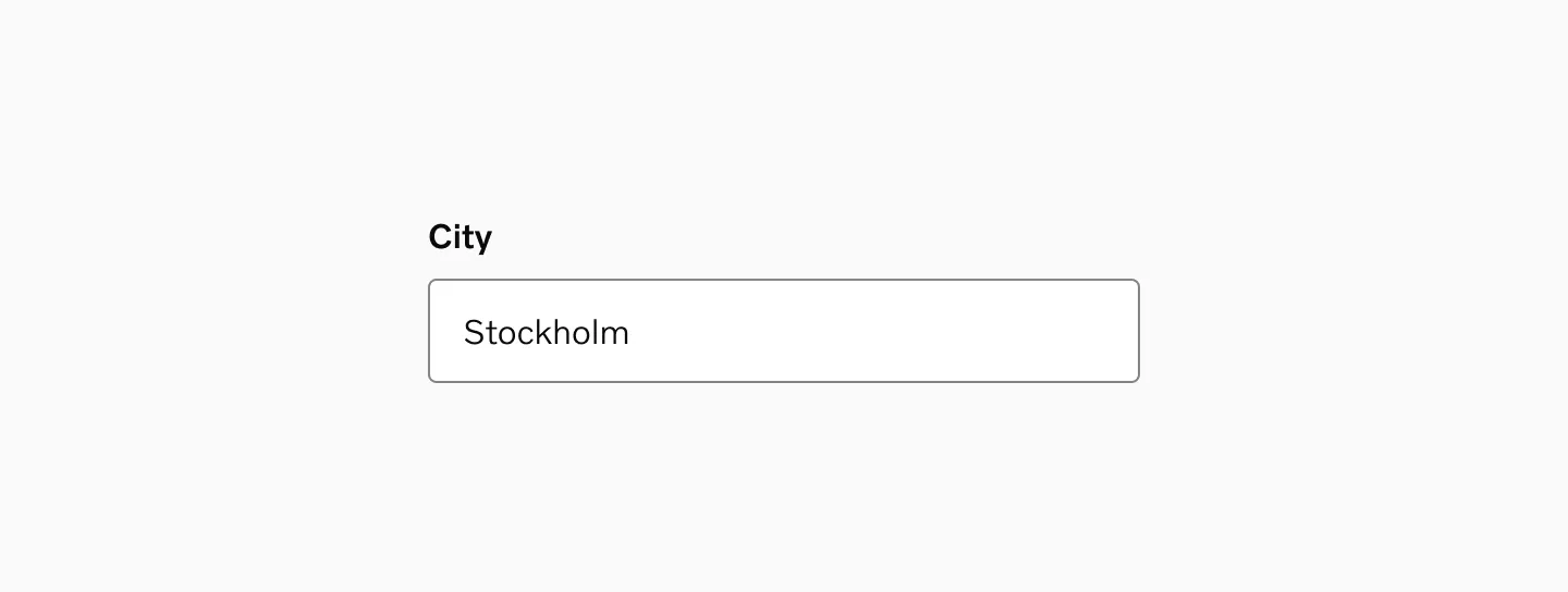
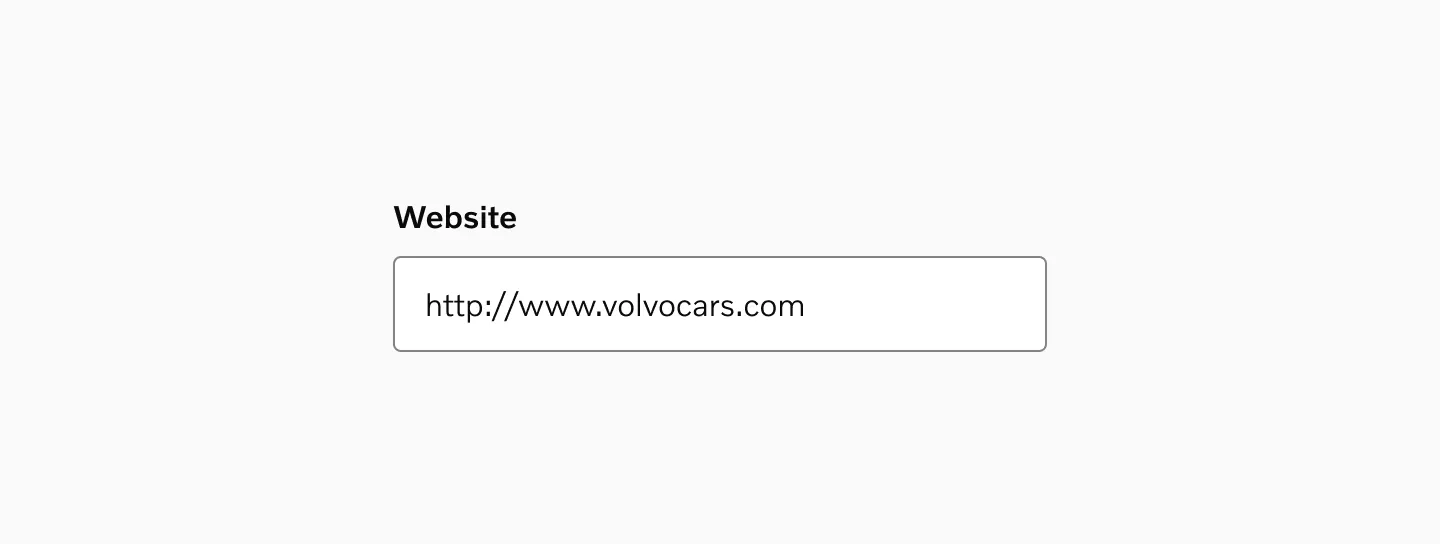
Text Input
Section titled “Text Input”A standard text input field designed for single-line text entry.
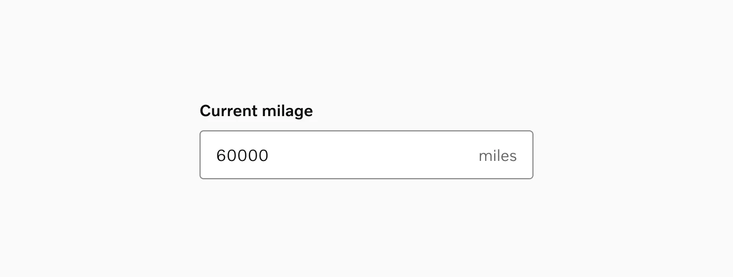
Unit Input
Section titled “Unit Input”The Unit input allows users to enter measurements like distance, with the appropriate localized unit displayed as a suffix.
URL Input
Section titled “URL Input”Use URL input when users need to enter a web address. While it appears identical to a Text input, it provides URL-specific validation.
Custom input
Section titled “Custom input”Custom inputs are designed for variants not included in the library. Use the slot as a placeholder to build your own input type.
States
Section titled “States”Default
Section titled “Default”The normal, non-focused state where the input is enabled and available to interact with.
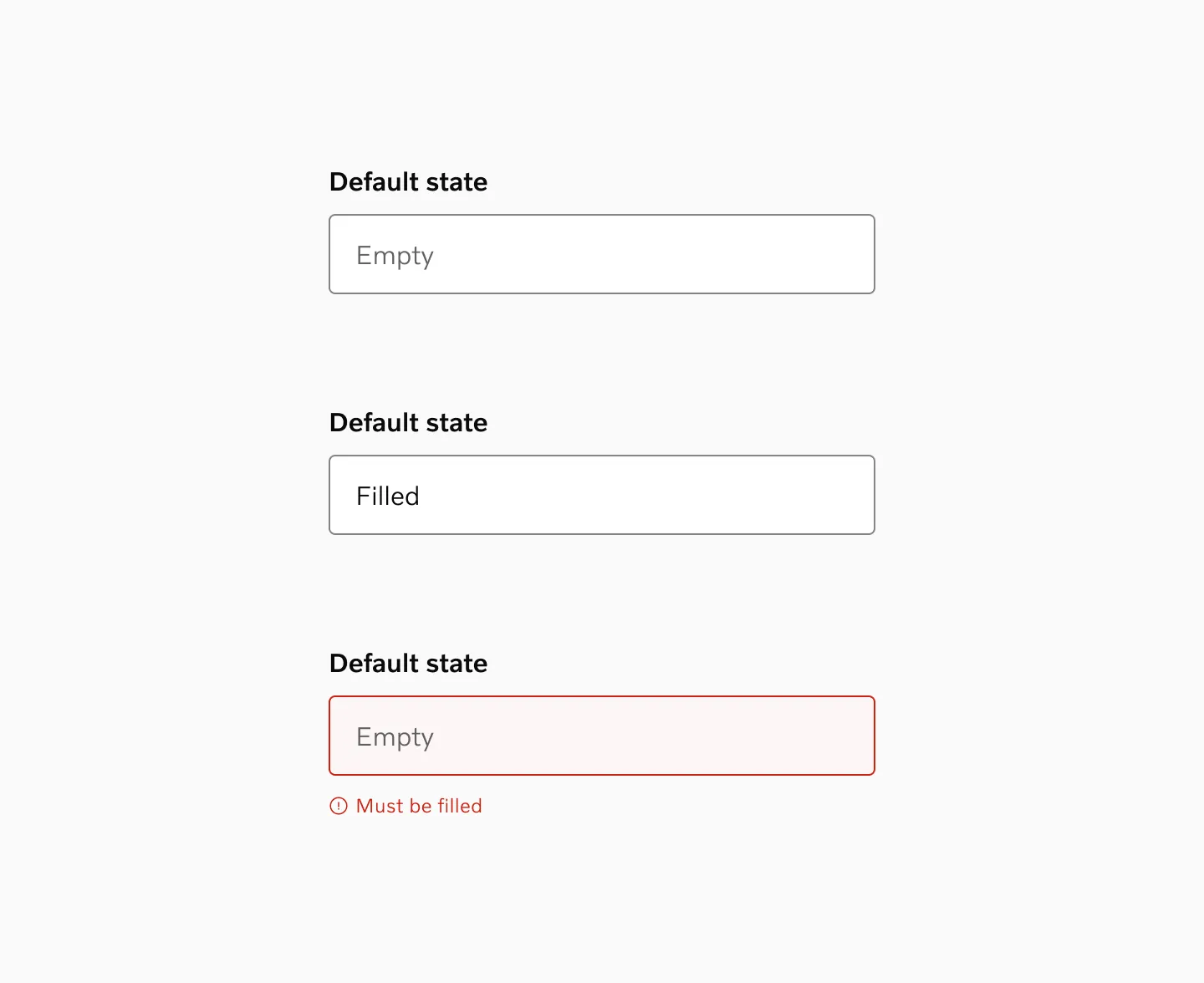
The container’s outline changes color as the cursor hovers over the input area.

When clicked or tapped, the outline becomes thicker to highlight that the component is currently being interacted with.
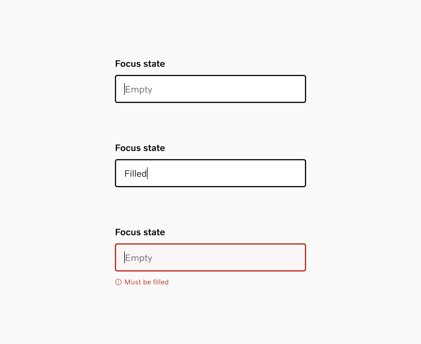
Active
Section titled “Active”The active state looks similar to the focus state and is essentially equivalent. It activates specifically during interaction.
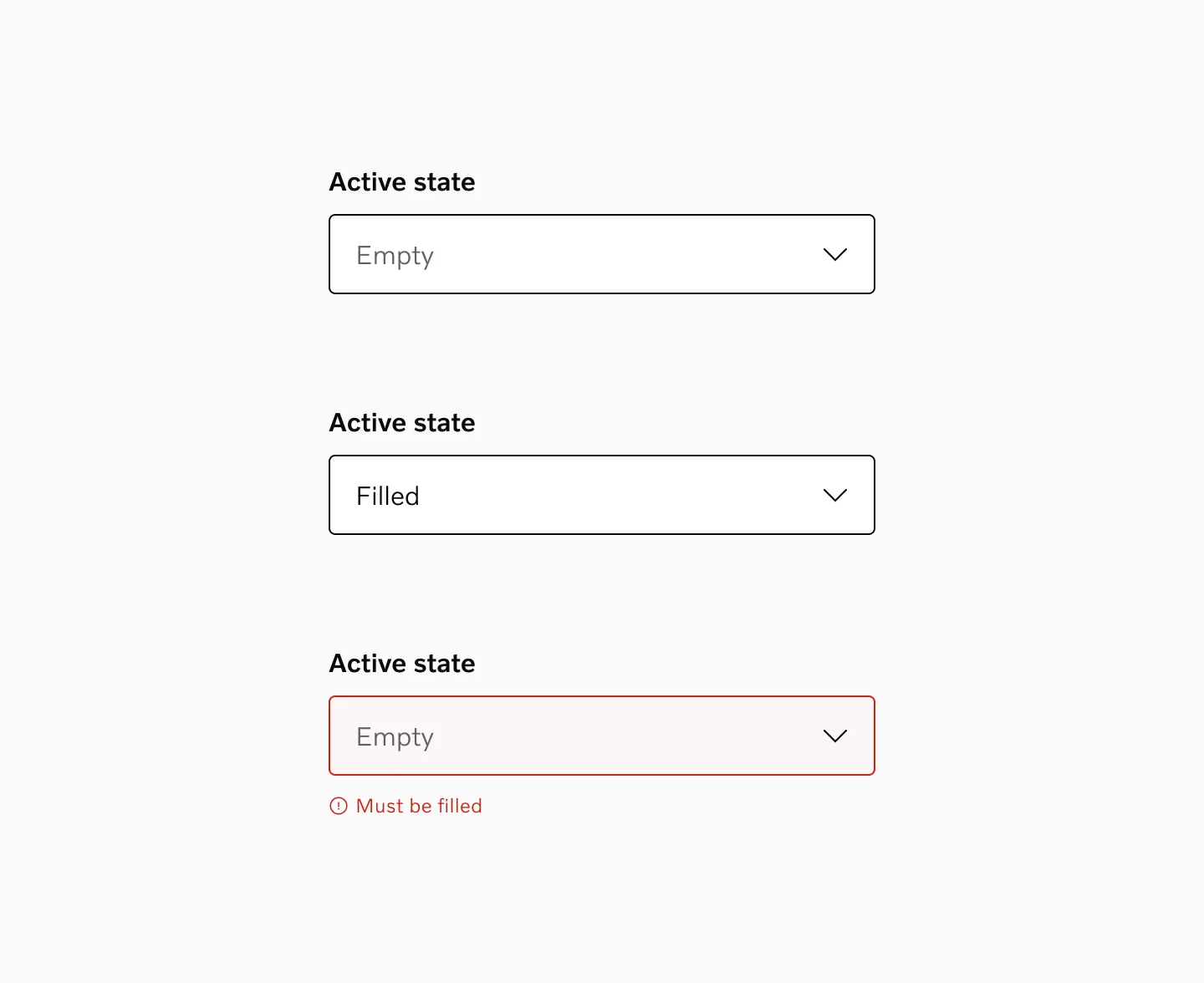
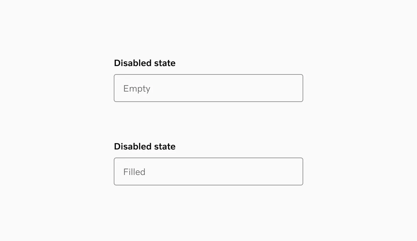
Disabled
Section titled “Disabled”The input is grayed out and cannot be interacted with. Used when the system or logic prevents a user from editing the field.
Color modes
Section titled “Color modes”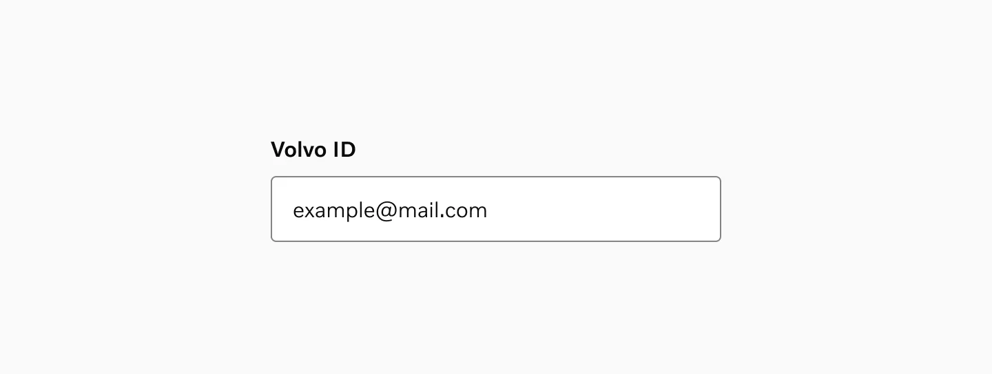
The input field as presented in light mode contexts.
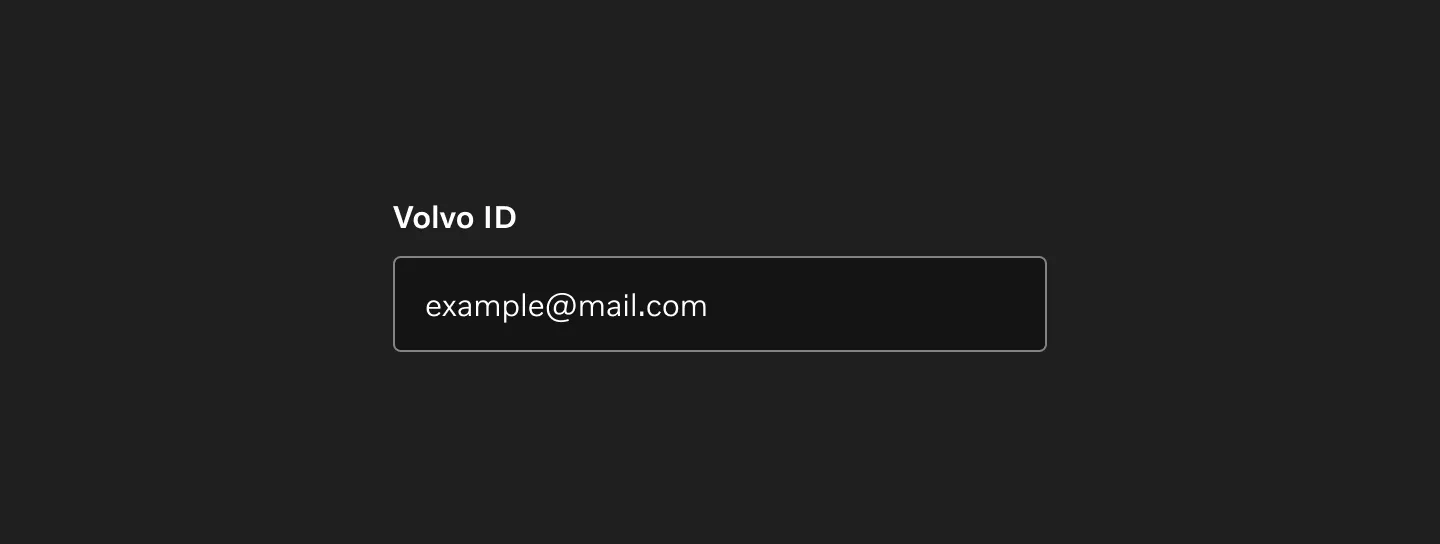
The input field as presented in dark mode contexts.
Target Size
Section titled “Target Size”Each input field has a minimum height of 48px. All input fields must have a clearly connected label, ensuring that the combined touch target meets accessibility requirements.
The default text-based inputs have a fixed height, whereas text areas have a minimum height that can expand.
Interactive elements in the right slot (e.g., show/hide password) are based on our existing icon button patterns.
Spacing
Section titled “Spacing”Vertical spacing
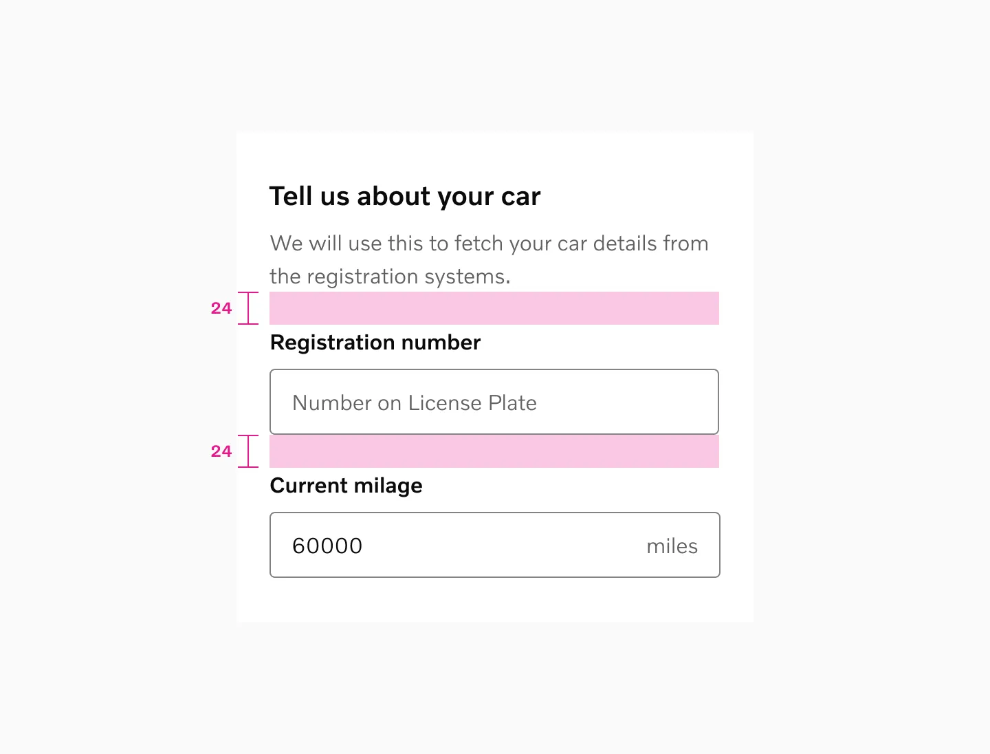
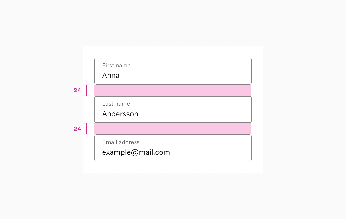
Section titled “Vertical spacing”It is important to maintain consistent vertical spacing between each input field. A general recommendation is to use 24px spacing between fields.
Example with top label using 24px spacer
Example with floating label using 24px spacer
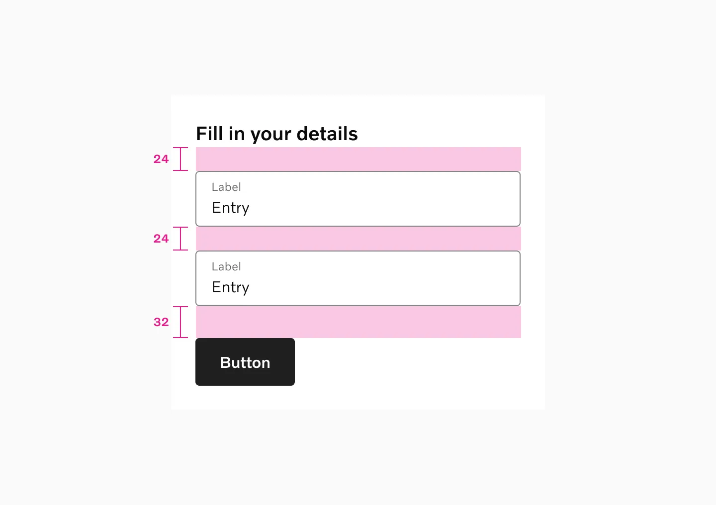
Example with heading, top label and button
Horizontal spacing
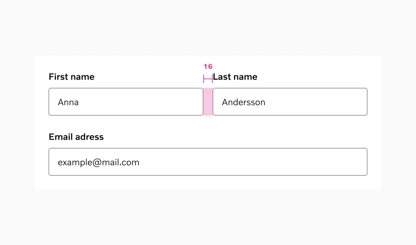
Section titled “Horizontal spacing”When input fields are placed on the same line, they should have a logical relationship, with 16px spacing between them.
Internal spacing
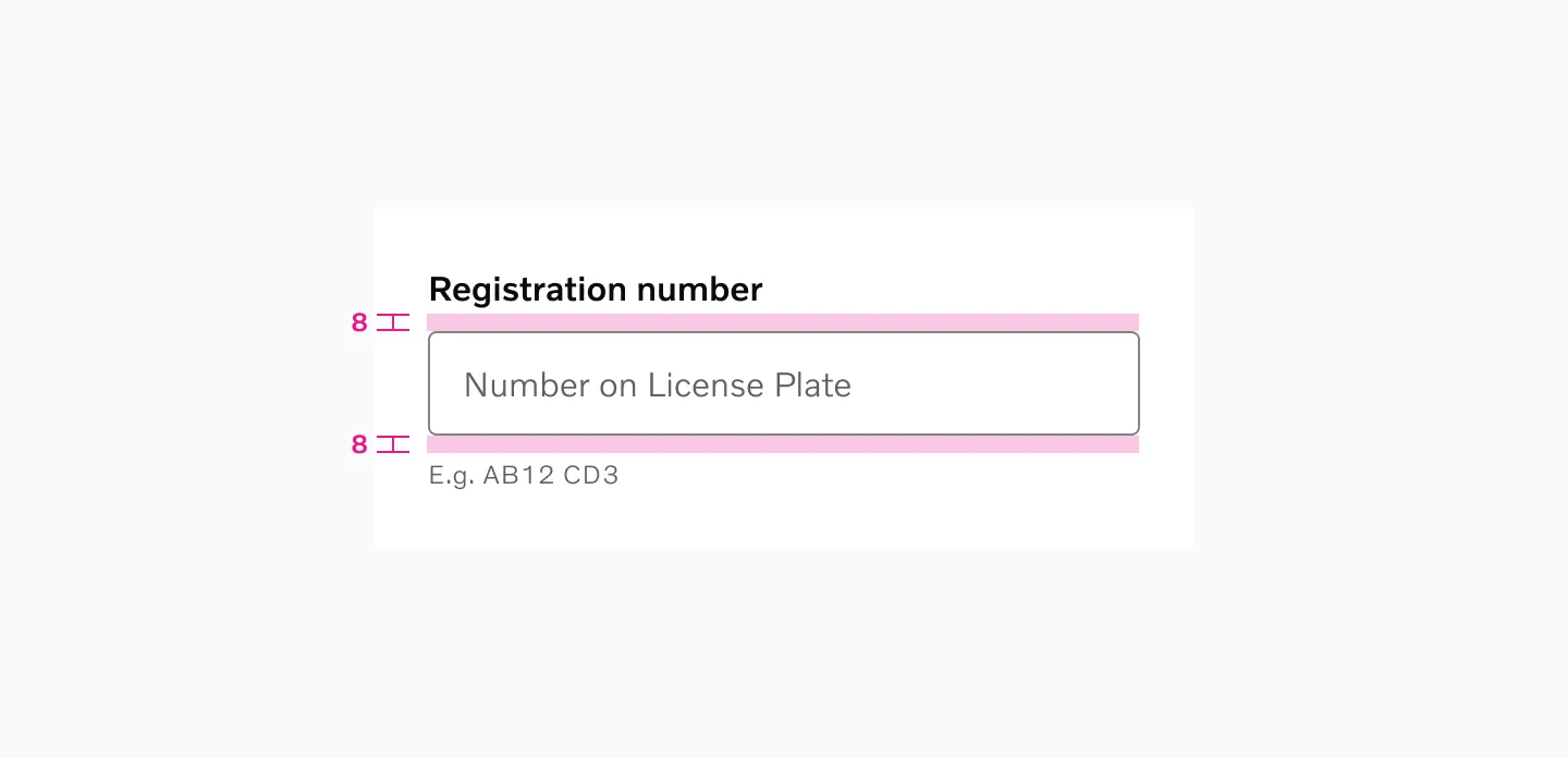
Section titled “Internal spacing”Default labels have an 8px spacing between itself and the actual input field. Hint/error messages similarly have 8px spacing below the input.
Vertical stacking
Section titled “Vertical stacking”In most circumstances, always opt to arrange your forms vertically as this makes it significantly easier to scan and complete.
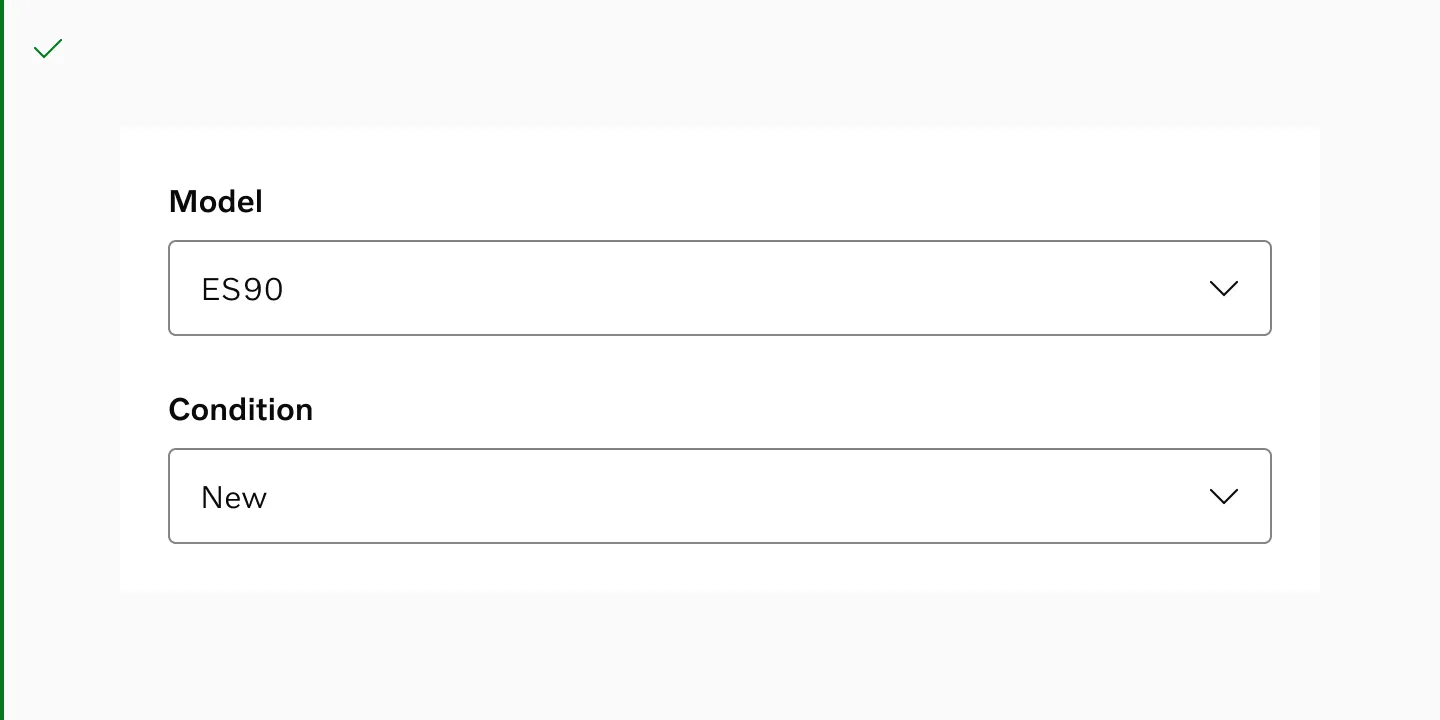
Do - It is highly recommended to always stack form input fields vertically as this makes the form easier to scan.
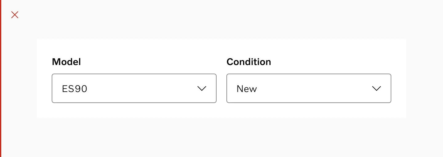
Don’t - It is generally recommended to avoid breaking forms into several columns as it has a significant impact on usability.
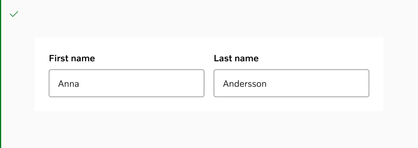
Do - However, there’s one main exception to this rule and that is when there’s a very clear logical grouping.
Examples
Section titled “Examples”Unit Input
Section titled “Unit Input”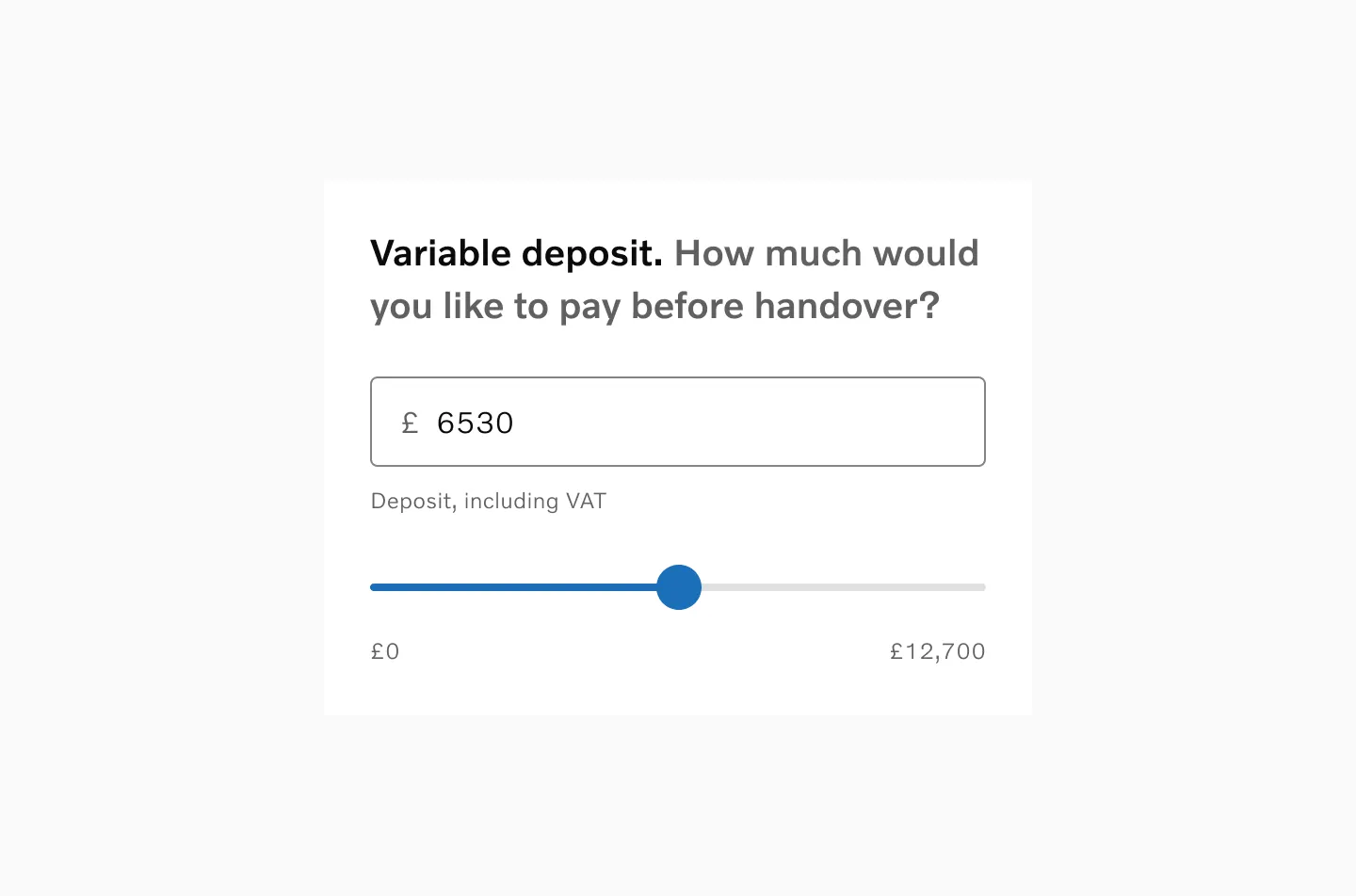
Example of an input field linked to a slider.
Date Input
Section titled “Date Input”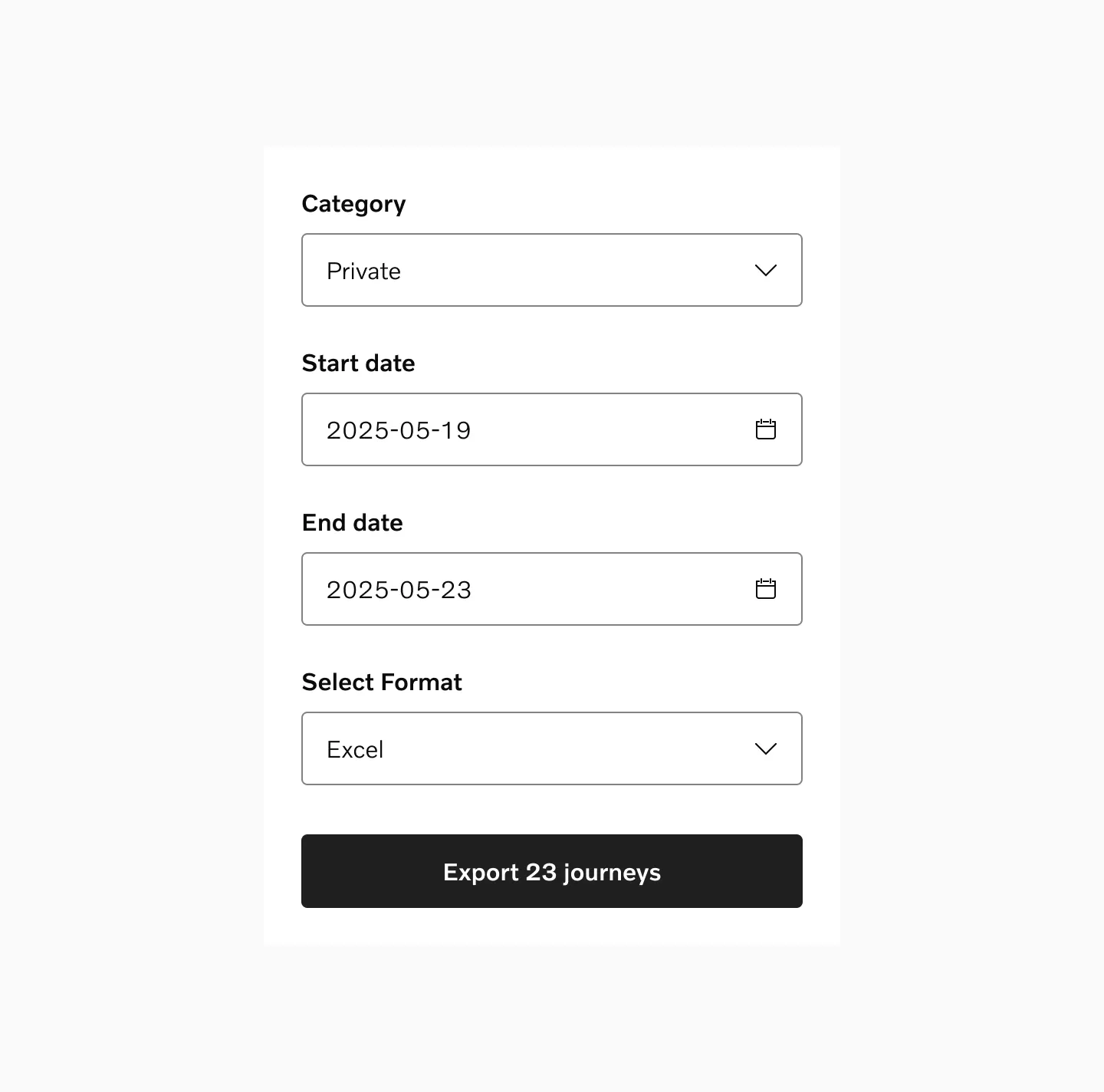
Example of a date input. Date input uses native date picker.
Password Input
Section titled “Password Input”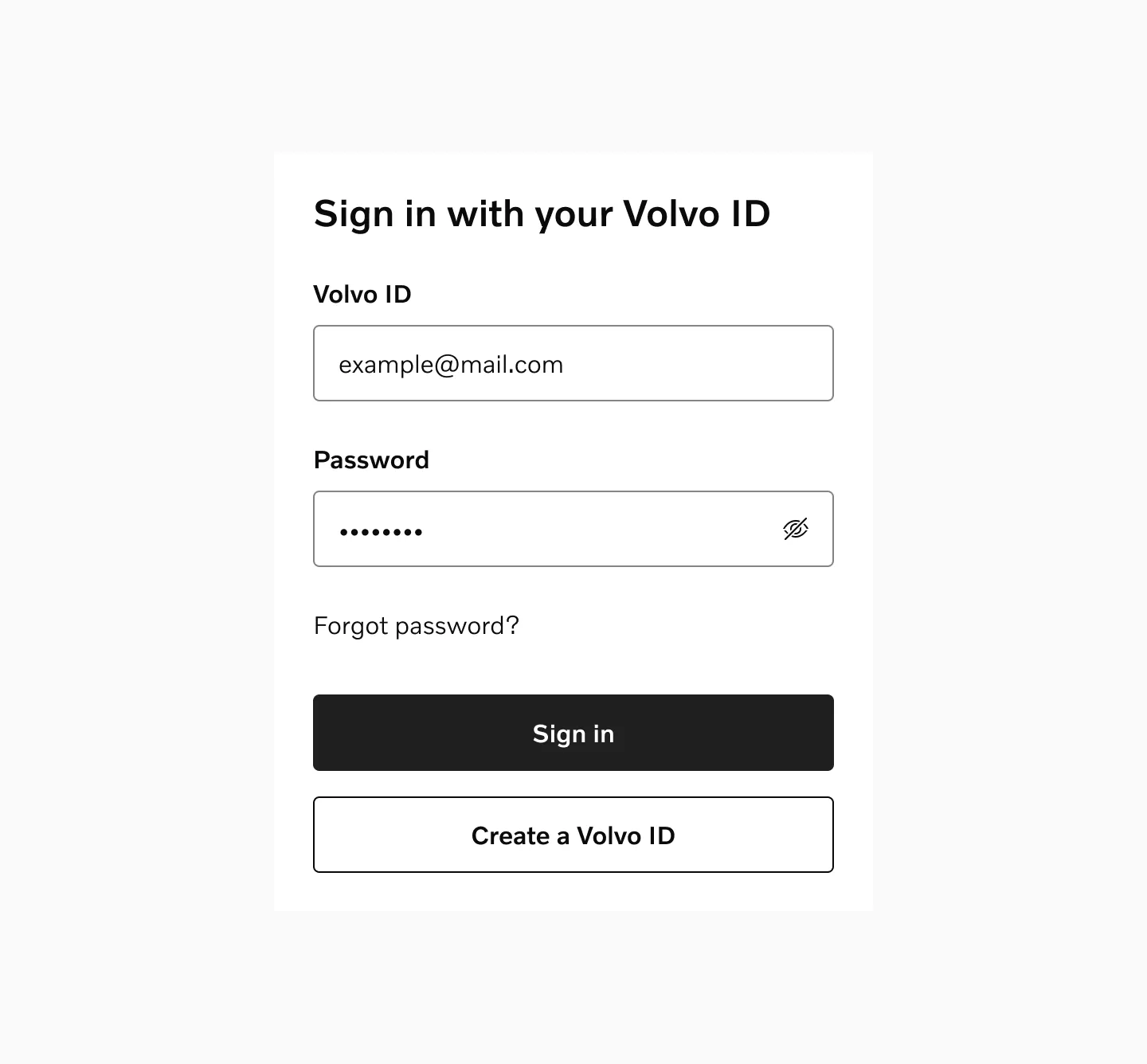
Example of a masked input field.
Considerations
Section titled “Considerations”Don’t mix fields types
Section titled “Don’t mix fields types”Don’t mix input fields with standard labels and floating labels in the same layout.
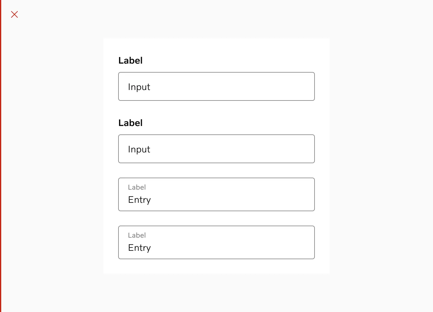
Required input fields
Section titled “Required input fields”If most fields in a form are required, mark optional fields instead of marking all required fields. This reduces visual noise.
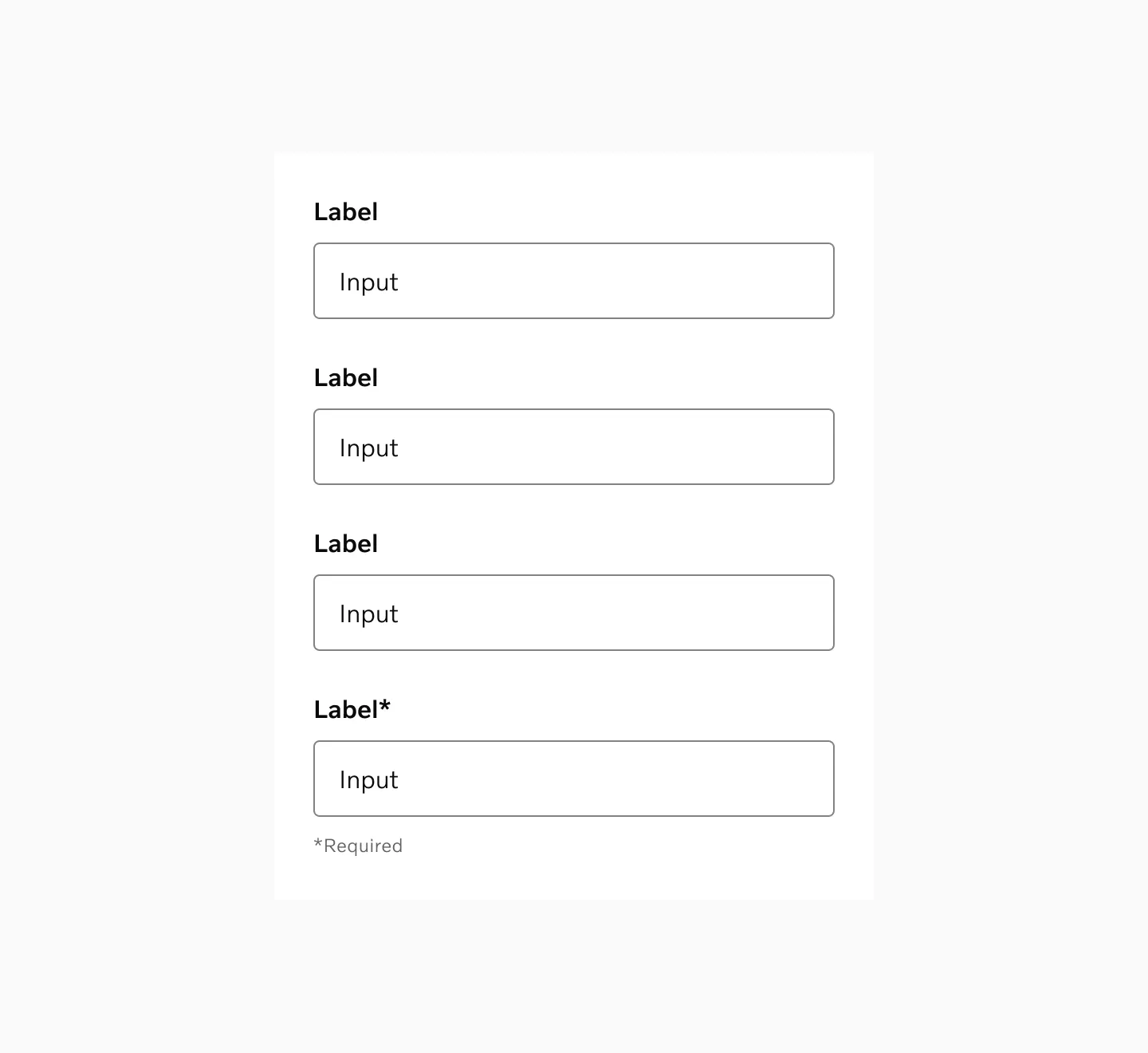
Displaying optional fields and one required field.
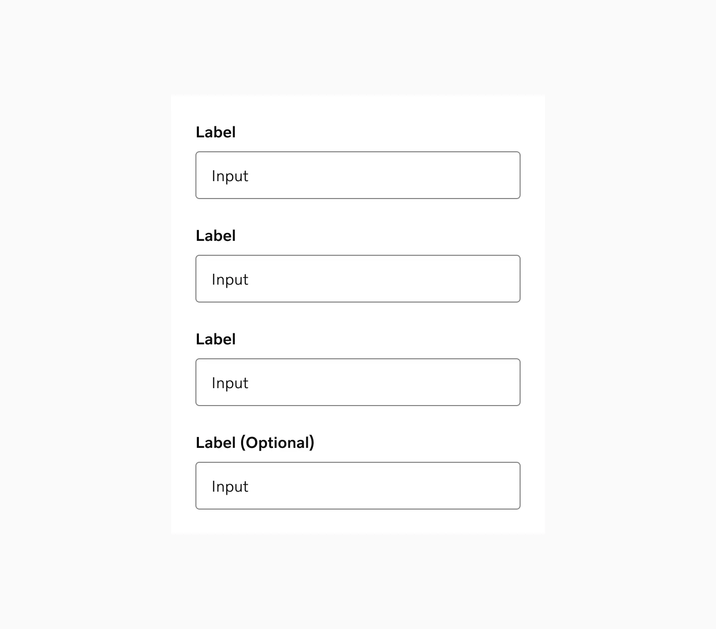
Displaying required field and one optional field.
Form validation
Section titled “Form validation”To reduce user stress and frustration, implement lazy validation. Instead of showing immediate warnings, validate fields when the user moves away or submits.
Trigger appropriate keyboards
Section titled “Trigger appropriate keyboards”Consider which mobile keyboard type is most appropriate for your input field. You can control this using the inputMode attribute.
Responsiveness
Section titled “Responsiveness”Input fields should match the width of their containing form. On mobile devices, inputs should span the full width of the viewport.
While desktop forms can be more flexible in width, all inputs within the form should maintain consistent widths for visual alignment.