IconButton
Icon buttons help people take supplementary actions with a single tap. They’re used when a compact button is required, such as in a toolbar or image list.
Anatomy
Section titled “Anatomy”
- Container
- Icon
How to use
Section titled “How to use”Use Icon Buttons to display actions in a compact layout when an icon can replace a button label without ambiguity.
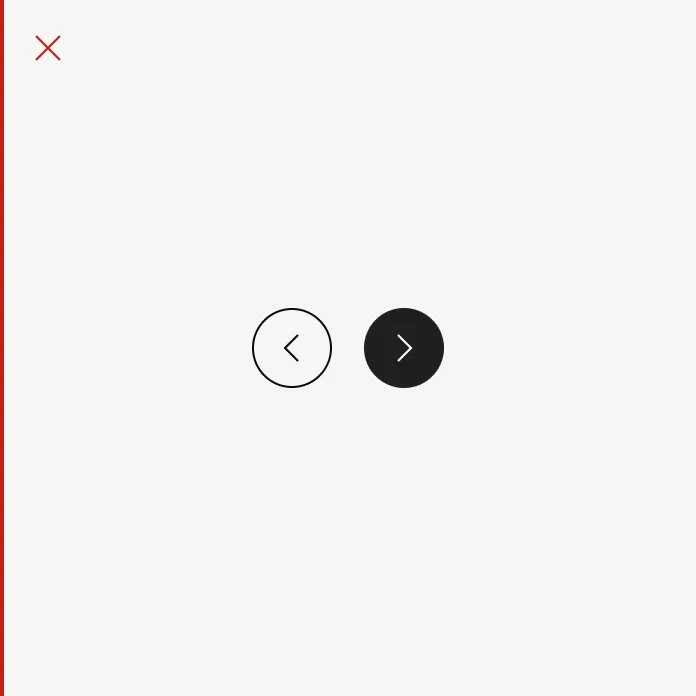
Icon buttons typically represent actions such as opening a menu, closing a dialog or navigating a carousel. Icon buttons can be grouped together or they can stand alone.
Showing: Icon button filled, Icon button outlined and Icon button clear
Variants
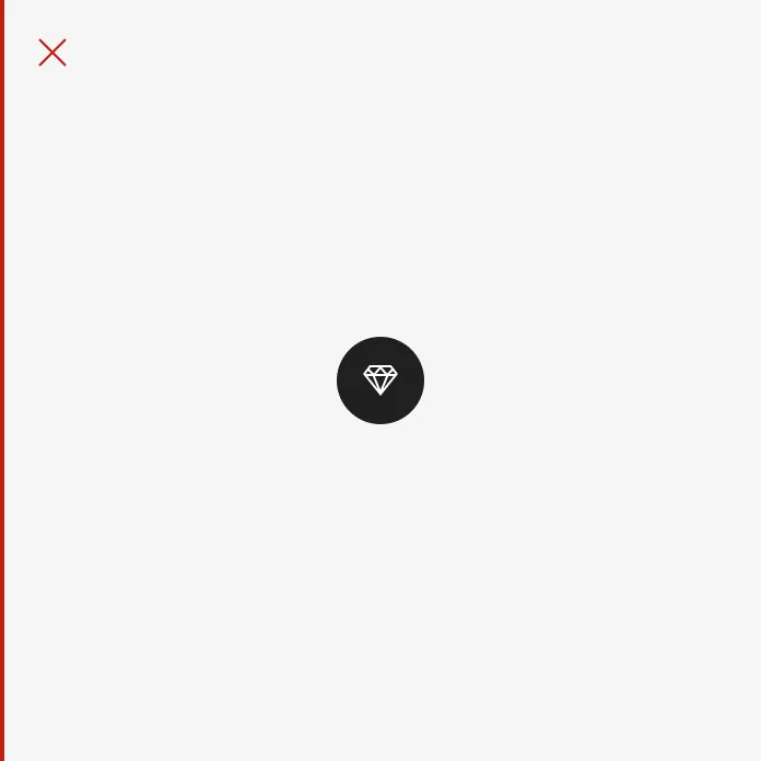
Section titled “Variants”Filled
Section titled “Filled”Icon Button Filled have higher visual impact and are best for high emphasis actions. Filled should always be used whenever an Icon Button is placed on top of media such as video and images to ensure the appropriate contrast ratios.
Outlined
Section titled “Outlined”Icon Button Outlined are medium-emphasis buttons. They’re useful when an icon button needs more emphasis than a clear icon button but less than a filled icon button.
Icon Button Clear are low-emphasis buttons. Since they are visually indistinguishable from a non-interactive icon they should only be used when the context and placement makes it obvious that it can be interacted with, such as in a navigation bar. Comes with and without bleed.
With bleed
Section titled “With bleed”Uses 40px size.
Showing icon button clear with bleed on hover.
Without bleed
Section titled “Without bleed”Uses the size of the icon inside. Works well in navigations when you need to align content with margins.
Showing icon button clear without bleed on hover.
Localized Icon Buttons
Section titled “Localized Icon Buttons”The Localized Icon Buttons are reusable UI components that display icon-based buttons with labels automatically localized to the user’s language. These buttons leverage the react-locale-provider for internationalization and react-icons for consistent iconography.
Available Buttons
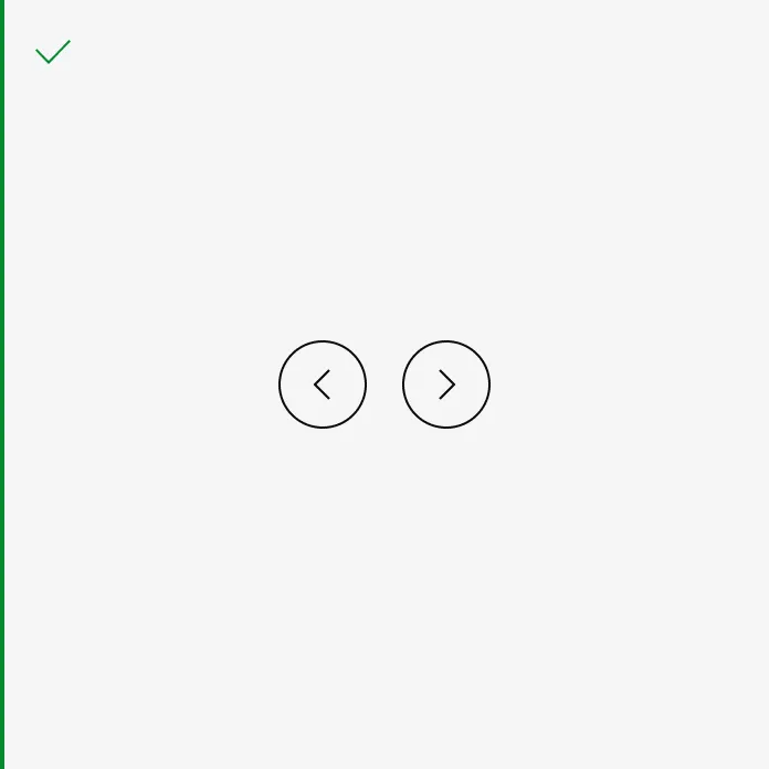
Section titled “Available Buttons”- Close: Renders a close (X) icon with a localized label, typically used for dismissing dialogs or modals.
- Next: Renders a right-arrow icon with a localized label, used for navigation to the next item or page.
- Prev: Renders a left-arrow icon with a localized label, used for navigation to the previous item or page.
Features
Section titled “Features”- Automatic Localization: Button labels are translated based on the current locale provided by
react-locale-provider. - Consistent Icons: Uses icons from
react-iconsto ensure visual consistency across the application. - Accessibility: Each button includes appropriate
aria-labelattributes for screen readers, using the localized label.
Neutral
Section titled “Neutral”Our neutral button should be used as standard and is provided in all sizes and in all variants (filled, outlined and clear).
Destructive
Section titled “Destructive”The red buttons should be used when the action of the button ends or terminates a function or setting, such as delete or remove.
States
Section titled “States”Default
Section titled “Default”The default state is the default state of the icon button. It is not currently being interacted with, but is available to be interacted with.
The hover state is shown when the user places a cursor over the link on non-touch devices.
Pressed
Section titled “Pressed”The pressed state communicates a user click, tap, or press.
Disabled
Section titled “Disabled”A button in a disabled state shows that an action exists, but is not available in that circumstance. This state can be used to maintain layout continuity and to communicate that an action may become available later.
Color modes
Section titled “Color modes”
Showing icon button in neutral in light color mode.
Showing icon button in destructive in light color mode.
This is the default color mode on top of imagery.
Showing icon button in neutral in dark color mode.
Showing icon button in destructive in dark color mode.
Target size
Section titled “Target size”Icon button uses 40px target size
Spacing
Section titled “Spacing”
When used together, Icon button filled have a 16 spacer in between.
When used together, Icon button filled have a 16 spacer in between.
When used together, Icon button clear have a 8 spacer in between.
Examples
Section titled “Examples”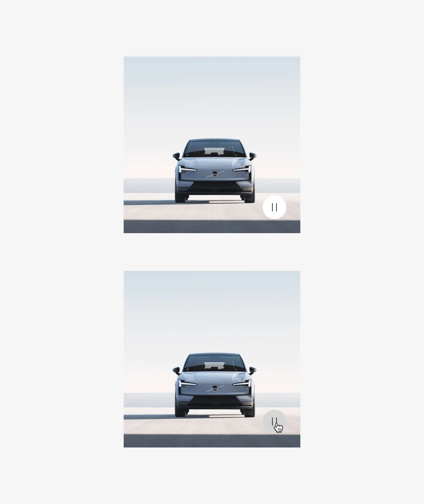
Showing Icon button filled with pause icon in a gallery
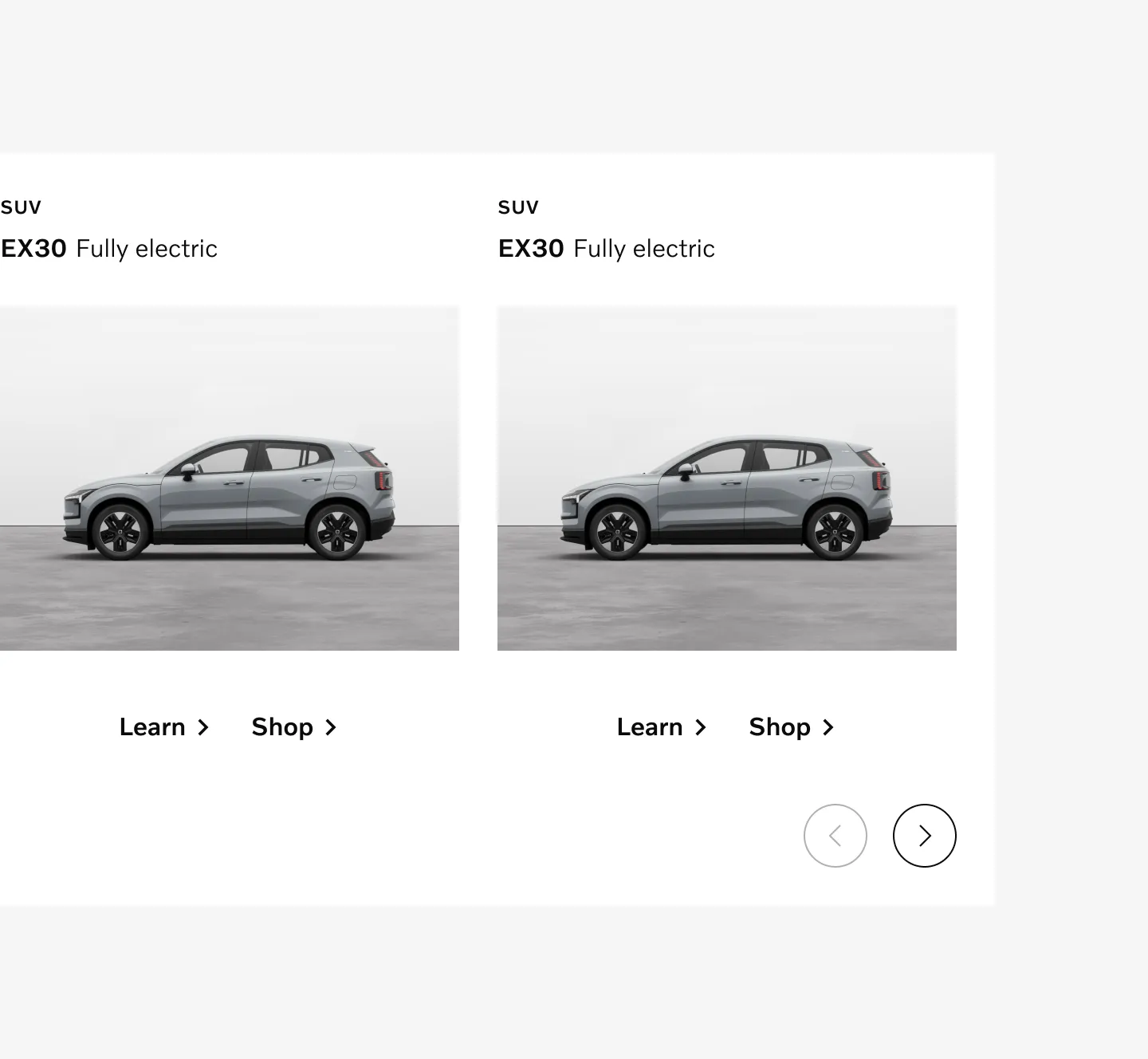
Showing Icon button outlined in product gallery.
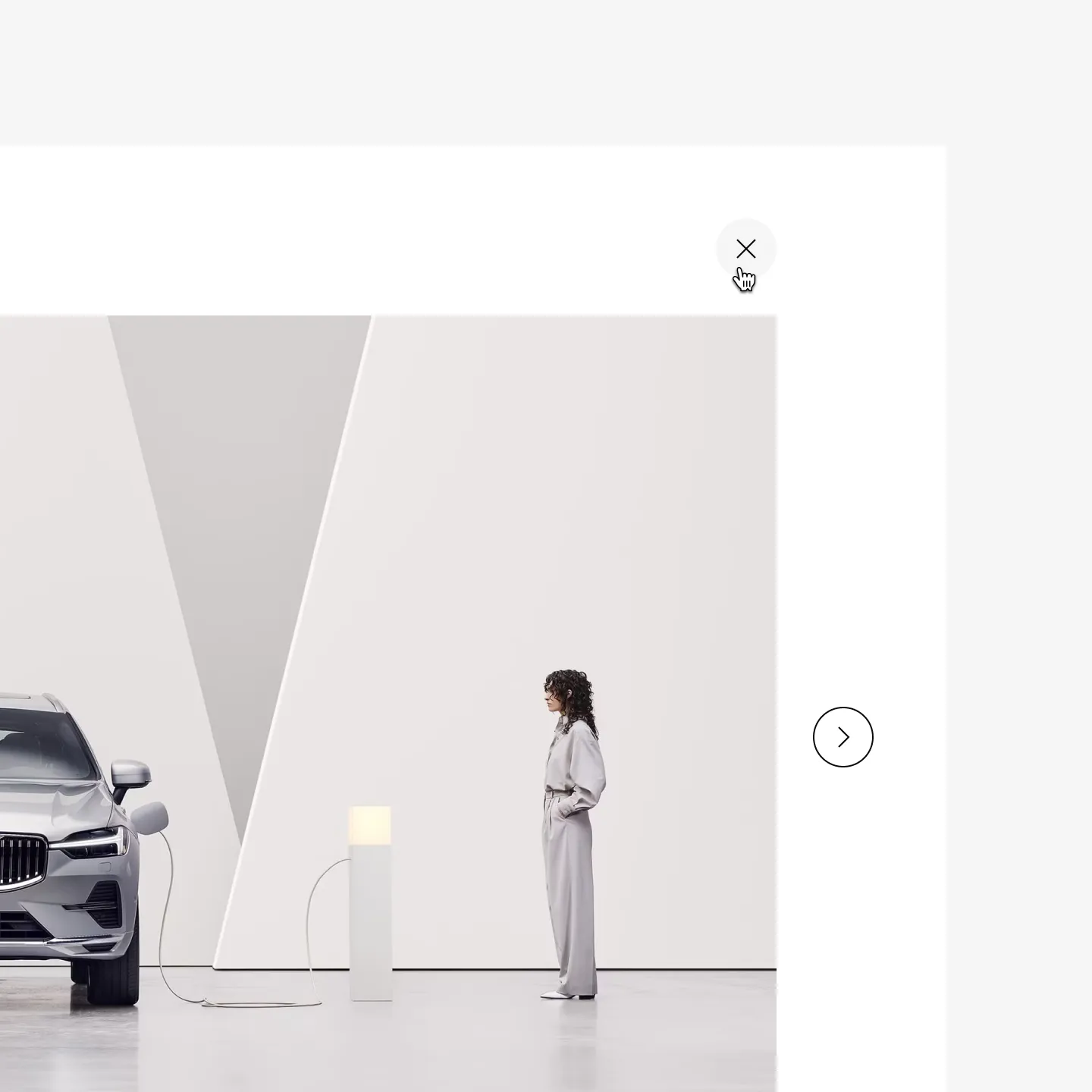
Showing Icon button clear in gallery on hover
Considerations
Section titled “Considerations”Use sparingly
Section titled “Use sparingly”Use sparingly when icon very clearly communicates the action. Consider using a text link instead when possible.
Don’t override color
Section titled “Don’t override color”Do not use custom colors for buttons. The colors of different button variations have been designed to be consistent and accessible.
Don’t
Hierarchy
Section titled “Hierarchy”Avoid using outlined icon buttons alongside filled or ghost buttons as it doesn’t create enough hierarchy in actions.
Do
Don’t
Buttons on top of media
Section titled “Buttons on top of media”Do not use clear or outlined buttons on top of videos or images.
Do
Don’t
Don’t use icons for decoration
Section titled “Don’t use icons for decoration”Icons can be used in buttons when additional clarity is required and the icon is highly relevant to the action. Icons should not be used for decoration.
Do
Don’t