Disclaimer
Used for legal copy and disclaimer text.
How to use
Section titled “How to use”Used for legal copy and disclaimer text.
Showing left aligned standalone disclaimer that are normally used in the bottom of the page.
Anatomy
Section titled “Anatomy”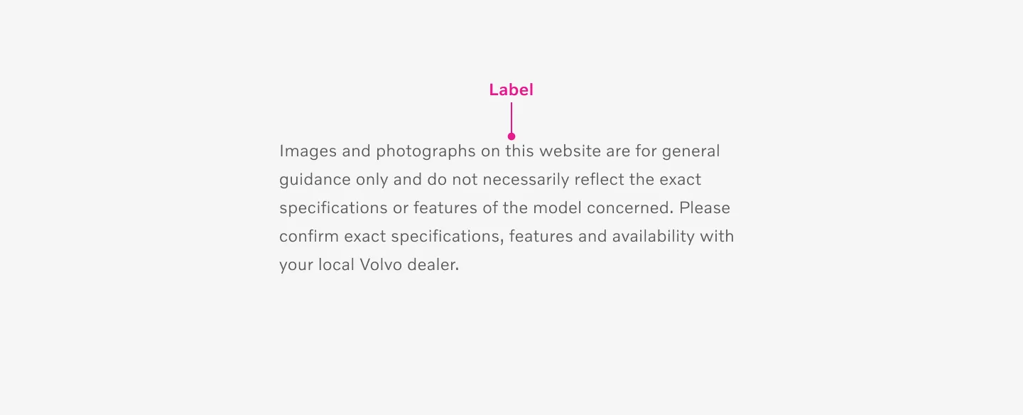
Showing a center aligned disclaimer.
Variants
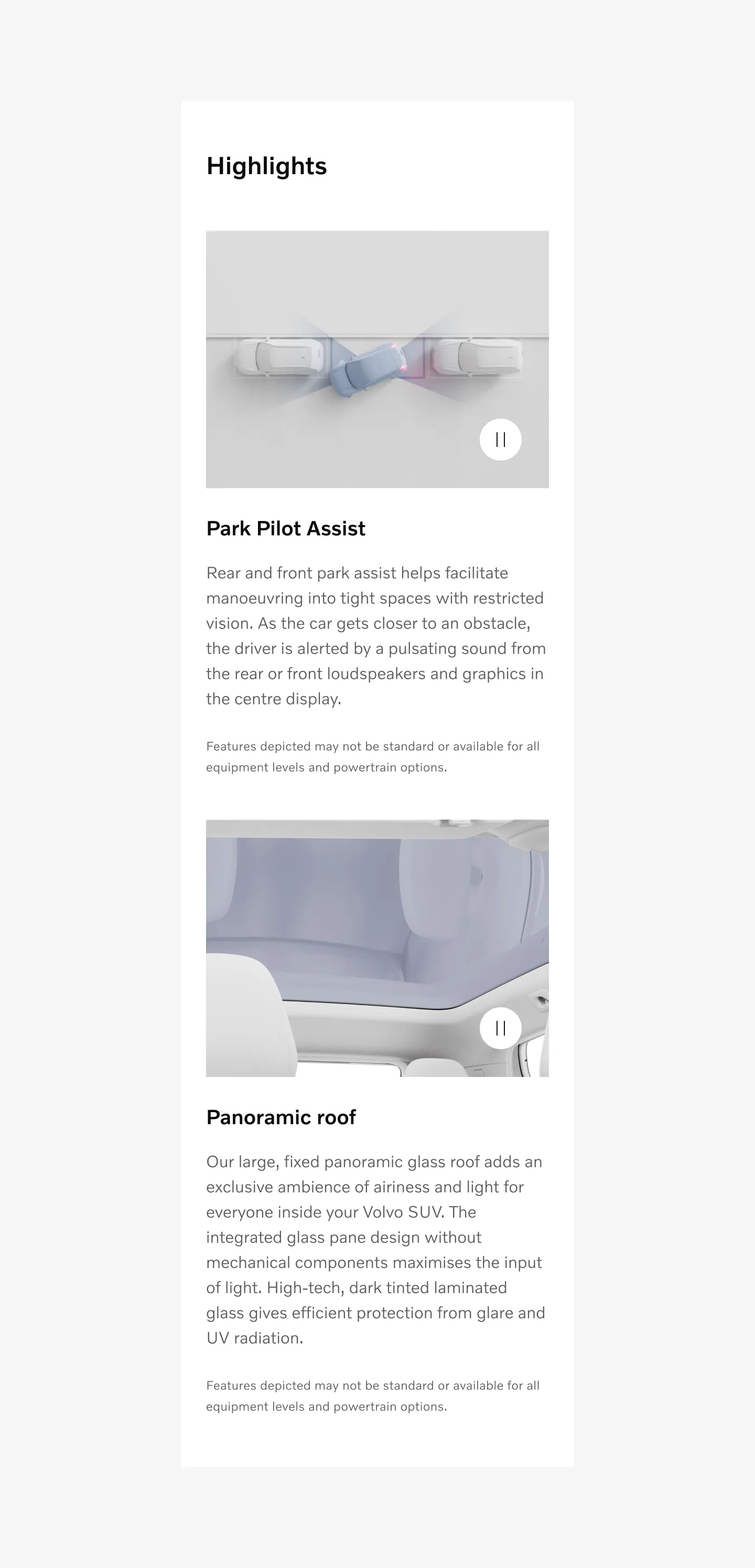
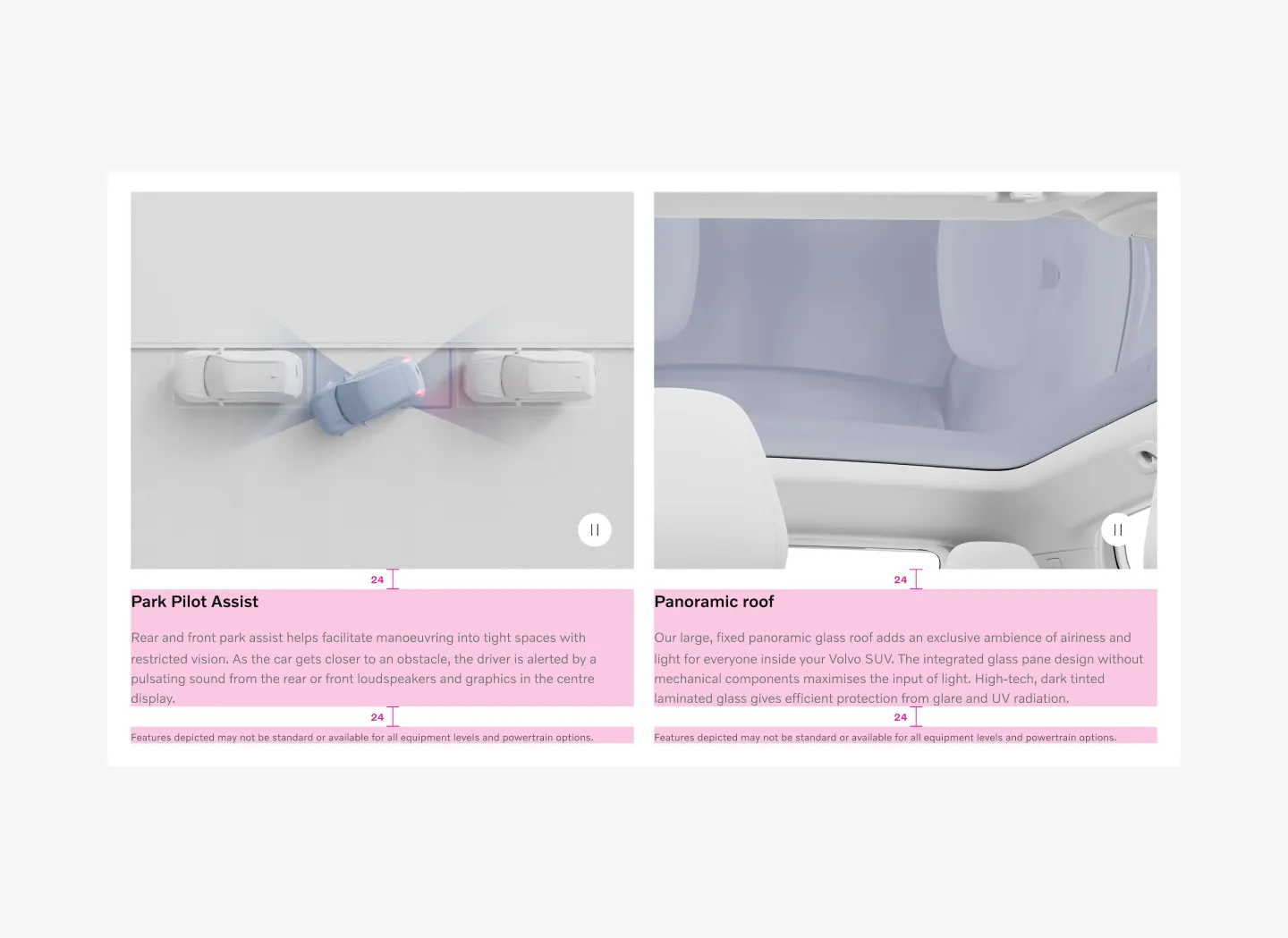
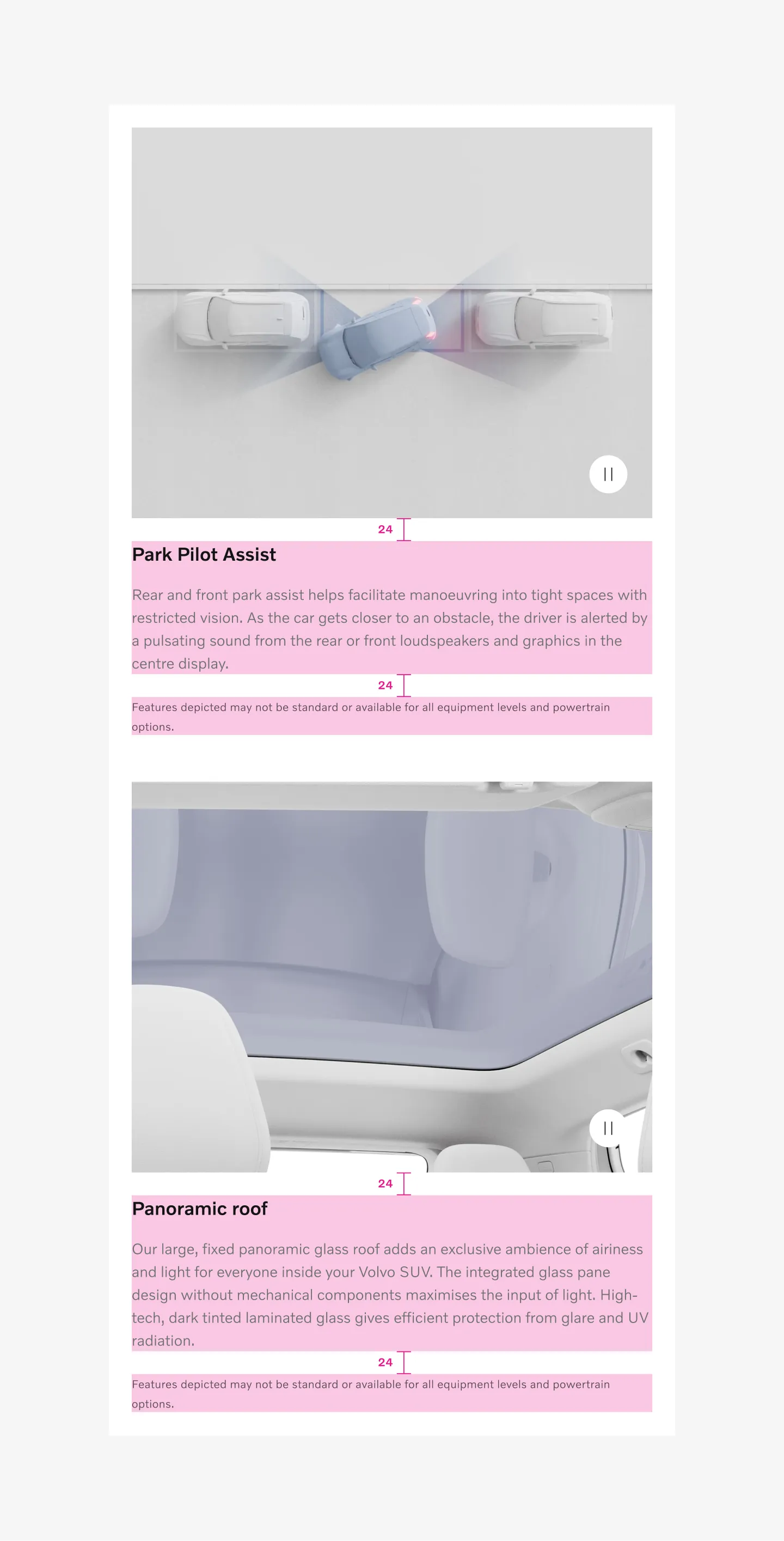
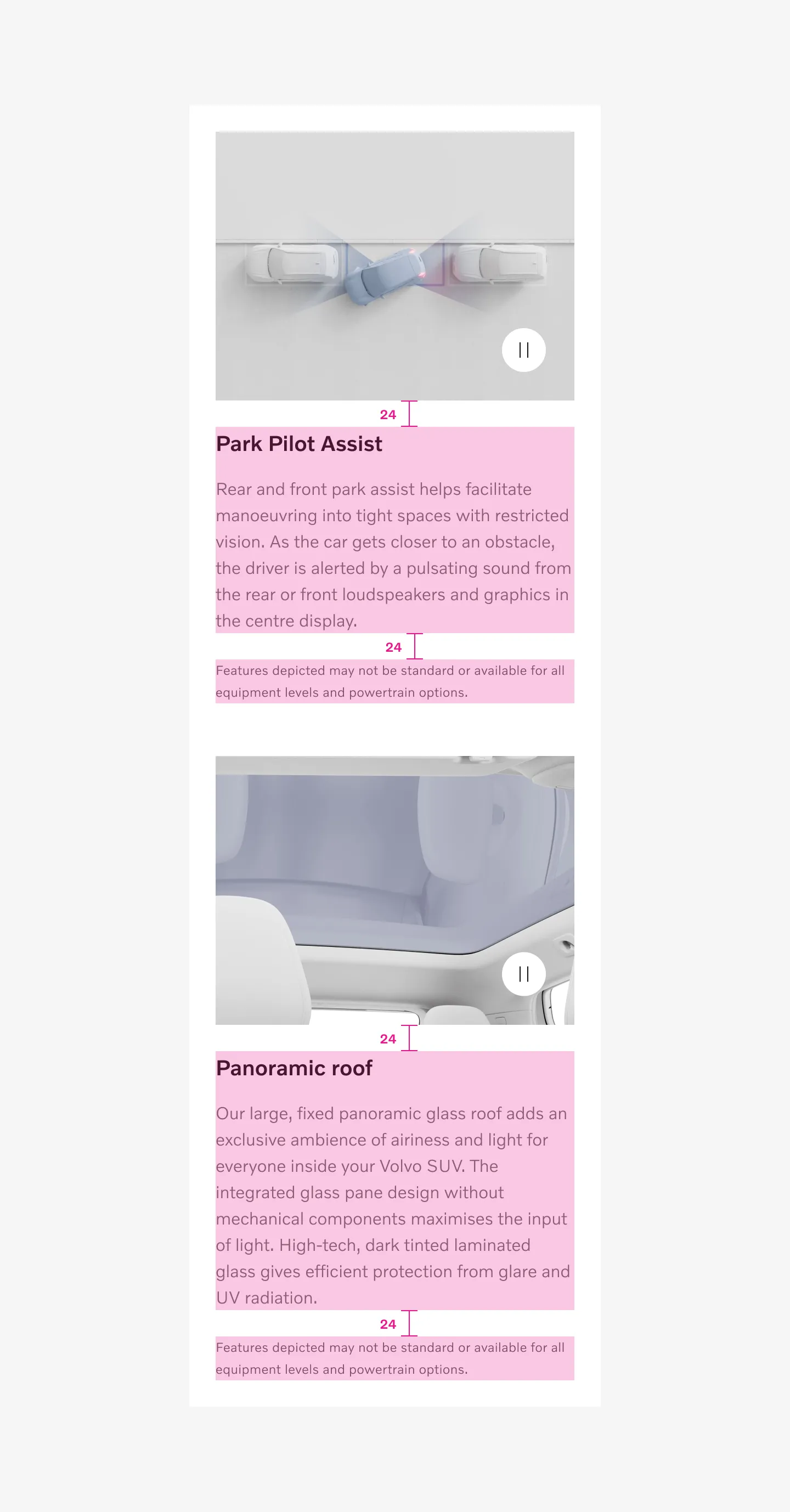
Section titled “Variants”Embedded in component.
Section titled “Embedded in component.”Used inside component.
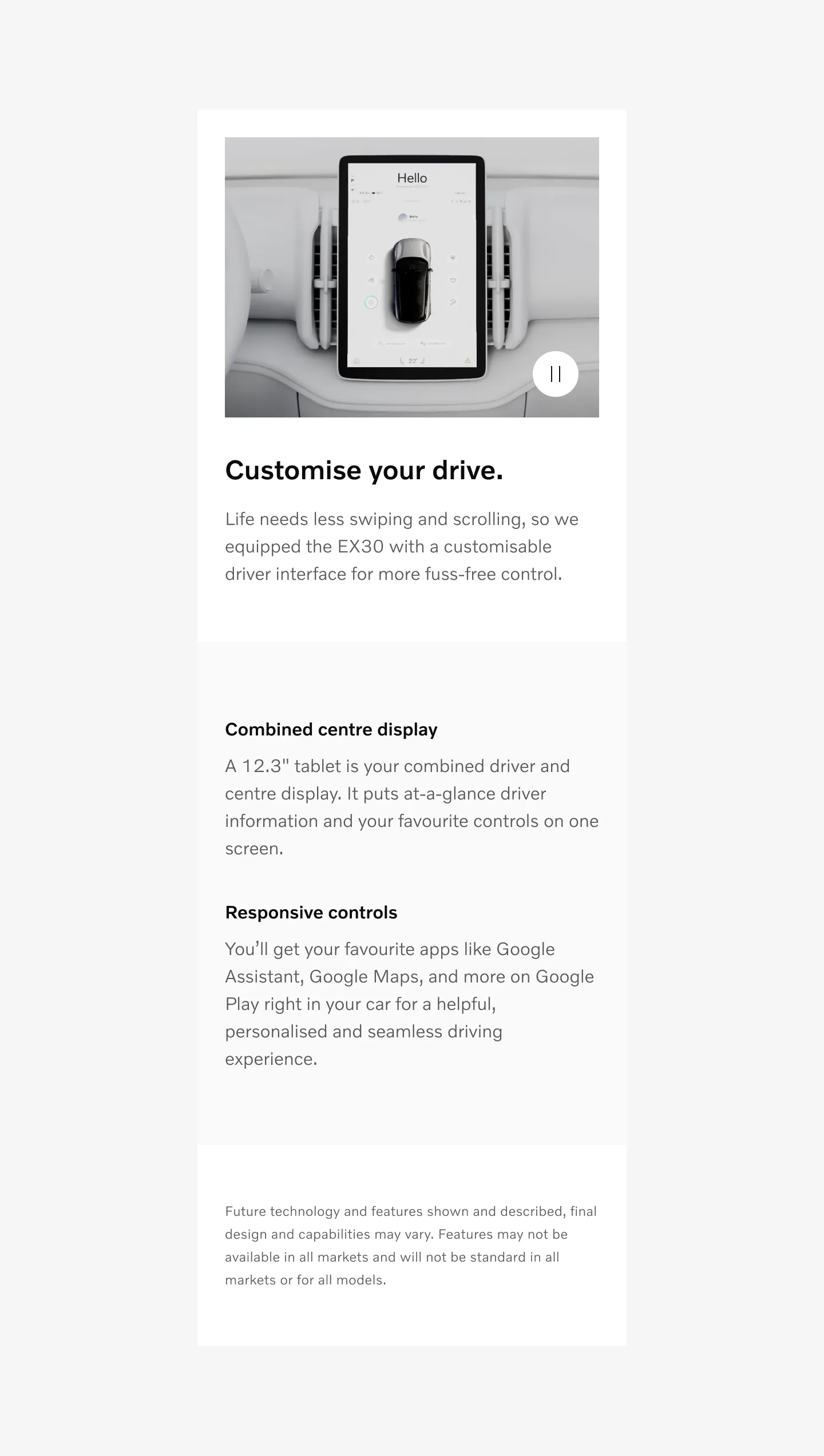
Showing left aligned embedded disclaimer on mobile
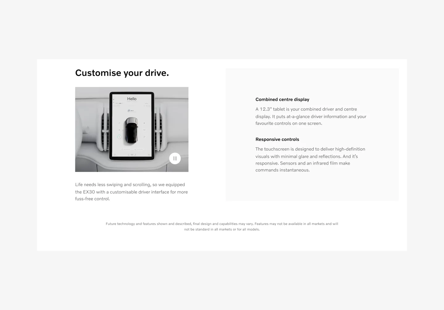
Showing center aligned embedded disclaimer on desktop
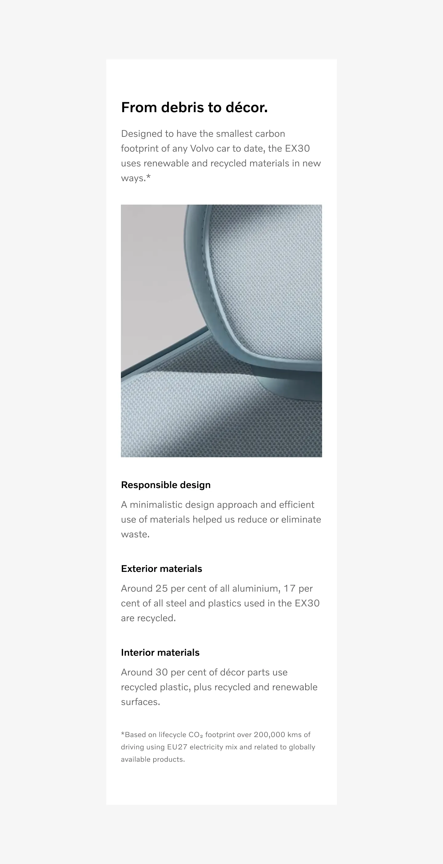
Inline disclaimer
Section titled “Inline disclaimer”Used inside component for each callout.
Showing left aligned inline disclaimer on mobile.
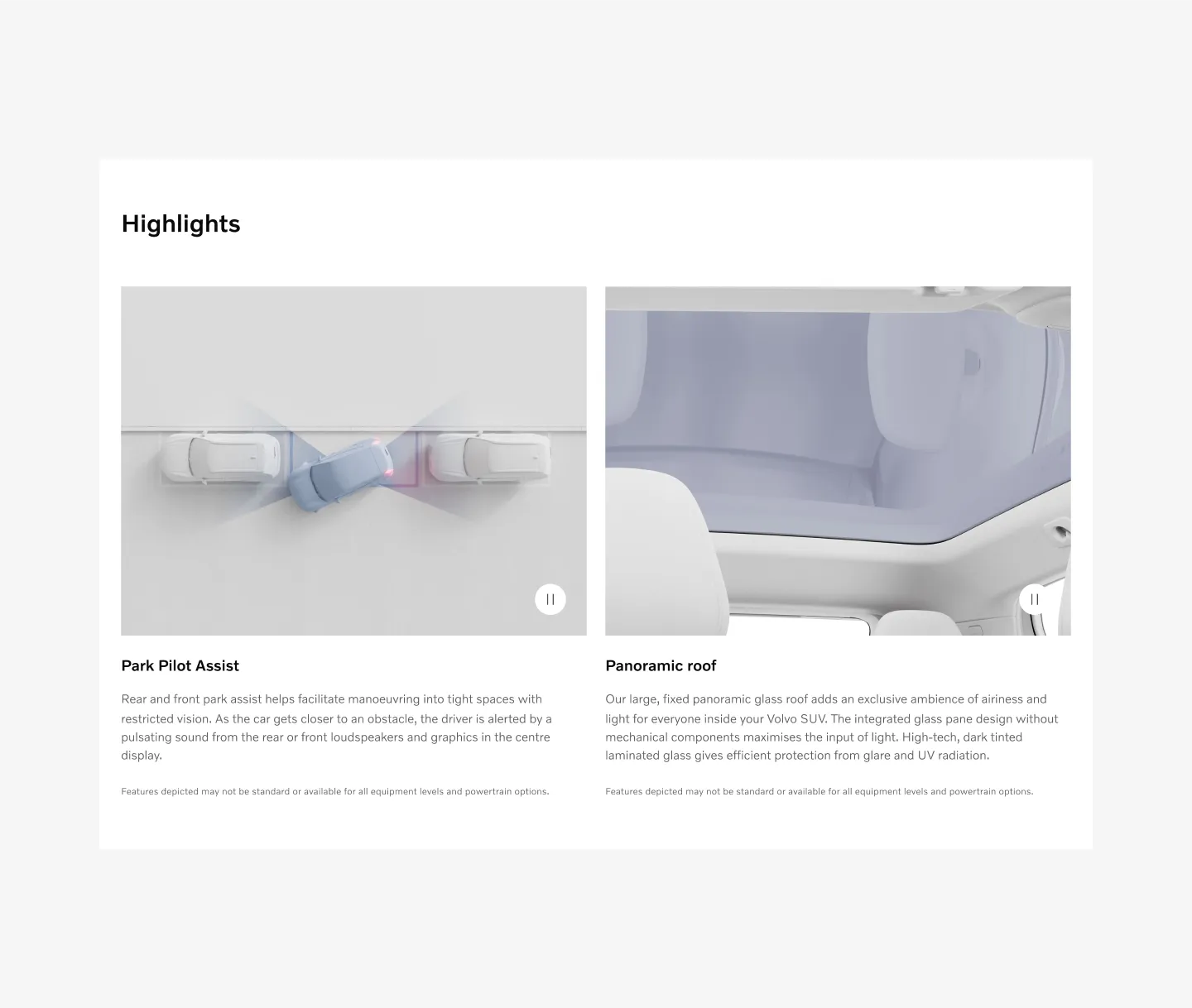
Showing left aligned inline disclaimer on desktop.
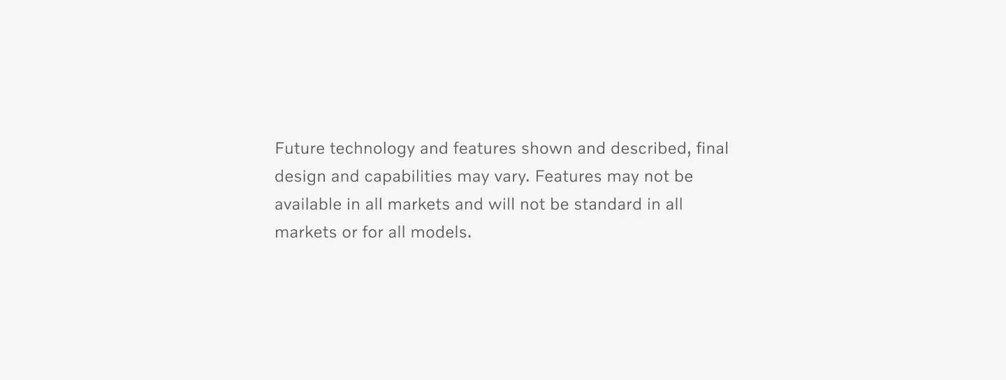
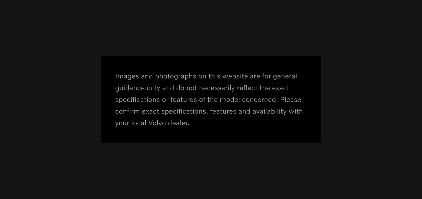
Standalone disclaimer
Section titled “Standalone disclaimer”Used on Bottom of page
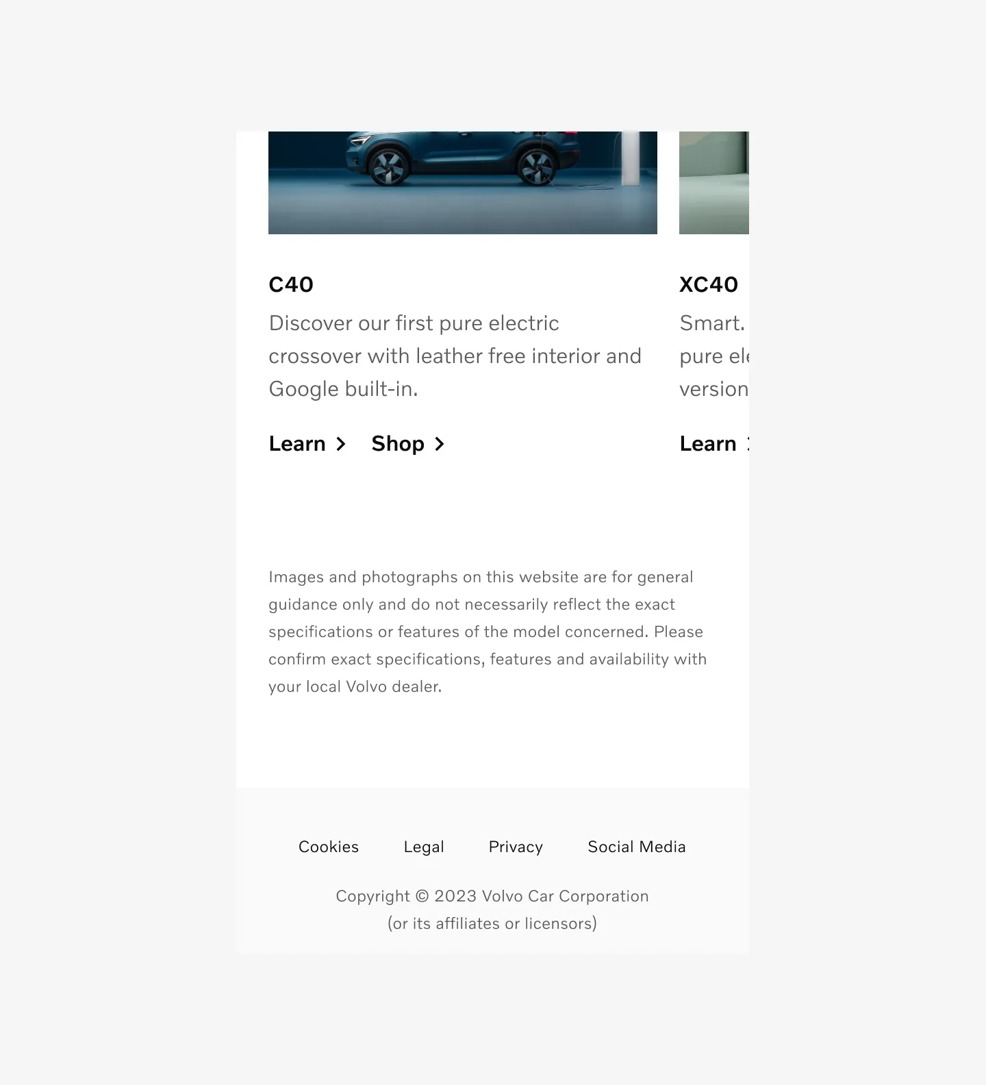
Showing left aligned standalone disclaimer on mobile.
Showing center aligned standalone disclaimer on desktop.
Pop up disclaimer
Section titled “Pop up disclaimer”Info icon + text that opens up a modal with disclaimer text.
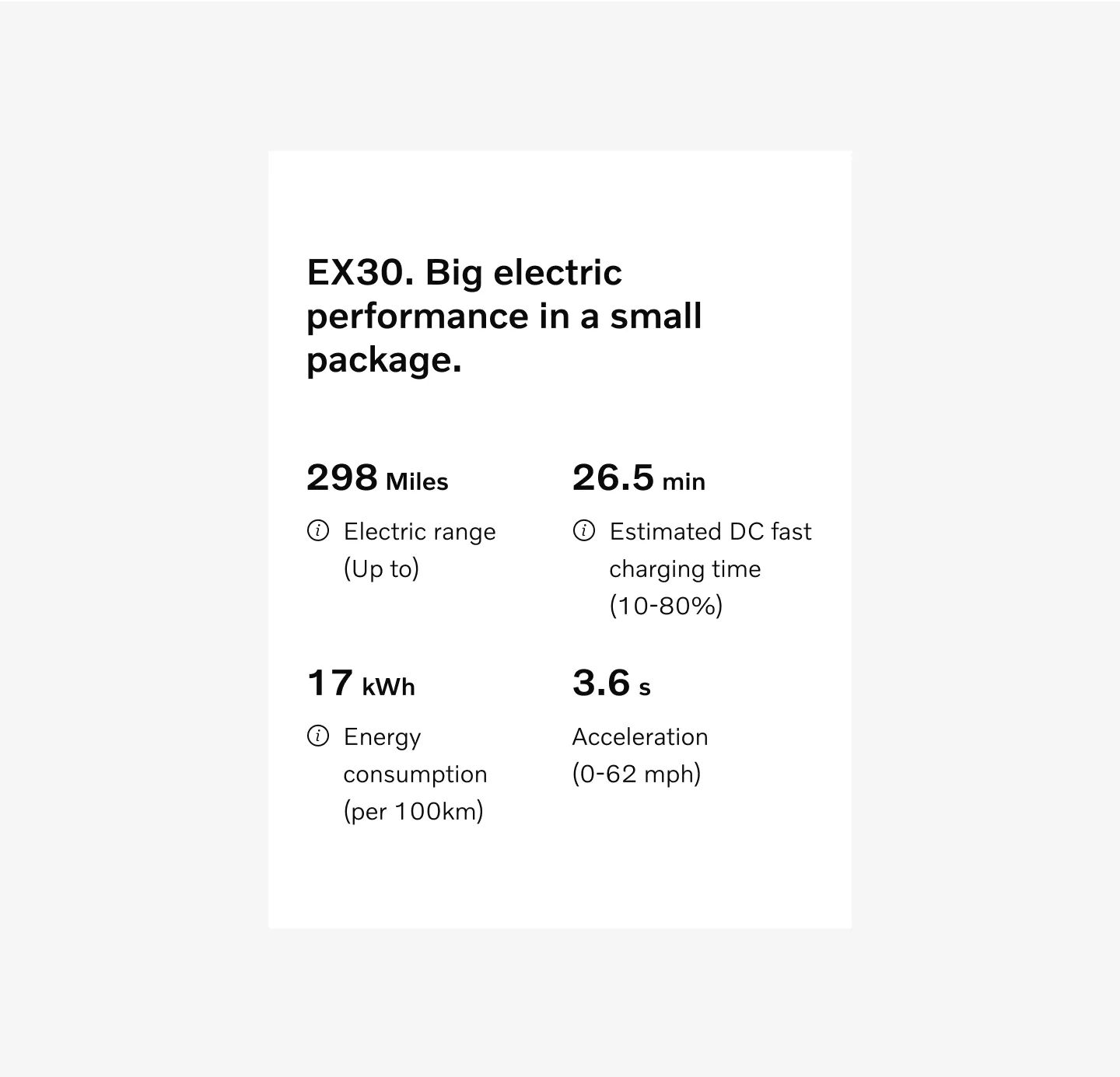
Showing popup disclaimer on mobile.
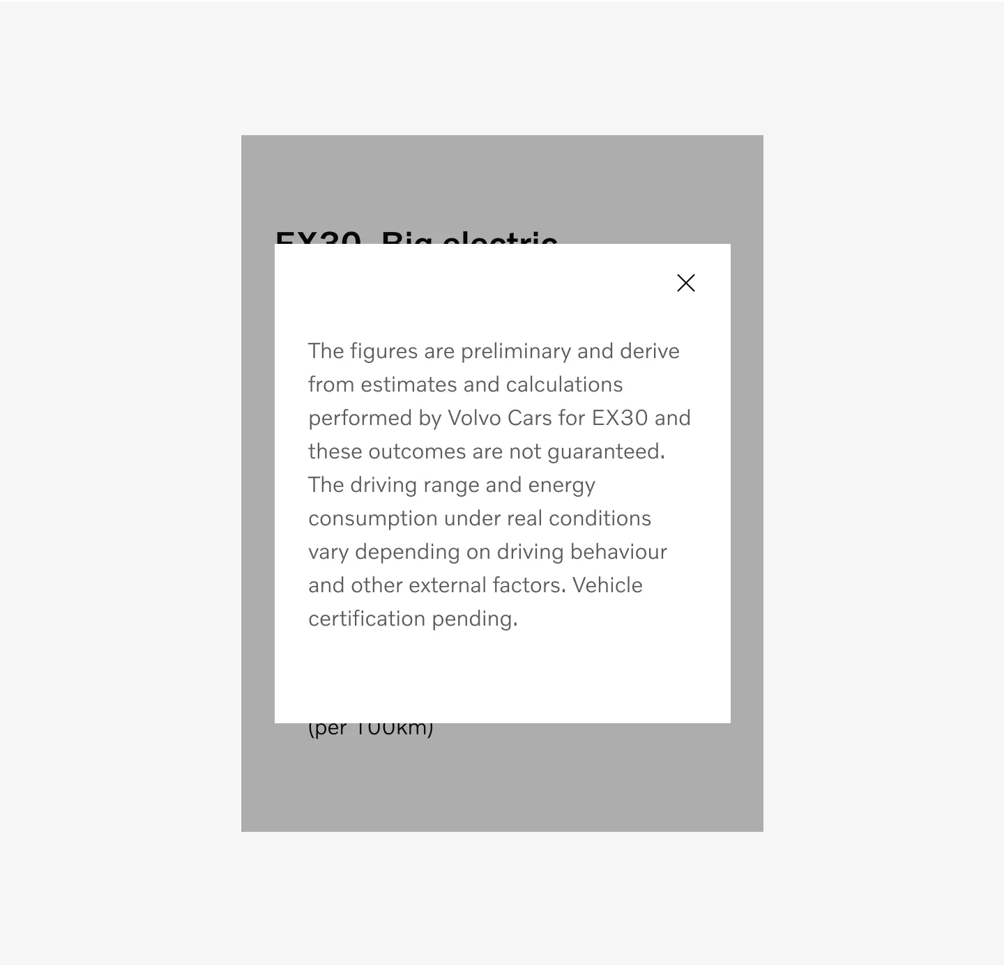
Showing popup disclaimer with modal with left aligned text on mobile.
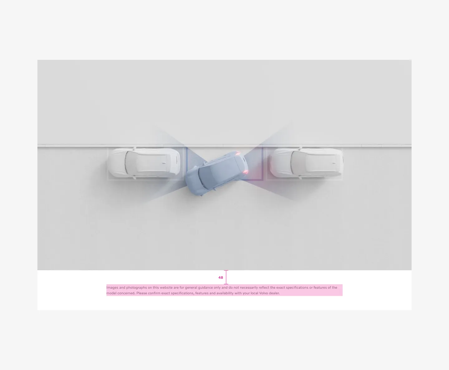
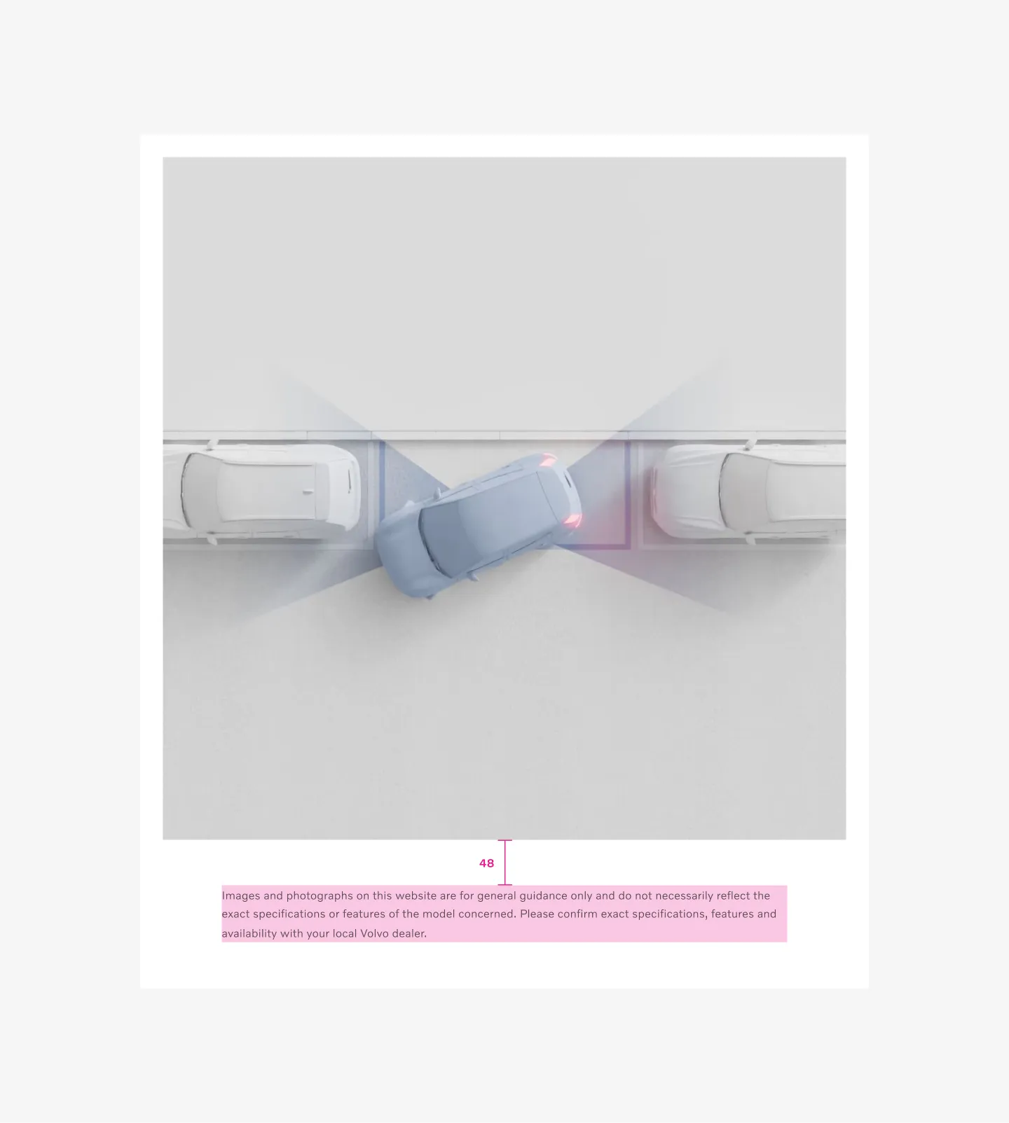
Spacer
Section titled “Spacer”Embedded disclaimer
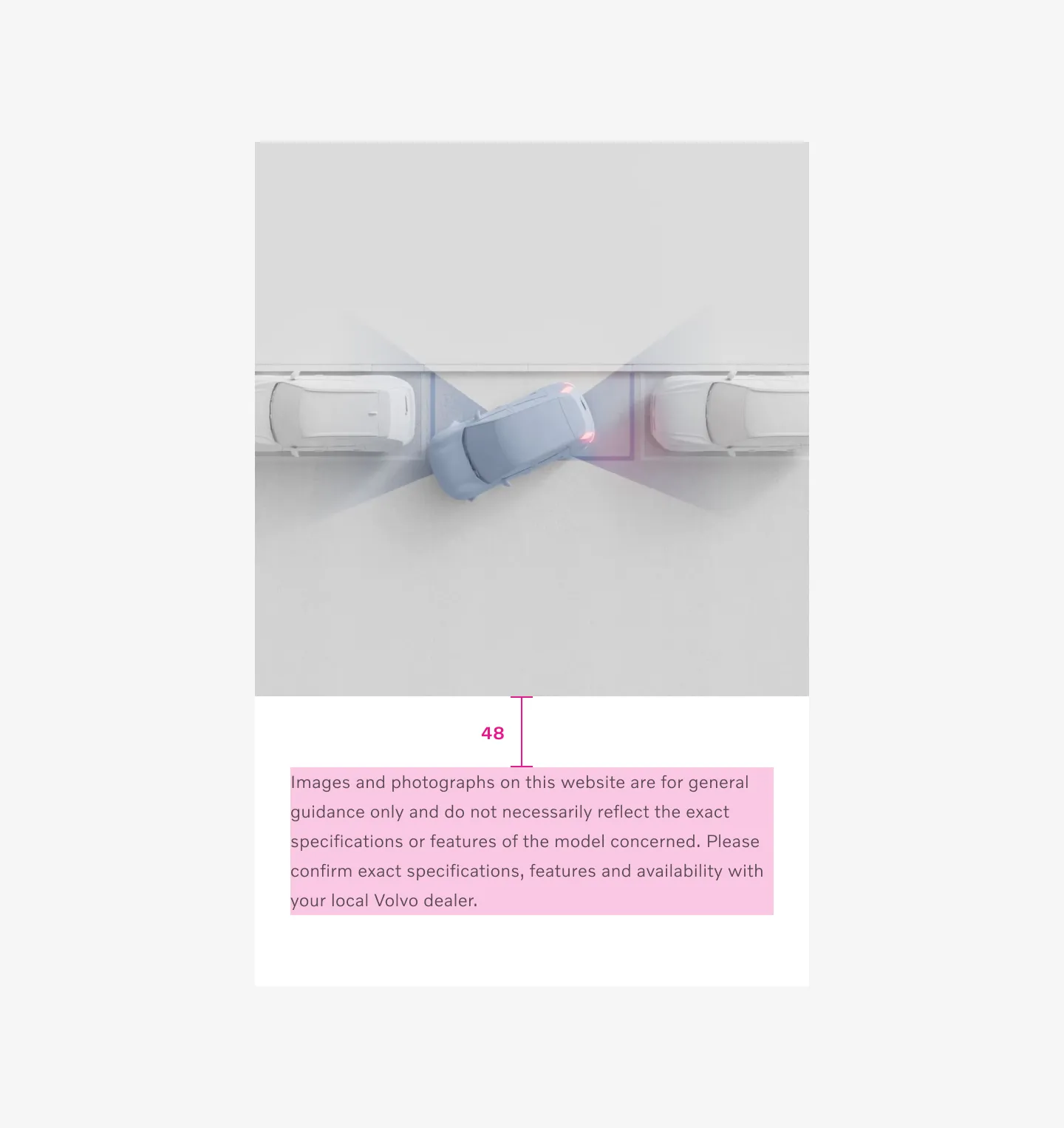
Section titled “Embedded disclaimer”Embedded using a fixed spacer of 48 and on all breakpoints.
Example: Desktop with embedded disclaimer
Example: Tablet with embedded disclaimer
Example: Mobile with embedded disclaimer
Inline disclaimer
Section titled “Inline disclaimer”Uses component spacer. Using the same spacing as between elements inside a component.
Example: Desktop with inline disclaimer
Example: Tablet with inline disclaimer
Example: Mobile with inline disclaimer
Standalone disclaimer
Section titled “Standalone disclaimer”Standalone disclaimer uses fluid page spacer. Use same spacing as between all components on the page.
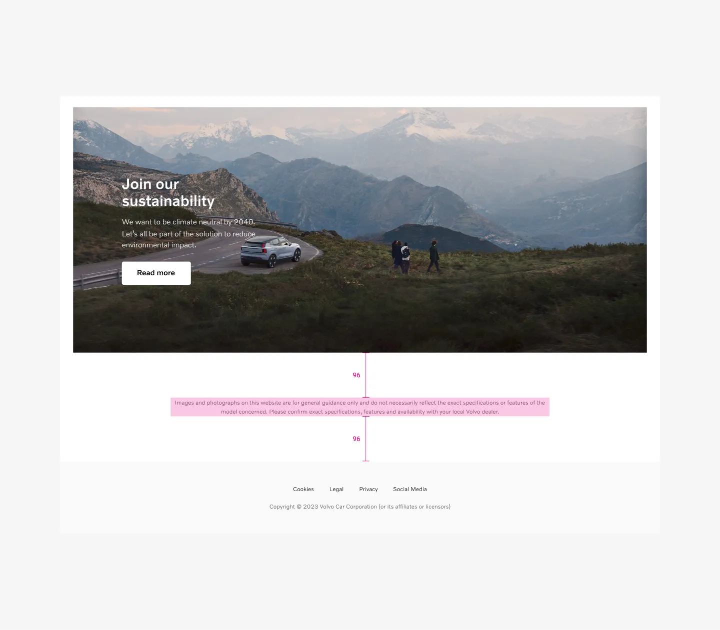
Large viewports uses 96px spacer between
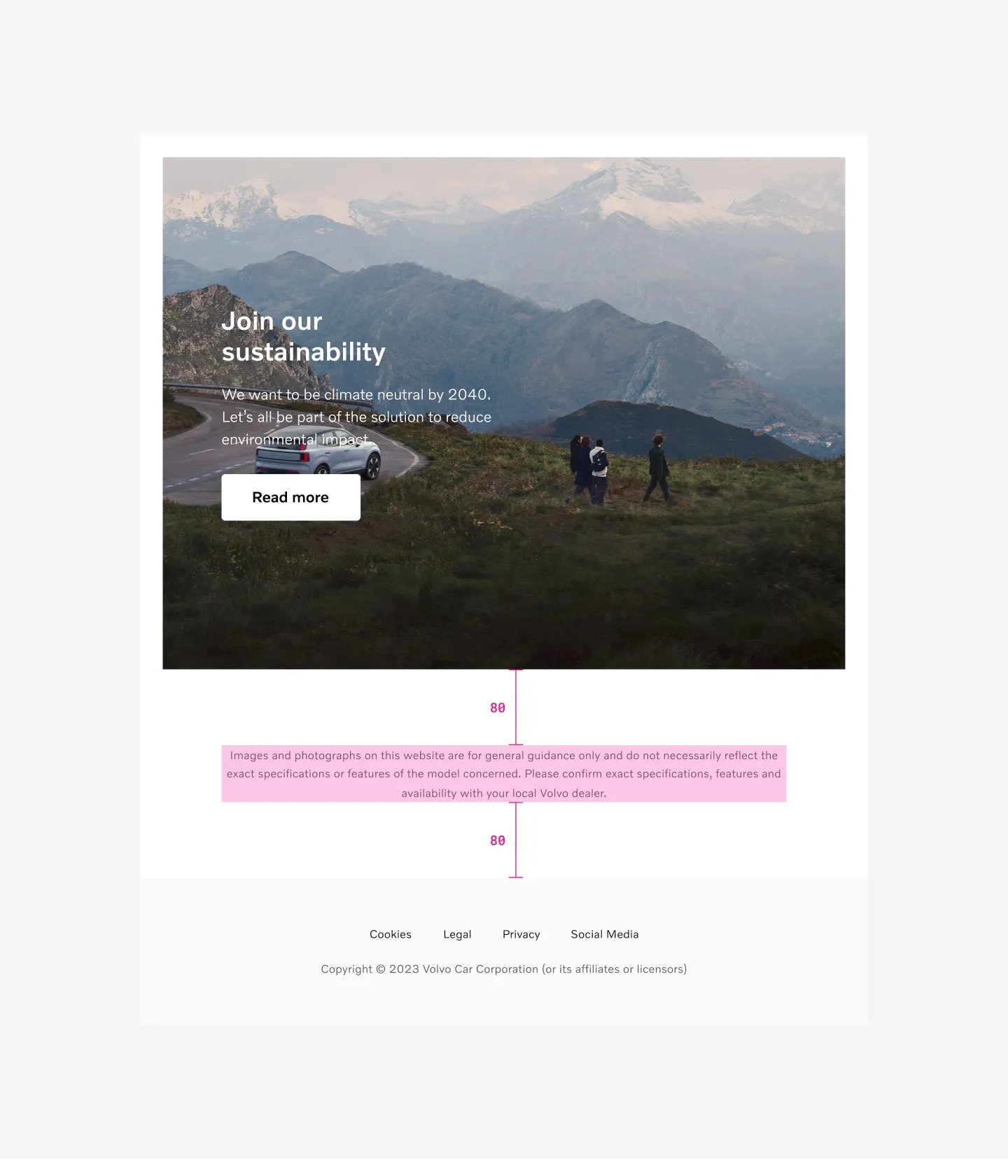
Medium viewports uses 80px spacer between
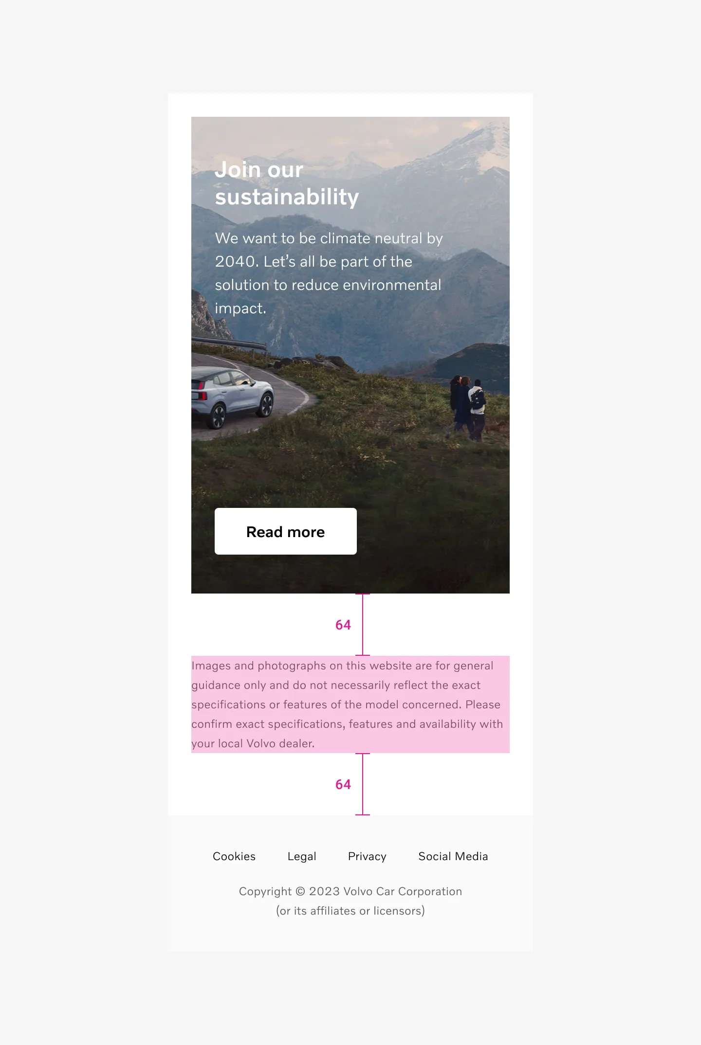
Small viewports uses 64px spacer between
Page spacer
Section titled “Page spacer”Small viewports
64px spacer between
Medium viewports
80px spacer between
Large viewports
96px spacer between
Disclaimer text is 12pt.
Use 16pt body copy inside modal when using popup disclaimer.
Disclaimer text uses secondary color on text.
Primary color when used inside modal.
Text alignment
Section titled “Text alignment”Text should always be left aligned on small (mobile) viewports.
Text can be centered or left aligned on medium (tablet) and large (desktop) viewports.
Embedded
Same width as the content
Max width 808px
Inline
Same width as the content
Max width 808px
Standalone
Max 808px
Popup
Depending on modal width
Color modes
Section titled “Color modes”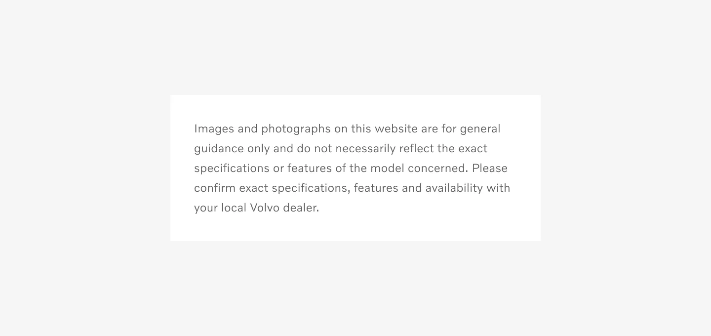
Showing disclaimer on light color mode
Showing disclaimer on dark color mode
Using star or number
Section titled “Using star or number”Using star
Section titled “Using star”If the disclaimer applies to a single word or statement in the component and not the whole component, use a * or number to connect it with the disclaimer. Star should be added after text to highlight there is a disclaimer text and before text inside disclaimer.
Recommend to use star when its 1 or 2 disclaimers.
Using number
Section titled “Using number”Use (Example¹) number when its more than 2 callouts. Number should be added after text to highlight there is a disclaimer text and before text inside disclaimer (Example¹).
Example using number.
Link:
Considerations
Section titled “Considerations”When to center or left align text.
Section titled “When to center or left align text.”Text should always be left aligned on small (mobile) viewports.
Text can be centered or left aligned on Medium (tablet) and Large (desktop) viewports.
Do not use star or number in pop disclaimer
Section titled “Do not use star or number in pop disclaimer”Star or number is not used when using info Popup disclaimer.
Star placement on text
Section titled “Star placement on text”
Use star after text
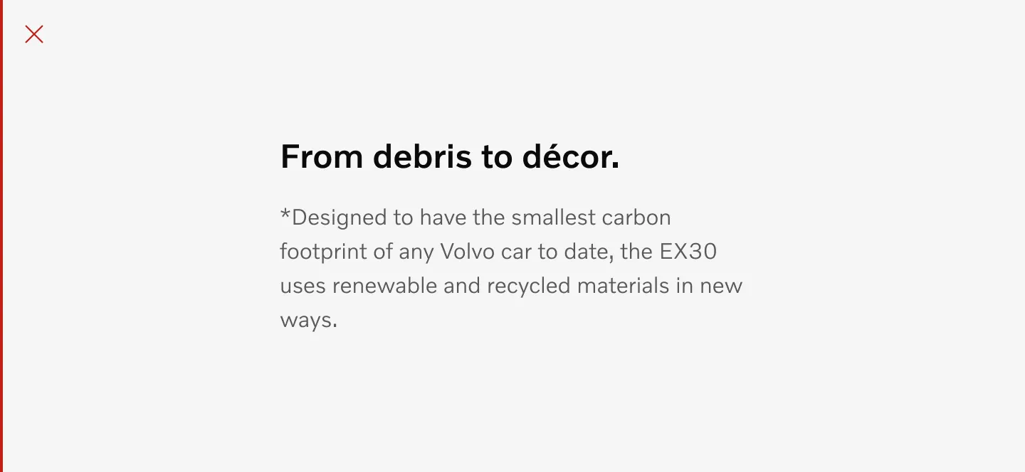
Do not use star before text
Star placement on disclaimer text
Section titled “Star placement on disclaimer text”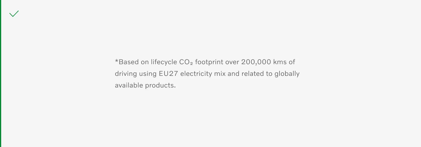
Use star before disclaimer text.
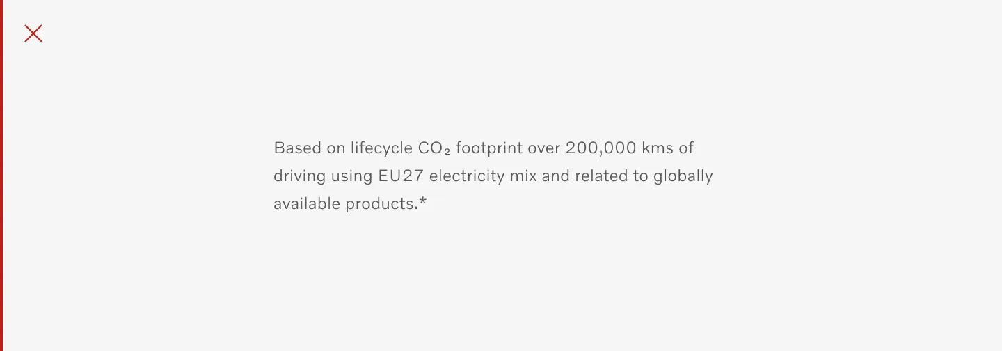
Do not use star after disclaimer text.
Table of options
Section titled “Table of options”From the design point of view, each component has a number of options. These options and their names are platform agnostic, and each implementation should adapt these to fit into their framework.
| Property | Values | Default value |
|---|---|---|
| Color mode | Light, Dark | Light |
| Text alignment | Left, Center | Left |
| Description | - | - |