Dialog
Dialogs and sheets are modal windows appearing in front of the main content, used to display important information, confirmation actions, selection actions, and more to a user without requiring them to navigate to a new page.
Anatomy
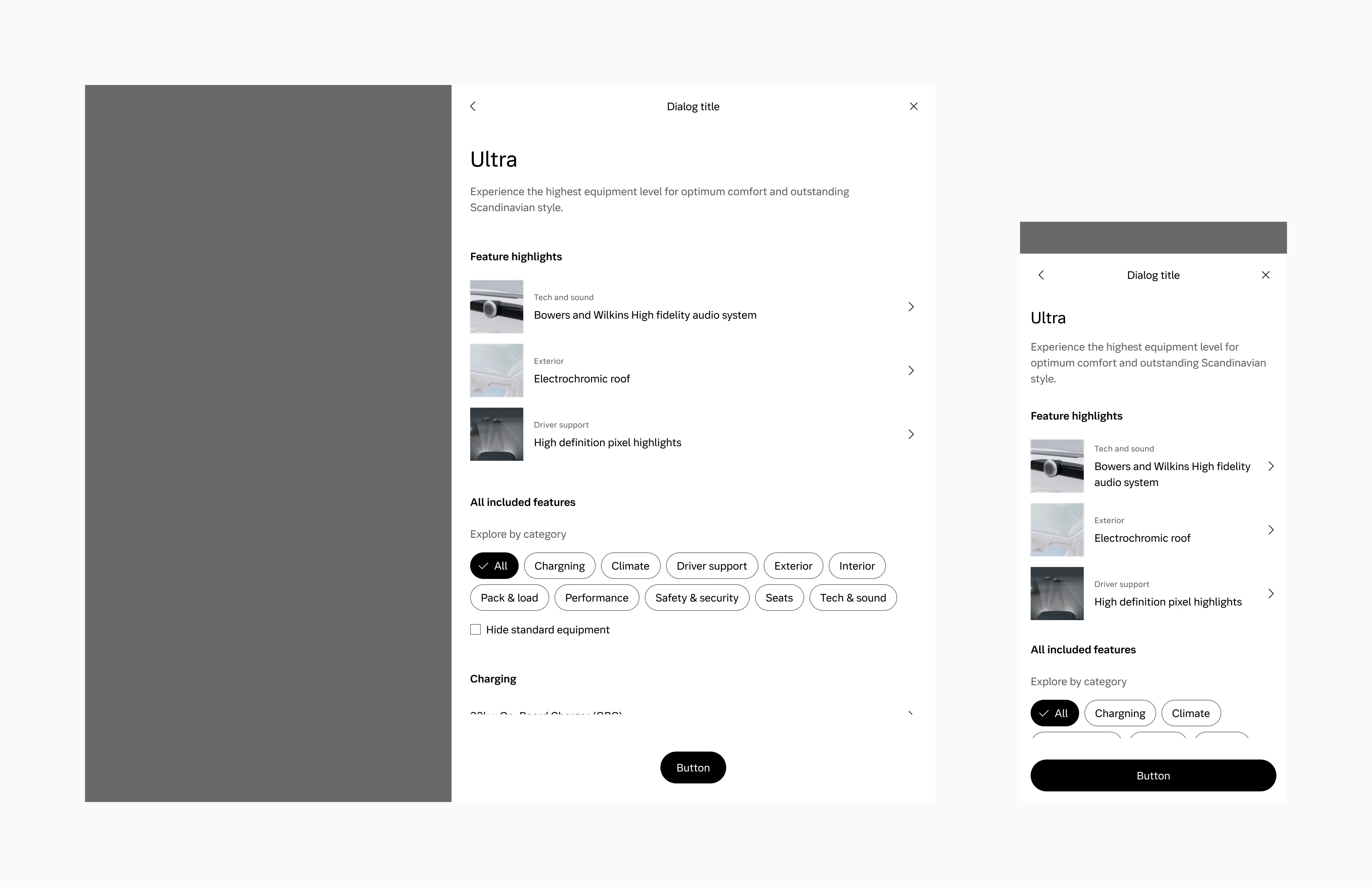
Section titled “Anatomy”Dialog large
Section titled “Dialog large”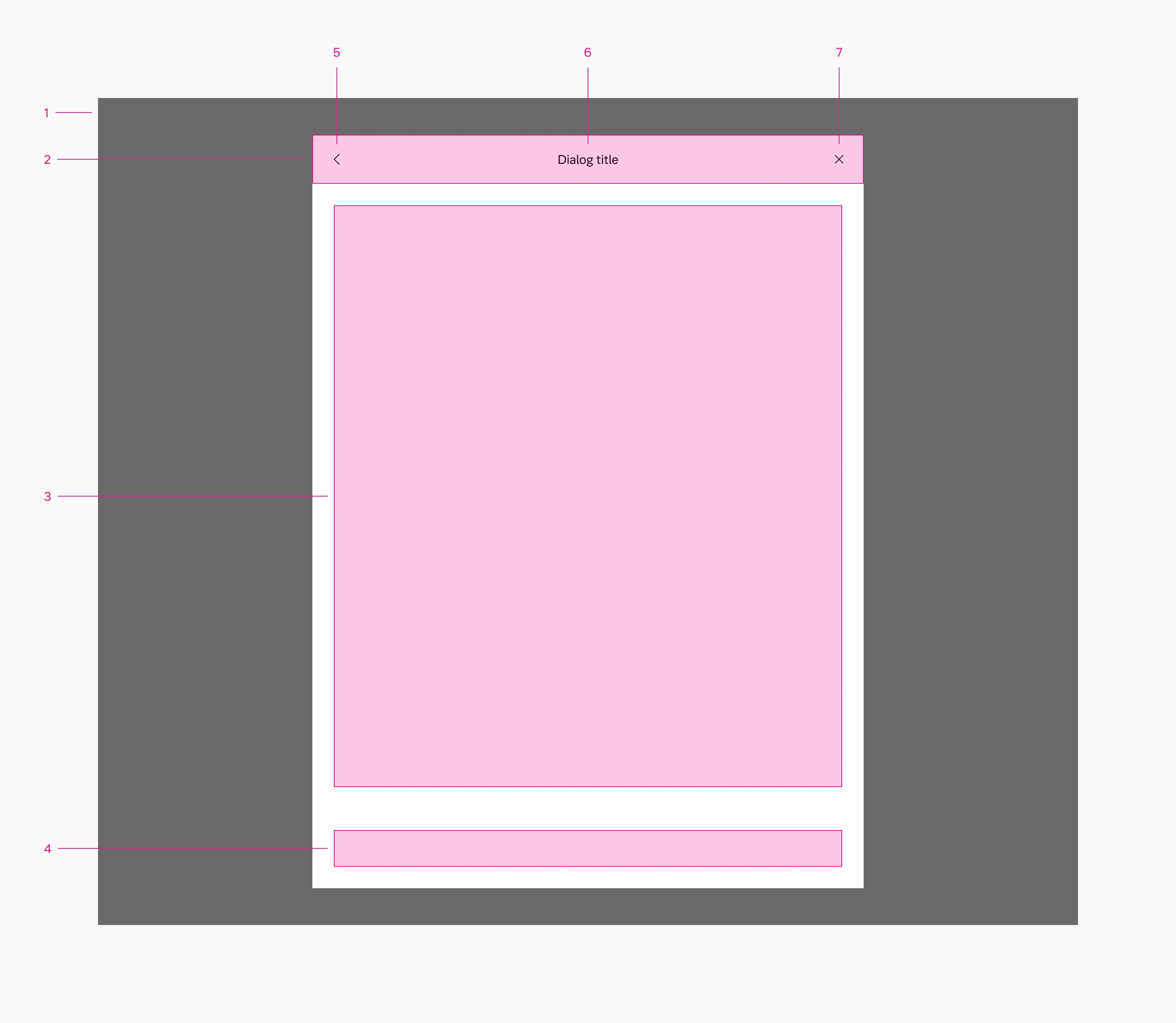
- Backdrop
- Header
- Content slot
- Footer slot
- Back button
- Dialog title
- Close button
Side sheet
Section titled “Side sheet”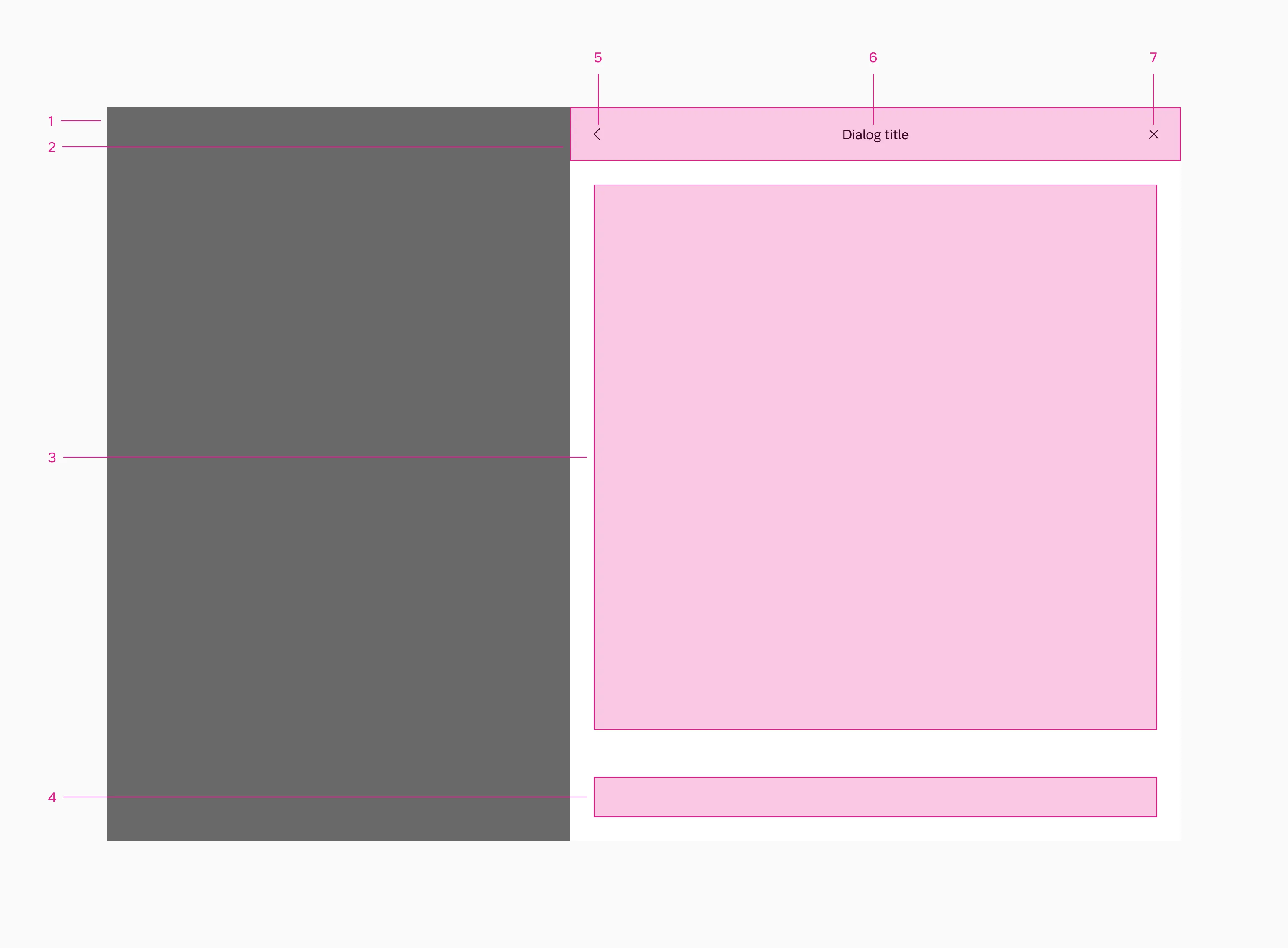
- Backdrop
- Header
- Content slot
- Footer slot
- Back button
- Dialog title
- Close button
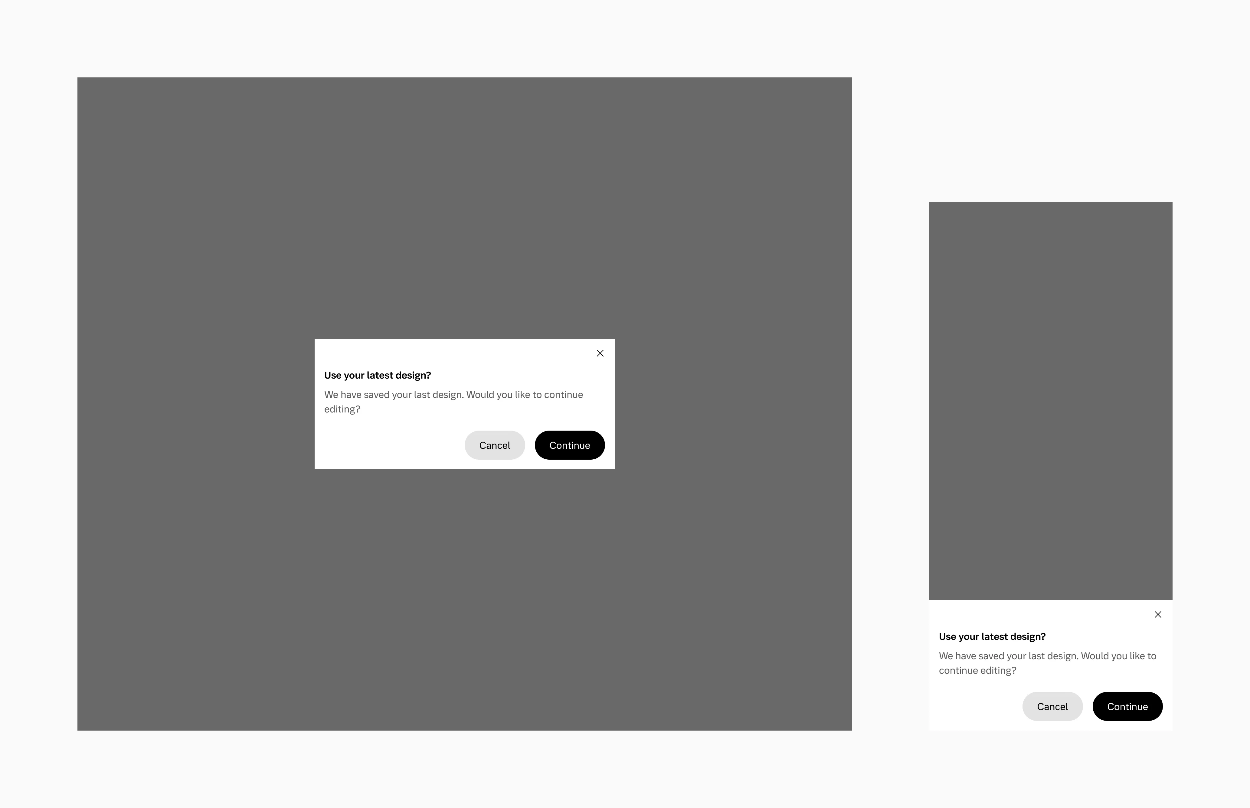
Dialog small
Section titled “Dialog small”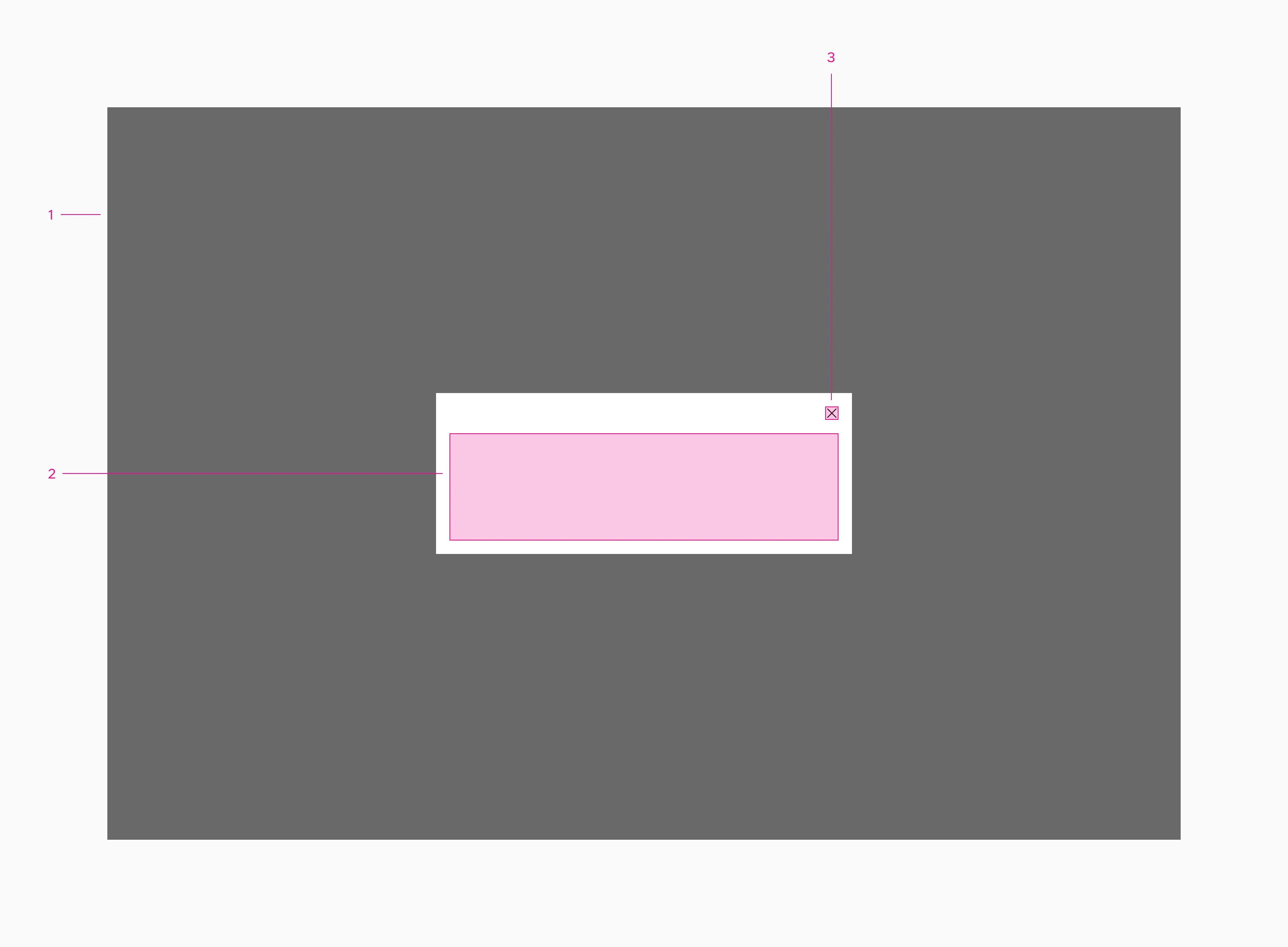
- Backdrop
- Content slot
- Close button
Dialog large
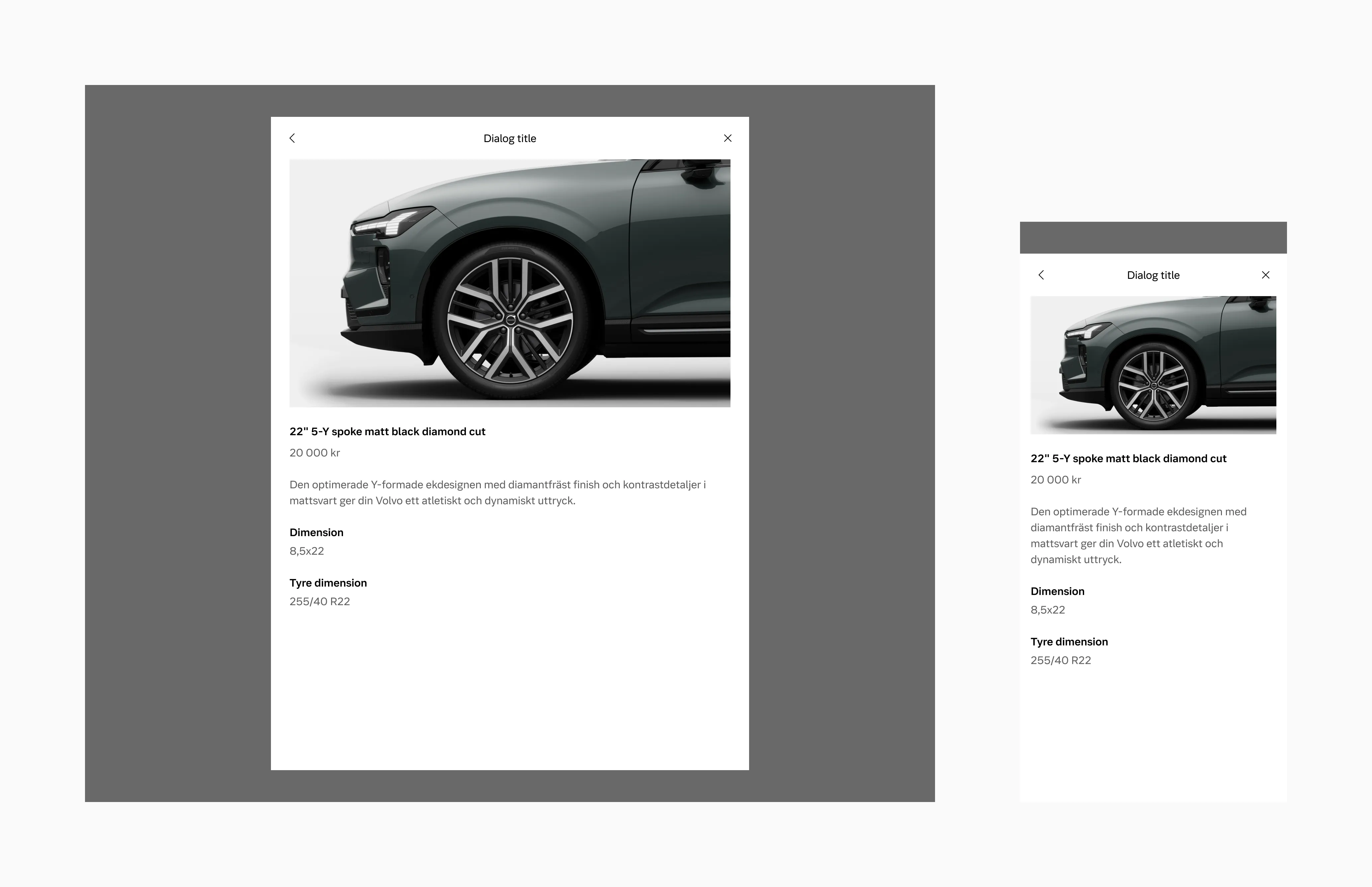
Section titled “Dialog large”Dialog large is used for displaying additional information or options without navigating away from the current screen.
Side sheet
Section titled “Side sheet”A side sheet is a variant of a dialog that appears on the side of a screen. It’s used for displaying additional information or options without navigating away from the current screen.
A side sheet is perfect for displaying extensive and detailed information, as it spans the entire screen height. It’s also useful when it is beneficial to see immediate results of actions such as filters etc. Side sheets appear identical to large dialogs on sm screen sizes.
Dialog small
Section titled “Dialog small”Use dialog small when you need to alert the user about the impact of their chosen action or to request their confirmation.
Max width
Section titled “Max width”Large uses a max width of 70ch. When on sm breakpoint, the dialog scales to the edge of the screen.
Small uses a max width of 45ch. When on smaller breakpoints the dialog scales to the edge of the screen.
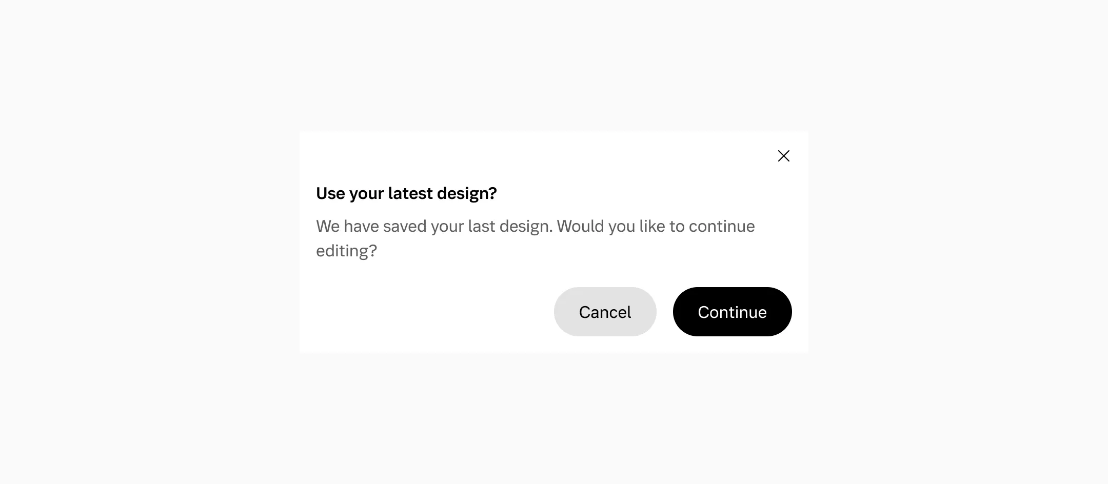
Buttons
Section titled “Buttons”Side-by-side buttons (Recommended)
Section titled “Side-by-side buttons (Recommended)”Side-by-side buttons are used to display two buttons adjacent to each other.
Stacked full-width buttons
Section titled “Stacked full-width buttons”Stacked buttons are designed to accommodate longer button text.
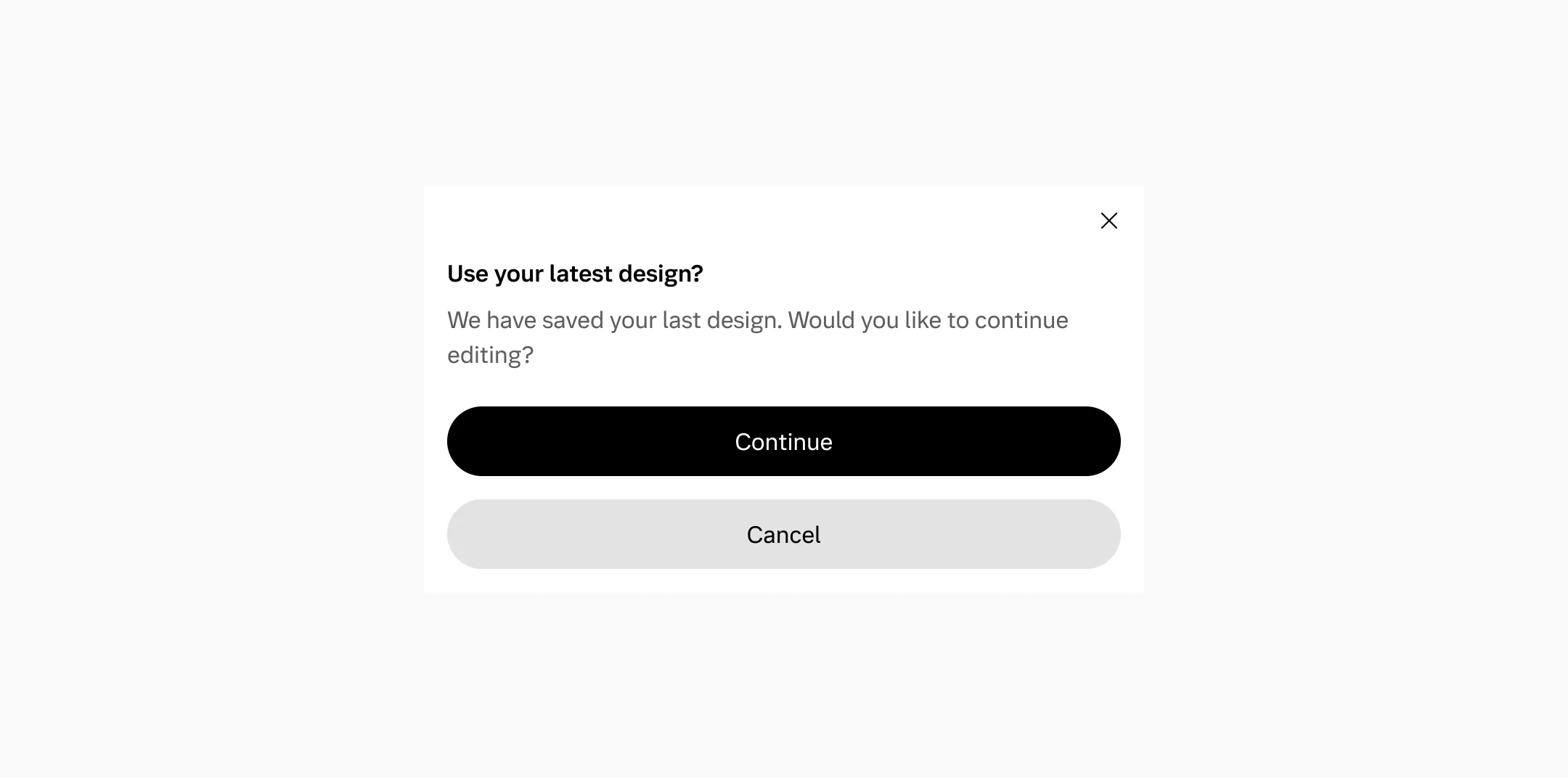
Button layout
Section titled “Button layout”We need to maintain the same order of buttons if they’re stacked or side-by-side, since they will automatically stack if they don’t fit side-by-side.
Backdrop
Section titled “Backdrop”Dialogs have a minimum of a 48px visible backdrop, letting the user click outside to close the dialog and providing a visual cue to the user that they are interacting with a dialog.
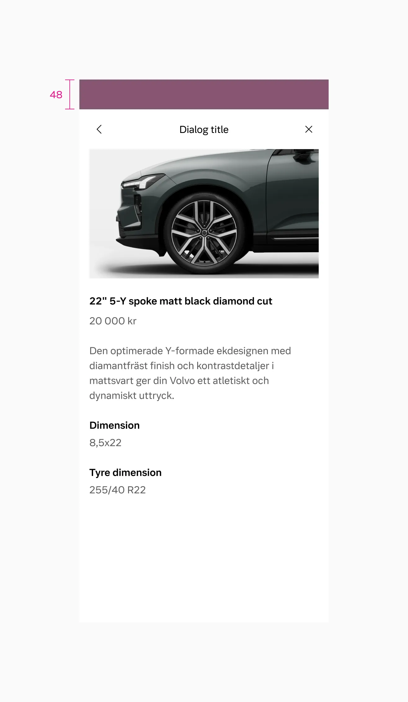
Displaying touch area outside dialog on the sm breakpoint.
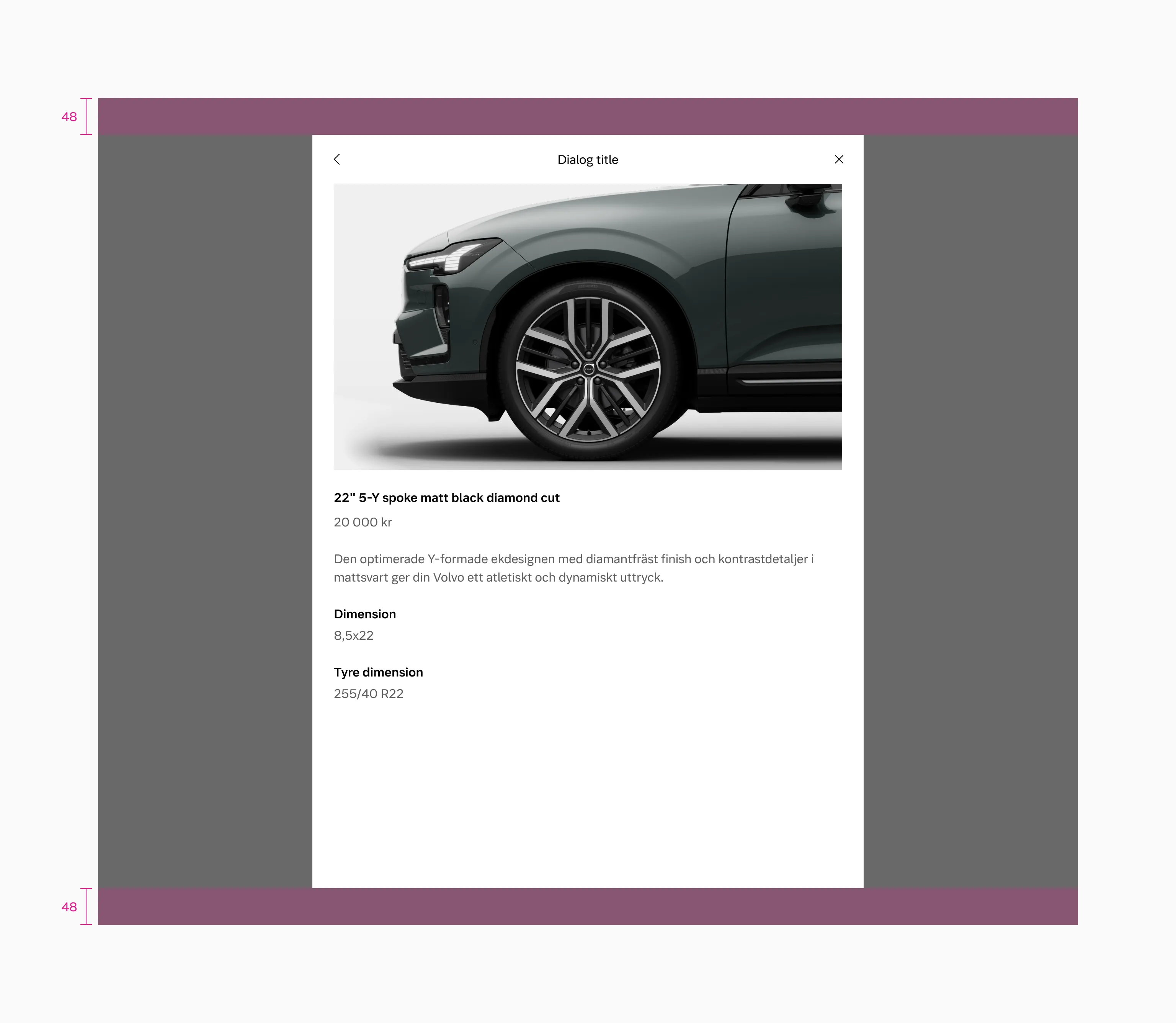
Displaying touch area outside dialog on the lg breakpoint.
Animation
Section titled “Animation”Dialog large
Section titled “Dialog large”- Scales up from the center of the screen on the
lgandmdbreakpoints. - Slides in from the bottom on the
smbreakpoint.
Dialog small
Section titled “Dialog small”- Scales up from the center of the screen on all breakpoints.
Side sheet
Section titled “Side sheet”- Slides in from the side on the
lgandmdbreakpoints. - Slides in from the bottom on the
smbreakpoint.
Considerations
Section titled “Considerations”Use sparingly
A backdrop appears behind the component, blocking user interaction with the rest of the page. Because dialogs are interruptive, they should be used sparingly and only in response to a user action.
Avoid using more than 2 buttons
Try not to use more than 2 buttons in one view.
Max 2 modal levels
Don’t go too far with the amount of modal levels (try to stick to max:2).