Chips
Chips are compact elements that allows users to refine content, such as filtering categories or tags, with immediate visual feedback.
How to use
Section titled “How to use”Use chips when you need to display multiple related items in a compact format. They can be used to indicate selected filters, tags, or options, and also allow users to make selections from a set of options or dismiss/remove items.
When not to use
Section titled “When not to use”Avoid using chips in the following scenarios:
- Don’t use as a non-interactive list. Chips are meant to be interactive and therefore should not be used as a non-interactive list of metadata. Instead, use Pill component.
- Don’t use as a settings controller. Chips are designed to control and filter things on the current page. Don’t use it instead of checkboxes or radio buttons as a means of configuration.
- Don’t use a single chip as a replacement for a button. While buttons provide persistent, familiar calls to action, chips are dynamic and typically appear in groups based on context.
Variants
Section titled “Variants”Dismissible Chip
Section titled “Dismissible Chip”Dismissible chips display selected options and allows users quick removal of individual selections without affecting other active choices. Dismissible chips primarily should be paired with a selection component (filter input, select input) to take in the user’s selections.
Selectable Chip
Section titled “Selectable Chip”Selectable Chips component allows users to select/unselect quick filtering options that affect the current view. Chips in group supports mutually exclusive or multiple selection options.

Small size
Section titled “Small size”Designed to be used for dedicated filter modals or forms.
Large size
Section titled “Large size”Suited for a more prominent placement in larger layouts (e.g., top of a table or above search results)
States
Section titled “States”Dismissible Chip
Section titled “Dismissible Chip”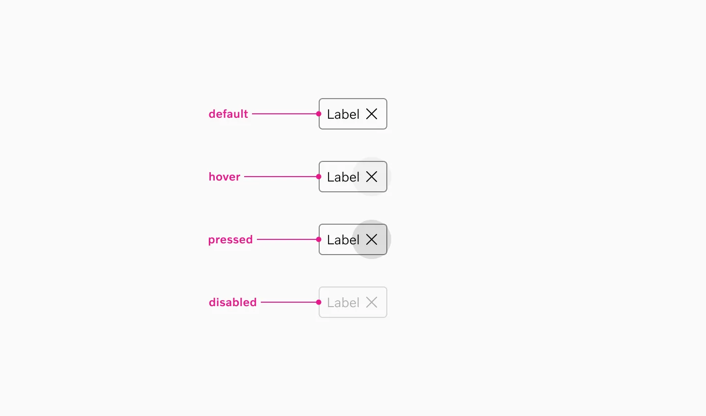
Supported states: Default, Hover, Pressed, Disabled
Selectable Chip
Section titled “Selectable Chip”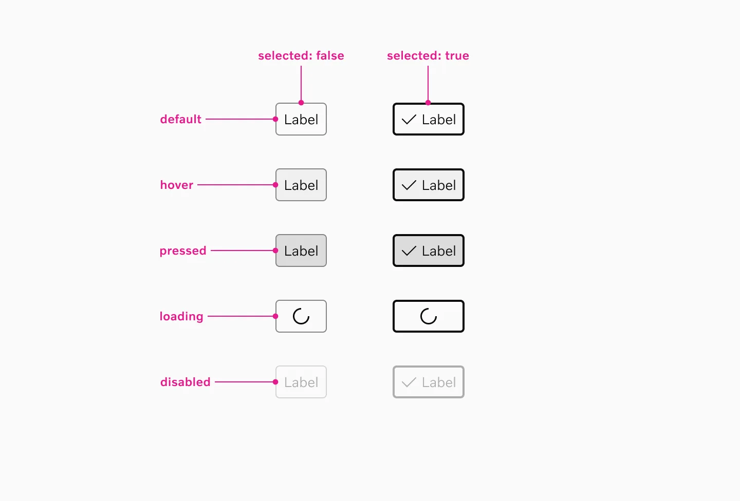
Supported states: Default, Selected, Hover, Pressed, Loading, Disabled
Interaction
Section titled “Interaction”Dismissible chips
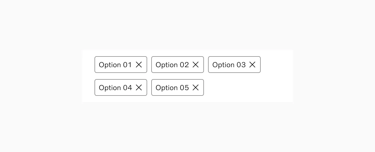
Section titled “Dismissible chips”Users can dismiss individual chips by clicking the close button (X), which removes the chip from the interface and updates the selection state. Multiple dismissible chips can be removed independently without affecting other active selections.
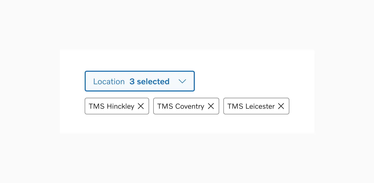
Example of dismissible chips used to display filter input results
Selectable chips
Section titled “Selectable chips”Depending on the scenario, multiple options can be selected all at once, or only one at a time. For clarity, it is important to not mix these behaviors in the same page or flow.
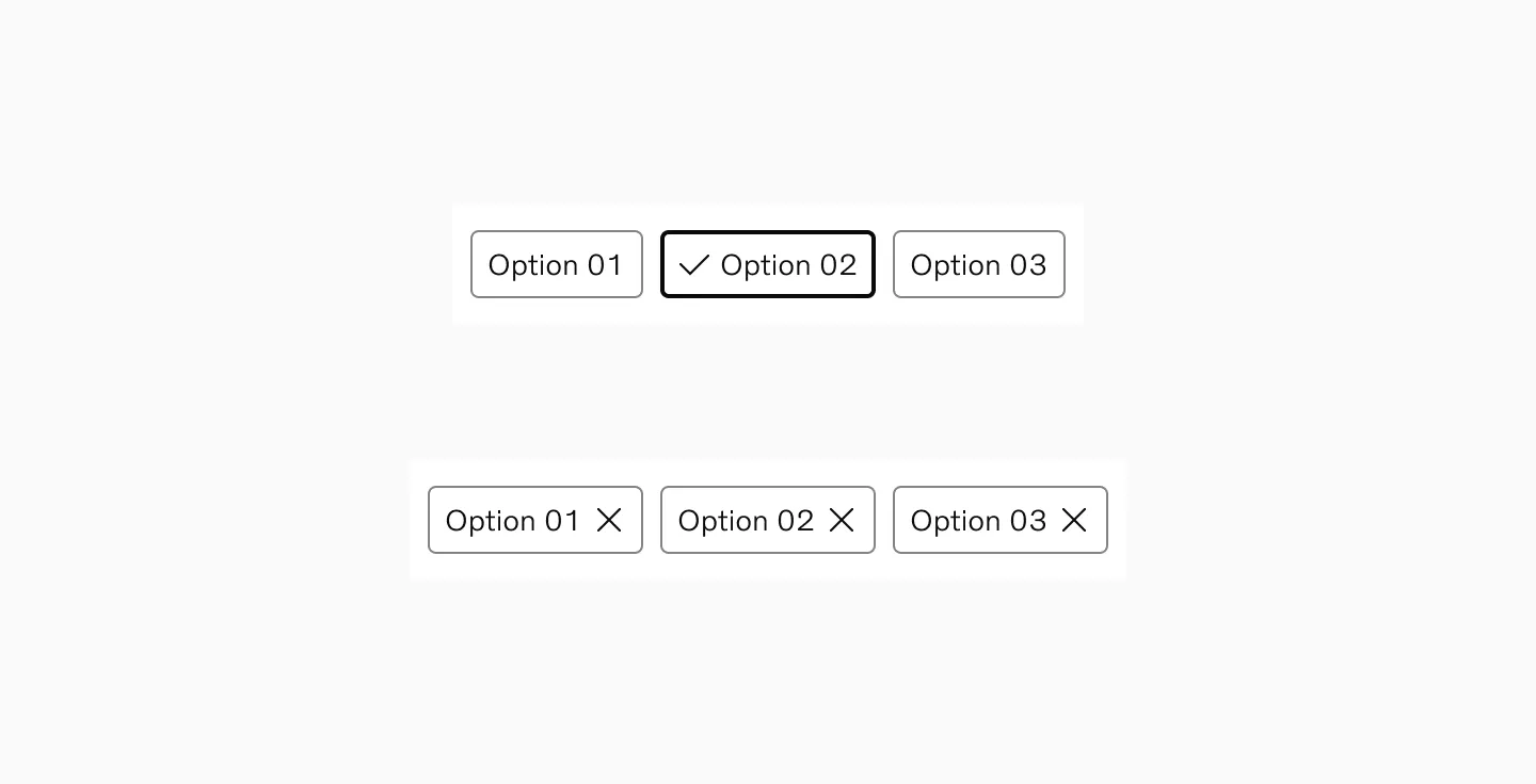
Single-selection
Section titled “Single-selection”Use single-selection when users need to choose exactly one option from a set of mutually exclusive choices.
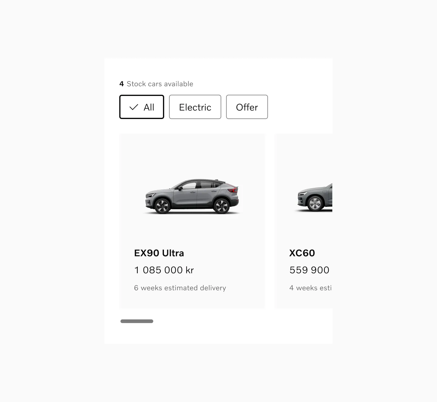
Example of single-selection filter to sort between stock cars.
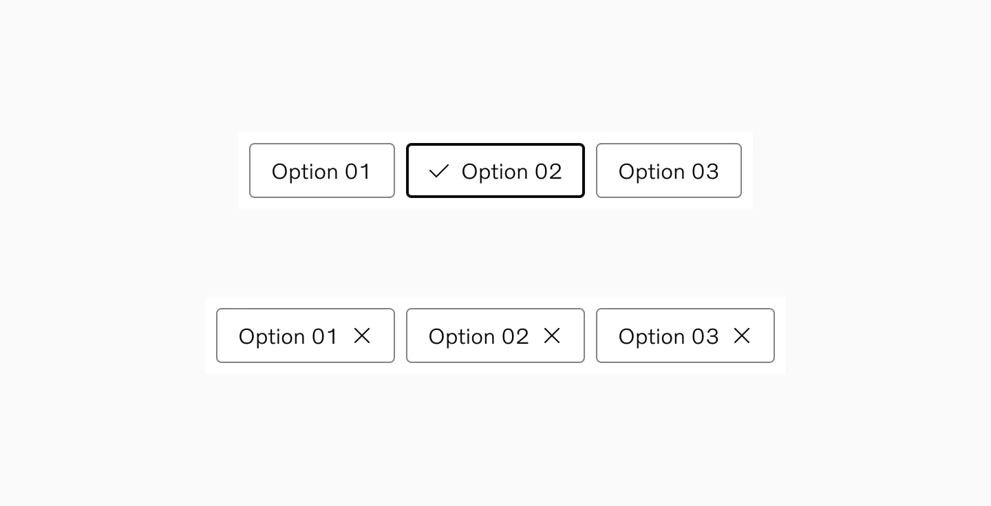
Multiple-selection
Section titled “Multiple-selection”Use multiple-selection when users need to combine different criteria to refine their results.
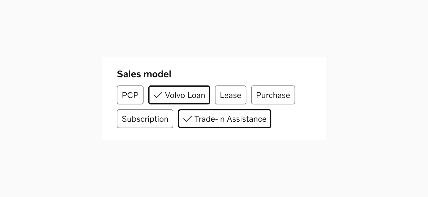
Example of multiple options presented as part of a longer form.
Accessibility
Section titled “Accessibility”Target size
Section titled “Target size”Chips uses 40px target size, ensuring comfortable touch interaction across devices. The height of the chip is minimum 32px, but the width adjusts to accommodate the content while maintaining minimum touch target requirements.
Both Small and Large variants use 40px target size.

Spacing
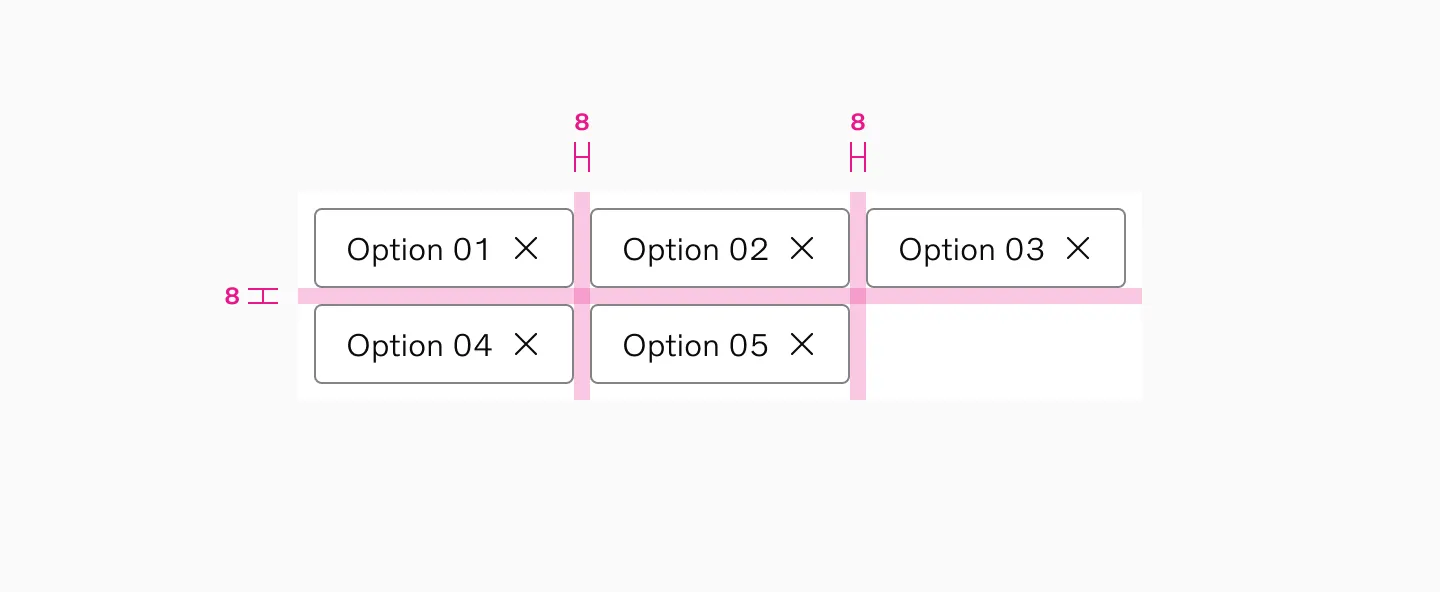
Section titled “Spacing”Chips in a group should have at least 8px spacer between them.
Examples
Section titled “Examples”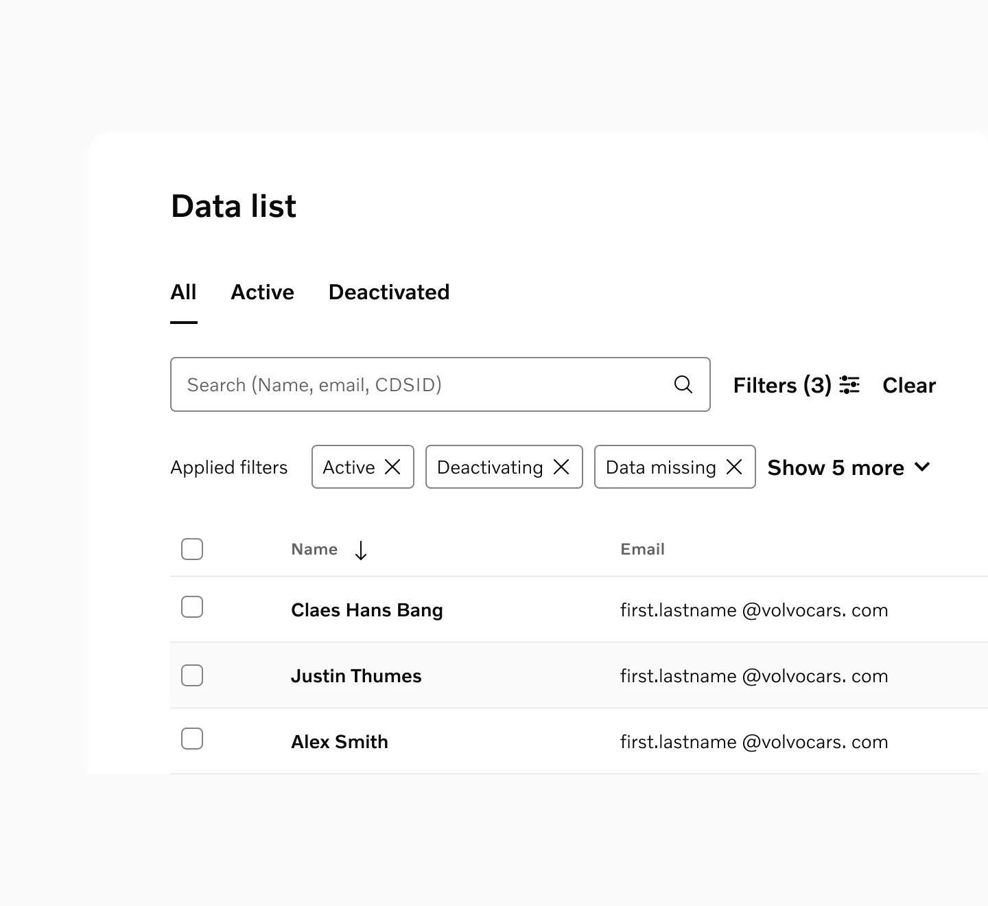
Dismissible chips used as a content filter for dynamic data in tables
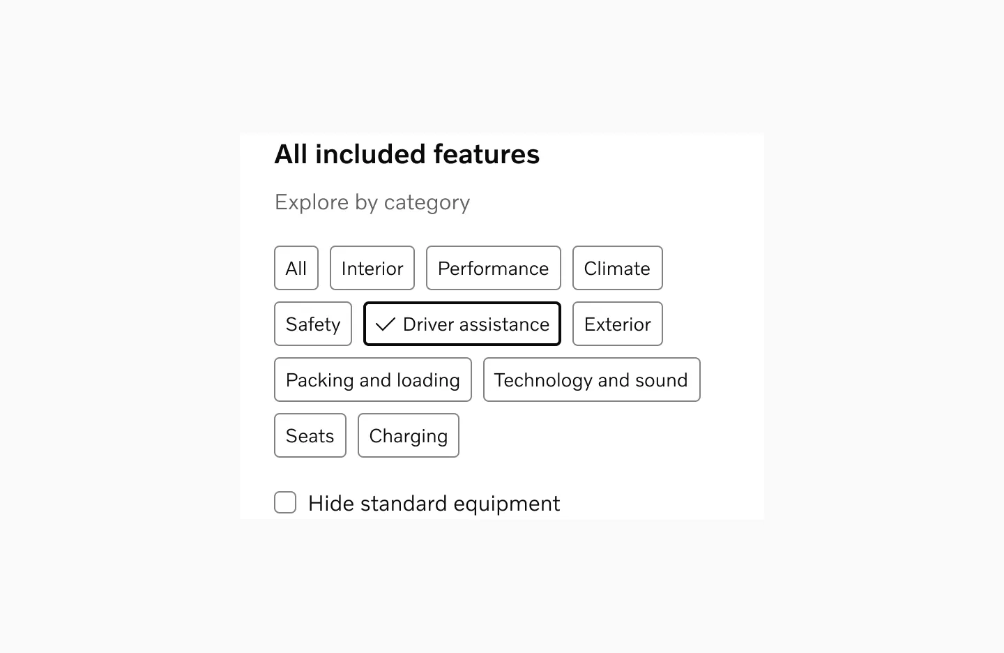
Single-selection selectable chips used in a filter modal
Considerations
Section titled “Considerations”Appropriate Content Length
Section titled “Appropriate Content Length”Keep chip text concise and focused. Long text in chips can disrupt visual consistency and layout.
Instant filtering
Section titled “Instant filtering”Users expect filter selections to apply immediately. However, in some cases, typically within filter modals with prominent “Apply Changes” buttons, changes may only take effect after confirmation.
Sensible defaults
Section titled “Sensible defaults”Start with either all options unselected or the most logical “default” option selected. Such a default should always be the first item in the list.
Don’t pre-select
Section titled “Don’t pre-select”If options were previously selected by the user, it might make sense to retain those selections, otherwise, let users make their own choices rather than pre-selecting options for them.
Stick to one behavior
Section titled “Stick to one behavior”Selectable chips can be configured to either allow multiple selections at once or just one selection at a time. However, to avoid ambiguity, it is important to stick to one of these behaviors per page/flow.
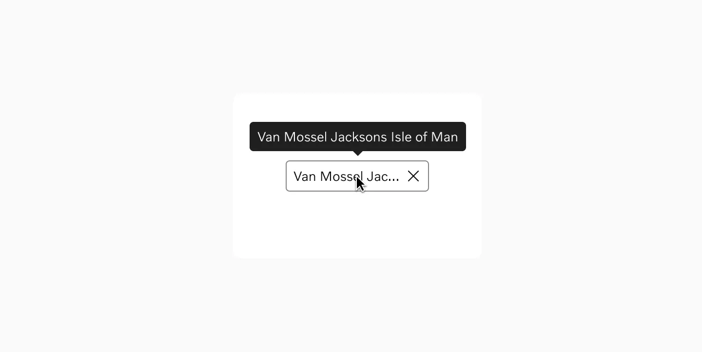
Content overflow
Section titled “Content overflow”Avoid truncation when possible, but if necessary, use ellipsis and provide tooltips. Consider internationalization and varying text lengths across languages.
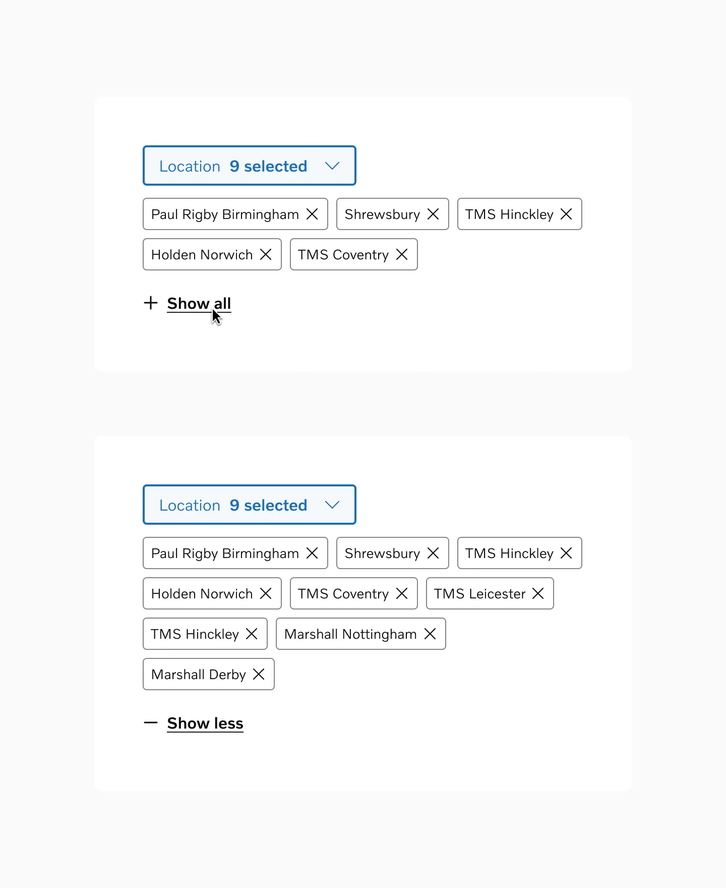
Progressive Disclosure
Section titled “Progressive Disclosure”In contexts with many chips or limited space, display a subset of the most important options initially with an action to reveal the complete set. Based on general UX principles like Miller’s Rule of 7±2 for optimal cognitive processing, start by showing 3-5 chips on mobile devices and 5-8 on desktop.