Checkbox
Checkboxes permit multiple selections from a set of options. They are suitable for choosing an option or as an alternative to a toggle for a preferred choice. When used in a list, it should always be possible to select all, none, or some of the options.
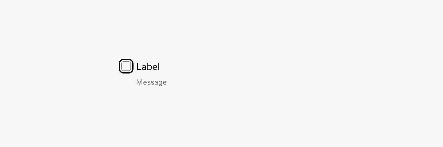
Anatomy
Section titled “Anatomy”The checkbox component changes content and visual treatment depending on which state it is in.
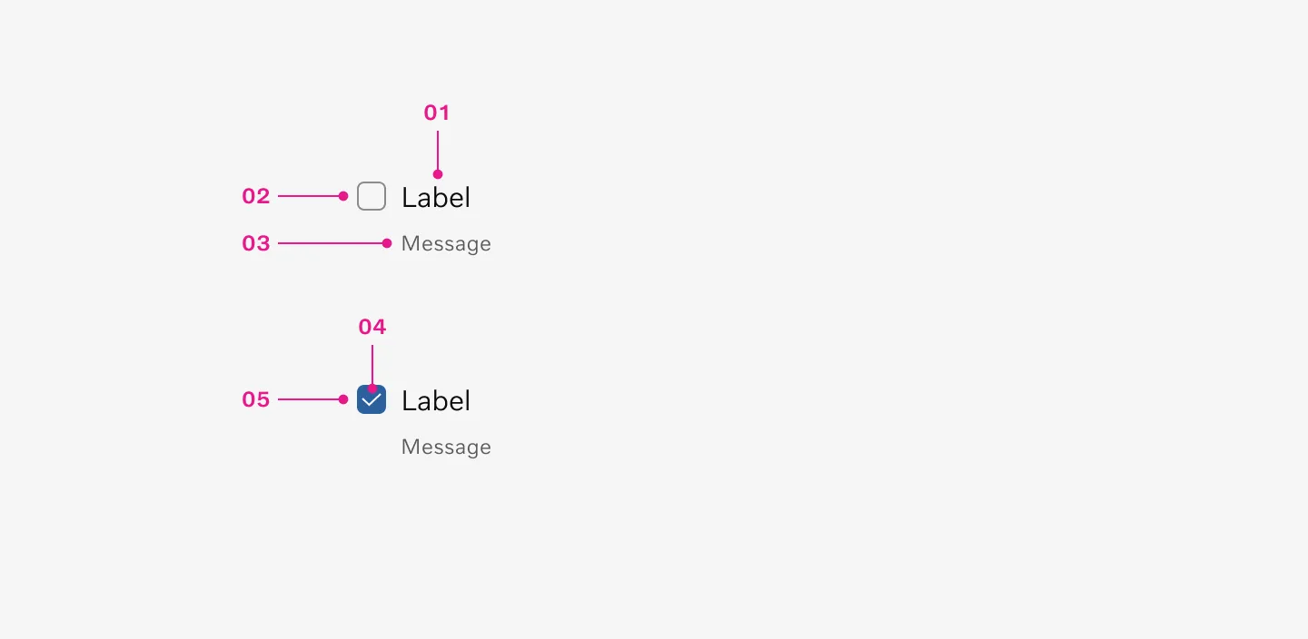
- Label
- Container
- Message (Optional)
- Icon
- Container filled
How to use
Section titled “How to use”Use checkboxes for multiple selection from a set of options.
- Use checkbox to select one or more options from a list
- Use checkbox to present a list containing sub-selections
- Use checkbox to turn an item on or off in a desktop environment
Dont’s
Section titled “Dont’s”- Do not use checkboxes when only one item can be selected from a list. Use radio buttons instead.
Variants
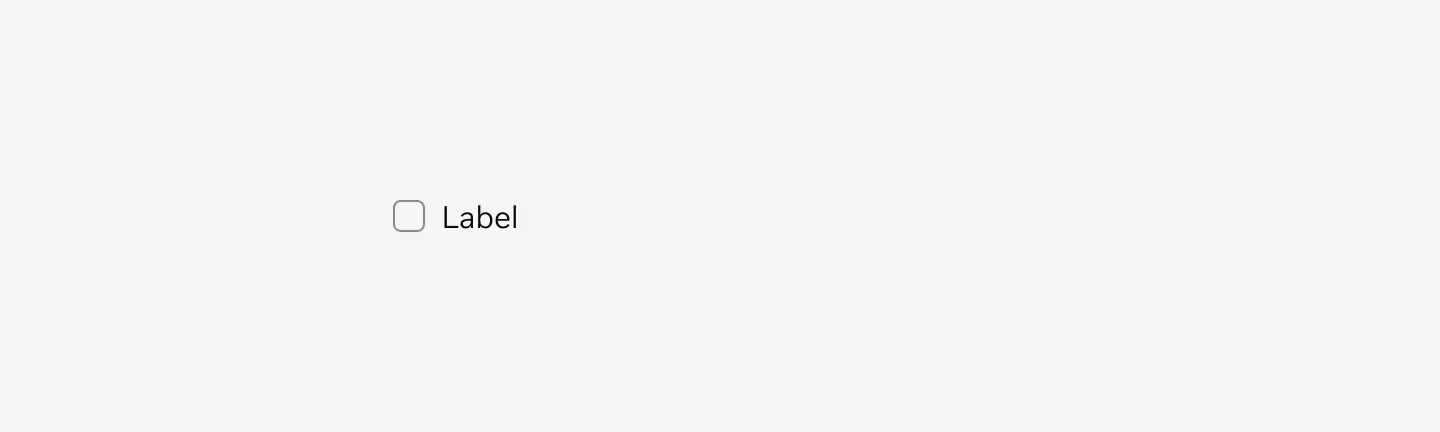
Section titled “Variants”Unselected
Section titled “Unselected”The unselected state for a checkbox with label refers to a checkbox that has not been clicked or checked by the user, and it is accompanied by a text label that describes what the checkbox is for.

Selected
Section titled “Selected”The selected state for a checkbox with label refers to the status of a checkbox when it has been clicked or chosen by the user. This selection is often indicated by a checkmark or a change in color.

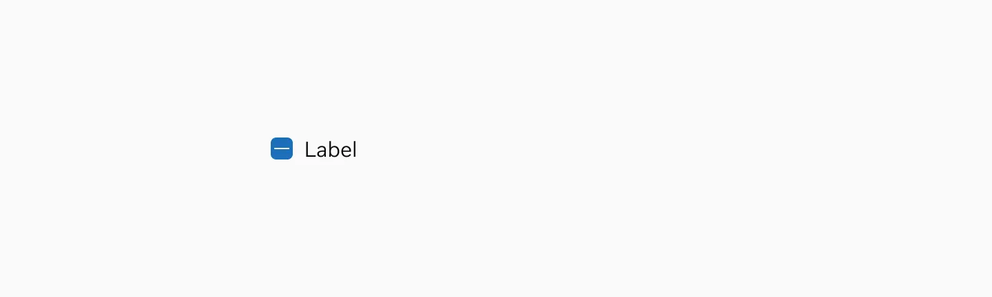
Indeterminate
Section titled “Indeterminate”The indeterminate variant is a special state of a checkbox where it shows a partially-selected or mixed state, typically used when a parent checkbox represents a group of sub-checkboxes where some, but not all, of the child items are selected.
States
Section titled “States”Checkboxes can be either selected or unselected. They have five states: enabled, disabled, hover, focused, and pressed.
Default
Section titled “Default”The default state in checkboxes refers to how the checkbox appears when it has not been interacted with. In this state, it typically consists of a checkbox container and a text label.
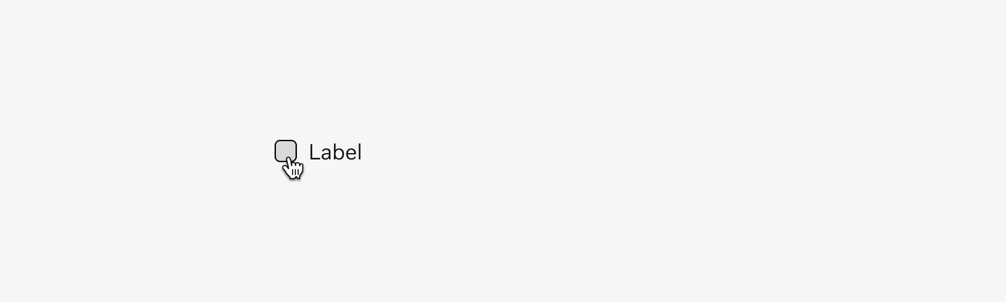
Shows an unselected checkbox with a label in its default state.

Shows a selected checkbox with a label in its default state.
A hover state for a checkbox is displayed when the user moves their cursor over the checkbox, before they actually click on it. It’s usually used to indicate that the checkbox is interactive.
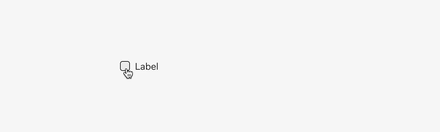
Shows an unselected checkbox with label in hover state.
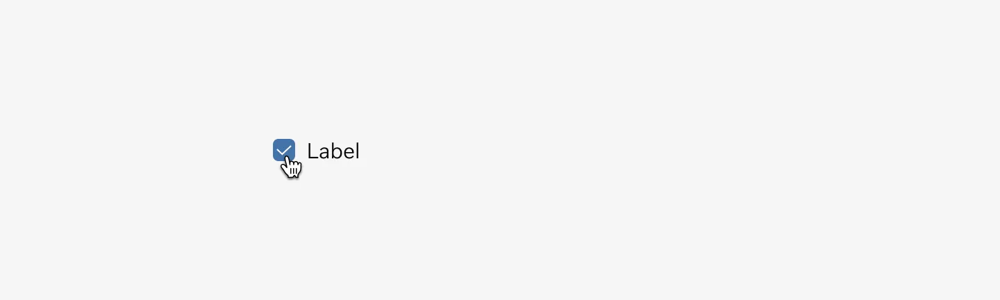
Shows a selected checkbox with label in hover state.
Pressed
Section titled “Pressed”The pressed state for a checkbox refers to the visual representation when a user clicks or touches the checkbox but hasn’t yet released it. This state often indicates that the checkbox is active and ready to change status once the click or touch is released.
Shows an unselected checkbox with label in pressed state.
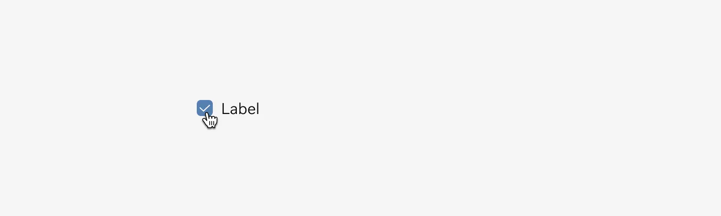
Shows a selected checkbox with label in pressed state.
Disabled
Section titled “Disabled”The disabled state of a checkbox refers to a user interface element that users cannot interact with, typically because certain conditions haven’t been fulfilled.

Shows an unselected checkbox with label in disabled state.
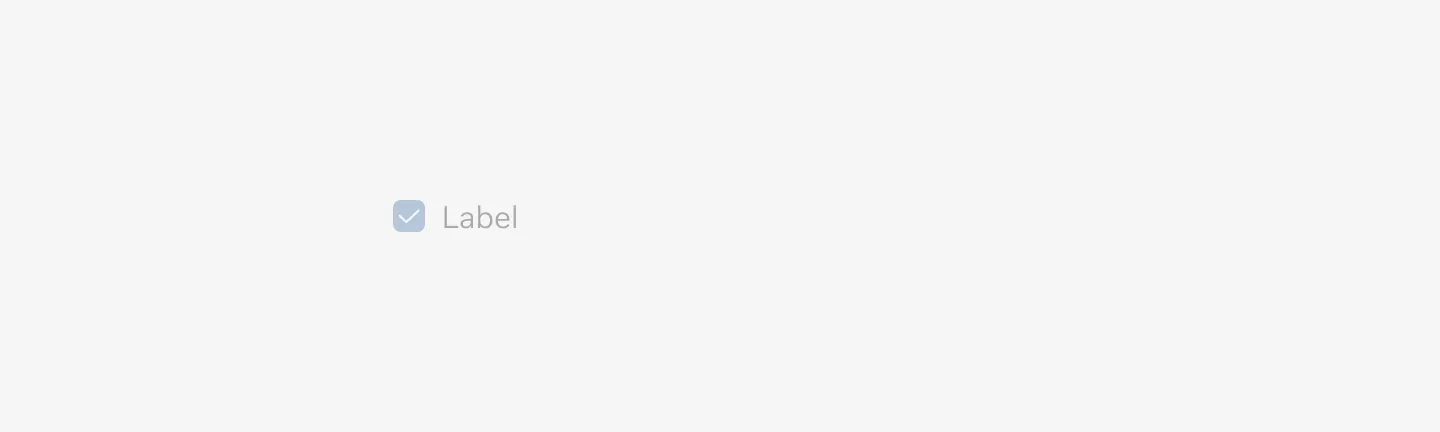
Shows a selected checkbox with label in disabled state.
The error state for a checkbox occurs when it is marked as incorrect. This typically happens when it hasn’t been appropriately filled out or selected as required.
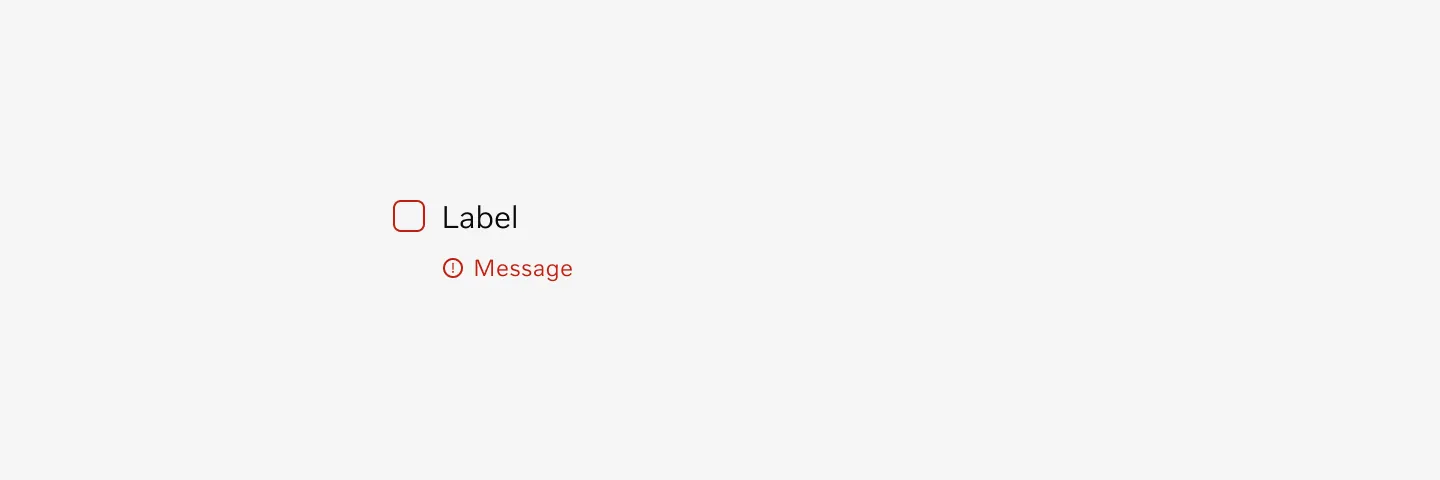
Shows an unselected checkbox with label in error state.
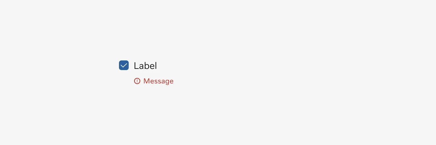
Shows a selected checkbox with label in disabled state.
Color mode
Section titled “Color mode”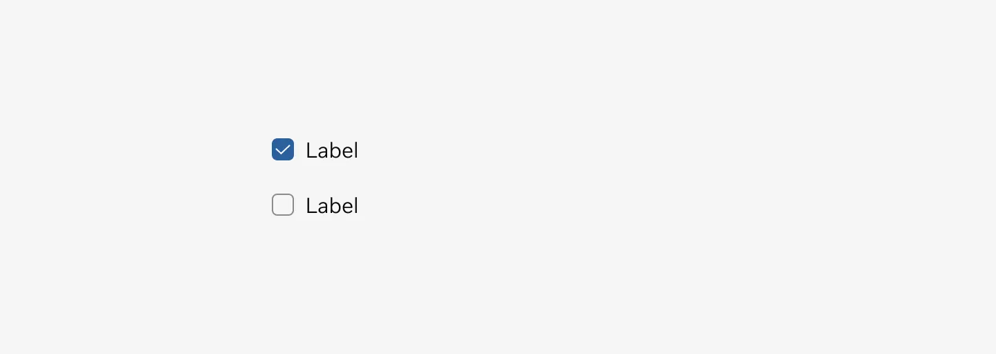
Displaying checkboxes in light mode
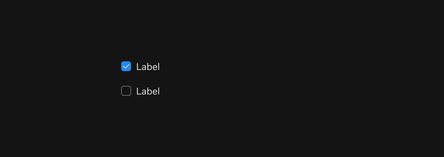
Displaying checkboxes in dark mode
Spacing
Section titled “Spacing”Spacing & placement
Section titled “Spacing & placement”Our checkboxes are normally placed in a stacked format, always with a spacing of 16px distance between each other.
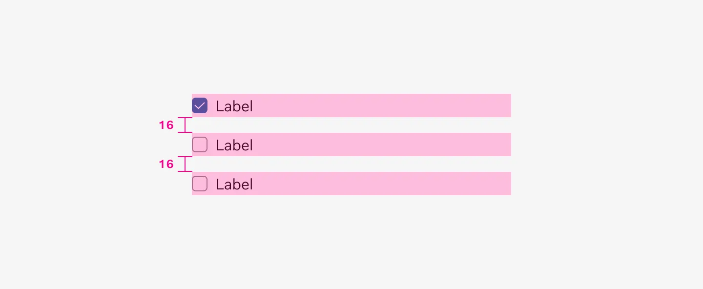
Checkboxes use a 16px spacer when grouped.
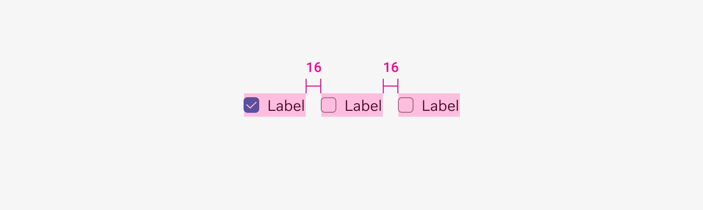
Checkboxes use a 16px spacer when arranged horizontally
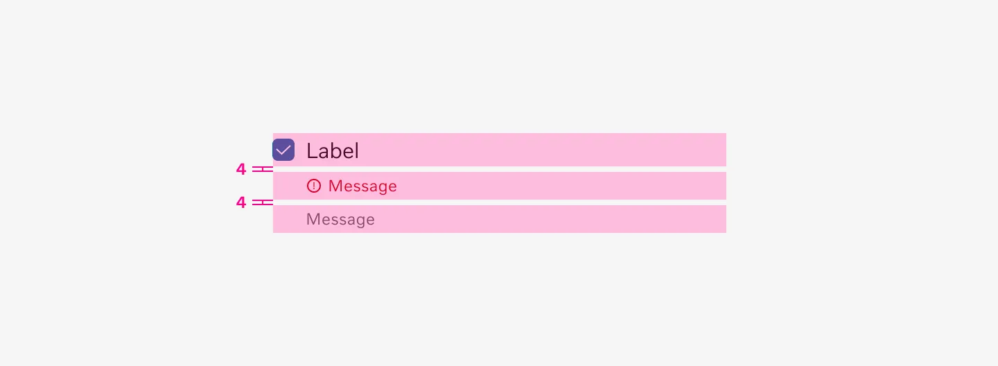
Checkboxes and their messages use 4px spacing between them.
Orientation
Section titled “Orientation”Checkboxes can be arranged either horizontally or vertically.
Vertical
Section titled “Vertical”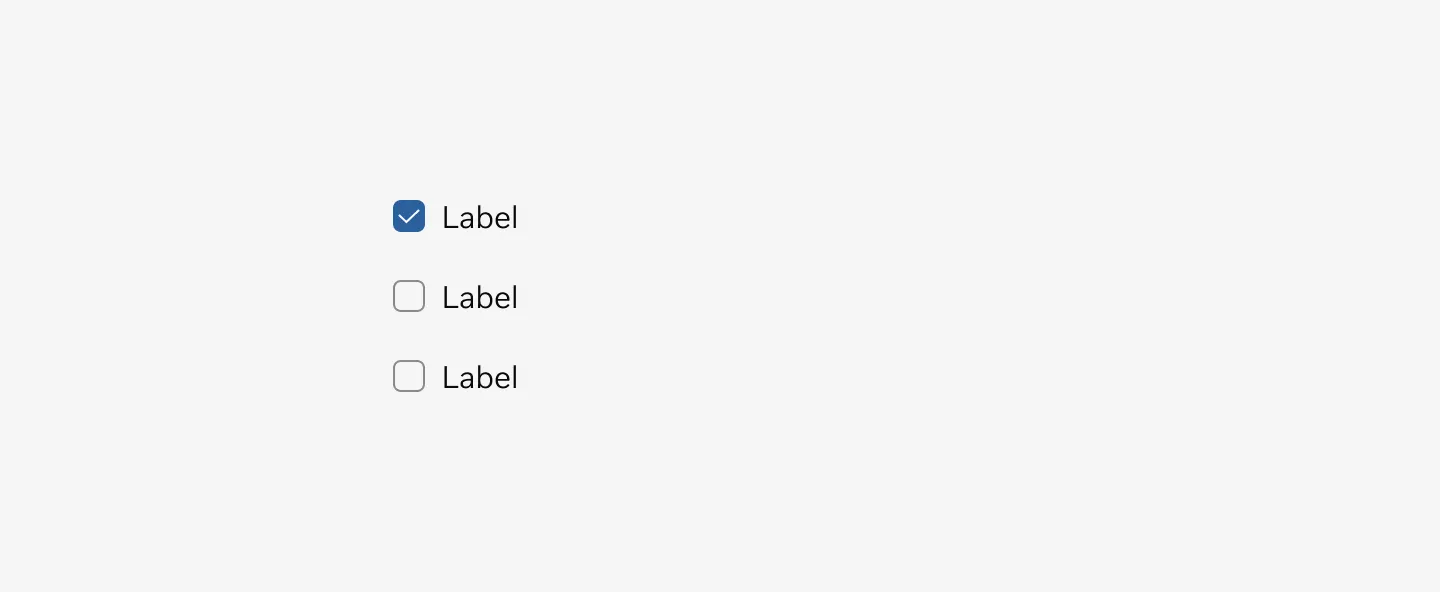
Shows checkboxes with labels arranged vertically.
Horizontal
Section titled “Horizontal”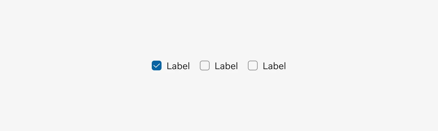
Displays checkboxes with labels aligned horizontally.
Messages
Section titled “Messages”Hint message
Section titled “Hint message”Hint messages are short messages used to add more context or purpose.
Shows a checkbox with label and hint message.
Error message
Section titled “Error message”The Error message is shown when an error occurs. Error messages are shown below the checkbox label together with a change of border color.
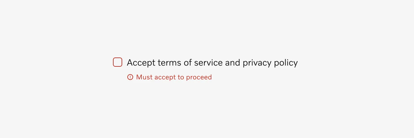
Displaying a checkbox with label and error message.
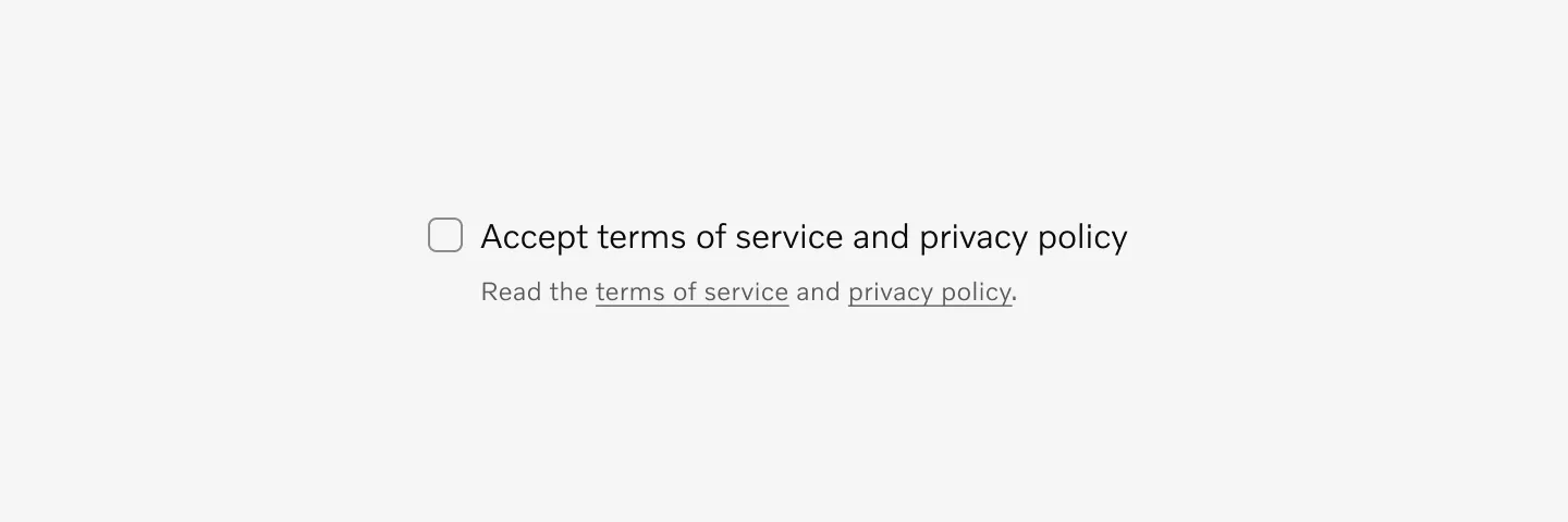
Hint and error message
Section titled “Hint and error message”Hint messages are used alongside error messages to provide additional guidance on how to resolve the issue.
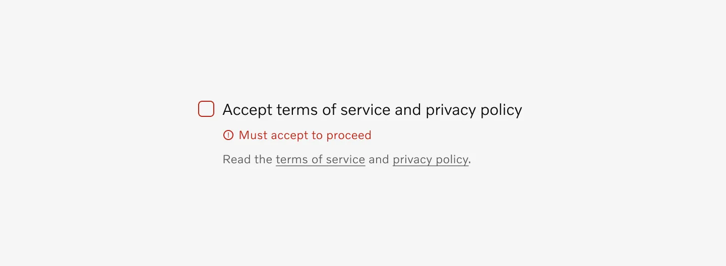
Shows a checkbox with label, error message, and hint message.
Char limit
Section titled “Char limit”Label: Max 40 char
Form message: Max 150 char
Examples
Section titled “Examples”add example
Accessibility
Section titled “Accessibility”Keyboard focus
Section titled “Keyboard focus”The checkbox component uses the default keyboard focus wrapped around the checkbox container.
Displaying checkbox with label on keyboard focus.
Considerations
Section titled “Considerations”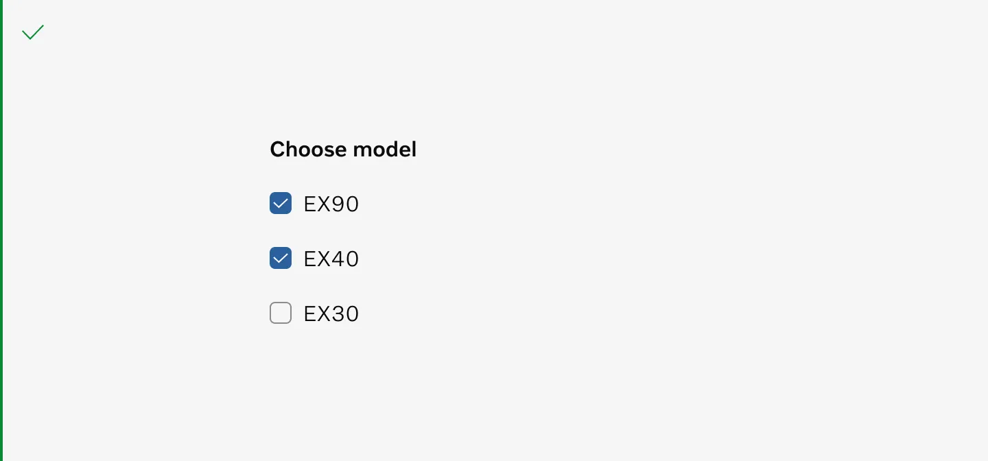
Use checkboxes for multiple selection from a set of options.
Use Radio buttons instead of checkboxes when only one item can be selected from a list.
Don’t use checkboxes when only one item can be selected from a list.