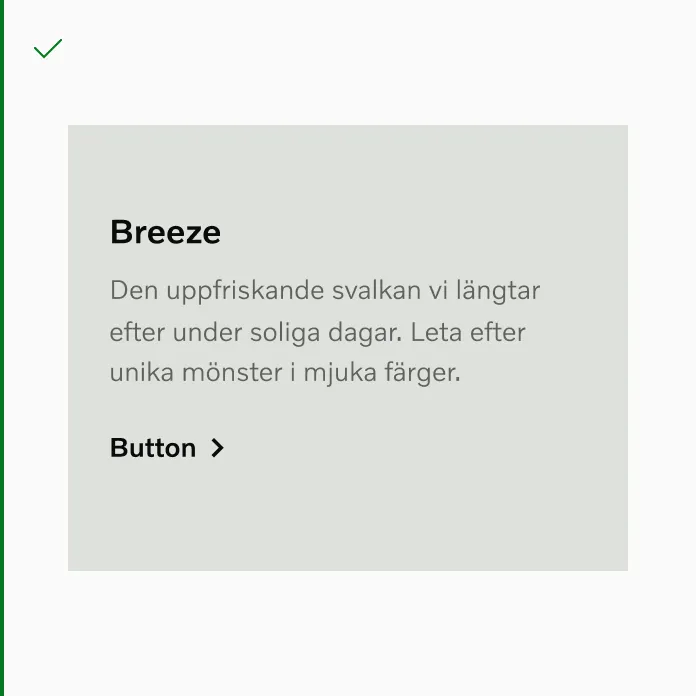
Button
Buttons serve to trigger actions. They convey calls to action and enable user interaction with pages and functions in diverse ways.
How to use
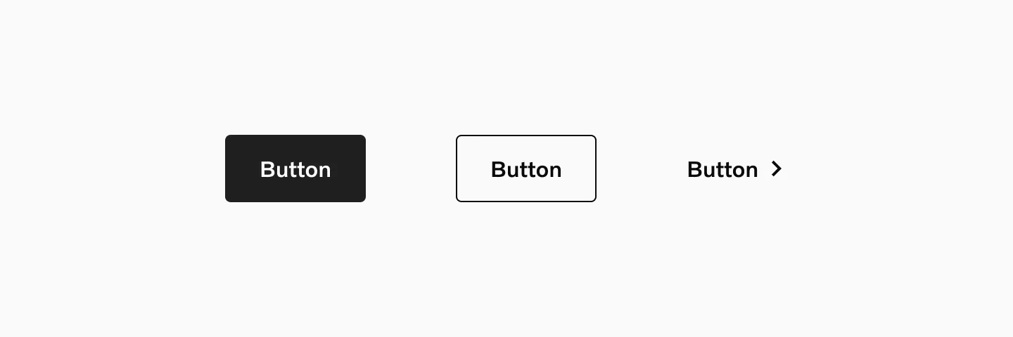
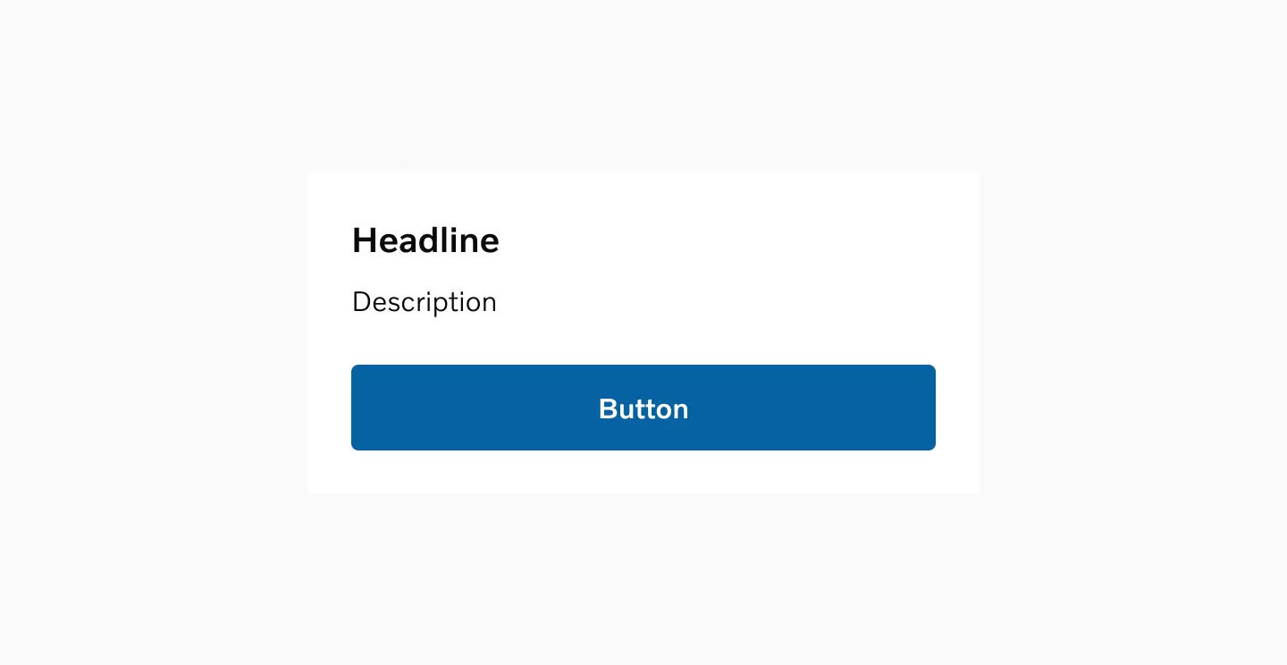
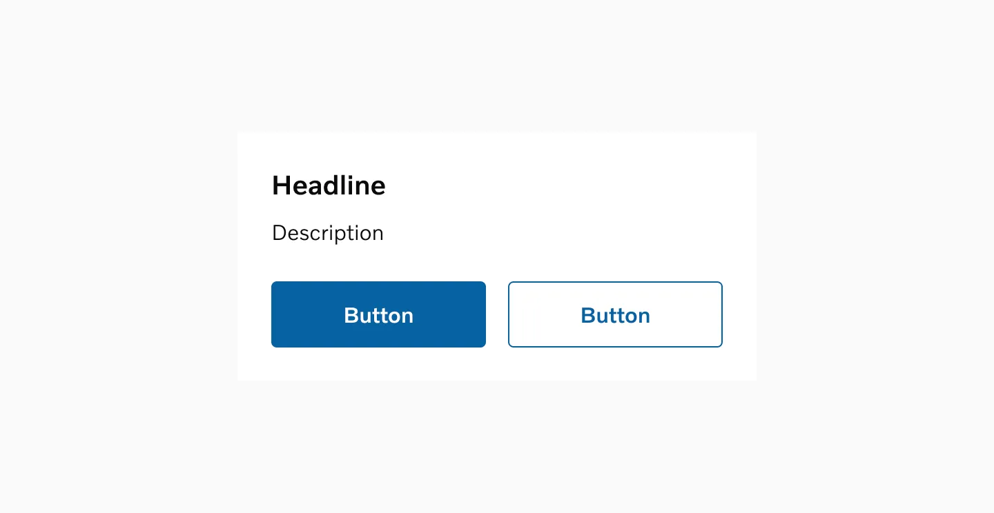
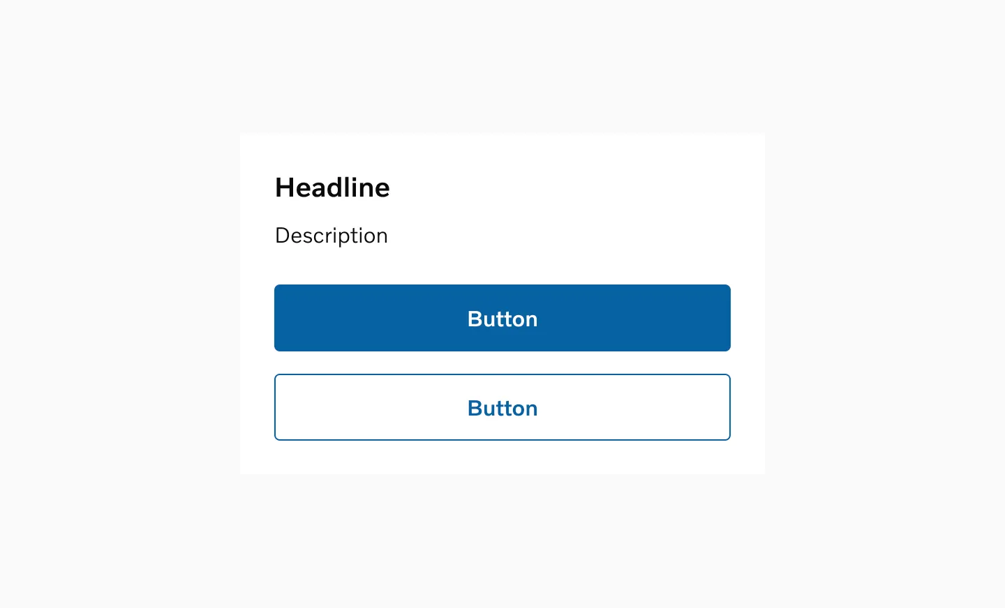
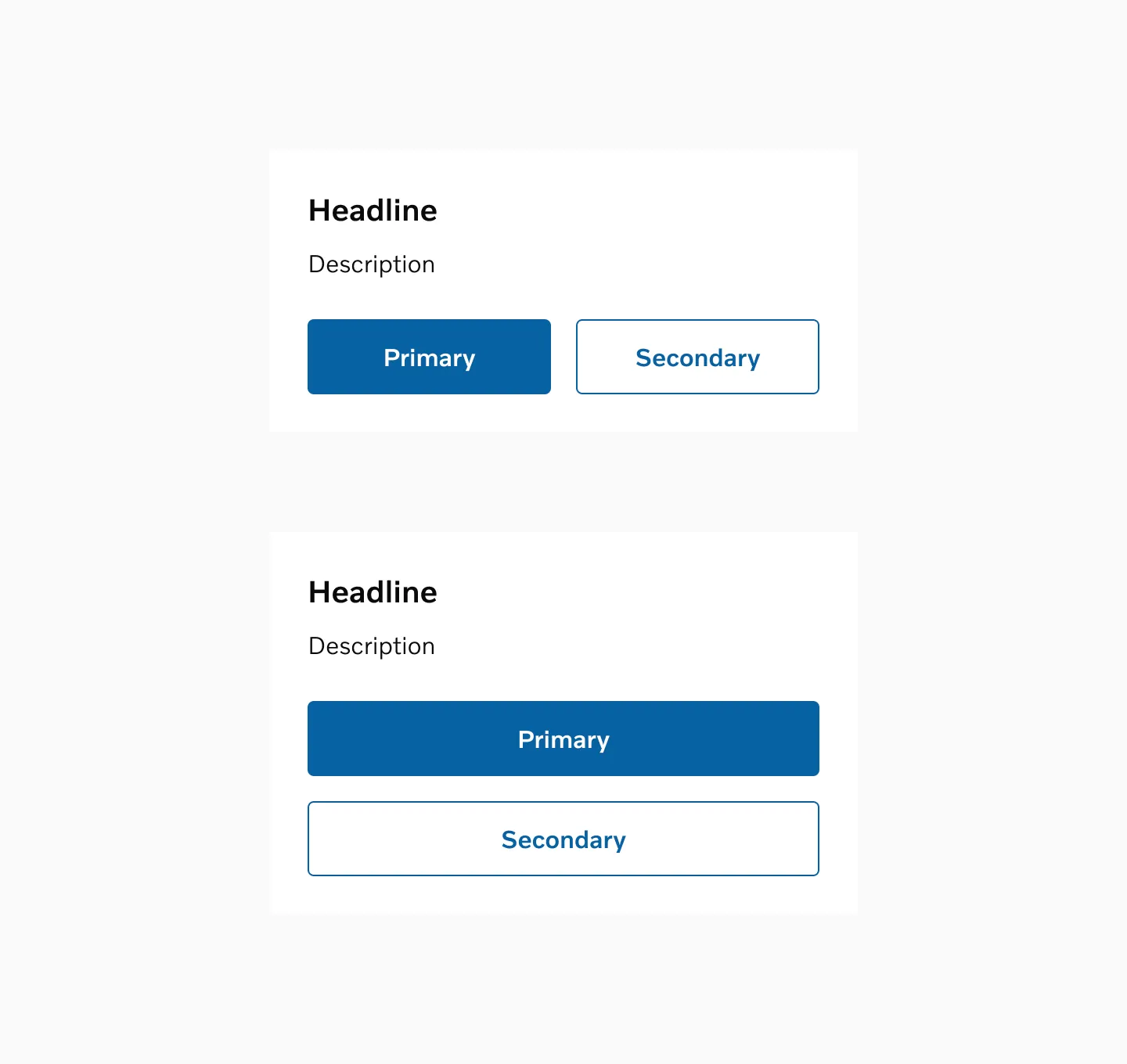
Section titled “How to use”There are three distinct types of buttons: filled, outlined, and text. Filled buttons are utilized for primary actions, outlined buttons for secondary actions, and text buttons for tertiary actions.
Variants
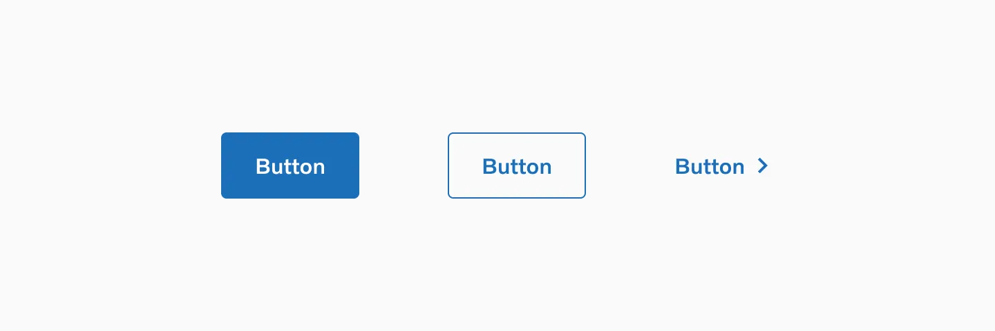
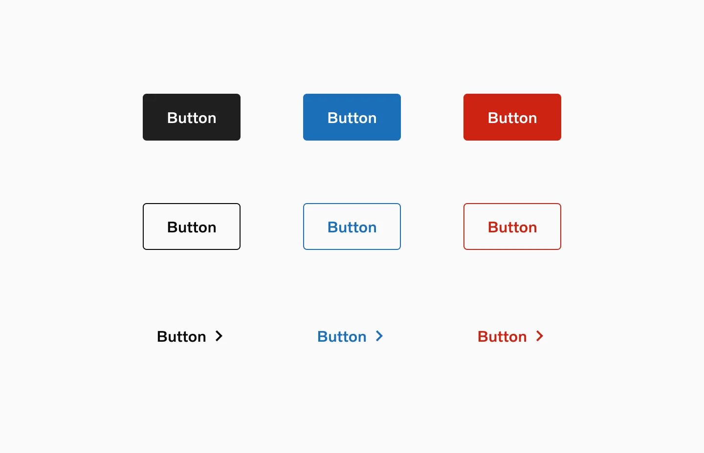
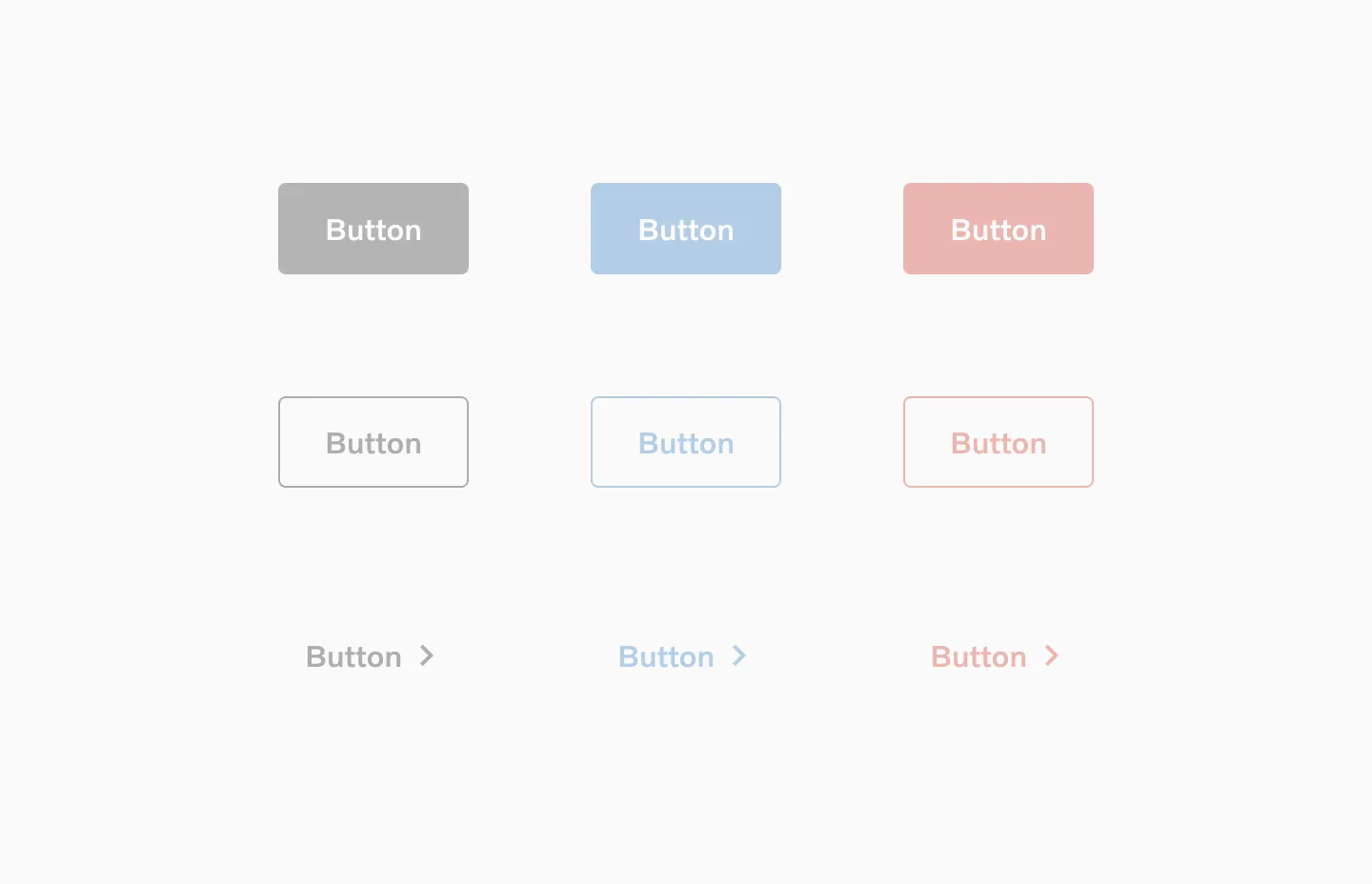
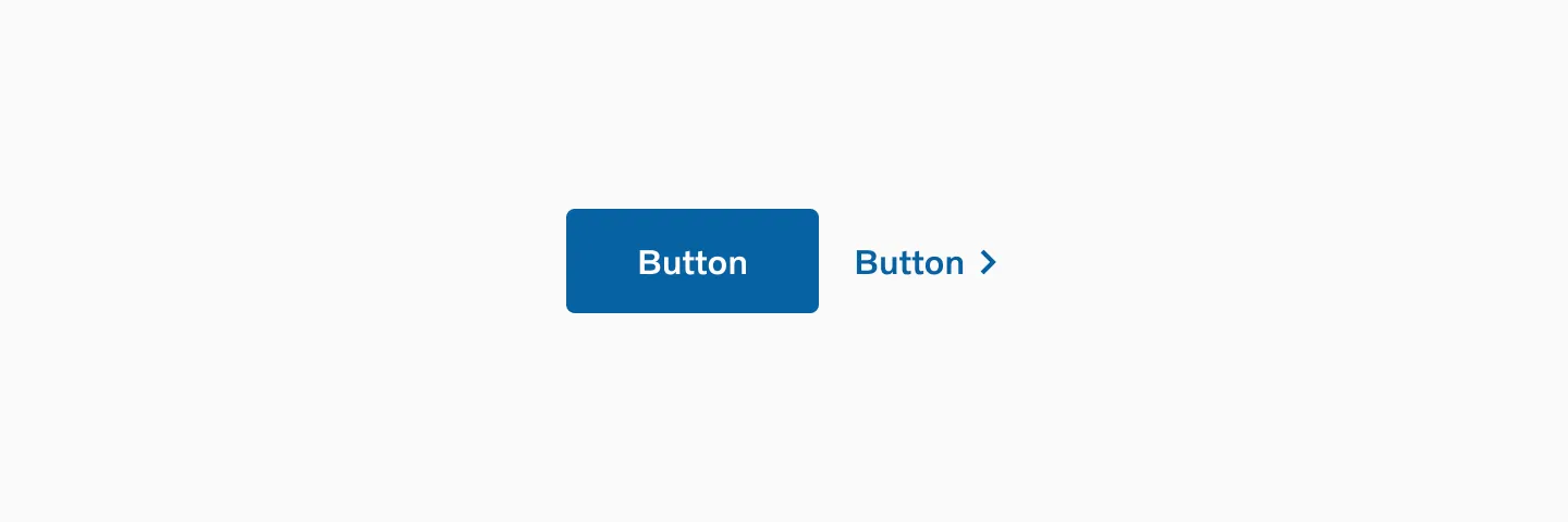
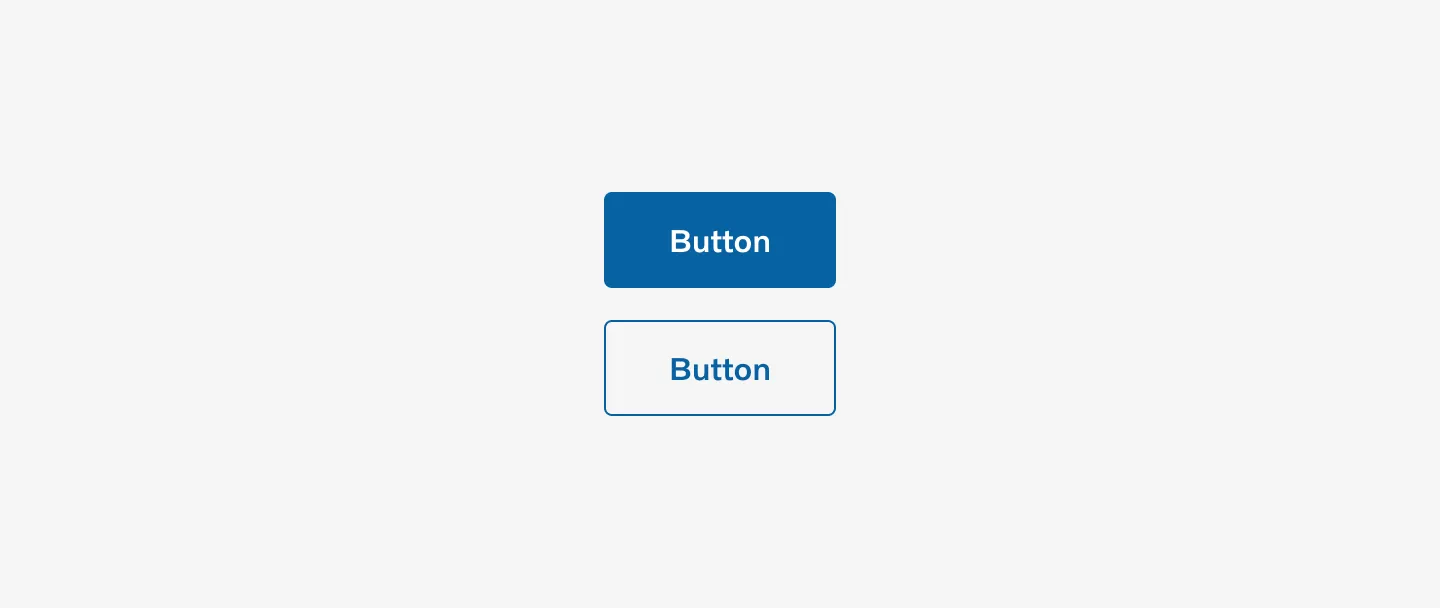
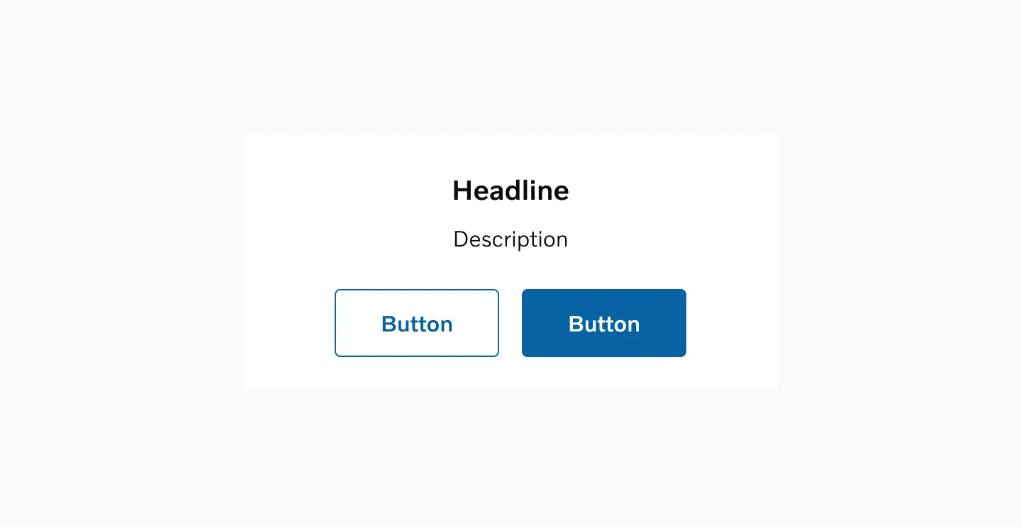
Section titled “Variants”Button filled
Section titled “Button filled”Filled buttons are the most prominent in the set. They should be used for the primary action, ideally within a page, but if necessary, per viewport. They are available in both neutral and accent blue colors.
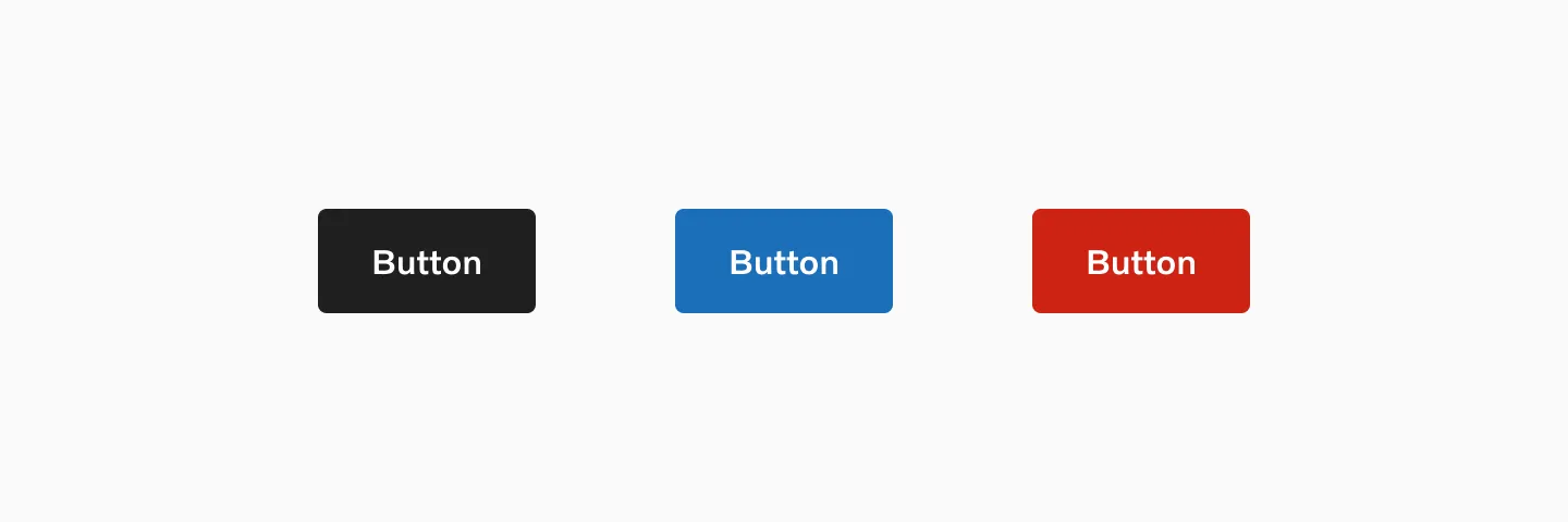
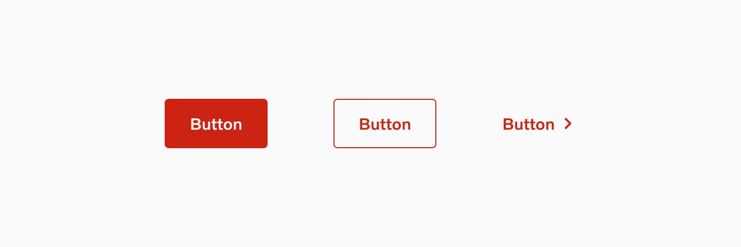
Showing: Neutral, accent blue and destructive variants of button filled.
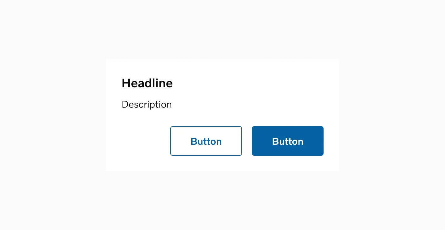
Button outlined
Section titled “Button outlined”Button outlined are secondary buttons that can be used multiple times on a page. While they suggest that the user can take action, they should not indicate the primary action.
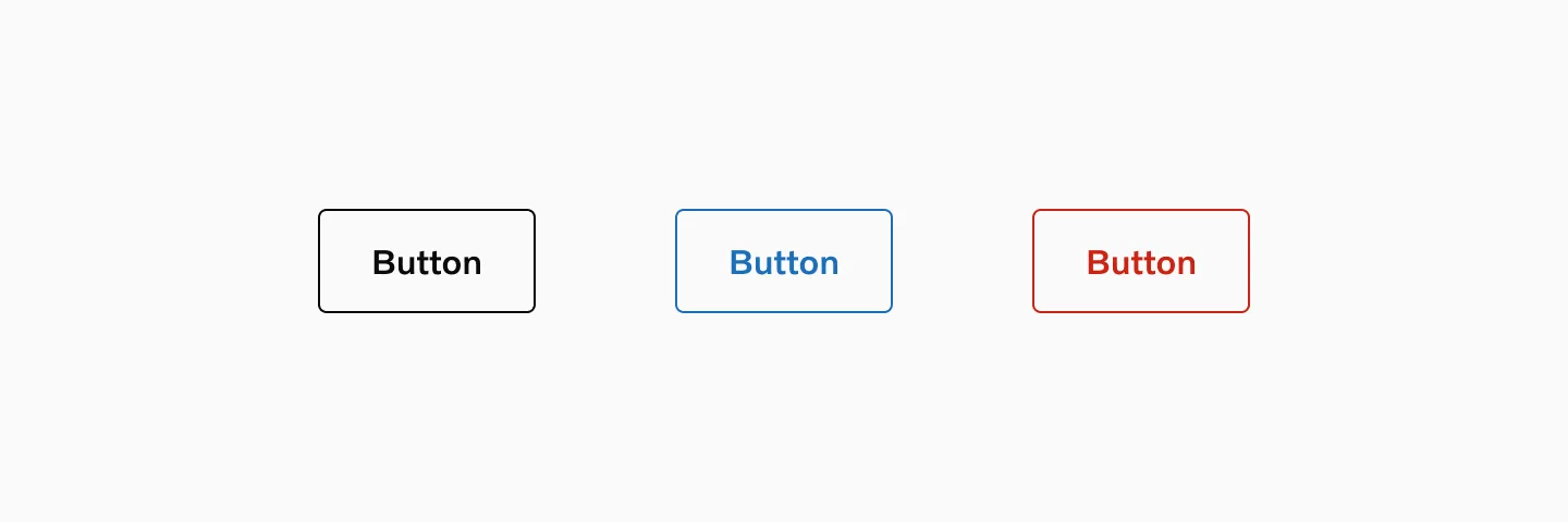
Showing: Neutral, accent blue and destructive variants of button outlined.
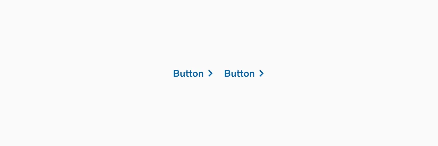
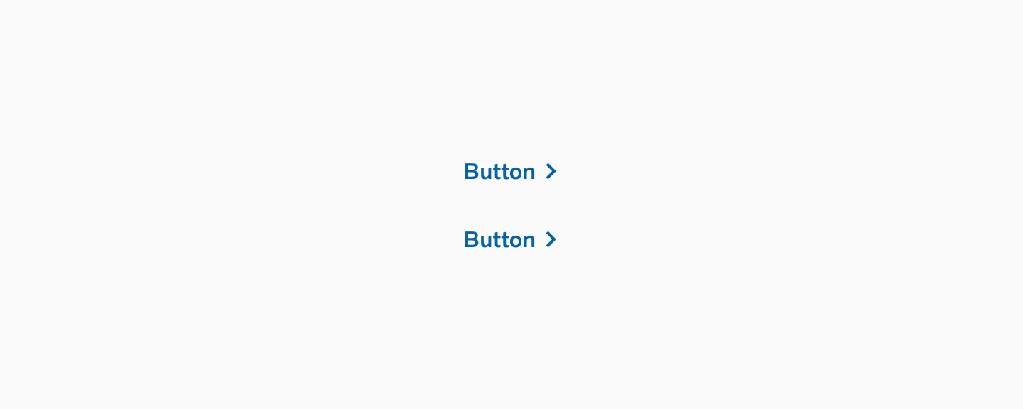
Button text
Section titled “Button text”Button text is used for tertiary actions and is the least prominent of the three types. These should be used for actions of low emphasis and should not be used for button actions, such as ‘submit’.
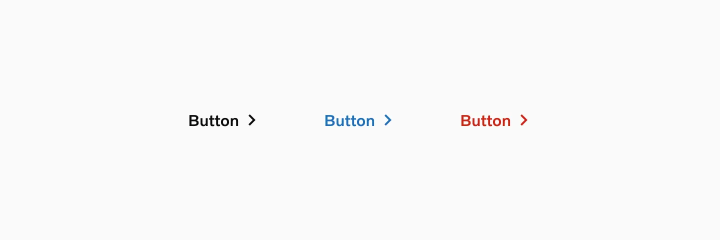
Showing: Neutral, Accent and Destructive variants of button text.
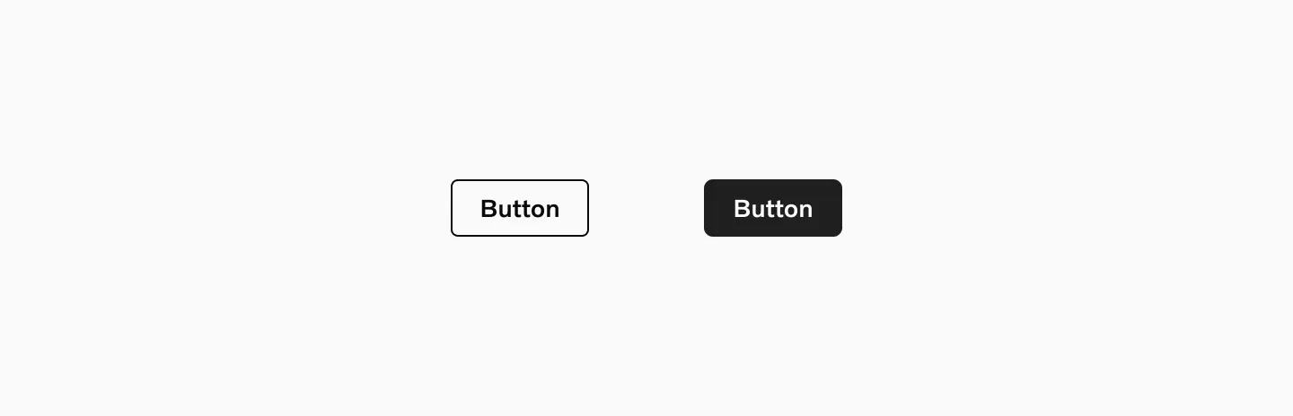
Neutral
Section titled “Neutral”The neutral button, available in all sizes and variants (filled, outline, and text), should be used as the standard.
Accent
Section titled “Accent”Use the Accent buttons sparingly to emphasize the primary button. Avoid using it on colored backgrounds or images.
Destructive
Section titled “Destructive”Use the destructive buttons when the button’s action concludes or terminates a function or setting, like delete or remove.
Two different button heights are provided to meet various needs, suit different contexts, and help establish the correct hierarchy. When used in a group, always maintain the same button size.
Large button
Section titled “Large button”Large buttons are standard and should be used on most of our pages when a button is needed.
Showing large Button-filled, Button-outlined and Button-text.
Considerations
Section titled “Considerations”- Large buttons are ok to use in cards as long as the card is not too small or condensed.
- Large buttons should not be used if the card is too small.
Small button
Section titled “Small button”Use small buttons in confined spaces.
Showing small Button-filled and small Button-outlined. Text button doesn’t come in small size.
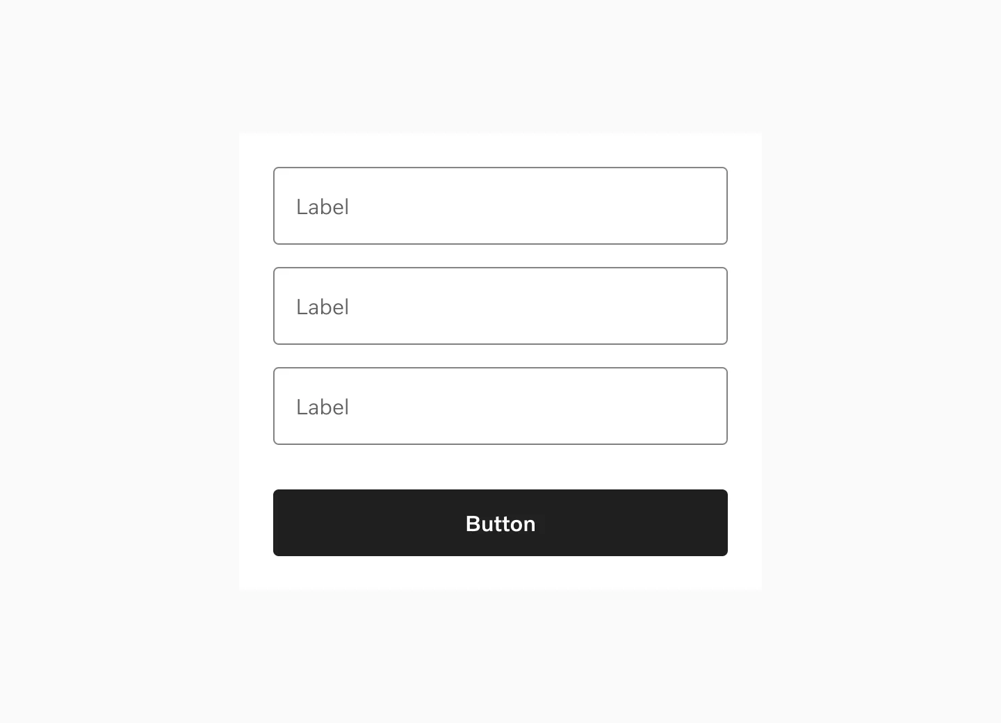
The width of a button can be set to flexible (with the button width wrapping around a text label) or set to fixed (with the button width adjusted to a column grid or form).
Flexible width
Section titled “Flexible width”The button default width is to wrap around the text and changes depending on the label length. The button can grow to a maximum character width at 25 characters.
Displaying Button-filled with the same width as the input fields.
Fixed width
Section titled “Fixed width”For the large button a set width can be used if you want to fill a container or a column with one or two buttons.
Displaying Button-filled with the same width as the input fields.
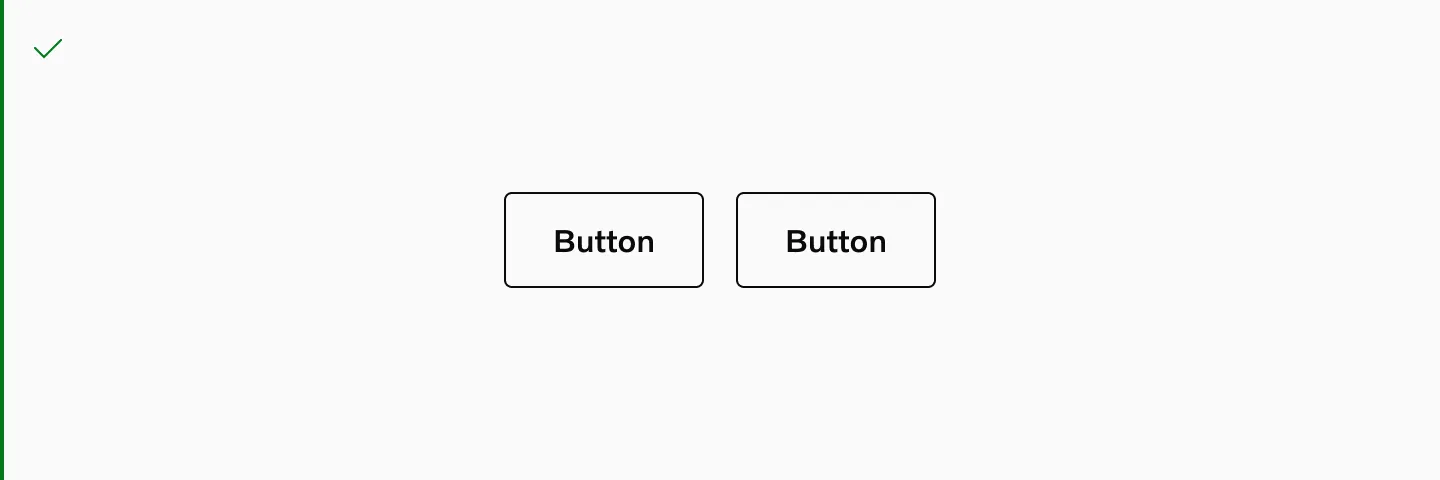
States
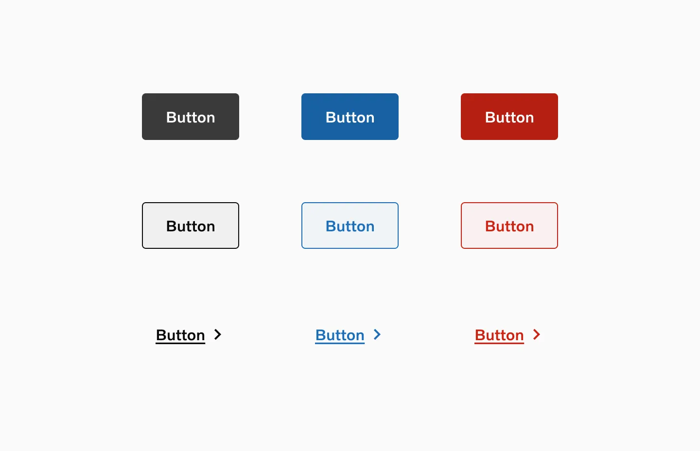
Section titled “States”Default
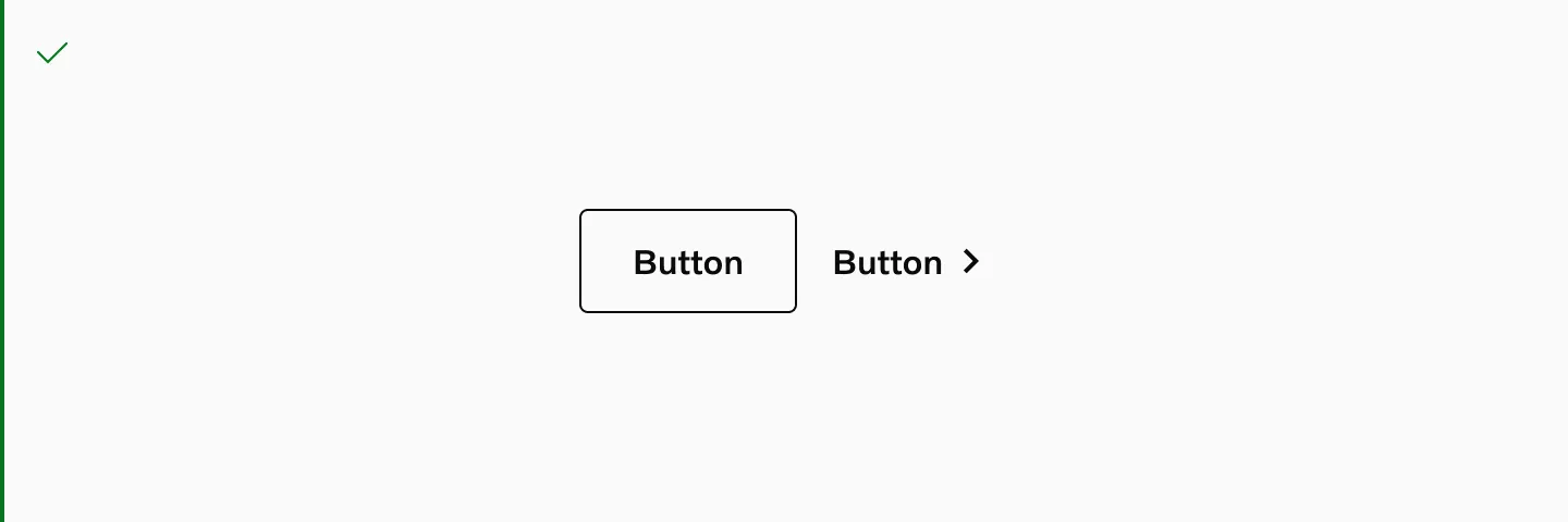
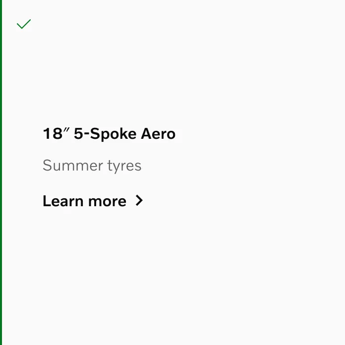
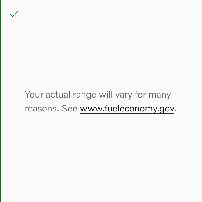
Section titled “Default”This is the Default state of the button. It is not being interacted with, but is available to be interacted with.
Displaying Button-filled, Button-outlined, and Button-text in their Default state
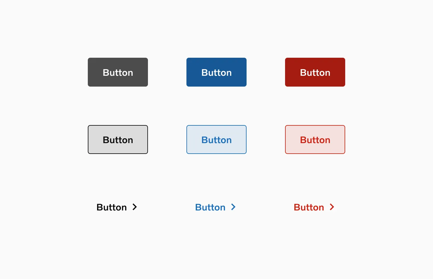
The Hover state is shown when the user places a cursor over the button, desktop only.
Displaying Button-filled, Button-outlined and Button-text in their Hover state
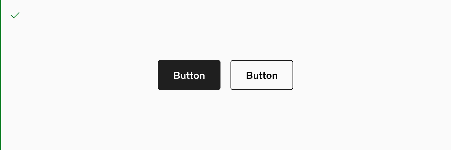
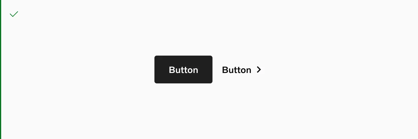
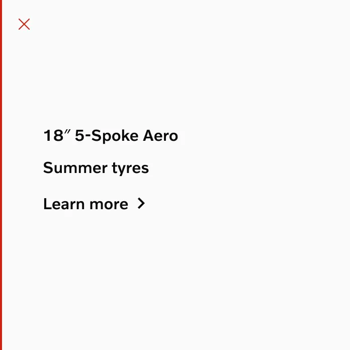
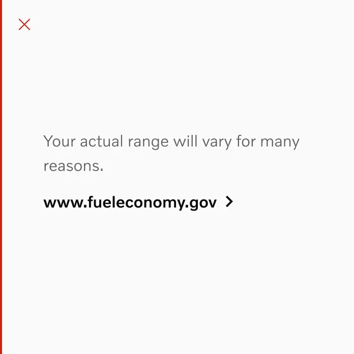
Pressed
Section titled “Pressed”The Pressed state communicates a user click, tap, or press.
Displaying Button-filled, Button-outlined and Button-text in their Pressed state
Disabled
Section titled “Disabled”A Disabled state of a button is system initiated and indicates that the button cannot be interacted with. Avoid using disabled buttons whenever possible. Instead show a message explaining the next steps the user should take.
Displaying Button-filled, Button-outlined and Button-text in their Disabled state.
Loading
Section titled “Loading”The Loading state is triggered by the system and will load until the system is ready for the change.
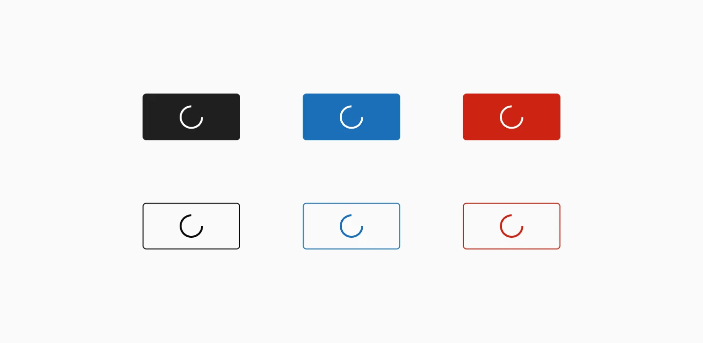
Displaying Button-filled, Button-outlined in their Loading state
Grouping
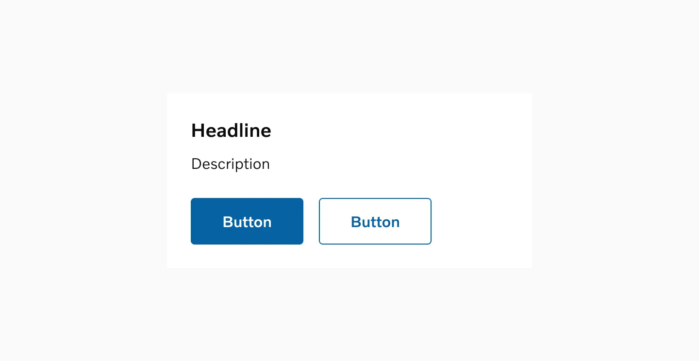
Section titled “Grouping”It is recommended to group a maximum of two buttons together. To signify greater importance, consider using a single primary button instead of a group.
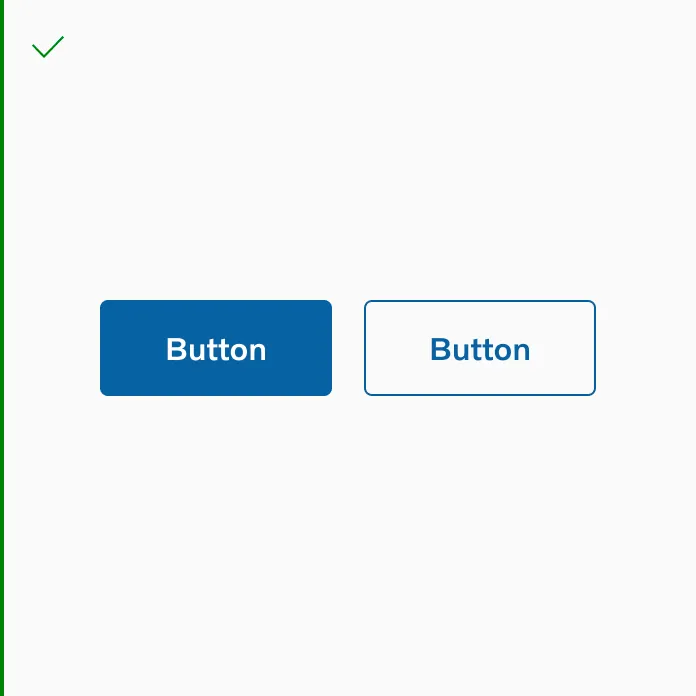
Its ok to group primary and secondary
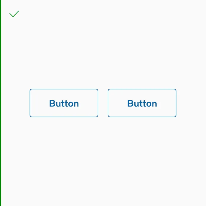
Its ok to group 2 secondary buttons
Its ok to use button outline and button text side by side.
Its ok to use button filled and button text side by side.
If you’re stacking two button text in your design, you need to update the spacing to 0px.
Its ok to use two button text side by side.
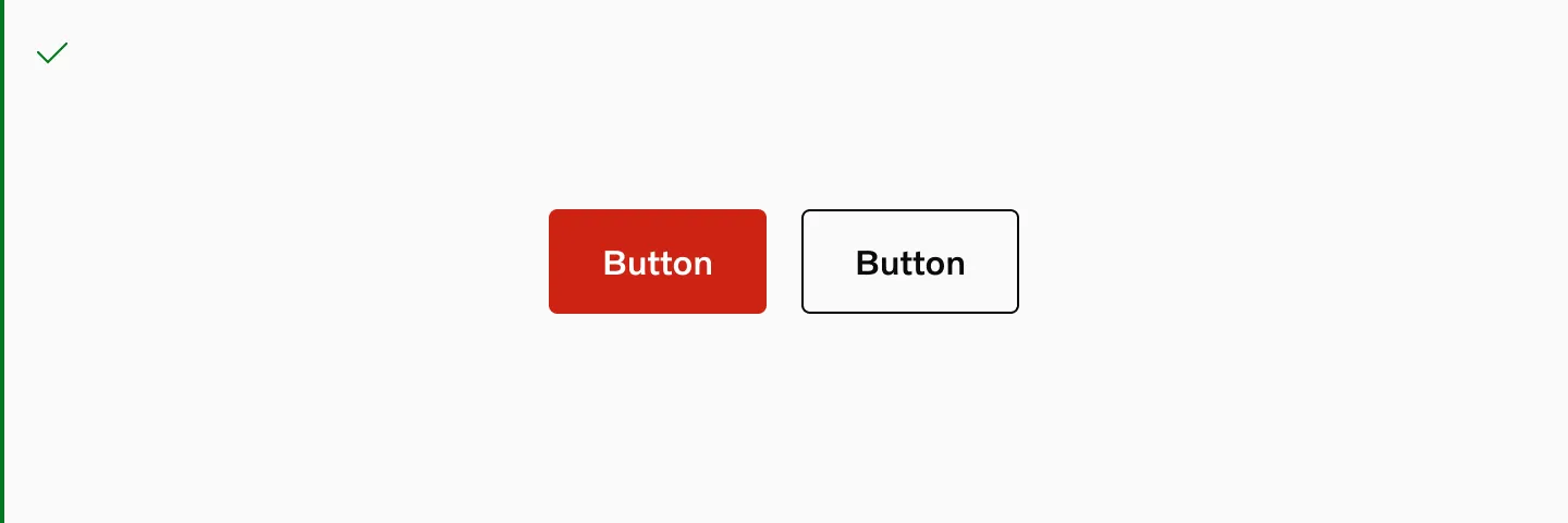
Do use different colors when using destructive buttons in a group.
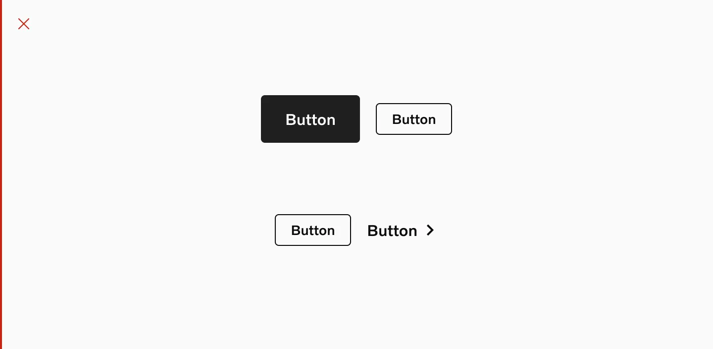
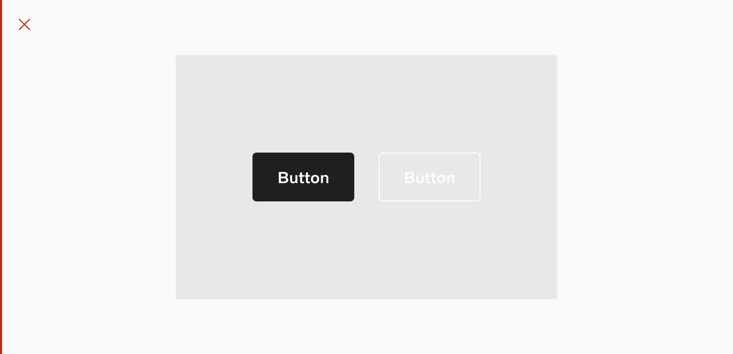
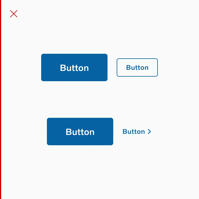
Don’t group large and small buttons
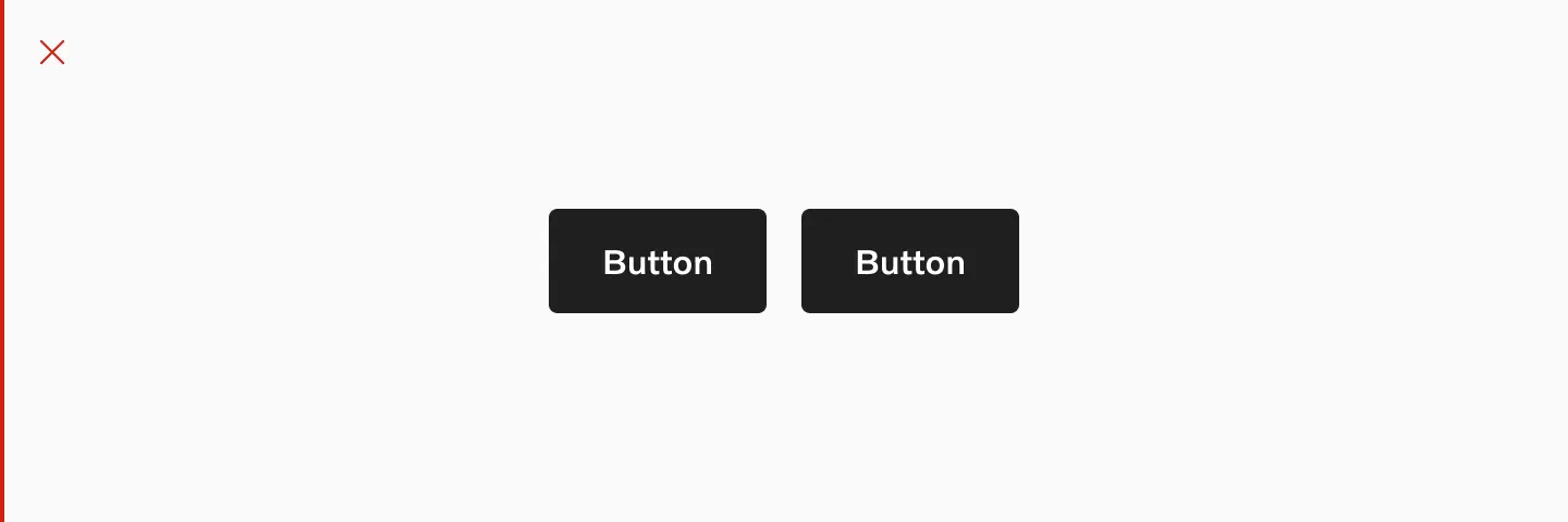
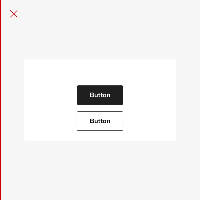
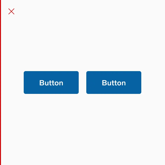
Don’t group 2 primary buttons
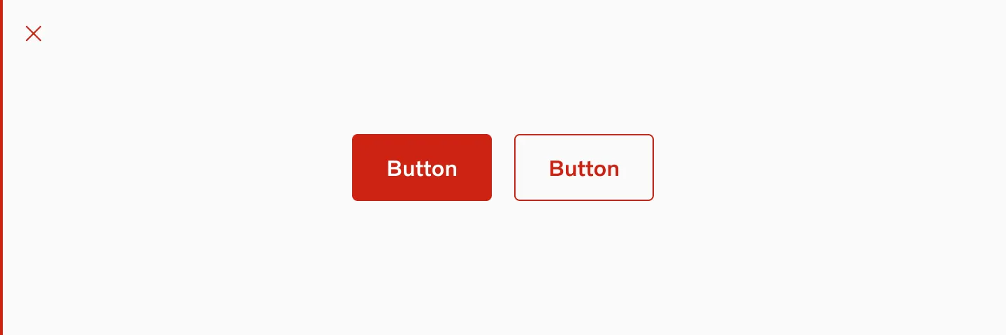
Don’t use the same color on both buttons when using destructive buttons in a group.
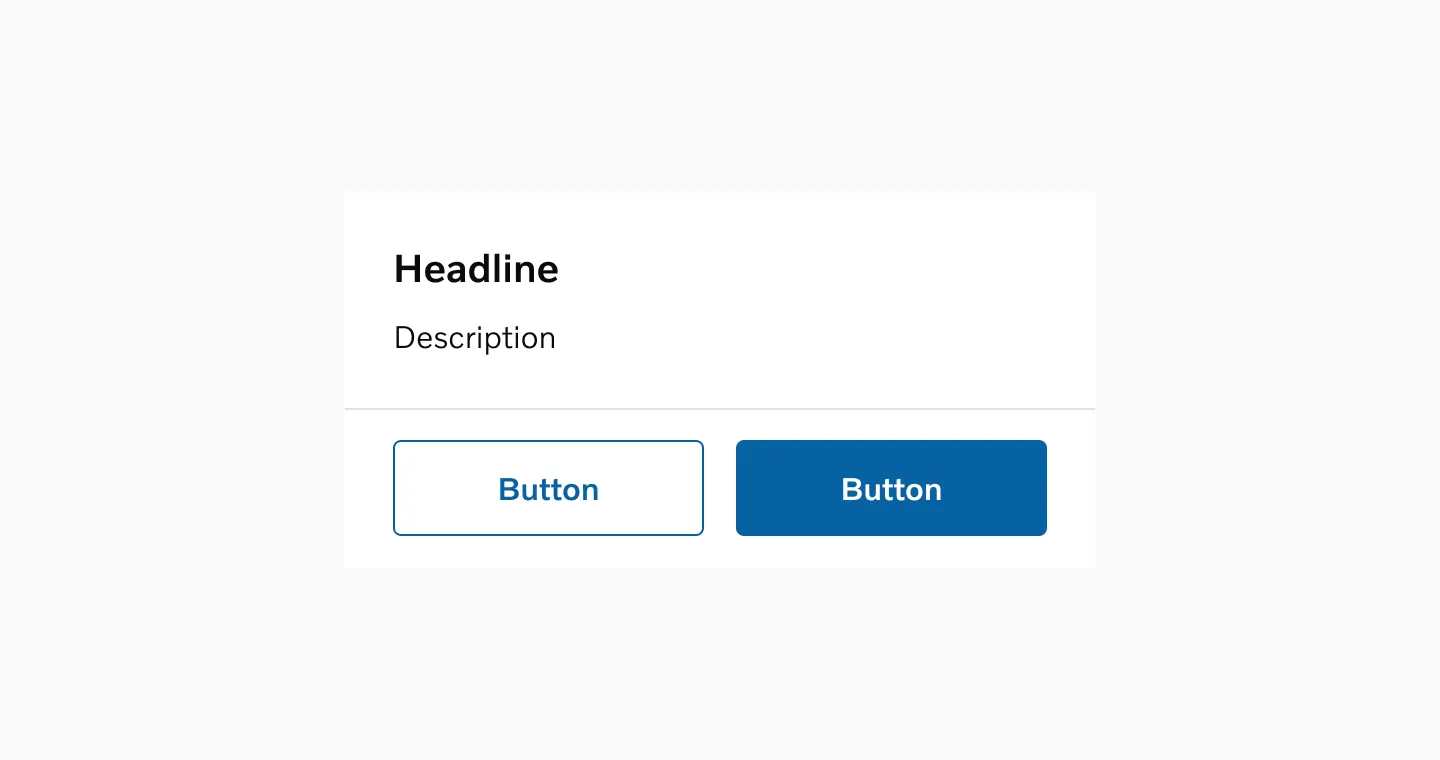
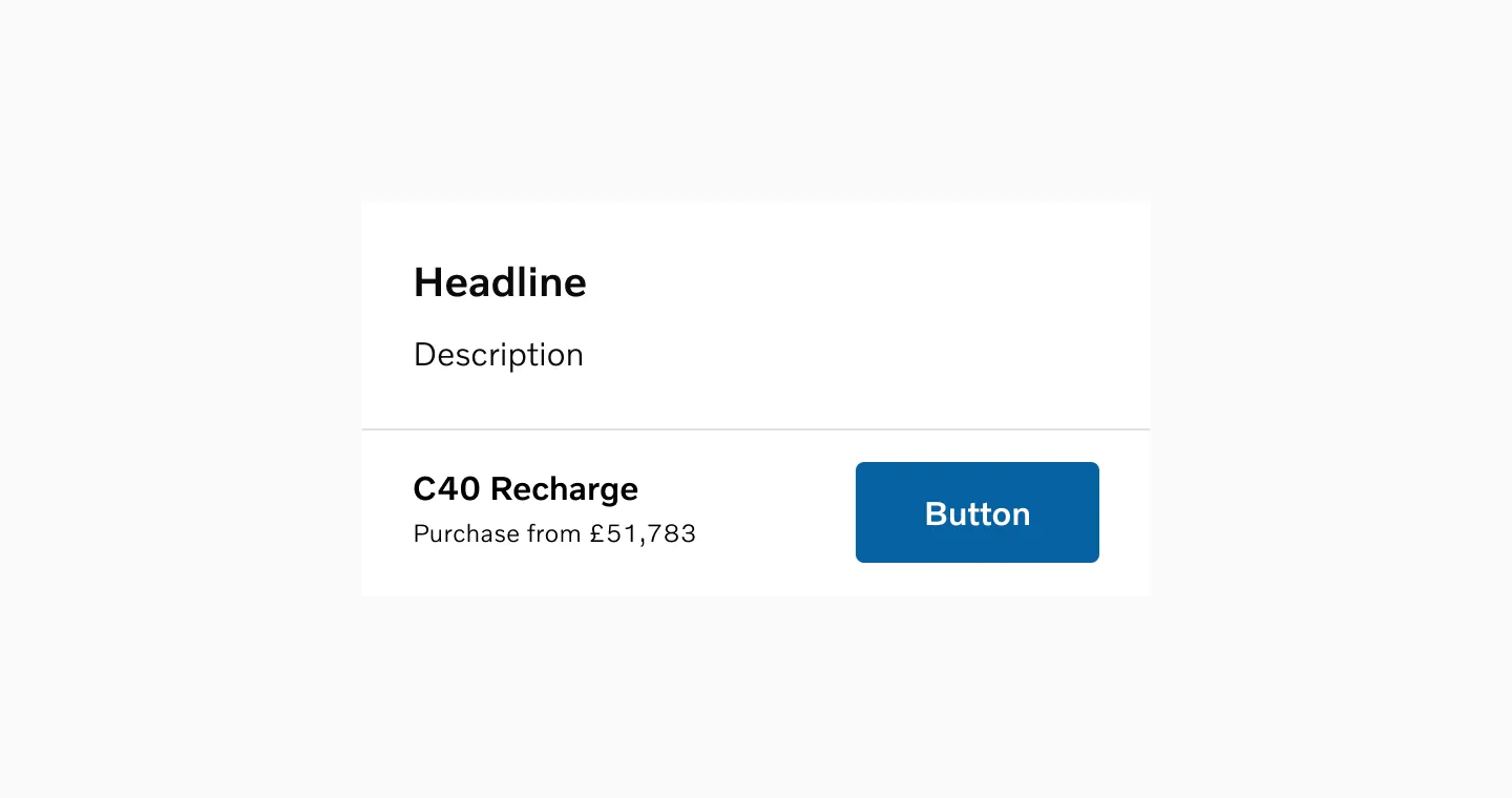
Placement
Section titled “Placement”Position
Section titled “Position”A button should be positioned under or within its relevant content, with the exception of buttons used in a navigation bar.
Alignment
Section titled “Alignment”Align the button with its content: left-justified text should have a left-justified button, right-justified text should have a right-justified button, and if the content spans the full width of the screen, center the button.
Sequence steps
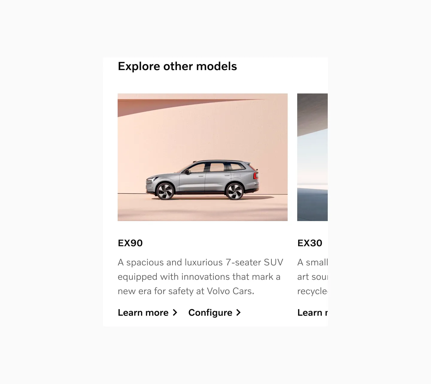
Section titled “Sequence steps”In a sequence of steps, a primary button should be placed on the right side of the screen. This is especially applicable to desktop and tablet designs where the buttons do not stretch the full width of the breakpoints. For mobile designs, the button should expand from margin to margin.
Top of media
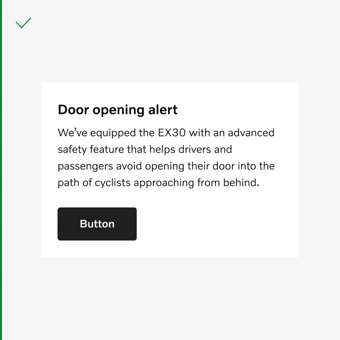
Section titled “Top of media”Use only primary buttons on top of media, as outlined buttons lack sufficient contrast and accessibility when placed over images. If using outlined buttons the image should have a solid color background.
Considerations
Section titled “Considerations”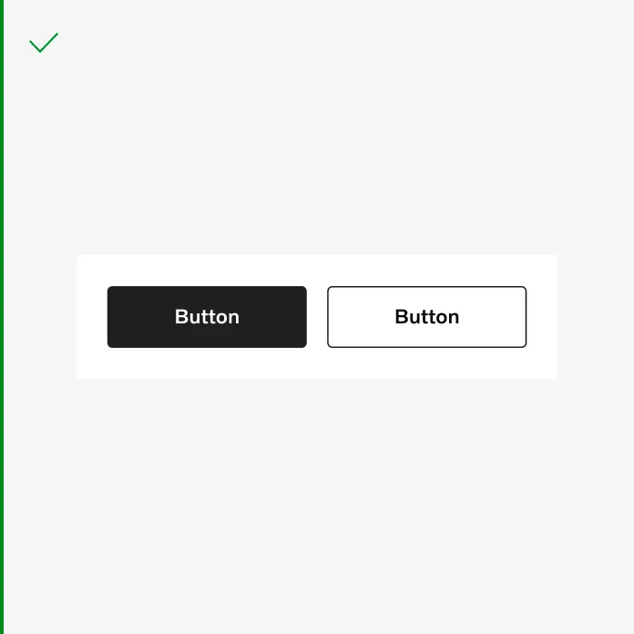
A button group that spans the full width of the small viewport.
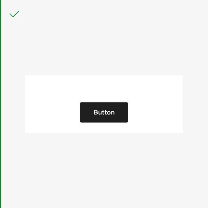
It’s acceptable to add a button that doesn’t span the full width.
Align the button with the content.
Do not to stack buttons vertically when there is enough space to arrange them horizontally.
Spacing
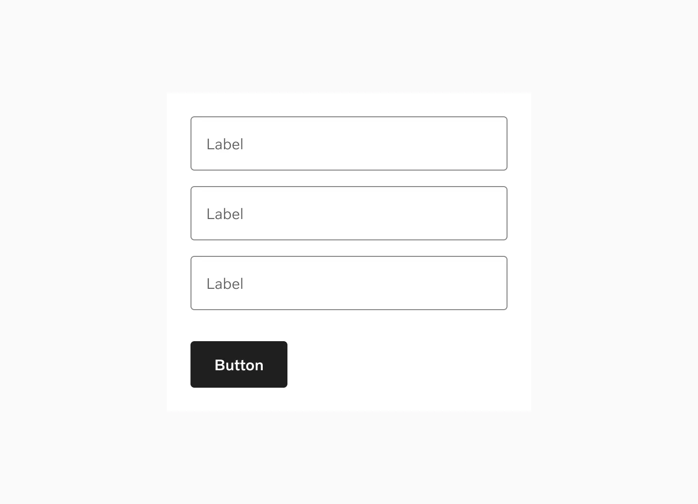
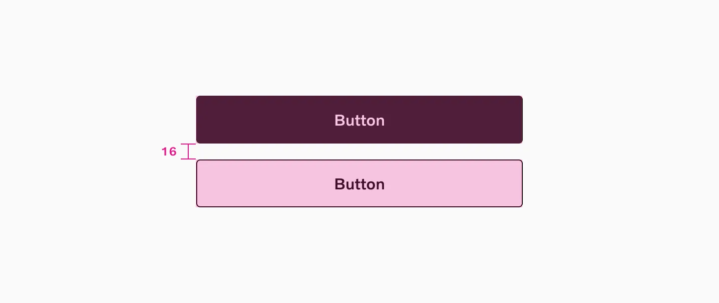
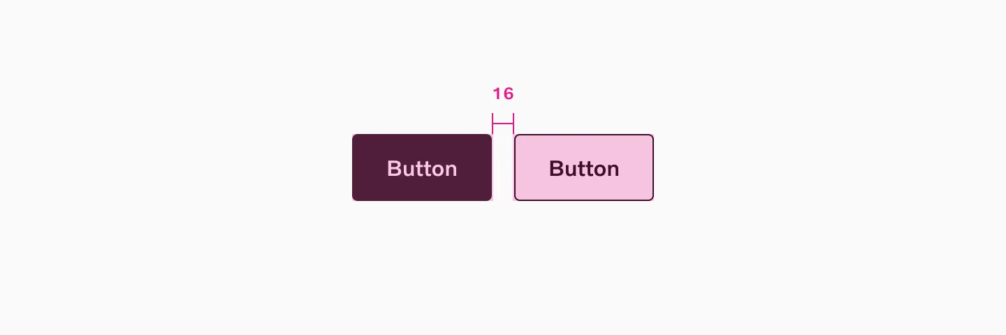
Section titled “Spacing”When placing buttons in a group, use spacer 16 between buttons. An exception of spacer 32 is applied between a form and a button.
Vertical spacing
Horizontal spacing
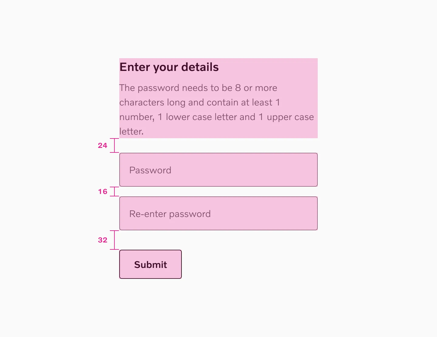
Spacing with input fields
Target size
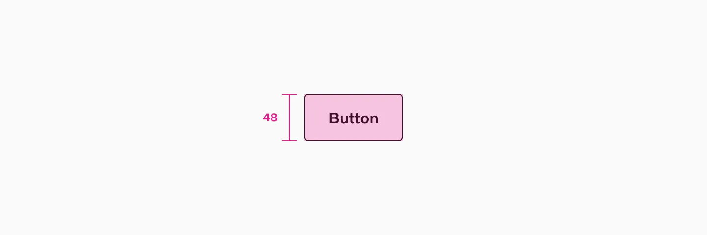
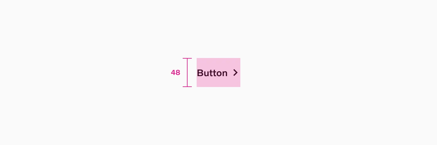
Section titled “Target size”Large buttons
Section titled “Large buttons”Large button uses 48px target size.
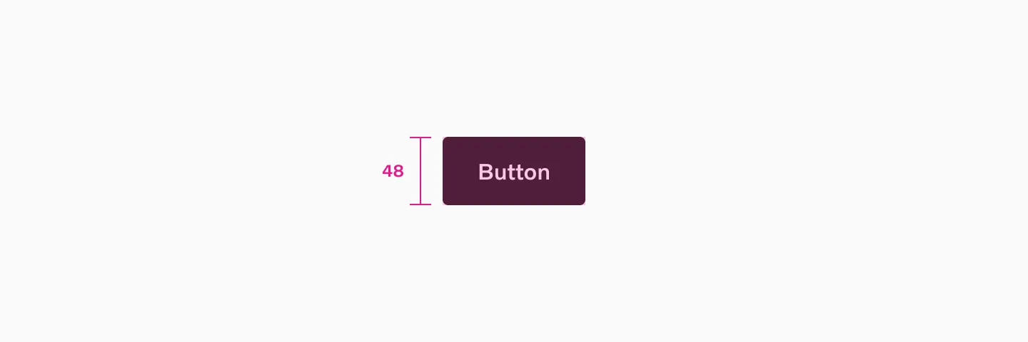
Button filled large using 48px target size
Button outlined large using 48px target size
Button text large using 48px target size
Small buttons
Section titled “Small buttons”Small button uses 40px target size.
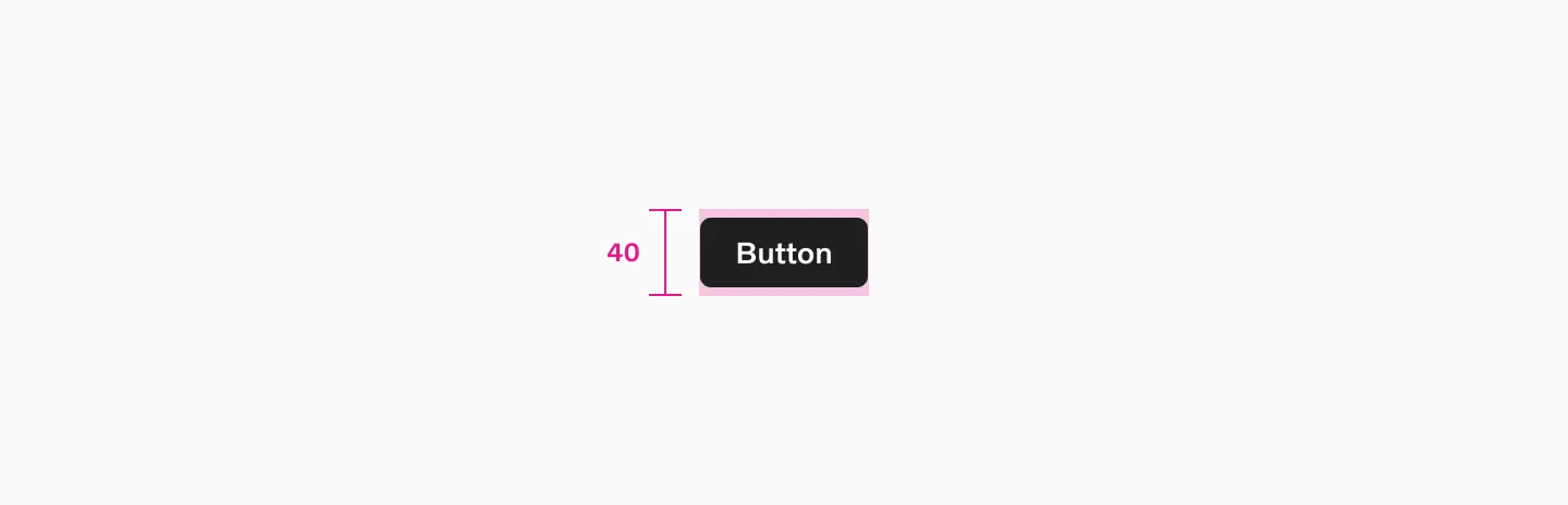
Button filled small using 40px target size
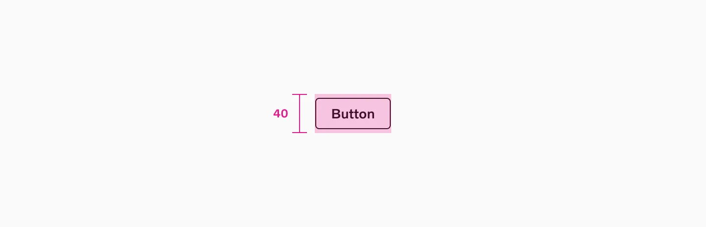
Button outlined small using 40px target size
Char count
Section titled “Char count”Stay brief but descriptive; max 25 chars.
Considerations
Section titled “Considerations”Disabled buttons
Section titled “Disabled buttons”- Avoid using disabled buttons whenever possible. Instead show a message explaining the next steps the user should take.
- Making a button disabled is not a clear indication of what the user should do to resolve the issue.
- Do not use disabled buttons when part of a form.
- There is a non-disabled button related to the disabled state, such as next/previous.
Usability Pitfalls of Disabled Buttons, and How To Avoid Them
Making Disabled Buttons More Inclusive
Highlighting the most important button
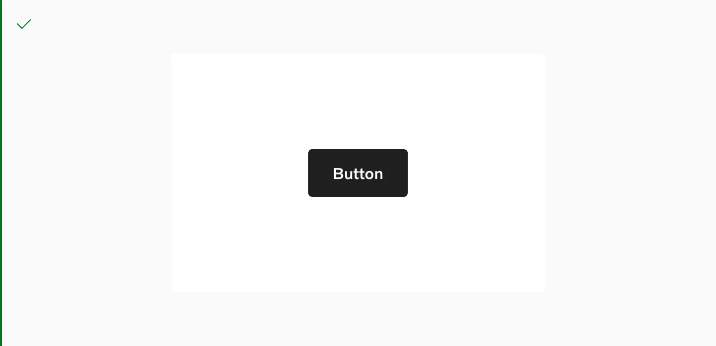
Section titled “Highlighting the most important button”To highlight the most important button, ensure only one filled button is present per viewport.
Combined in groups
Section titled “Combined in groups”Filled, outlined, and text buttons can be grouped. However, keep them the same size and avoid placing two filled buttons next to each other or within the same viewport.
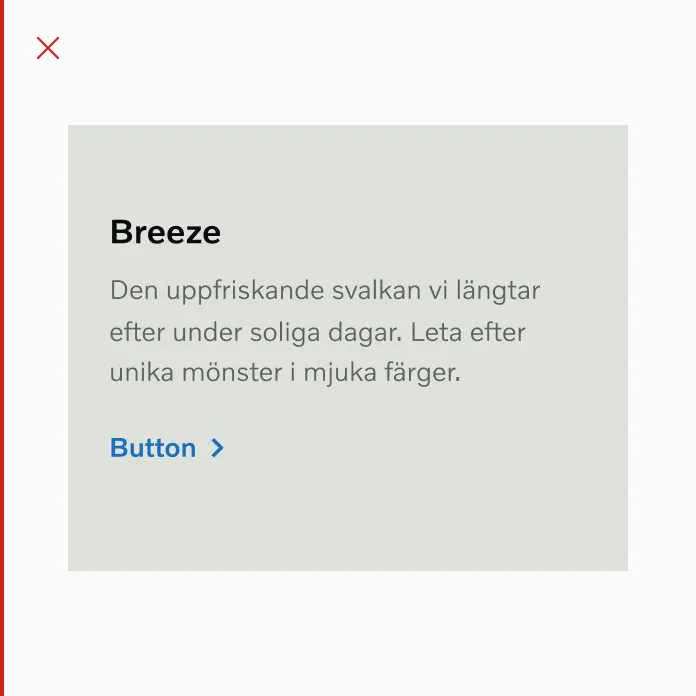
Text buttons
Section titled “Text buttons”Text buttons closely resemble plain text, so careful consideration should be given to their placement and integration with other text elements. Ensuring a text button is visible and distinct from the surrounding content is crucial. It may also be worth considering the use of an inline text link.
Do make button text standout using text hierarchy and colors.
Do not use button text with the same hierarchy as text.
Do use an inline text link when greater emphasis is not necessary.
Do not use a button text when greater emphasis is not necessary.
Color backgrounds
Section titled “Color backgrounds”Avoid using accent or destructive colors on colored backgrounds.
Always use neutral buttons on colored backgrounds and media.
On top of media
Section titled “On top of media”Only use primary button on top of media. Outlined button will not be accessible.
Avoid using accent blue on colored backgrounds and media.
Contrast
Section titled “Contrast”We use “modes” to adapt the color palette for different contexts. For instance, when placing a button on a dark image, you can switch the container to “dark” mode to ensure sufficient contrast for buttons and other elements.
Read more about our use of color modes
Avoid mixing dark and light mode buttons on the same background.
Use the “light color mode” button on a light background.
Use the “dark color mode” button on a dark background.
Example of color mode switching within Figma.
Responsiveness
Section titled “Responsiveness”Button sizes are not responsive and don’t scale between breakpoints. To counter this, use buttons across various breakpoints and adjust their widths to adapt to different column grids.
Culture dependency
Section titled “Culture dependency”For left-to-right languages, buttons that are placed on the right side to indicate direction should be flipped to the left side.
Button Group
Section titled “Button Group”Button group is a layout component used to align a set of buttons together. It is primarily used for inline secondary actions that call for less emphasis.
How to use
Section titled “How to use”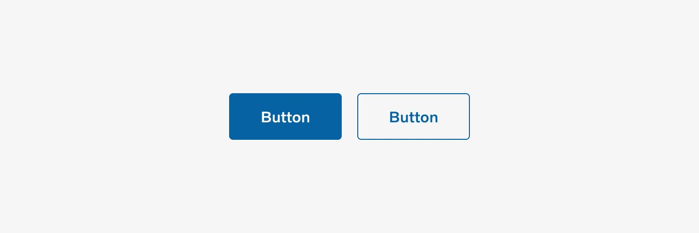
Variants
Section titled “Variants”Horizontal
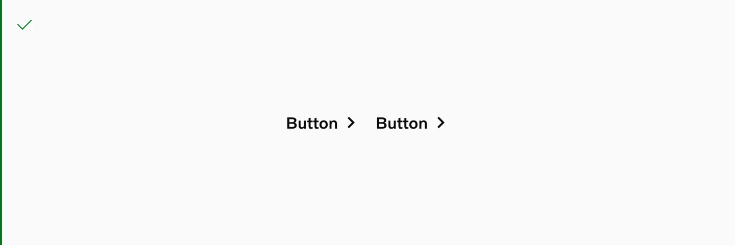
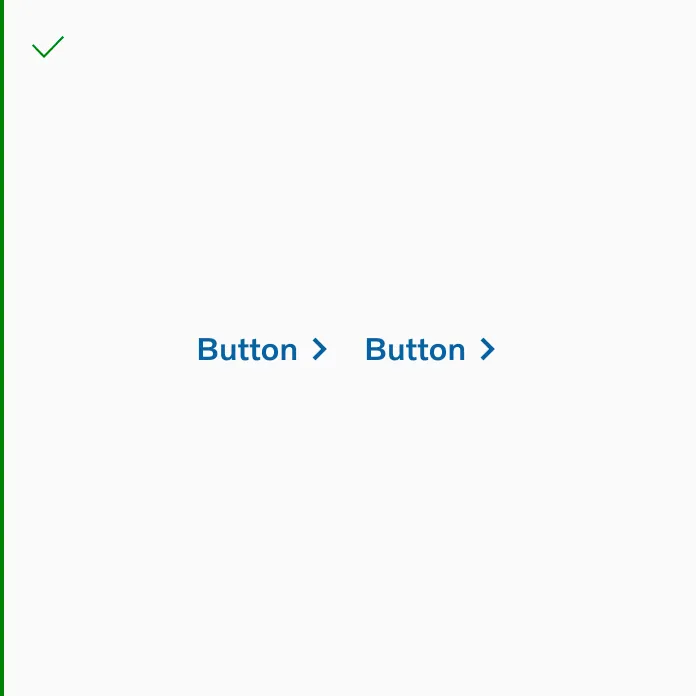
Section titled “Horizontal”Two buttons side by side
Two buttons with text side by side
Three buttons side by side
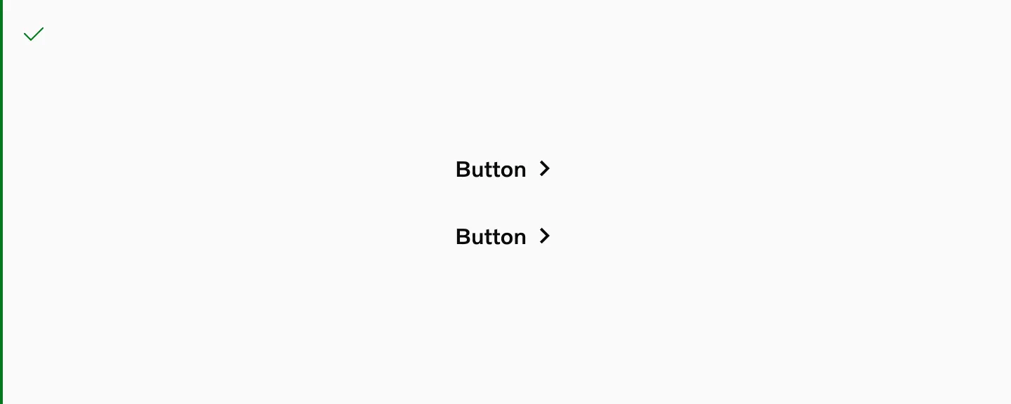
Vertical
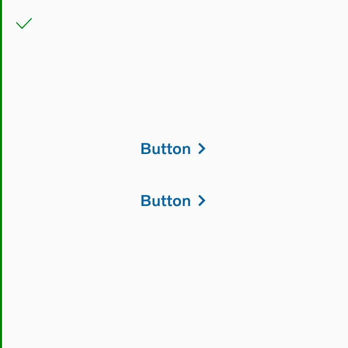
Section titled “Vertical”Vertical layout
Vertical layout with text

Three buttons stacked vertically
Neutral
Section titled “Neutral”
Neutral colored buttons
Accent
Section titled “Accent”
Accent colored buttons
Destructive
Section titled “Destructive”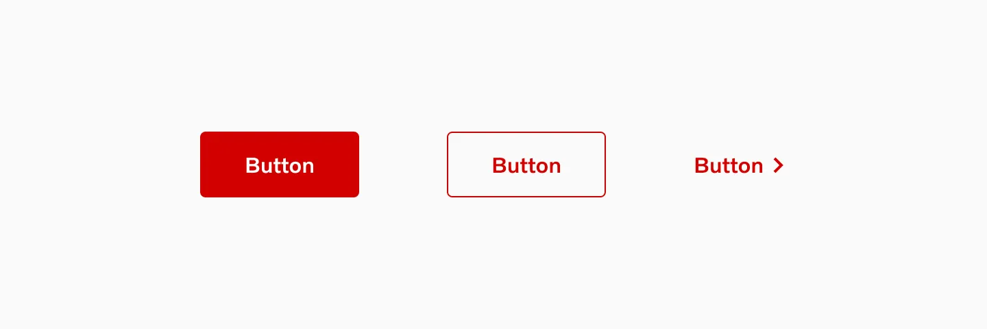
Destructive colored buttons
Placement
Section titled “Placement”Text aligned button group
Section titled “Text aligned button group”Align buttons the way the text/content/form is aligned.
Showing left aligned ButtonGroup.
Left aligned group
Section titled “Left aligned group”If the ButtonGroup is left aligned, the primary button is on the left.
Center aligned group
Section titled “Center aligned group”If the ButtonGroup is center aligned, the primary button is on the right.
Right aligned group
Section titled “Right aligned group”If the ButtonGroup is right aligned, the primary button is on the right.
Sticky group
Section titled “Sticky group”If the ButtonGroup is sticky then the primary button is on the right.
Showing two buttons side by side.
Showing text and a button beside each other.
Full-width buttons
Section titled “Full-width buttons”Full-width buttons are utilized on mobile devices and in narrow containers. The buttons extend to their full width unless they are positioned next to text.
Showing a button stretched to full width.
Showing two buttons side by side, each stretched to full width.
Showing two buttons stacked vertically, stretched to full width.
Order of buttons
Section titled “Order of buttons”If the primary button is on the left when next to each other, then the primary button is at the top when stacked vertically.
Grouping guidelines
Section titled “Grouping guidelines”It is recommended to group a maximum of two buttons together. To signify greater importance, consider using a single primary button instead of a group.
It’s ok to group primary and secondary.
Don’t group large and small buttons.
It’s ok to group 2 secondary buttons.
Don’t group 2 primary buttons.
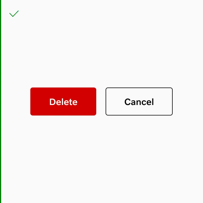
Do use different colors when using destructive buttons in a group.
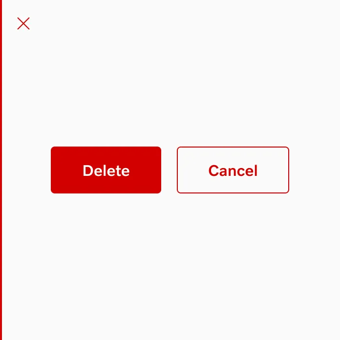
Don’t use the same color on both buttons when using destructive buttons in a group.
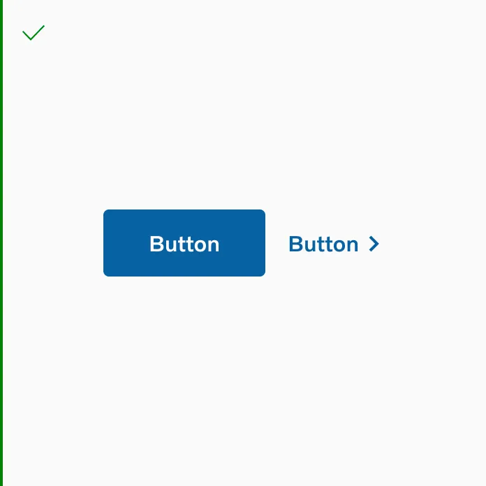
It’s ok to use button filled and button text side by side.
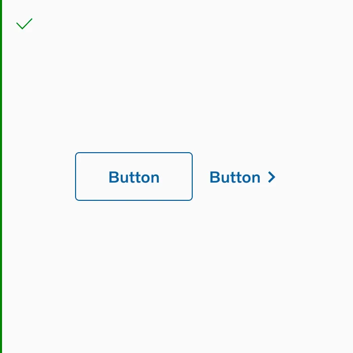
It’s ok to use button outline and button text side by side.
If you’re stacking two button text in your design, you need to update the spacing to 0px.
It’s ok to use two button text side by side.
Button Group Spacing
Section titled “Button Group Spacing”Horizontal spacing
Section titled “Horizontal spacing”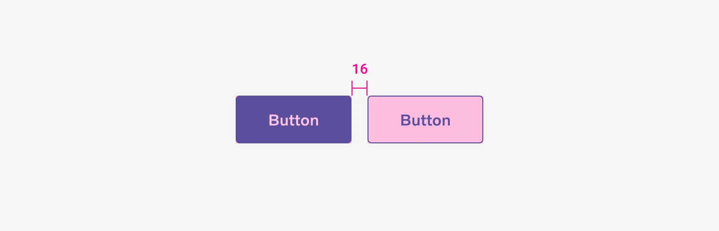
Showing two buttons side by side using spacer 16.
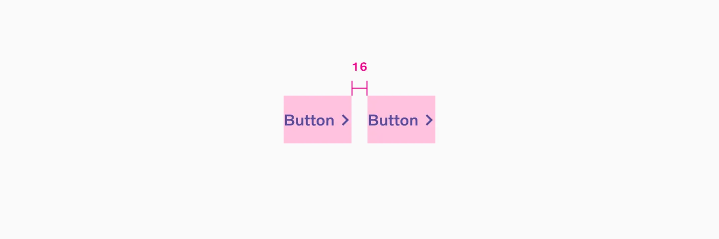
Showing two button texts side by side using spacer 16.
Vertical spacing
Section titled “Vertical spacing”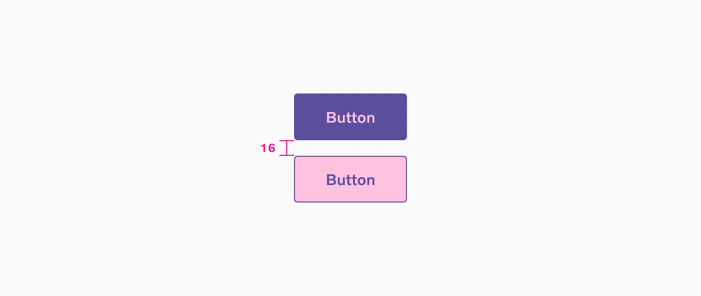
Showing two buttons stacked vertically with a 16 spacer in between.
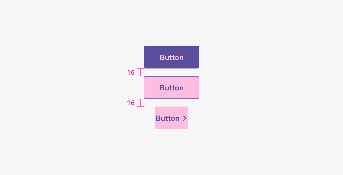
Showing three buttons stacked vertically with a 16 spacer in between.
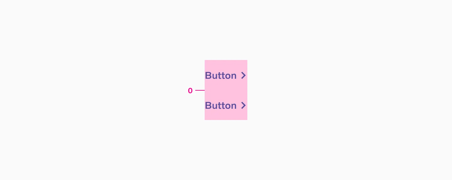
When stacking two button texts, we don’t use any spacing in between.
Button Group Examples
Section titled “Button Group Examples”
Showing three buttons stacked with accent and neutral color.
Showing two buttons text, using a neutral color, side by side.