Accordion
The accordion component is used to toggle the visibility of additional content.
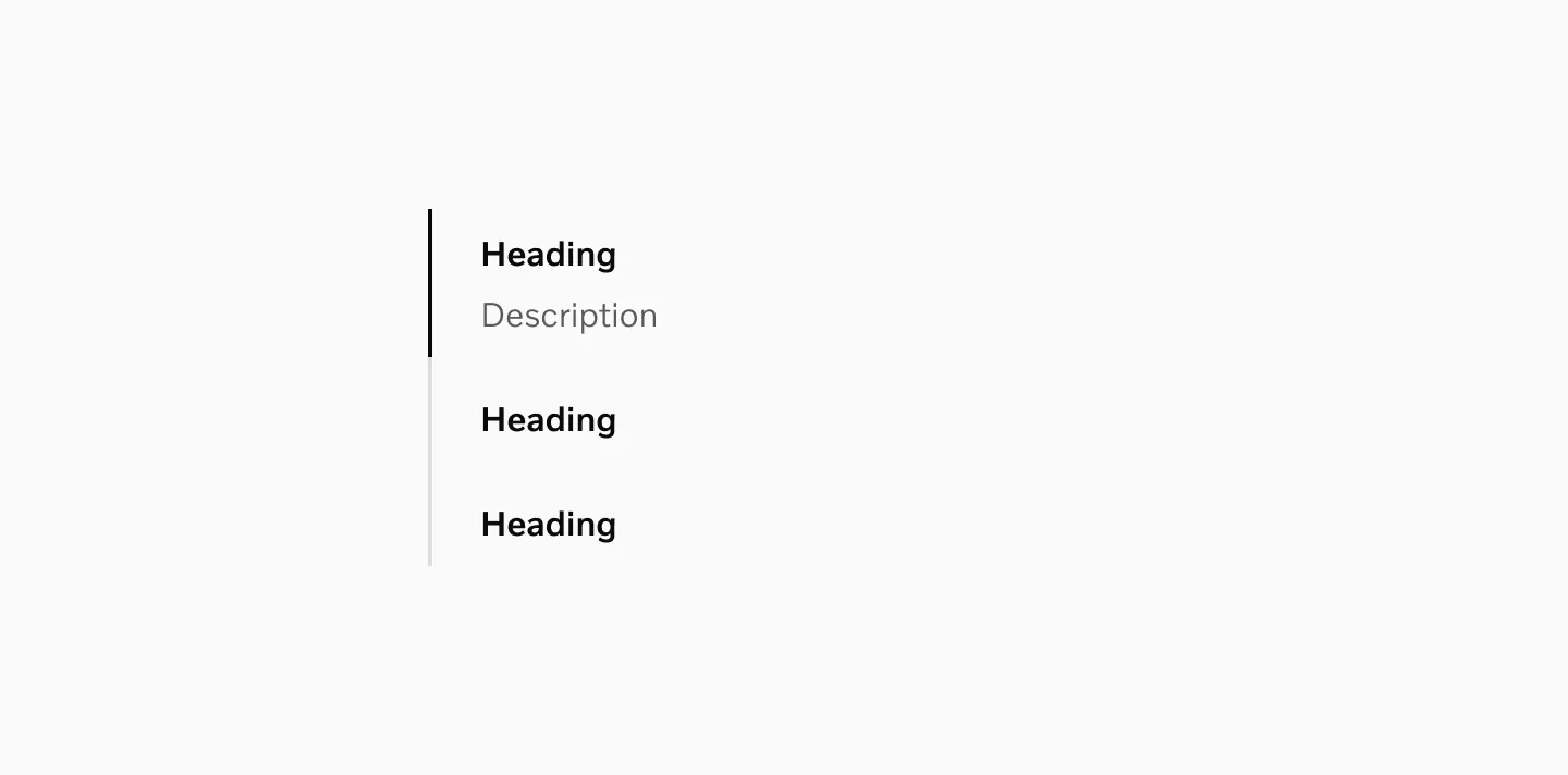
Anatomy
Section titled “Anatomy”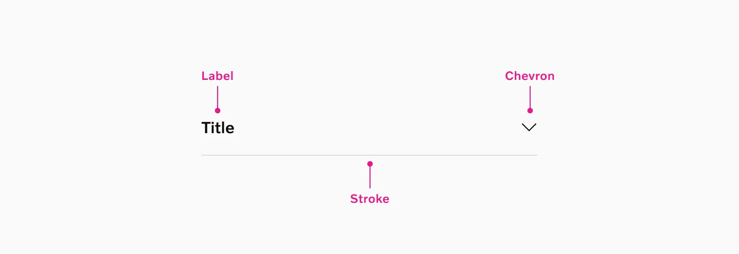
- Label
- Stroke
- Chevron
How to use
Section titled “How to use”The accordion component is used to toggle the visibility of additional content, allowing users to reveal or hide sections as needed.
Accordions can be utilized in various contexts, such as FAQs, product descriptions, or any scenario where content needs to be organized in a compact, expandable format.
Example: Accordions used in FAQs.
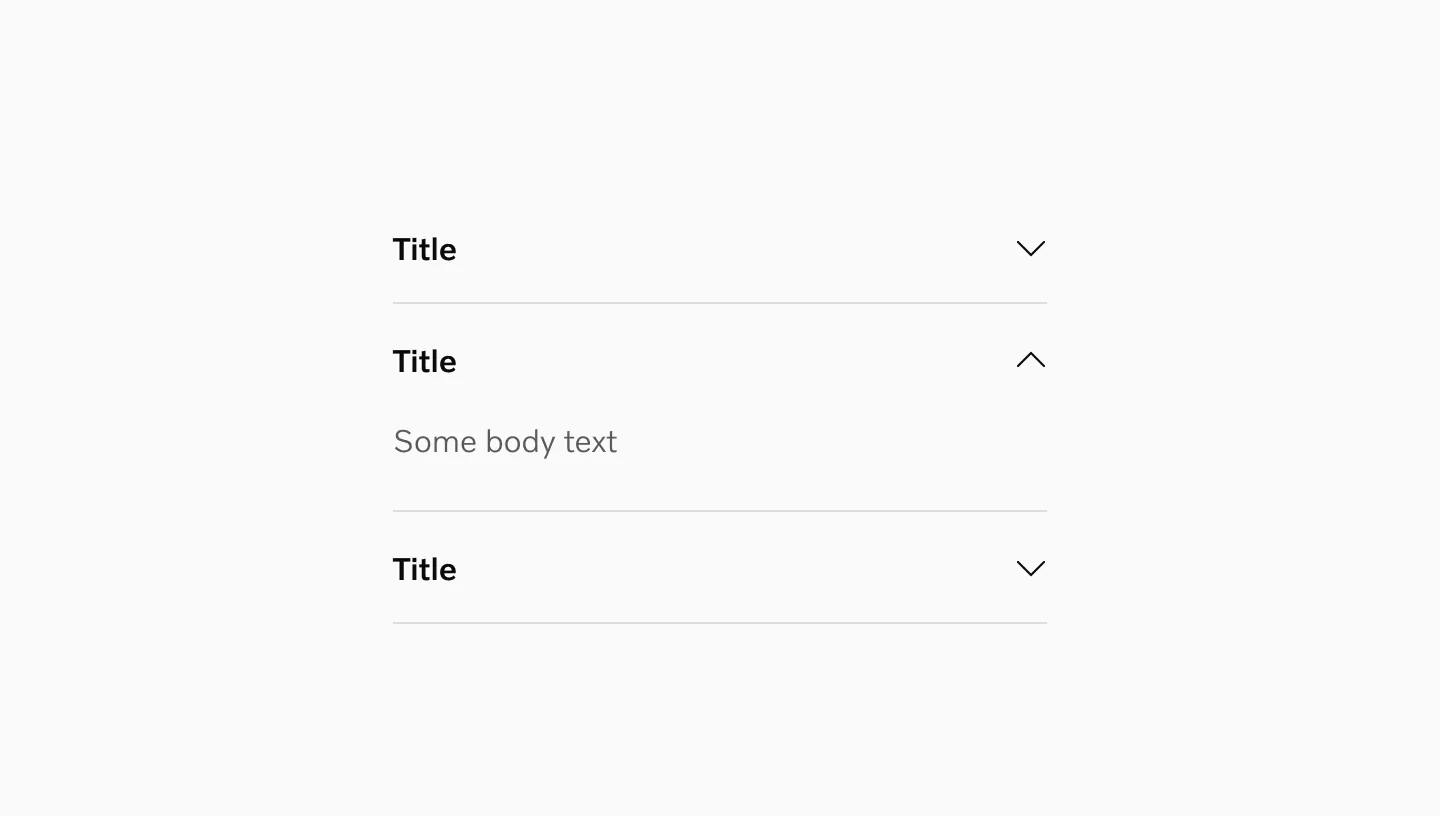
Text style
Section titled “Text style”Medium
Section titled “Medium”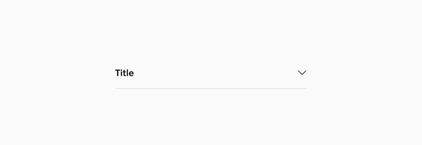
Showing accordion in medium text style.
Semi light
Section titled “Semi light”
Showing accordion in semi light text style.
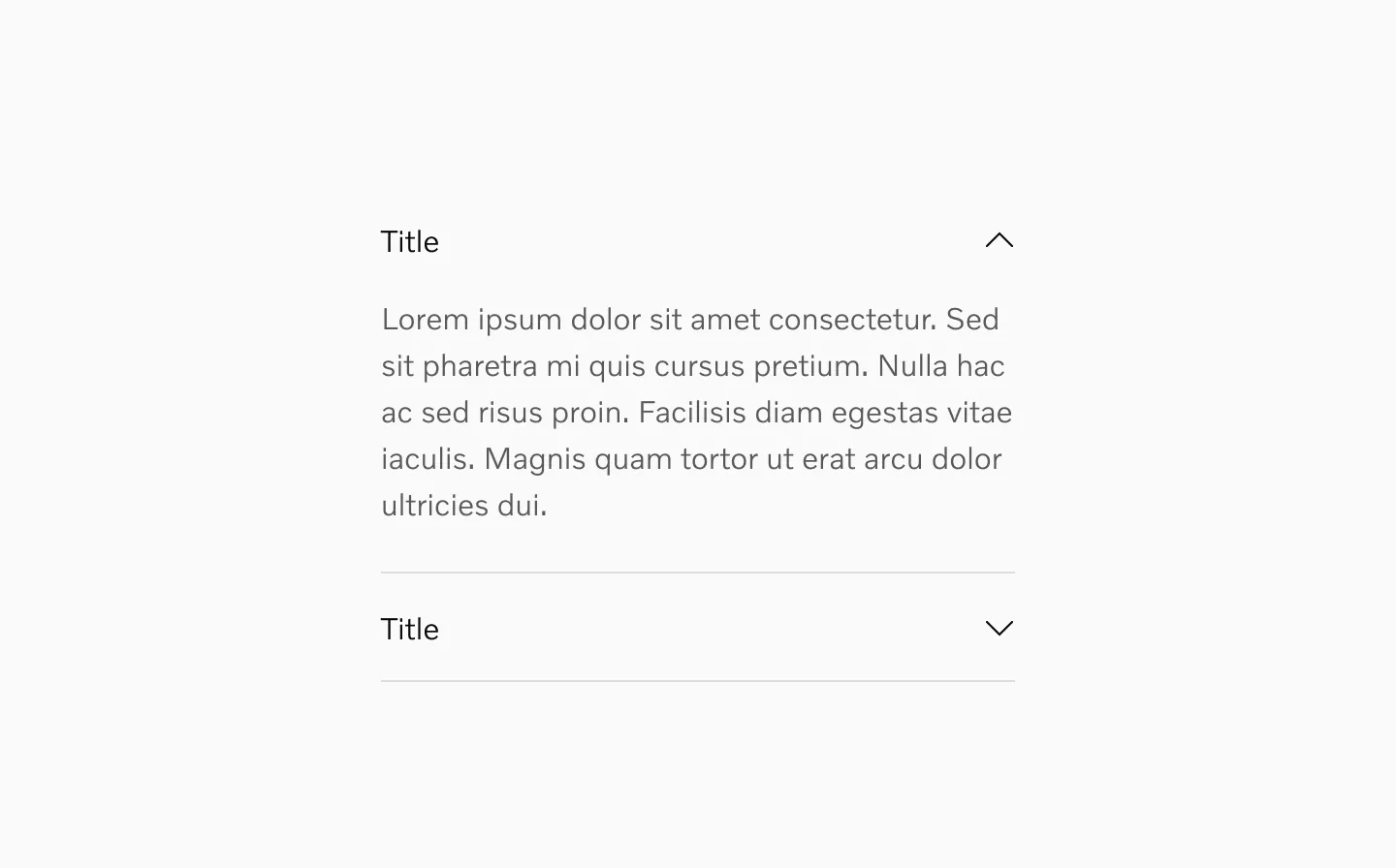
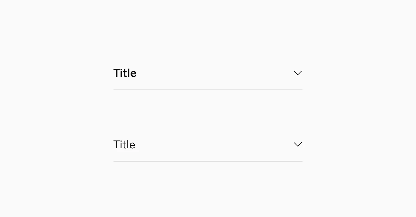
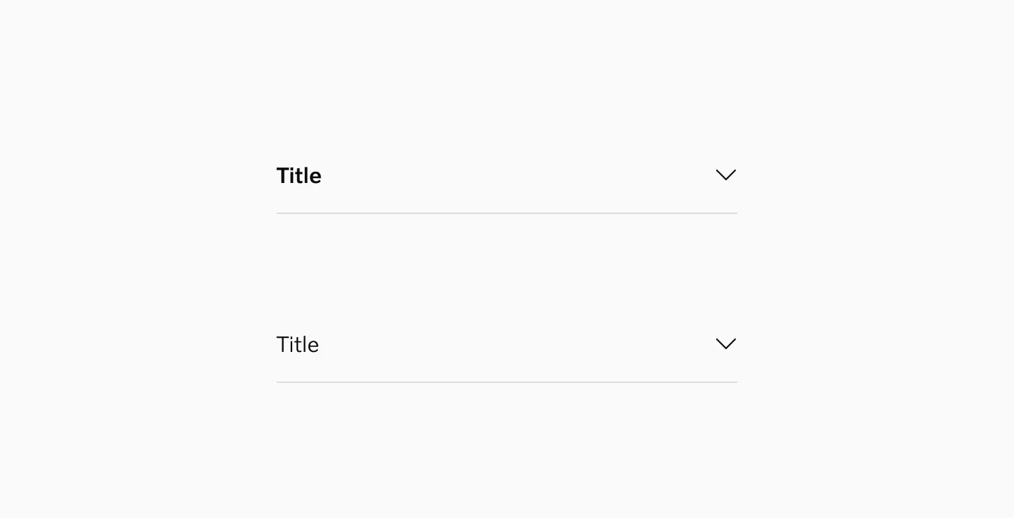
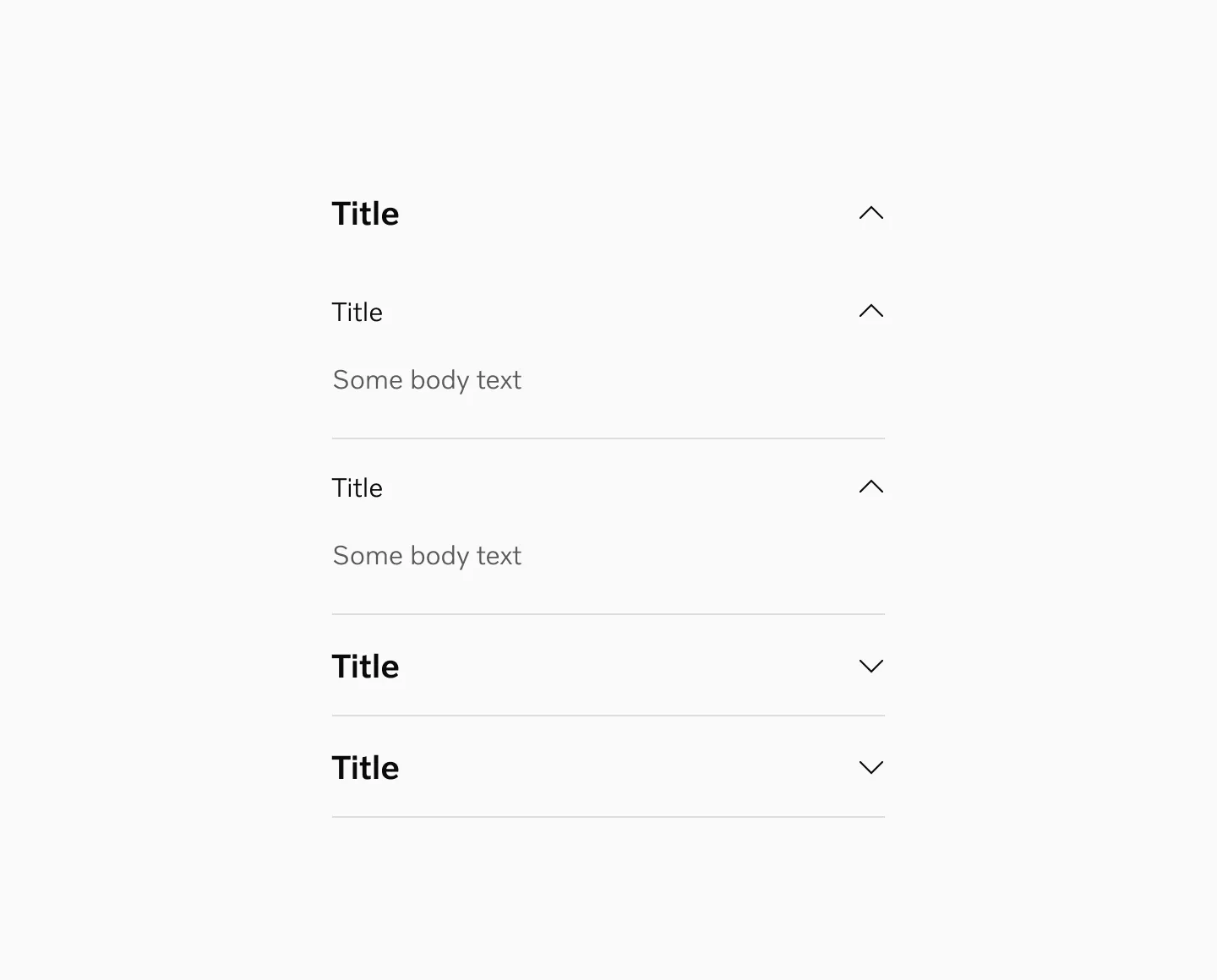
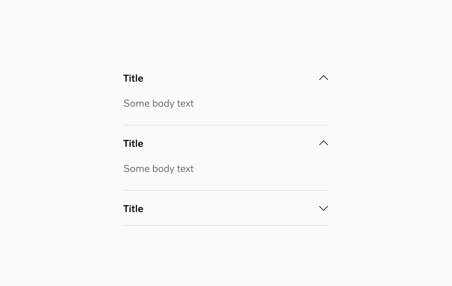
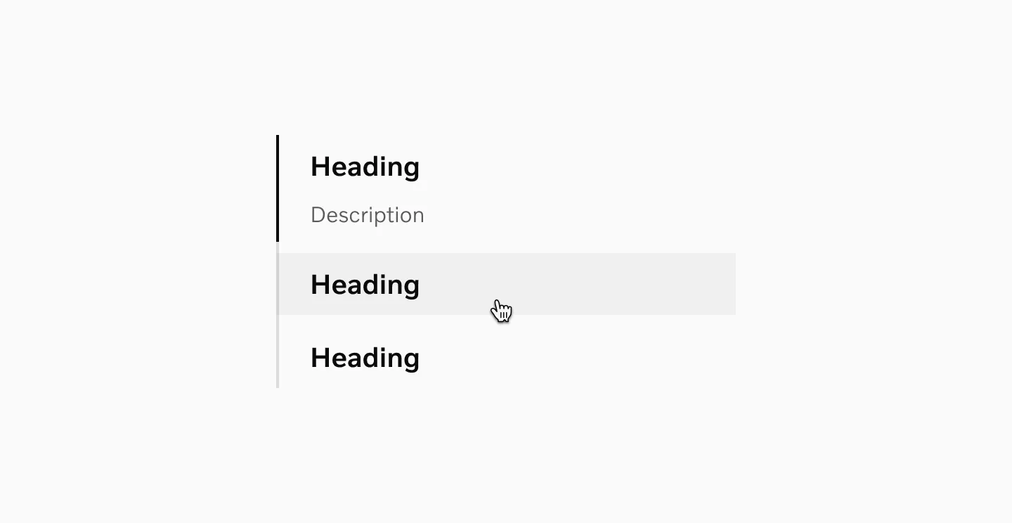
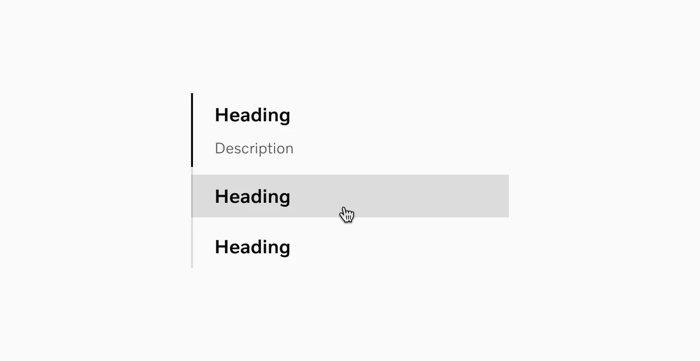
States
Section titled “States”Collapsed
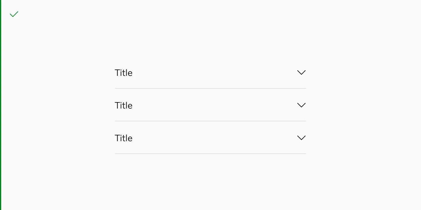
Section titled “Collapsed”
Showing accordion collapsed.
Expanded
Section titled “Expanded”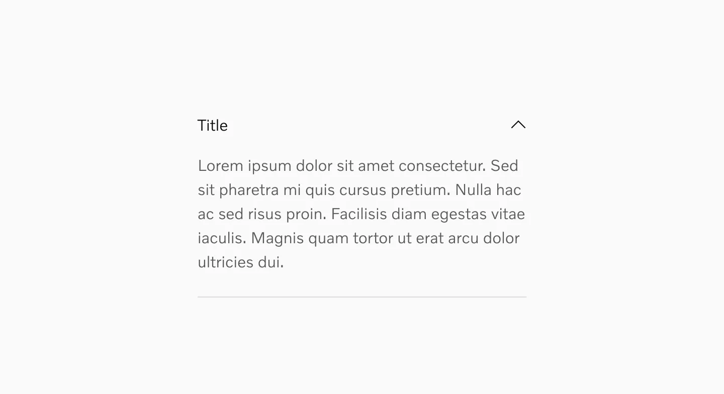
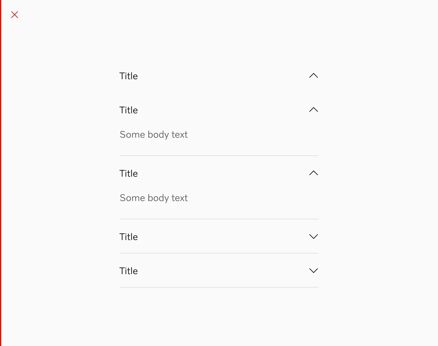
Showing accordion expanded. Content inside is added separately.
Showing accordion in 20pt in semi light and medium font.
Showing accordion in 16pt in semi light and medium font.
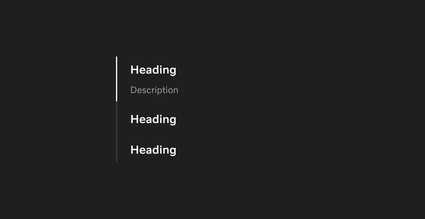
Color modes
Section titled “Color modes”
Showing accordions in light mode.
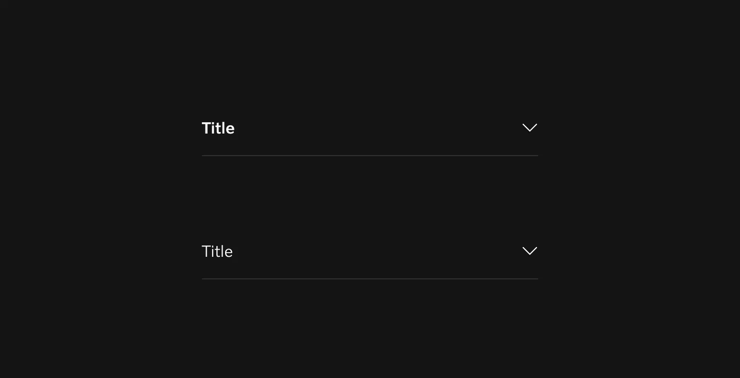
Showing accordions in dark mode.
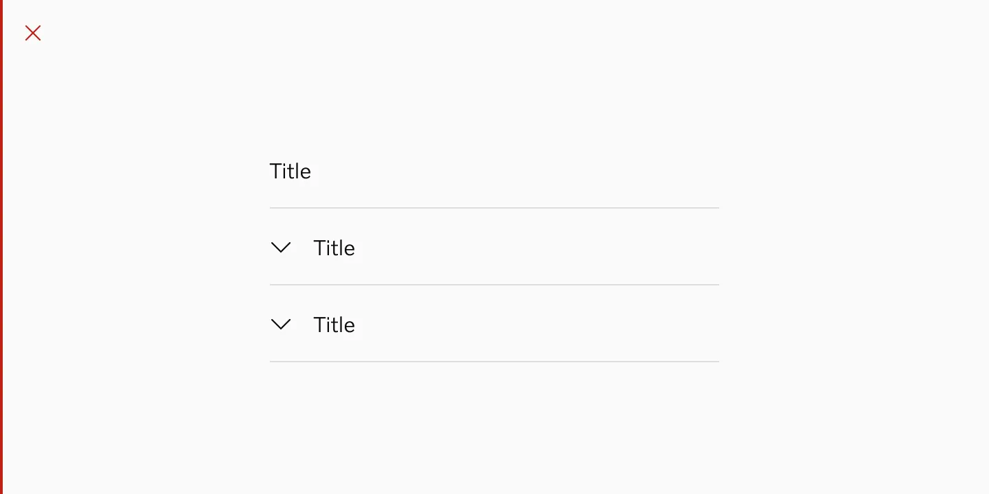
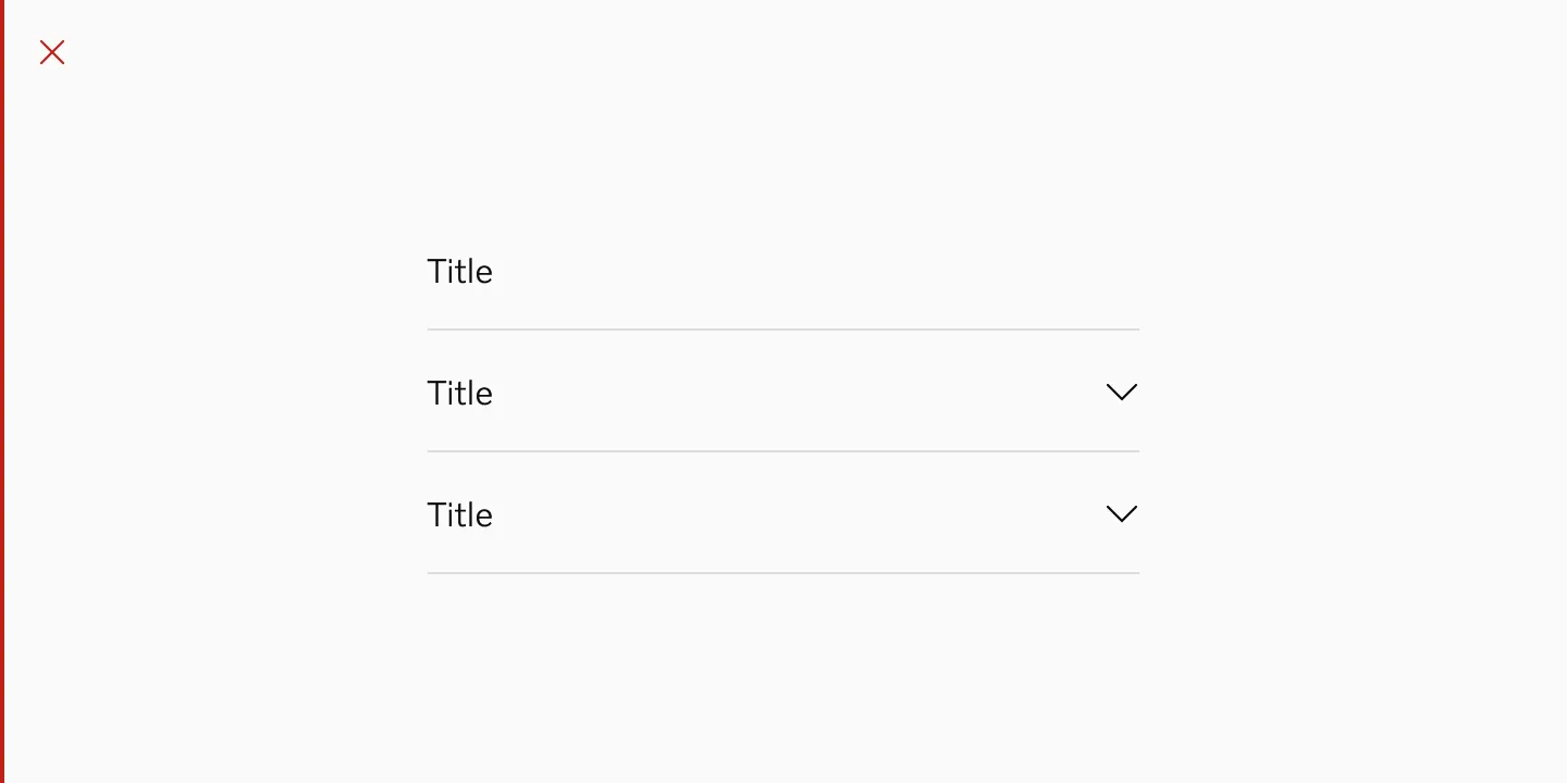
Chevron placement
Section titled “Chevron placement”Right side
Section titled “Right side”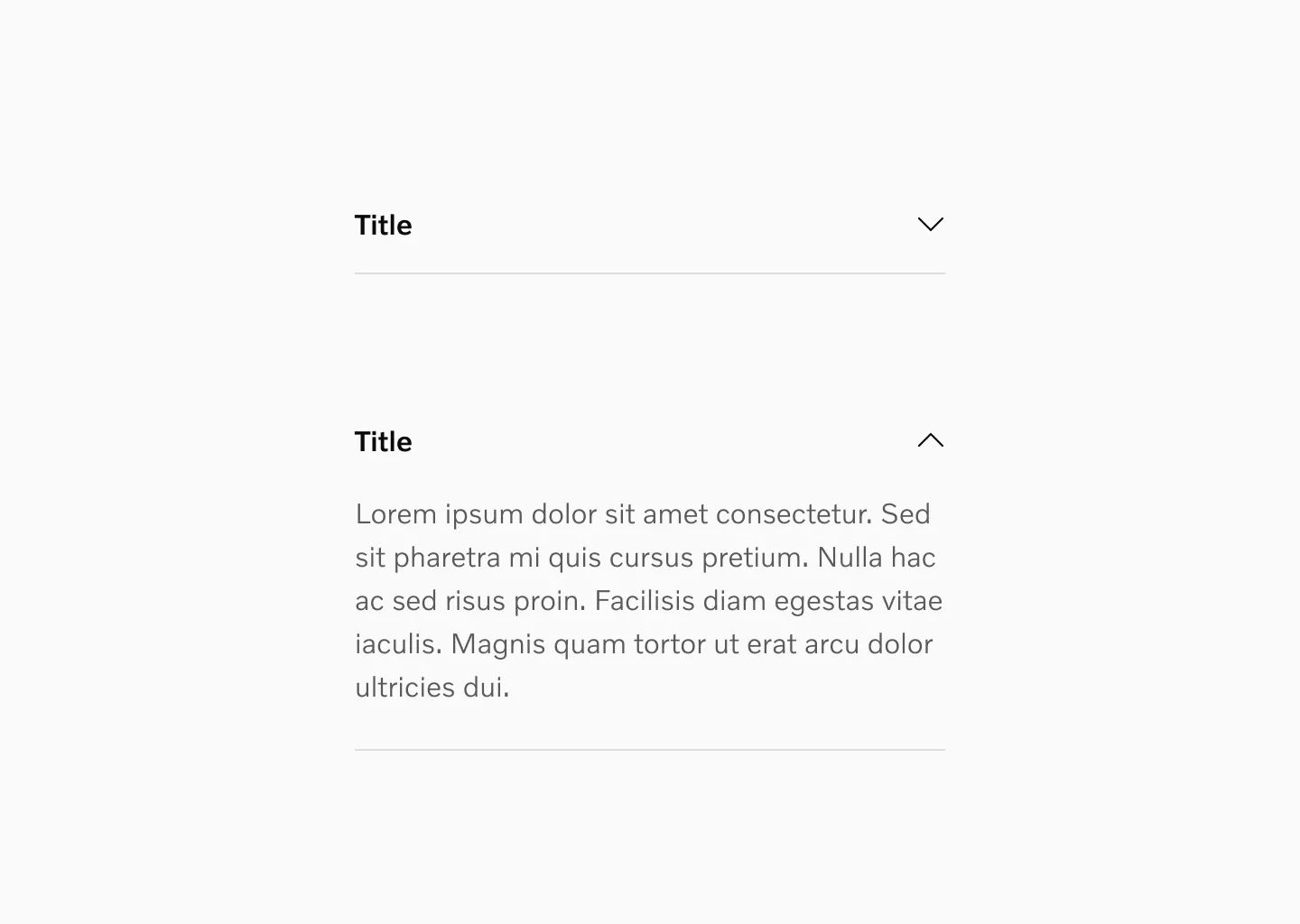
Showing chevron on the right side.
Left side
Section titled “Left side”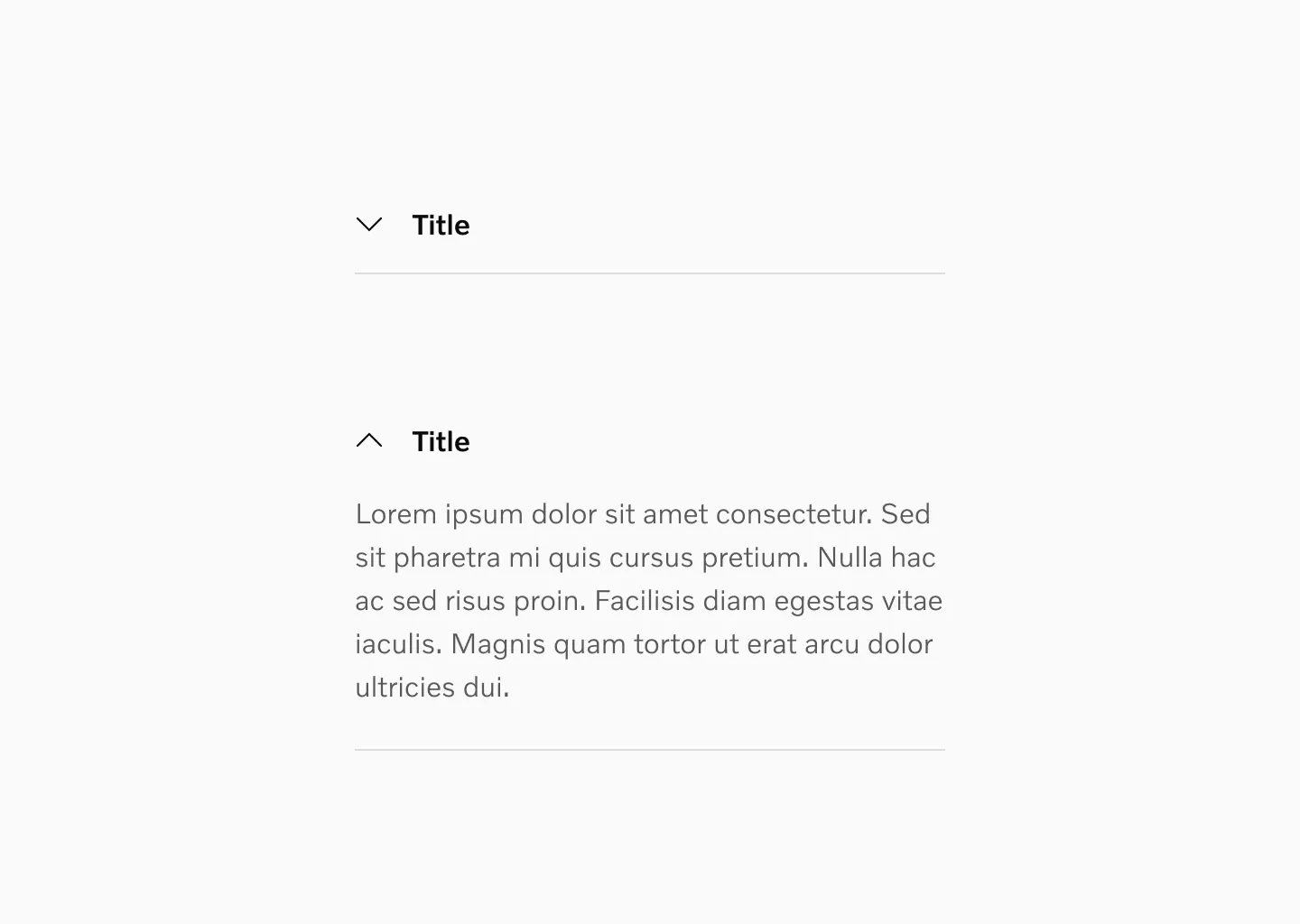
Showing chevron on the left side. This can be used when using wider sections.
Target size
Section titled “Target size”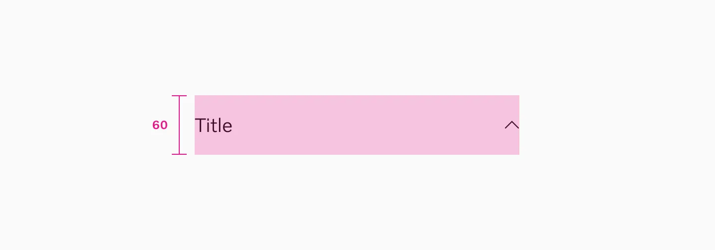
Accordion with 20px text uses minimum 60px target size.
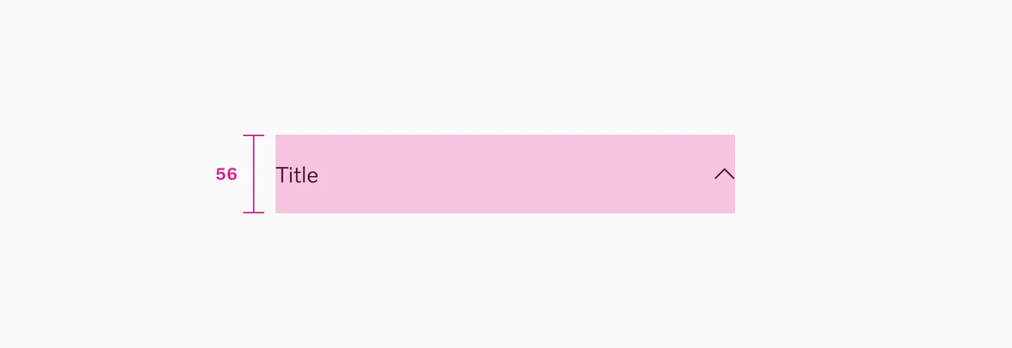
Accordion with 16px text uses minimum 56px target size.
Spacing
Section titled “Spacing”Spacing inside accordions depends on component.
Setup 1
Section titled “Setup 1”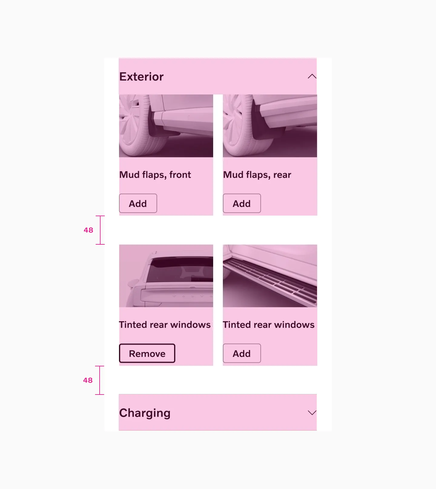
In this setup we want a bit more spacing inside the accordions since we have used clickable buttons. Here we use 48 spacer between content to ease up the tap area. Stroke and margin is added manually to the content inside.
Setup 2
Section titled “Setup 2”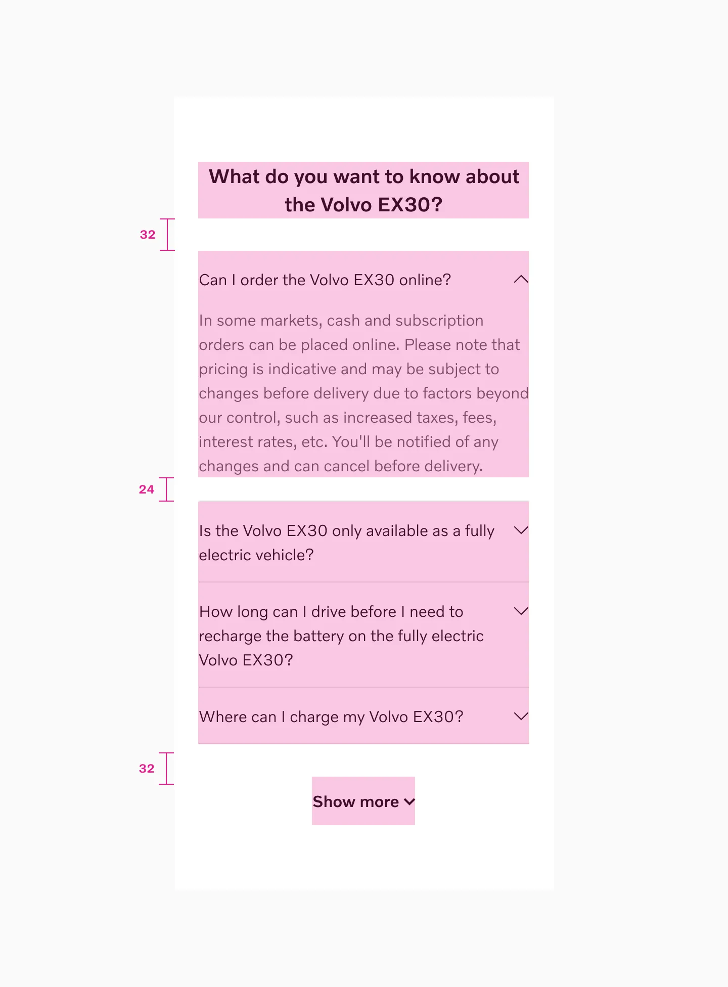
In this setup we want less spacing so here we use 32 spacer between content and 24 spacer after text inside an accordion. Stroke and margin is added manually to the content inside.
Examples
Section titled “Examples”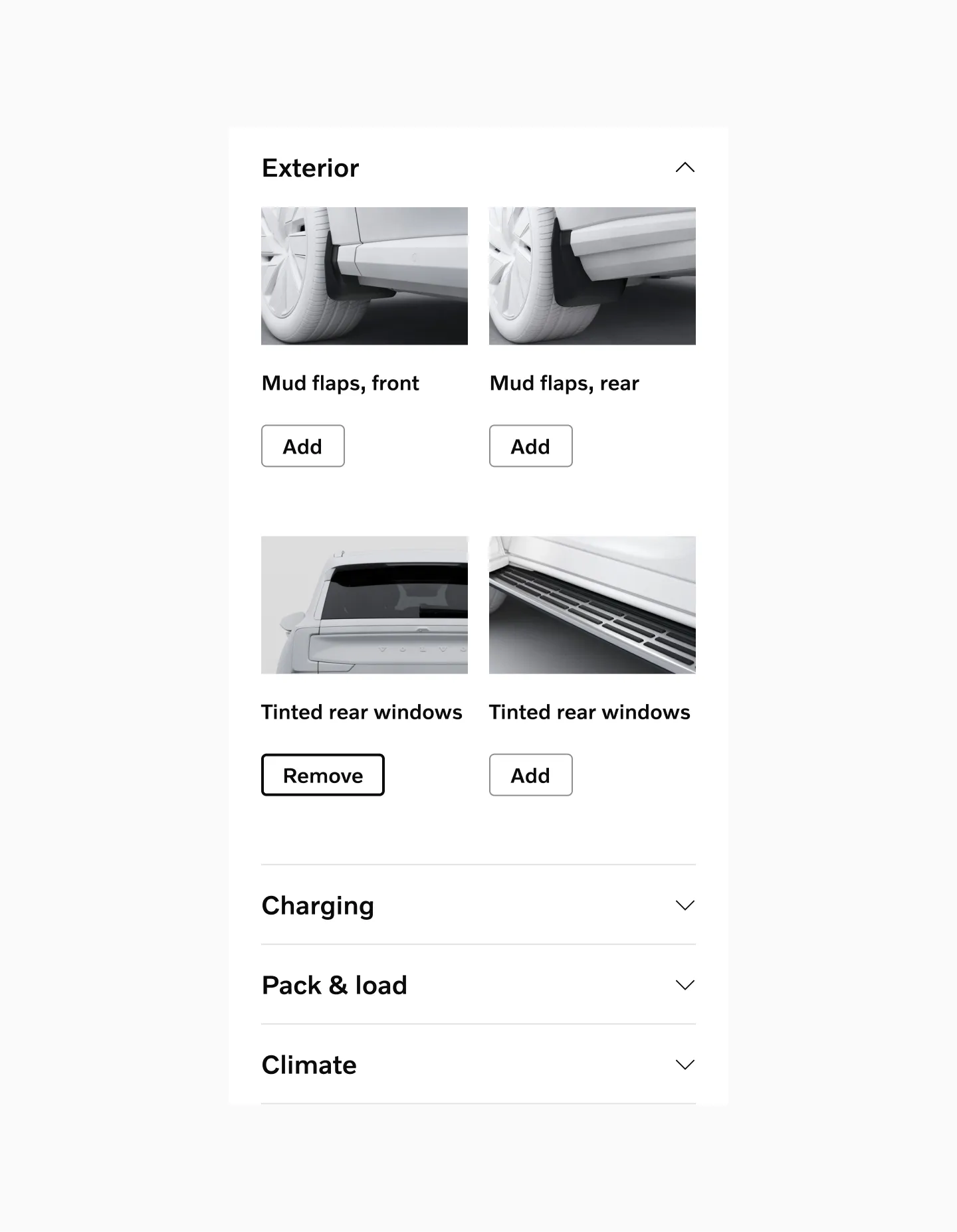
Example: Accordions used as a product listing component.
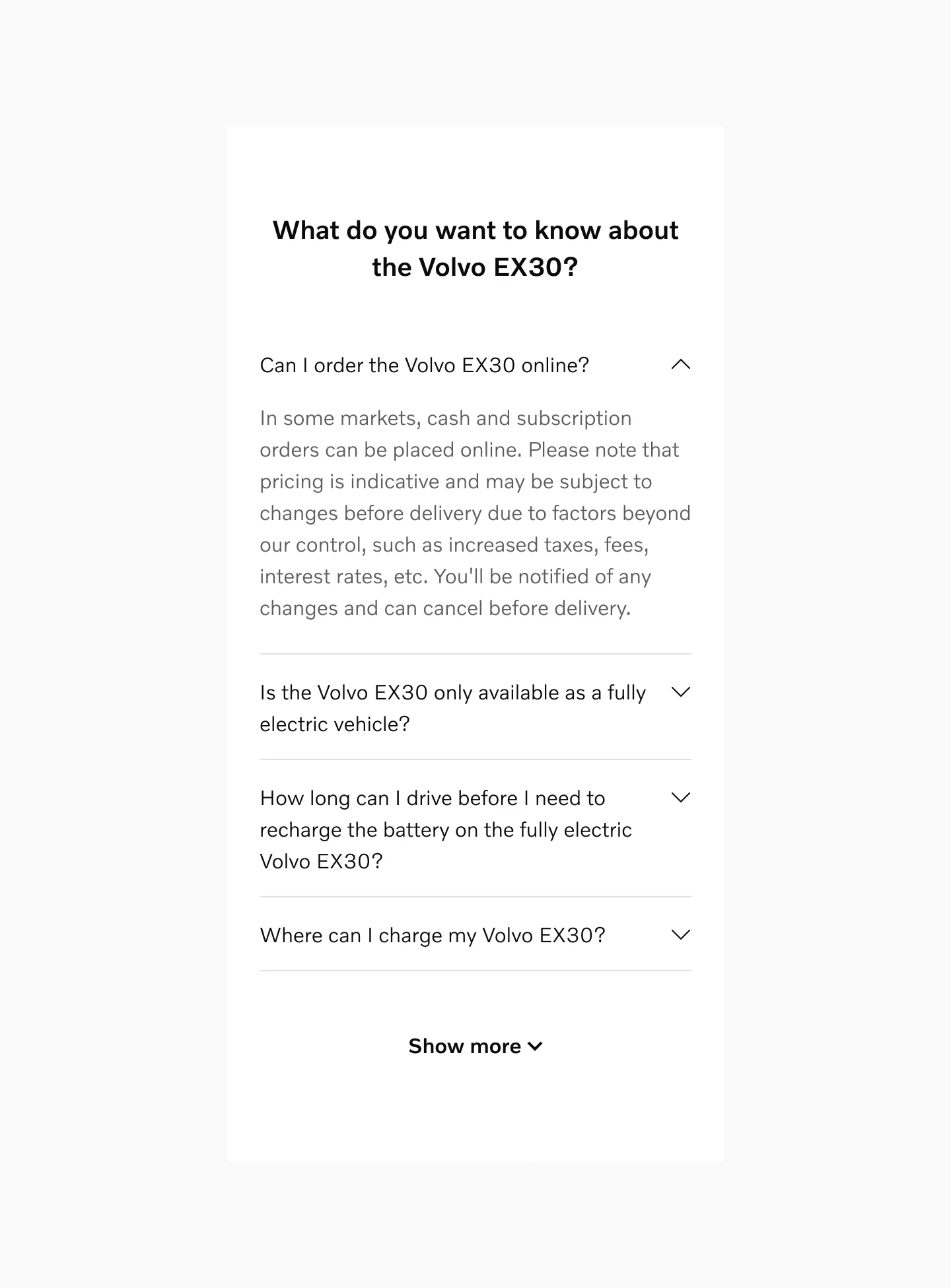
Example: Accordions used in a FAQ component.
Example: Accordions used as a nested option.
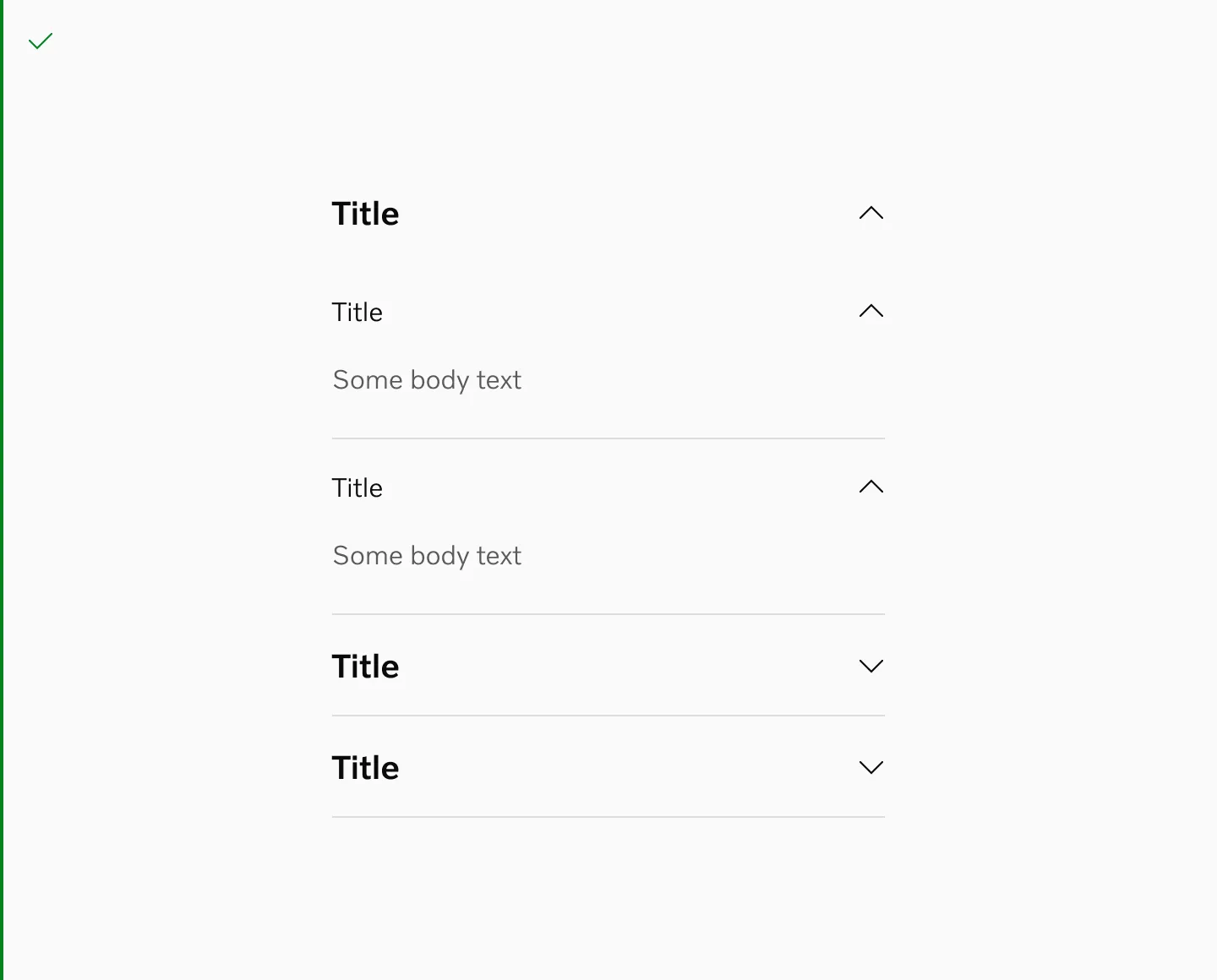
Behaviour
Section titled “Behaviour”Exclusive Accordion
Section titled “Exclusive Accordion”Generally you can leave the state of the accordion up to the user, to collapse and expand each item. If you have limited vertical space you can create an exclusive accordion that only allows one item to be open at a time.
Showing one item open.
Standard
Section titled “Standard”When using this option you can have all items open when toggled at the same time.
This is our recommended option.
Showing 2 items open at the same time.
Considerations
Section titled “Considerations”When to use
Section titled “When to use”Accordions hide content, which isn’t necessarily a good thing. Hiding content diminishes people’s awareness of it and to click on each heading to show information can be cumbersome and exhaust the user in finding what they need.
Accordions are suitable when people need only a few key pieces of content on a single page. By hiding most of the content, users can spend their time more efficiently focused on the few topics that matter.
Accordions should be avoided when the audience needs most or all of the content to answer their questions or solve their problem. In those cases it’s better to show all the content at once.
Clear and concise labels
Section titled “Clear and concise labels”Make sure to provide clear and concise labels for the accordion headers to indicate the content they toggle.
Nesting
Section titled “Nesting”If you nest accordions, make sure there is a clear hierarchy between the different levels of nesting.
Do
Don’t
Layout
Section titled “Layout”The chevron icon signifies additional content and indicates an accordion item’s interaction. The chevron can be either at the start or the end of the header. Be consistent with the icon placement within an experience.
Use accordions with consistent chevron placement in the same layout.
Avoid using accordions with inconsistent chevron placement.
Avoid using accordions without chevrons.
Storybook
Section titled “Storybook”Stepped Accordion
Section titled “Stepped Accordion”Used to display information sequentially.
Anatomy
Section titled “Anatomy”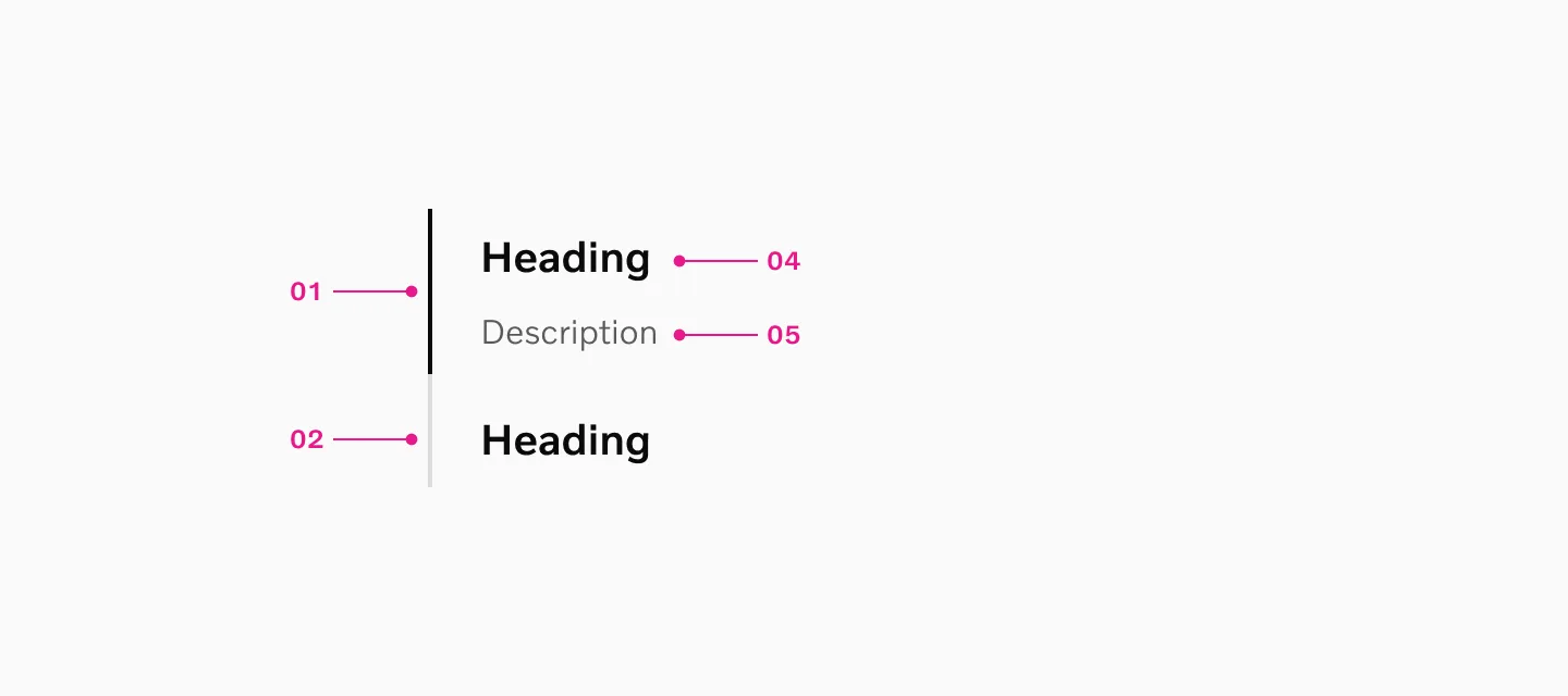
How to use
Section titled “How to use”A stepped accordion is used to display information sequentially. Stepped accordions can be used when displaying information that otherwise would be too overwhelming when displayed at once.
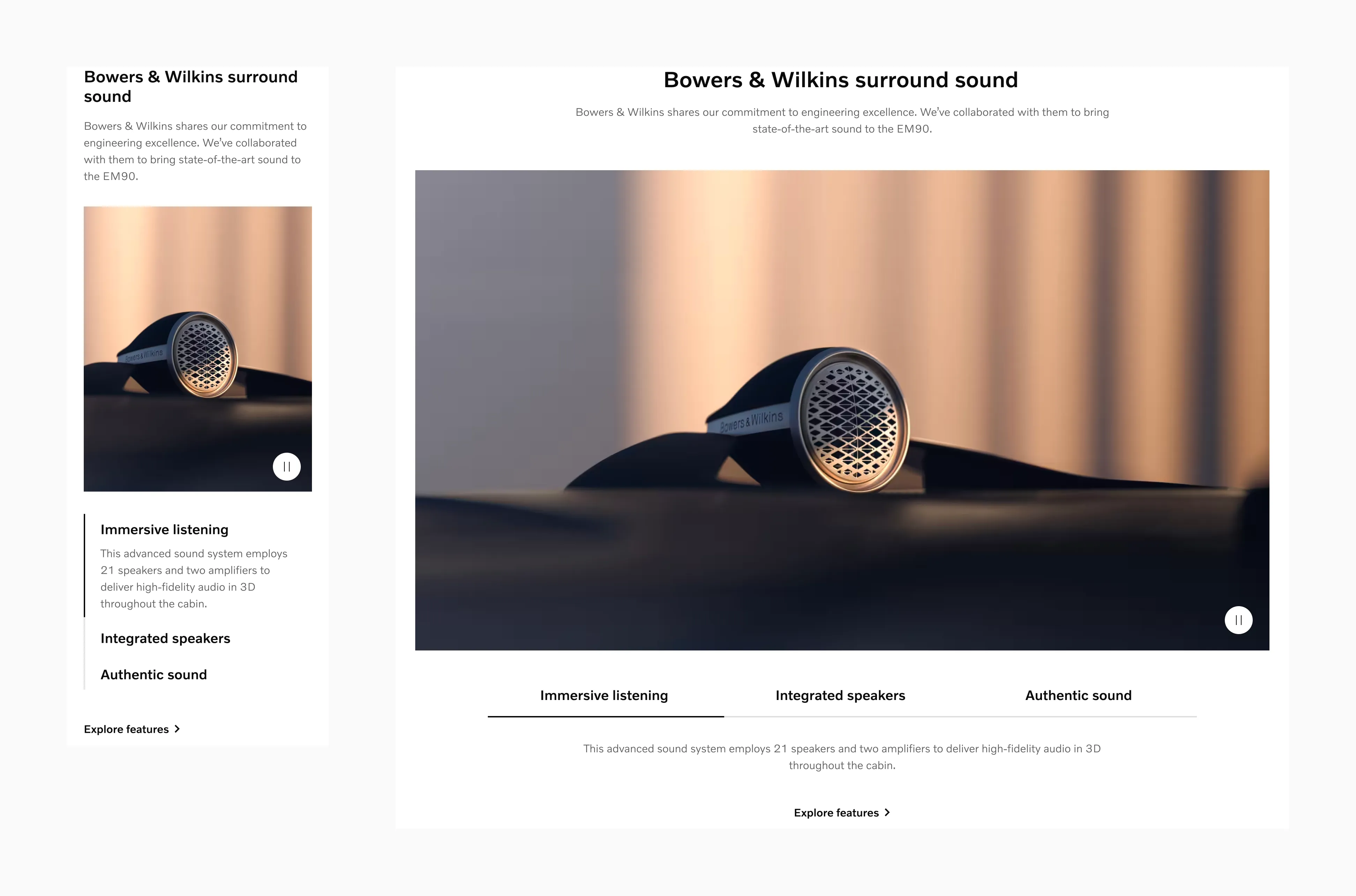
Displaying Stepped accordion on sm breakpoint.
Displaying Stepped accordion on lg breakpoint.
Stepped accordion comes in two heading sizes. 20pt and 16pt. Both variants uses the same spacing and description size.
Displaying stepped accordion with 20pt heading and 16pt description.
Displaying stepped accordion with 16pt heading and 16pt description.
Variants
Section titled “Variants”Selected
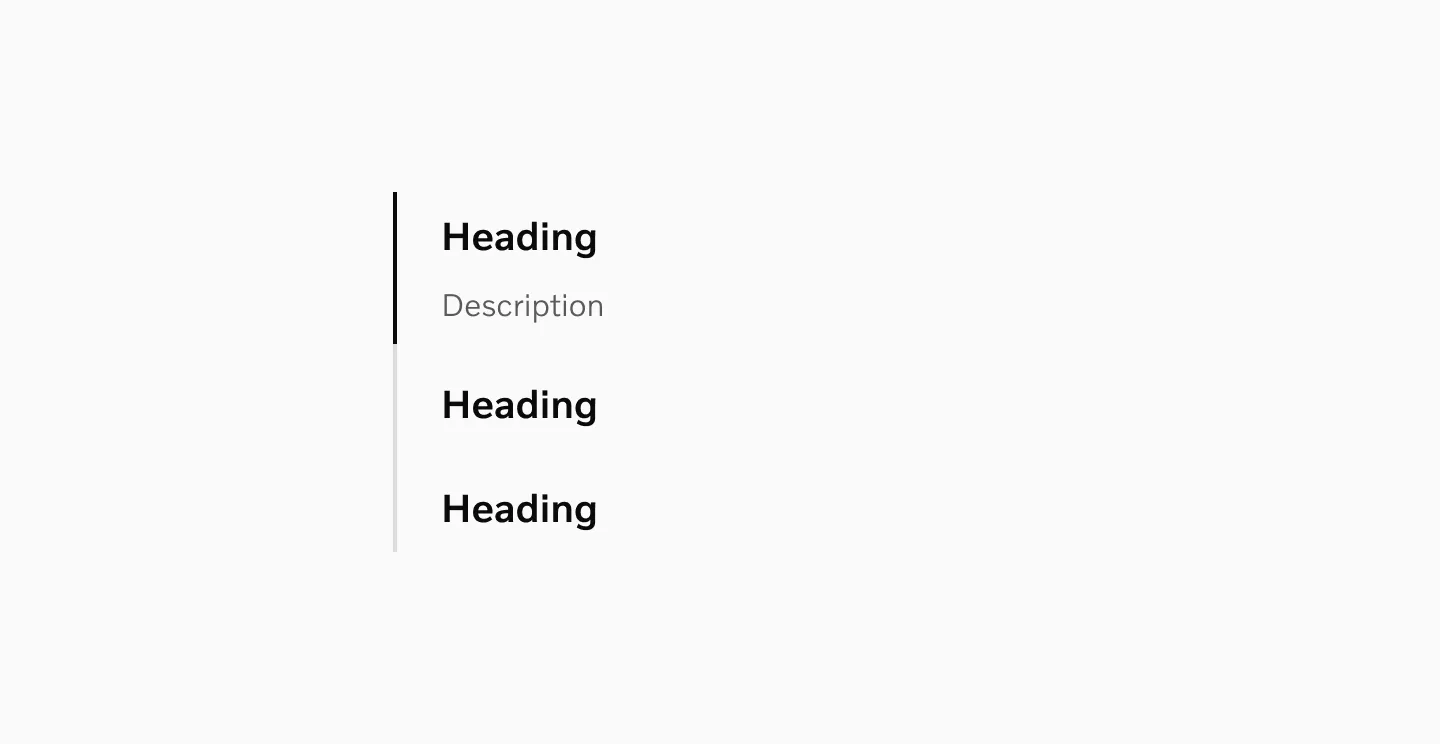
Section titled “Selected”A stepped accordion always has one active selection. When selected, it shows a highlight border, and the content becomes visible.

Displaying selected state.
Unselected
Section titled “Unselected”In the unselected state, there is no selected border or visible content. Instead, the heading becomes a clickable element to allow the user to select the collapsed step.

Displaying unselected state.
States
Section titled “States”Default
Section titled “Default”The Default state represents when the tab is inactive but available for interaction.
Displaying stepped accordion in its default state.
The Hover state appears when users move their cursor over the link on non-touch devices.
Displaying the stepped accordion in its hover state.
Pressed
Section titled “Pressed”The Pressed state communicates a user click, tap, or press. On touch devices, the pressed state is visible only momentarily.
Displaying the stepped accordion in its pressed state.
Color mode
Section titled “Color mode”
Displaying stepped accordion in light mode.
Displaying stepped accordion in dark mode.
Target size
Section titled “Target size”Stepped accordion have a minimum target size of 40px.
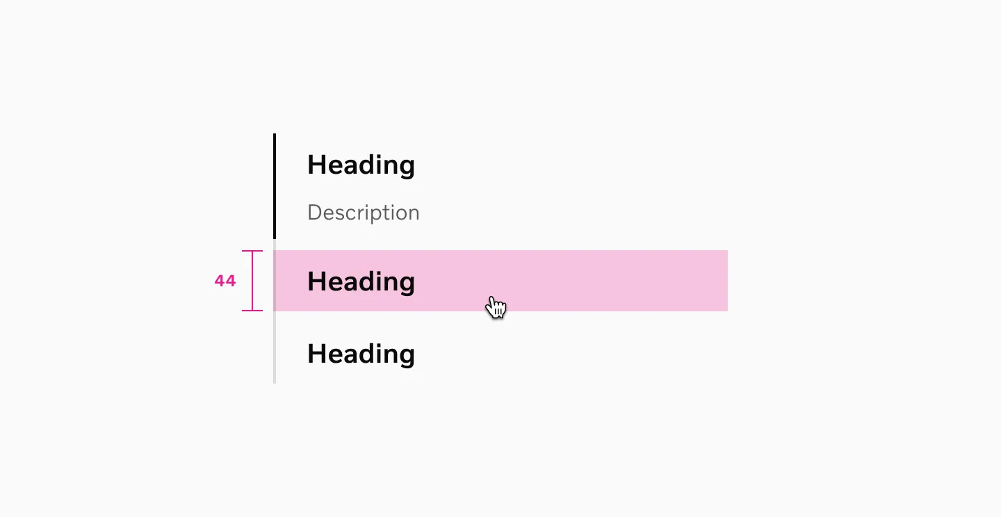
20pt heading is using 44px touch area.
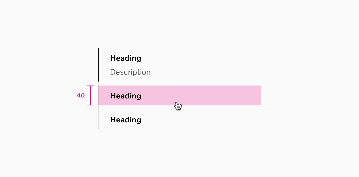
16pt heading is using 40px touch area.
Spacing
Section titled “Spacing”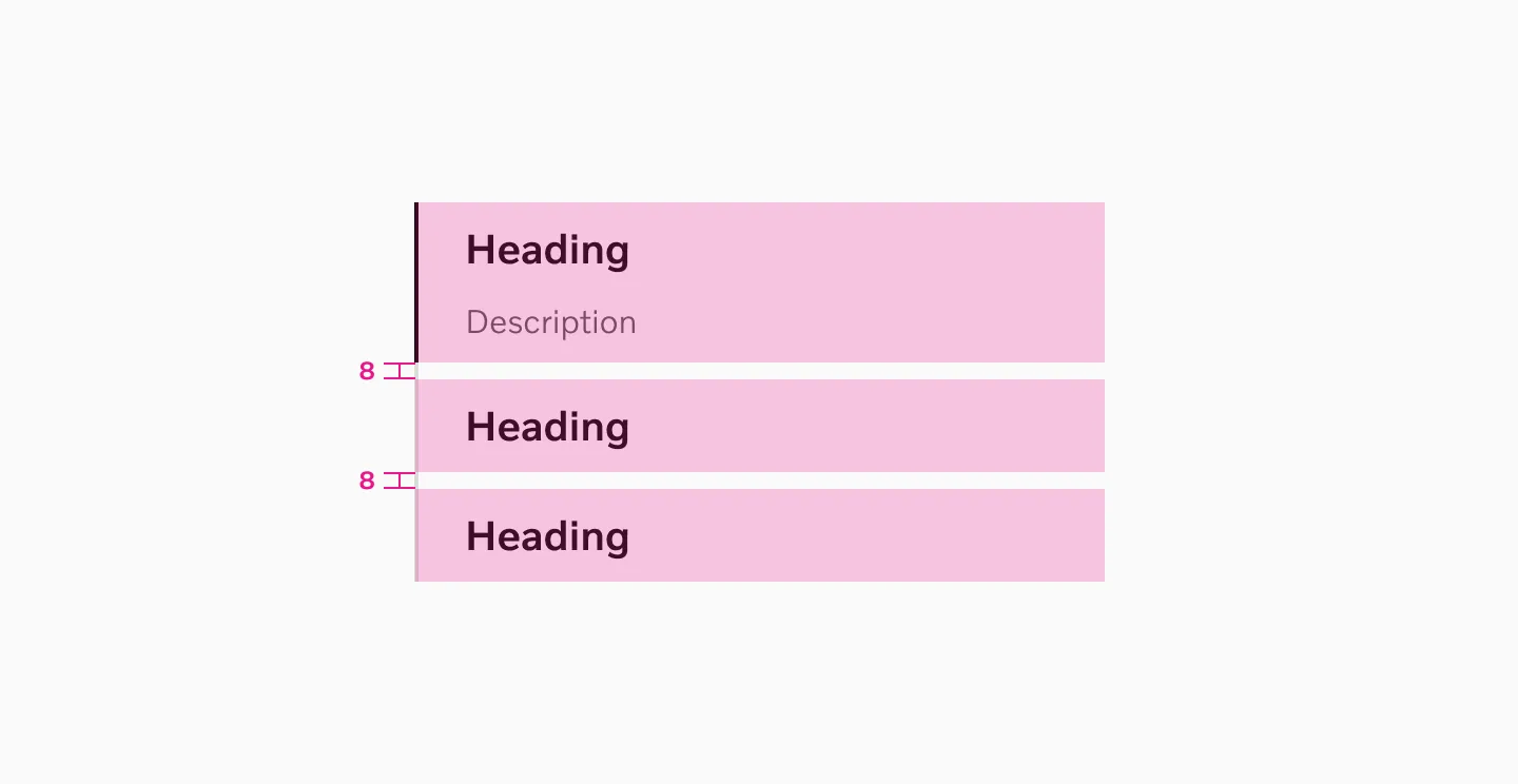
Stepped accordions uses 8px spacer between each other.
Examples
Section titled “Examples”
Displaying Stepped accordion on sm breakpoint.
Displaying Stepped accordion on lg breakpoint.
Content guidelines
Section titled “Content guidelines”Keep the text short and descriptive. If more text is needed, use a link to another page.
Heading
Section titled “Heading”Maximum 2 rows of text on the smallest breakpoint. Use text that describes or relates to the content in the full description.
Description
Section titled “Description”Limit text to a maximum of 4 rows on the smallest breakpoint.
Considerations
Section titled “Considerations”Stepped accordion and tabs
Section titled “Stepped accordion and tabs”Do not combine tabs and stepped accordions within the same element.
Do use stepped accordion by itself.
Don’t use tabs and stepped accordion at the same time.
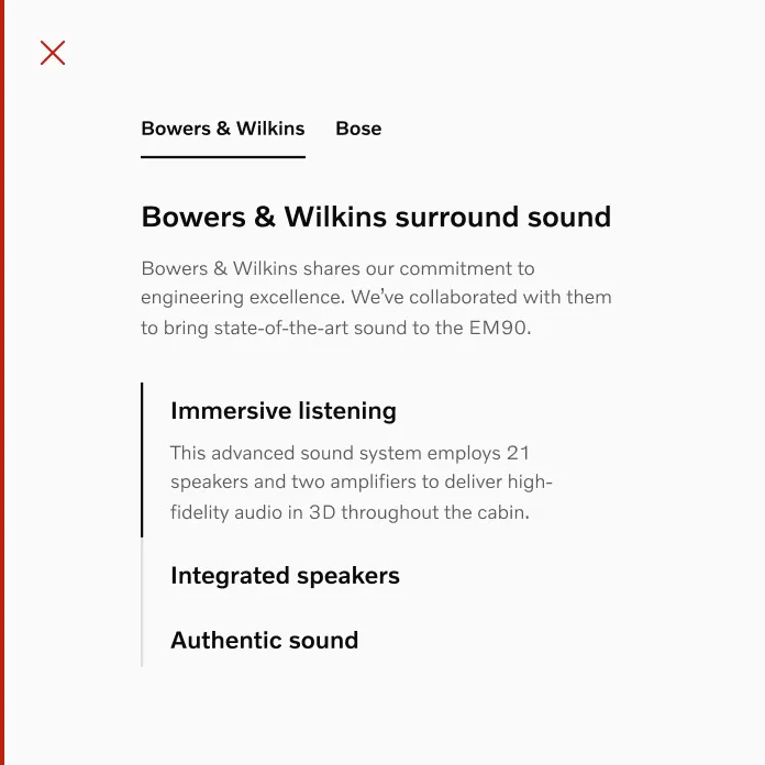
Text and image
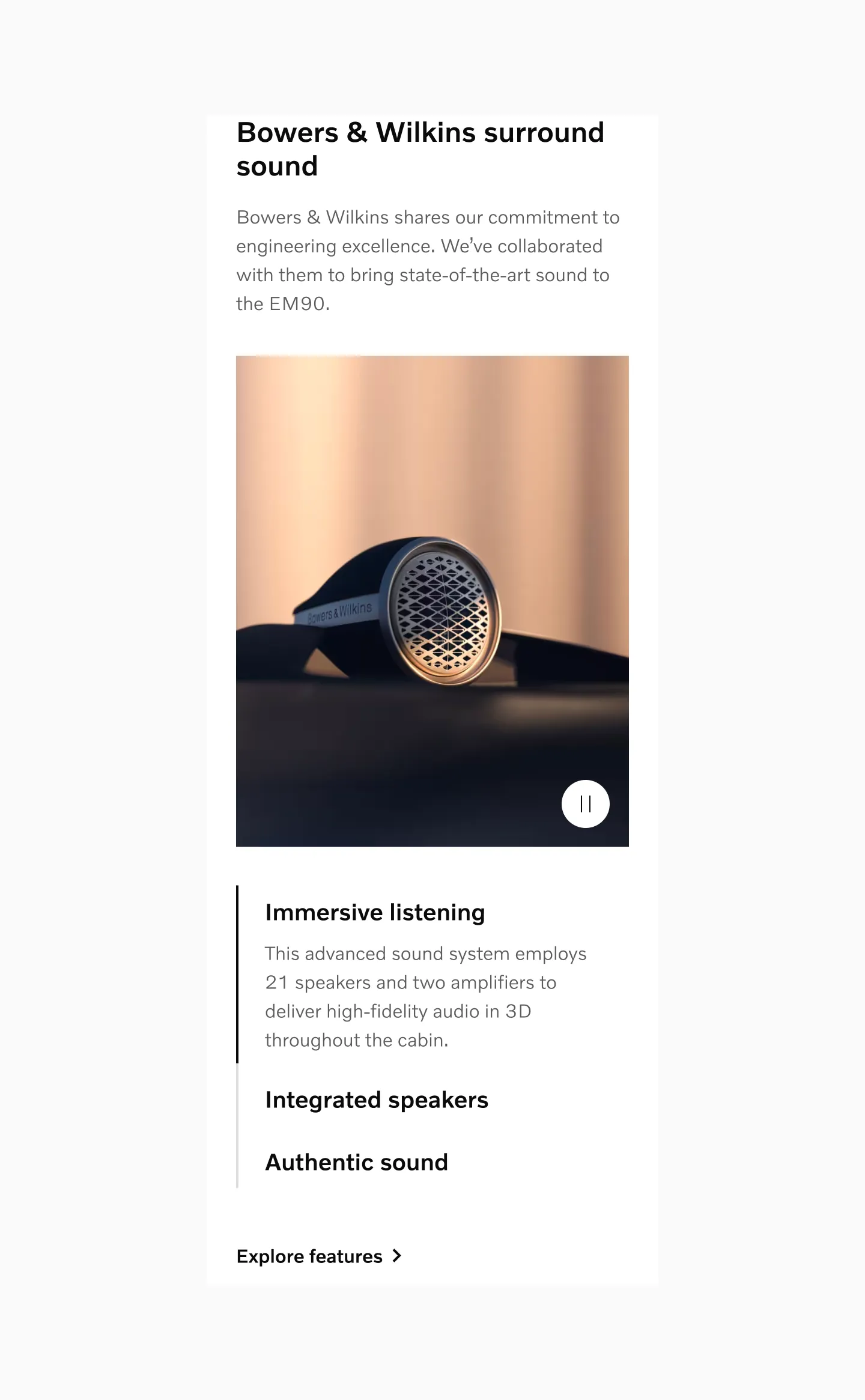
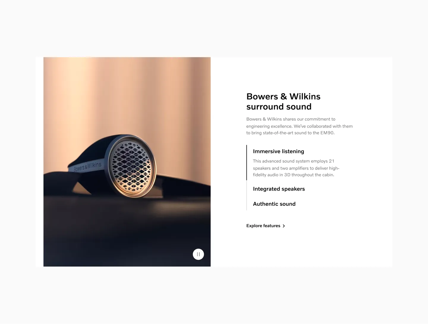
Section titled “Text and image”When combining images and text, make sure the image height exceeds the text height.
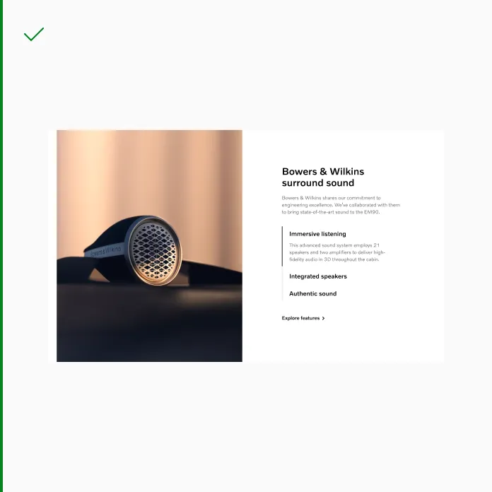
Do use larger image than the text element.
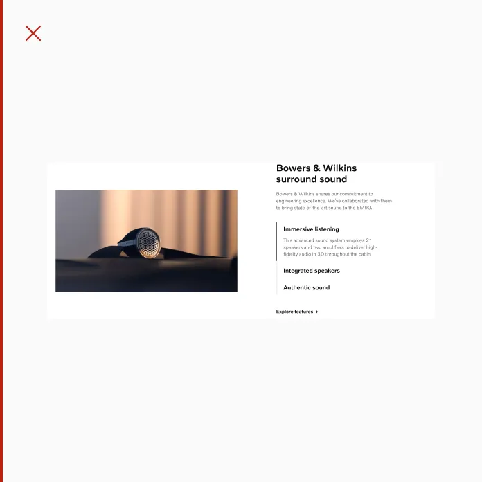
Don’t use smaller image than the text element.
Combining step accordion with tabs
Section titled “Combining step accordion with tabs”You may use stepped accordions on sm and md breakpoints while using tab buttons on lg and xl breakpoints.
Displaying Stepped accordion on sm breakpoint that transitions into a tab button on lg breakpoint.