
Reel

A horizontally scrolling container for browsing collections of cards or content frames.
@volvo-cars/css v3.1.0@volvo-cars/react-headless v0.27.0
Reel With Arrows
Section titled “Reel With Arrows”
Frame 1
Frame 2
Frame 3
Frame 4
Frame 5
Frame 6
Frame 7
Frame 8
Frame 9
Frame 10
Show code
import { useReel } from '@volvo-cars/react-headless';import { IconButton } from '@volvo-cars/react-icons';import { useRef } from 'react';
export function ReelWithArrows() {  const ref = useRef<HTMLDivElement>(null);  const { previousButtonProps, nextButtonProps, reelProps } = useReel({ ref });
  return (    <div>      <section        ref={ref}        className="reel gap-x-gridded-element"        aria-label="Scrollable frames"        {...reelProps}      >        {Array.from({ length: 10 }, (_, i) => i + 1).map((frame) => (          <div            key={frame}            className="snap-start flex items-center justify-center bg-secondary p-24 shape-default"            style={{ minWidth: '12rem', minHeight: '8rem' }}          >            Frame {frame}          </div>        ))}      </section>      <div className="flex items-center gap-8 mt-24 justify-end">        <IconButton          icon="chevron-back"          variant="filled"          color="subtle"          {...previousButtonProps}        />        <IconButton          icon="chevron-forward"          variant="filled"          color="subtle"          {...nextButtonProps}        />      </div>    </div>  );}
Reel Cards
Section titled “Reel Cards”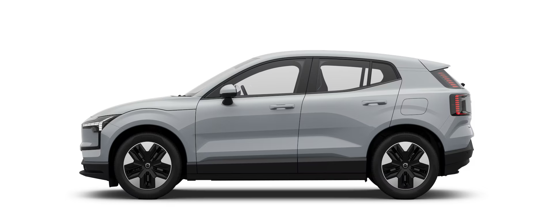
EX30
Electric SUV
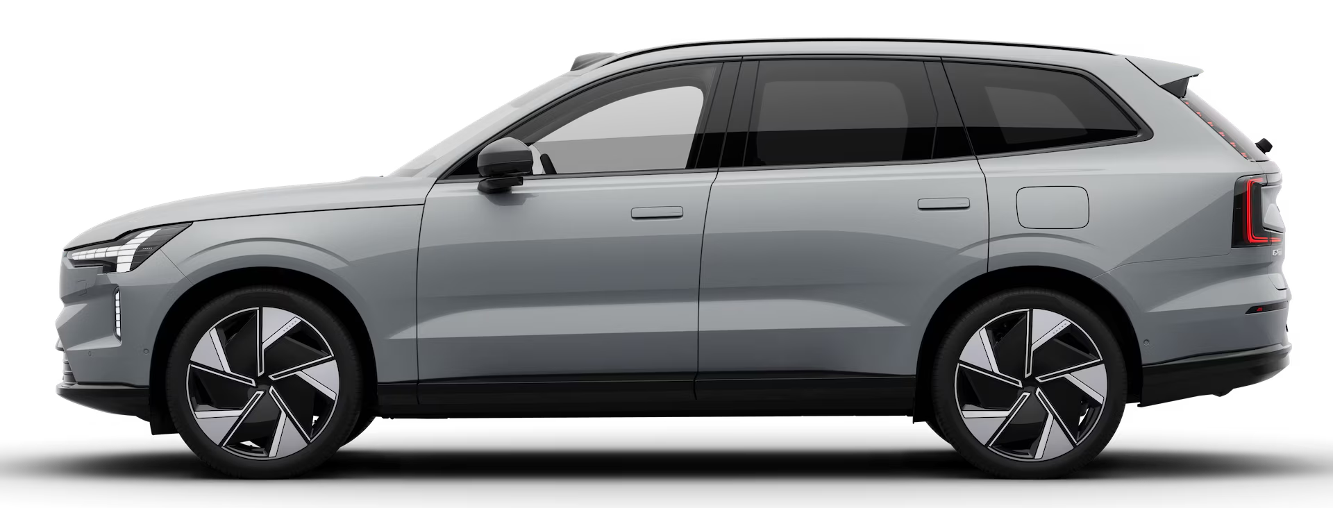
EX90
Electric SUV
XC90
Plug-in hybrid SUV
XC60
Plug-in hybrid SUV
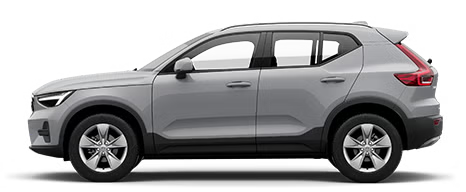
XC40
Mild hybrid SUV
Show code
import { useReel } from '@volvo-cars/react-headless';import { IconButton } from '@volvo-cars/react-icons';import { useRef } from 'react';
const cards = [  { title: 'EX30', subtitle: 'Electric SUV', image: 'ex30' },  { title: 'EX90', subtitle: 'Electric SUV', image: 'ex90' },  { title: 'XC90', subtitle: 'Plug-in hybrid SUV', image: 'xc90' },  { title: 'XC60', subtitle: 'Plug-in hybrid SUV', image: 'xc60' },  { title: 'XC40', subtitle: 'Mild hybrid SUV', image: 'xc40' },];
export function ReelCards() {  const ref = useRef<HTMLDivElement>(null);  const { previousButtonProps, nextButtonProps, reelProps } = useReel({ ref });
  return (    <div>      <section        ref={ref}        className="reel gap-x-gridded-element"        aria-label="Car models"        {...reelProps}      >        {cards.map(({ title, subtitle, image }) => (          <div            key={title}            className="snap-start flex-col flex-shrink-0 bg-secondary p-24 shape-default gap-8"            style={{ width: 'min(65vw, 16rem)' }}          >            <img              className="img aspect-3/2 object-contain"              src={`/images/cars/thumbnails/${image}.avif`}              width="400"              height="300"              alt={`Volvo ${title}`}            />            <p className="font-20 font-medium">{title}</p>            <p className="text-secondary font-14">{subtitle}</p>          </div>        ))}      </section>      <div className="flex gap-16 mt-24 justify-end">        <IconButton          icon="chevron-back"          variant="filled"          color="subtle"          {...previousButtonProps}        />        <IconButton          icon="chevron-forward"          variant="filled"          color="subtle"          {...nextButtonProps}        />      </div>    </div>  );}
Reel Hidden Scrollbar
Section titled “Reel Hidden Scrollbar”Show code
import { useReel } from '@volvo-cars/react-headless';import { IconButton } from '@volvo-cars/react-icons';import { useRef } from 'react';
export function ReelHiddenScrollbar() {  const ref = useRef<HTMLDivElement>(null);  const { previousButtonProps, nextButtonProps, reelProps } = useReel({ ref });
  return (    <div>      <section        ref={ref}        className="reel gap-x-gridded-element scrollbar-none"        aria-label="Scrollable frames"        {...reelProps}      >        {Array.from({ length: 10 }, (_, i) => i + 1).map((frame) => (          <div            key={frame}            className="snap-start flex items-center justify-center bg-secondary p-24 shape-default"            style={{ minWidth: '12rem', minHeight: '8rem' }}          >            Frame {frame}          </div>        ))}      </section>      <div className="flex gap-16 mt-24 justify-end">        <IconButton          icon="chevron-back"          variant="filled"          color="subtle"          {...previousButtonProps}        />        <IconButton          icon="chevron-forward"          variant="filled"          color="subtle"          {...nextButtonProps}        />      </div>    </div>  );}