
Input Fields

Input fields allow users to enter text, dates, and other structured data within a form. Each field type includes clear labeling and validation to support a consistent, accessible experience.
Choosing variant
Section titled “Choosing variant”Top label
Section titled “Top label”Use a top label by default. It gives longer, translated labels room to grow, keeps the label distinct from placeholder text, and lets an input sit the same height as an adjacent button.
Floating label
Section titled “Floating label”Use a floating label only in compact layouts, such as a sidebar or a filter panel, where the vertical space it saves matters more than the benefits of a top label.
CurrencyInput and UnitInput always use a top label.
Mixing variants
Section titled “Mixing variants”
Show code
import { EmailInput, TextInput } from '@volvo-cars/react-forms';
export function MixedLabelVariants() {  return (    <div className="flex-col gap-24">      <TextInput name="full-name" label="Full name" variant="top-label" />      <EmailInput name="email" label="Email address" variant="floating-label" />      <TextInput name="city" label="City" variant="top-label" />    </div>  );}
Choosing an input type
Section titled “Choosing an input type”Match the input type to the data you’re collecting so the browser applies the right validation and keyboard on mobile. See the input type table in Specification for the full HTML mapping.
- Use date or date-time inputs (
DateInput/DateTimeInput) when the user needs to see the calendar rather than type a value manually. - Use email, tel, and URL inputs for their respective data. Each one looks like a text input but carries its own validation and keyboard.
- Use currency and unit inputs for monetary values and measurements that need a locale-aware symbol or suffix.
- Use a custom input when none of the built-in types fit; build on the content slots rather than a plain text input.
Mobile keyboards
Section titled “Mobile keyboards”The input type also decides which keyboard mobile browsers open. A letter keyboard for text, an email keyboard with @ and . keys, a numeric keypad for phone numbers. When you need a keyboard the type doesn’t give you, set inputMode.
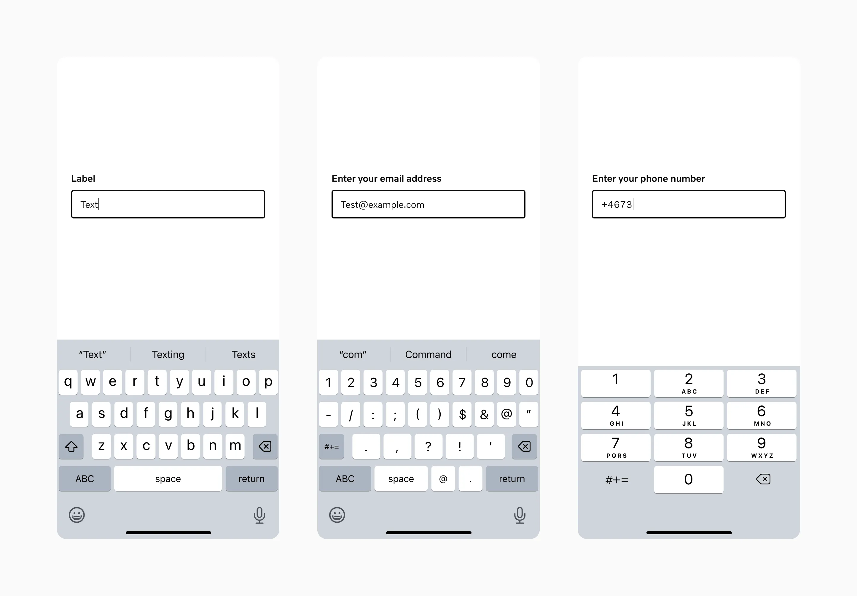
Each input type opens a matching keyboard on mobile.
Labels and placeholders
Section titled “Labels and placeholders”Every input needs a label a screen reader can announce. Never rely on a placeholder alone.
Form validation
Section titled “Form validation”Validate lazily: check a field when the user moves away from it or submits the form, not while they’re still typing.
Marking required fields
Section titled “Marking required fields”Mark whichever fields are fewer. If most fields in a form are required, mark the optional ones instead of marking every required one.
Layout and spacing
Section titled “Layout and spacing”Stack form fields vertically. It’s easier to scan and complete than a multi-column layout. Group two fields on the same line only when they have a clear logical relationship, such as city and postal code.
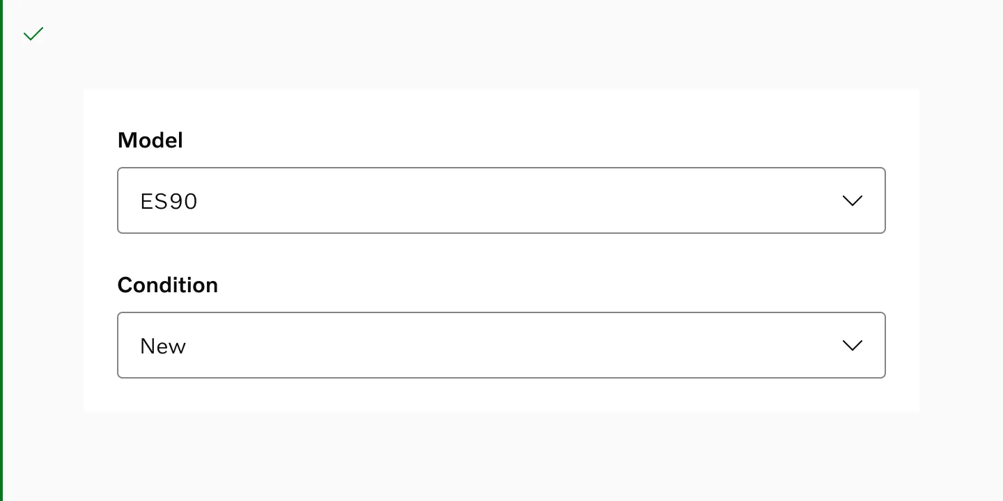
Do stack form fields vertically.
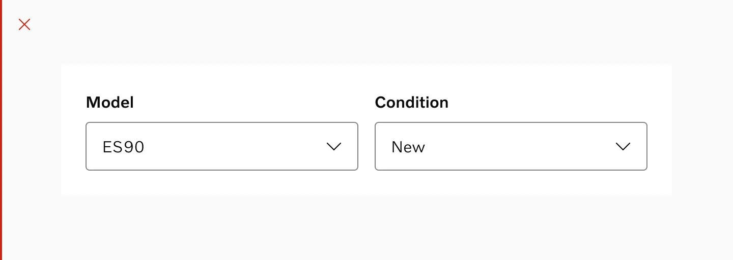
Don’t break a form into several columns without a clear grouping.
Use these spacings between fields:
- 24px between stacked fields.
- 16px between fields placed side by side.
- 8px between a field and its label, and between a field and its hint or error message.
Match the input’s width to its container. On mobile, span the full width between margins; on desktop, keep every input in a form the same width for visual alignment.