Chips

Chips are compact elements that allow users to refine content, such as filtering categories or tags, with immediate visual feedback.
When to use
Section titled “When to use”- Let users make selections from a small, known set of options, without a form or a submit step.
- Show currently applied selections as removable items, so users can see and undo their choices at a glance instead of returning to the control that created them.
- Display options in a compact space, when a full form field or dropdown would take more room than the choice deserves.
When not to use
Section titled “When not to use”- Don’t use as read-only metadata or status. Chips imply interactivity and removability. If there’s nothing to select or dismiss, use the Pill component instead.
- Don’t use as a settings controller. Chips are designed to control and filter things on the current page. Don’t use them instead of checkboxes or radio buttons as a means of configuration.
- Don’t use for a long list of selectable values that won’t fit compactly inline. A wall of chips doesn’t scale and becomes hard to scan. Use a checkbox list or searchable list pattern instead.
- Don’t use chips for navigation. If selecting an item should link to another page or launch a separate view, use a link or button instead.
- Don’t use a single chip as a replacement for a button, especially for a primary call-to-action or a destructive operation. Buttons provide persistent, familiar commitments, while chips are lightweight, secondary controls that typically appear in groups.
Choosing a variant
Section titled “Choosing a variant”- Selectable chip: lets users select and unselect quick filtering options that affect the current view. A group can support either mutually exclusive or multiple selection.
- Dismissible chip: displays selected options and lets users quickly remove individual selections without affecting other active choices. Pair dismissible chips with a selection component, such as a filter input or select, that takes in the user’s selections.
Choosing a size
Section titled “Choosing a size”- Large (40px): the default size, suited for a more prominent placement in larger layouts, such as the top of a table or above search results.
- Small (32px): designed for dedicated filter modals or forms. Add
data-size="small".
Interaction
Section titled “Interaction”Dismissible chips
Section titled “Dismissible chips”Users can dismiss individual chips by clicking the close button (X), which removes the chip from the interface and updates the selection state. Multiple dismissible chips can be removed independently without affecting other active selections.
Selectable chips
Section titled “Selectable chips”A group of selectable chips can be configured to allow either single selection or multiple selection. Don’t mix both behaviors within the same page or flow.
- Single-selection: use when users need to choose exactly one option from a set of mutually exclusive choices.
- Multiple-selection: use when users need to combine different criteria to refine their results.
Spacing
Section titled “Spacing”Chips in a group should have at least 8px spacer between them.
Considerations
Section titled “Considerations”Concise content
Section titled “Concise content”- Keep chip text short and focused. Long text disrupts visual consistency and layout.
- Use short, clear labels, one to three words when possible.
- Use keywords rather than a full sentence or long phrase, such as “Awaiting approval” instead of “Awaiting to be approved.”
- Don’t create chips with long phrases or sentences.
- Don’t mix multiple values, such as “Black and Blue,” in one chip.
Instant filtering
Section titled “Instant filtering”Users expect filter selections to apply immediately. However, in some cases, typically within filter modals with prominent “Apply Changes” buttons, changes may only take effect after confirmation.
Sensible defaults
Section titled “Sensible defaults”Start with either all options unselected or the most logical “default” option selected. Such a default should always be the first item in the list.
Don’t pre-select
Section titled “Don’t pre-select”If options were previously selected by the user, it might make sense to retain those selections, otherwise, let users make their own choices rather than pre-selecting options for them.
Stick to one behavior
Section titled “Stick to one behavior”Selectable chips can be configured to either allow multiple selections at once or just one selection at a time. However, to avoid ambiguity, it is important to stick to one of these behaviors per page/flow.
Content overflow
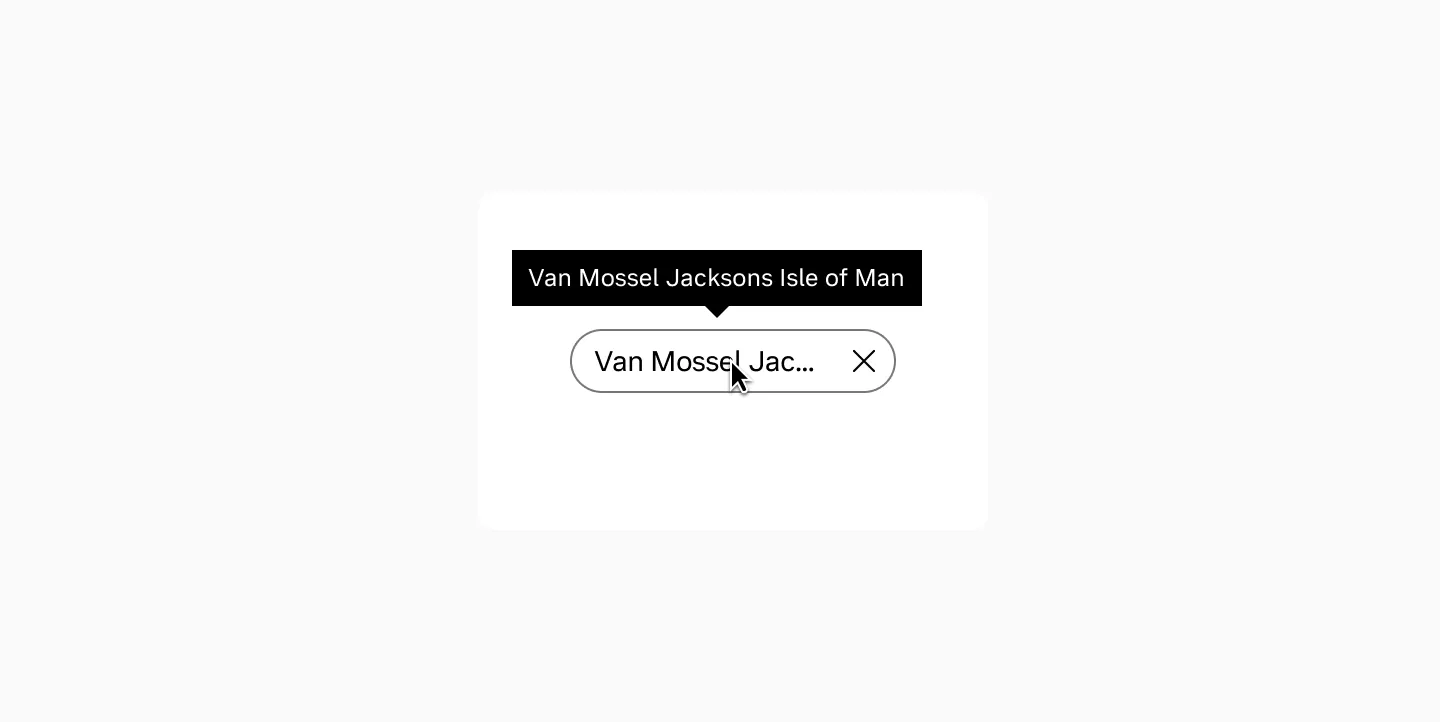
Section titled “Content overflow”Avoid truncation when possible, but if necessary, use ellipsis and provide tooltips. Consider internationalization and varying text lengths across languages.
Progressive disclosure
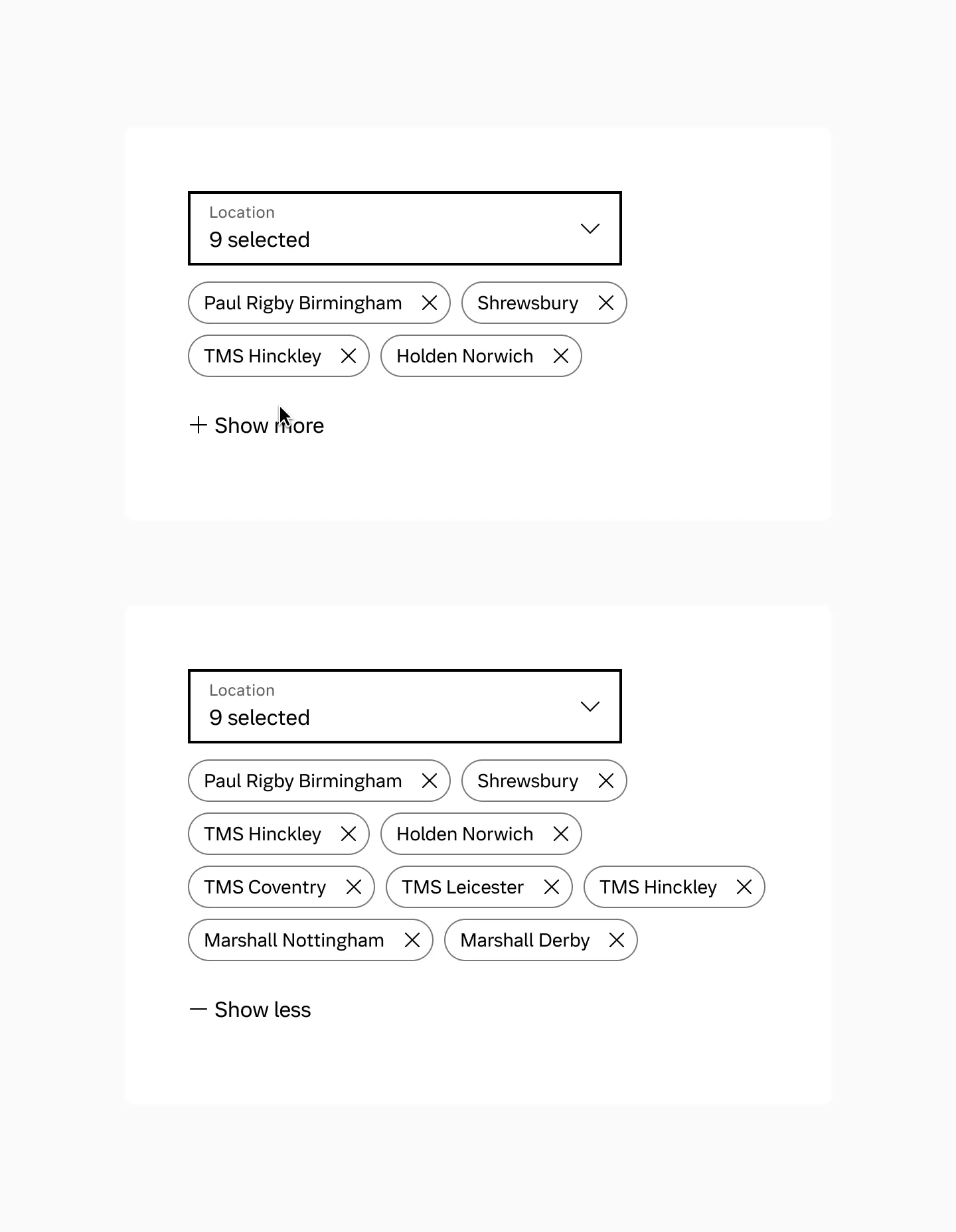
Section titled “Progressive disclosure”In contexts with many chips or limited space, display a subset of the most important options initially with an action to reveal the complete set. Based on general UX principles like Miller’s Rule of 7±2 for optimal cognitive processing, start by showing 3-5 chips on mobile devices and 5-8 on desktop.