
Button

Trigger actions with filled, outlined, and text button variants. Includes the SubmitButton React component for forms.
Buttons trigger an action. This page covers how to choose between variants, colors, and sizes, and how to place, group, and label buttons. For classes, attributes, and the React API, see Specification.
Choosing a variant
Section titled “Choosing a variant”Pick the variant that matches the importance of the action, not the look you want. A page should read as one clear primary action supported by less prominent ones.
| Priority | Variant | Typical use |
|---|---|---|
| Primary | Filled | The single most important action in the viewport. Order, Book test drive. |
| Secondary | Outlined | Meaningful alternatives that may repeat on the page. Compare, Save. |
| Tertiary | Text | Low-emphasis actions such as Learn more. Never for Submit. |
Text buttons need contrast
Section titled “Text buttons need contrast”A text button sits close to plain text, so it must stand out through hierarchy, weight, and surrounding space. When the action doesn’t need that emphasis, an inline text link is the better choice.
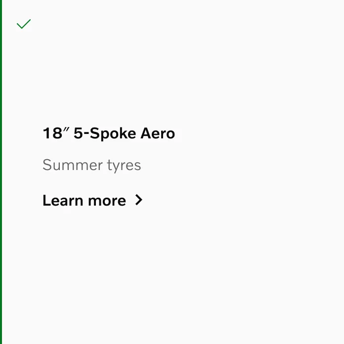
Do give a text button its own hierarchy so it reads as an action.
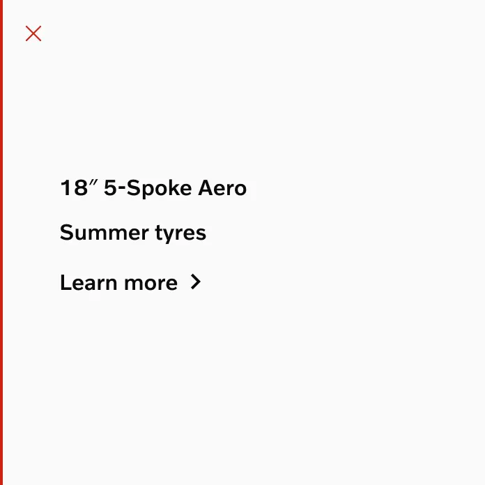
Don’t let a text button blend into surrounding copy.
Choosing a color
Section titled “Choosing a color”Neutral is the standard and works everywhere. The other colors carry meaning, so use them deliberately.
- Accent: reserve for the one action you want to emphasise above a neutral primary. Use on plain backgrounds only.
- Destructive: for actions that delete, remove, or cancel something. Always pair with a confirmation step.
- Subtle: for filled buttons that need the filled shape but not the primary weight.
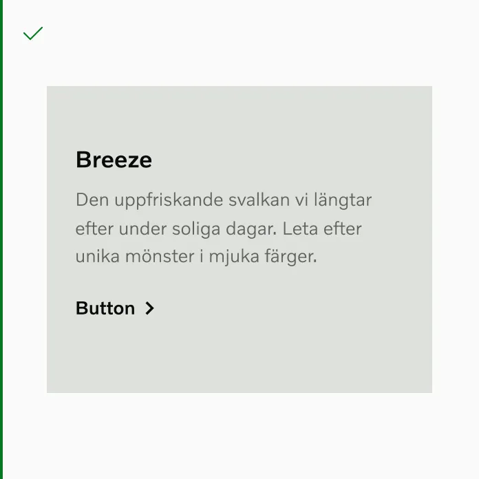
Do use neutral buttons on colored backgrounds and media.
When a destructive action is grouped with its alternative, give the two buttons different colors so the safe choice never looks the same as the irreversible one.
Backgrounds and color modes
Section titled “Backgrounds and color modes”Match the button’s color mode to what’s behind it: light-mode buttons on light backgrounds, dark-mode buttons on dark ones. When placing content on a dark image, switch the whole section to dark mode rather than mixing modes within one surface. See color modes.
On top of media, use filled buttons only. Outlined buttons don’t hold up against a photographic background unless it has a solid color area behind them.
Choosing a size
Section titled “Choosing a size”Buttons don’t scale between breakpoints. You choose the size for the context.
- Default (48px): the standard for page-level actions.
- Medium (40px) and small (32px): for dense areas such as compact cards, toolbars, and table rows.
By default a button wraps its label. Use a fixed or full width when the button should align to a form field, a grid column, or a container edge. For example a full-width primary action on small viewports.
Grouping
Section titled “Grouping”Group at most two buttons. If one action clearly matters more, use a single button instead of a group.
Allowed pairings:
- Filled + outlined
- Outlined + outlined
- Filled or outlined + text
- Text + text
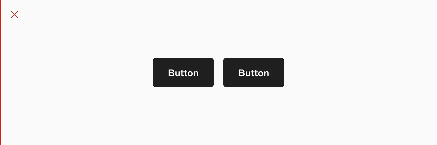
Don’t place two filled buttons next to each other. Neither reads as primary.
Buttons in a group sit on one row while they fit and stack when they don’t. Keep them horizontal whenever there is room.
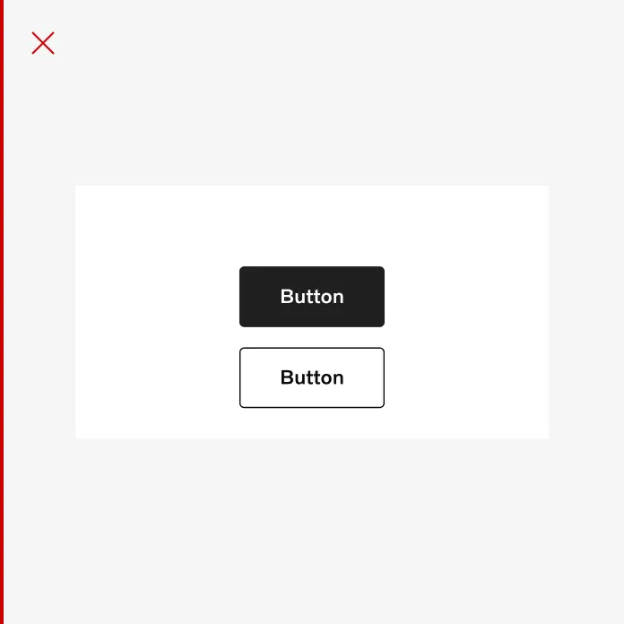
Don’t stack buttons vertically when there is space to place them side by side.
The primary button leads: on the left in a left-aligned group, on the right in a center-aligned, right-aligned, or sticky group. When the same group stacks, the primary button moves to the top.
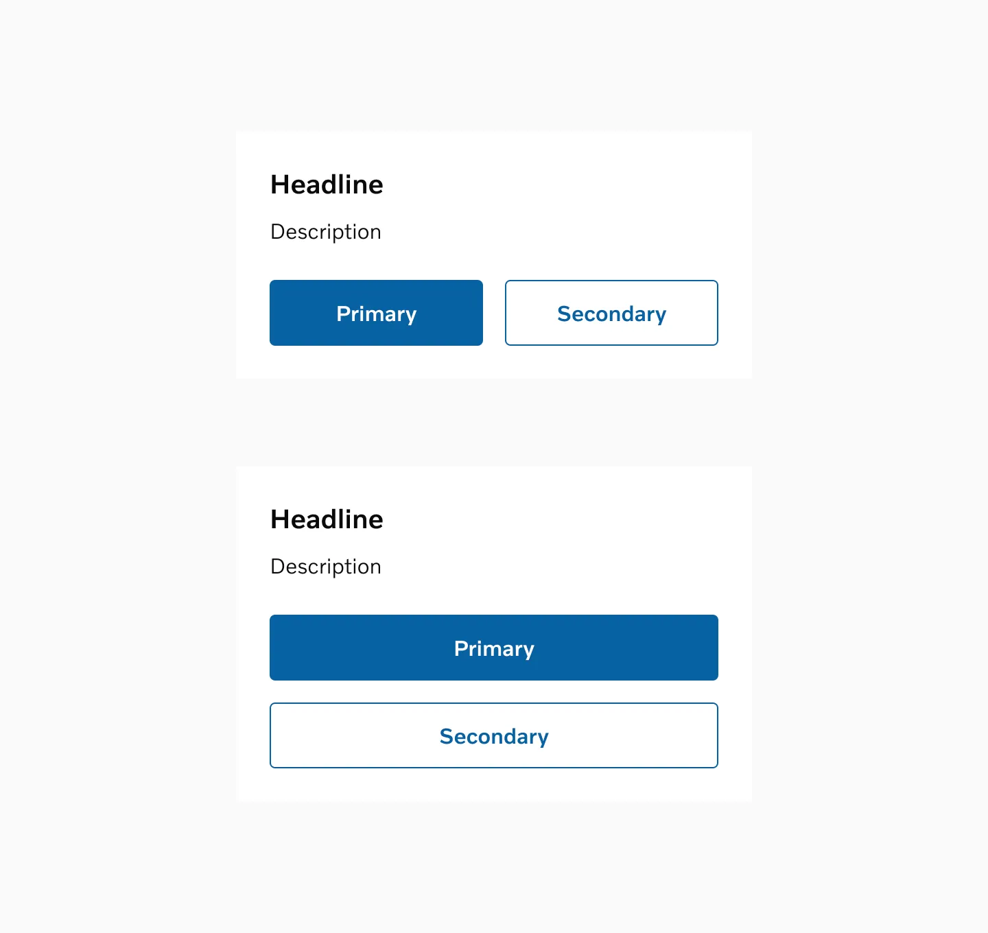
Keep the primary button first in both directions.
Placement
Section titled “Placement”Place a button directly under or inside the content it acts on. The exception is a button in a navigation bar. Align it the way that content is aligned: left-aligned copy gets a left-aligned button, centered copy a centered button.
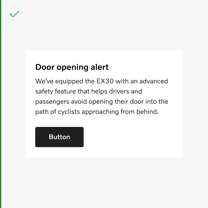
Do align the button with its content.
In a step-by-step flow, the button that moves the user forward goes on the right on desktop and tablet. On mobile, let it span the full width between margins.
For right-to-left languages, mirror directional placement so a “forward” button stays on the trailing side.
Spacing
Section titled “Spacing”Use a 16 spacer between buttons in a group, horizontally or vertically. Two stacked text buttons take no spacing between them. Between a form and its button, use 32.
Labels
Section titled “Labels”Write the action, not the context. Start with a verb, stay under 25 characters, and avoid repeating the heading above the button.
Disabled and loading
Section titled “Disabled and loading”Prefer explaining what’s missing over disabling the button. A disabled button gives the user no route forward and is easy to miss, especially in forms.
Use loading only for actions the system is actively processing, and keep the label in place so the button doesn’t resize.
Further reading: Usability Pitfalls of Disabled Buttons and Making Disabled Buttons More Inclusive.